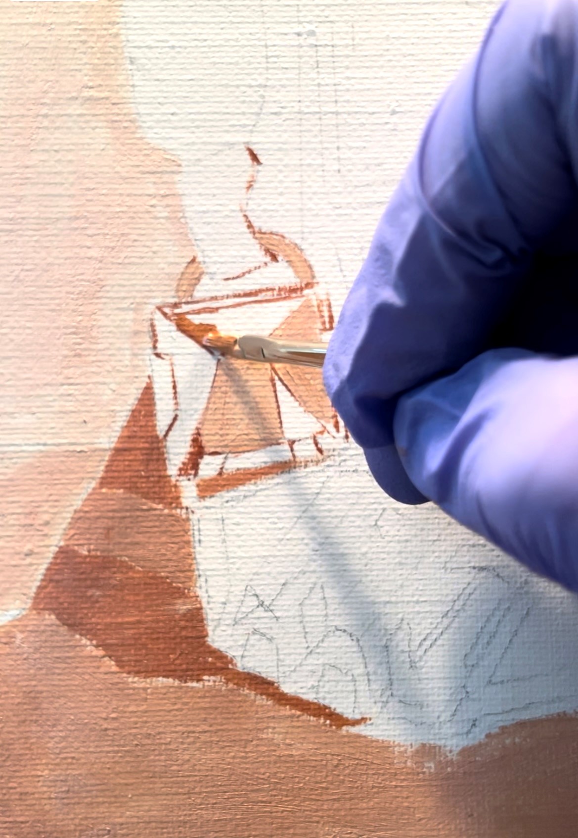
I began by underpainting the green and orange crystals with cadmium yellow. This will show through future glazed layers, making the final green and orange more vibrant. I have found that greens and oranges, painted this way, with a transparent glaze over a bright yellow ground, have a vibrancy that opaque mixtures lack.
The next step, below, was to put in the basic local colors. I don’t worry too much about details at this point. I also don’t worry about getting the colors exactly right. Until more paint is down, it’s impossible to judge them correctly. Some of the drawing got lost in the underpainting, so I spent some time re-seeing and re-painting details (though not the tiny ones yet!)
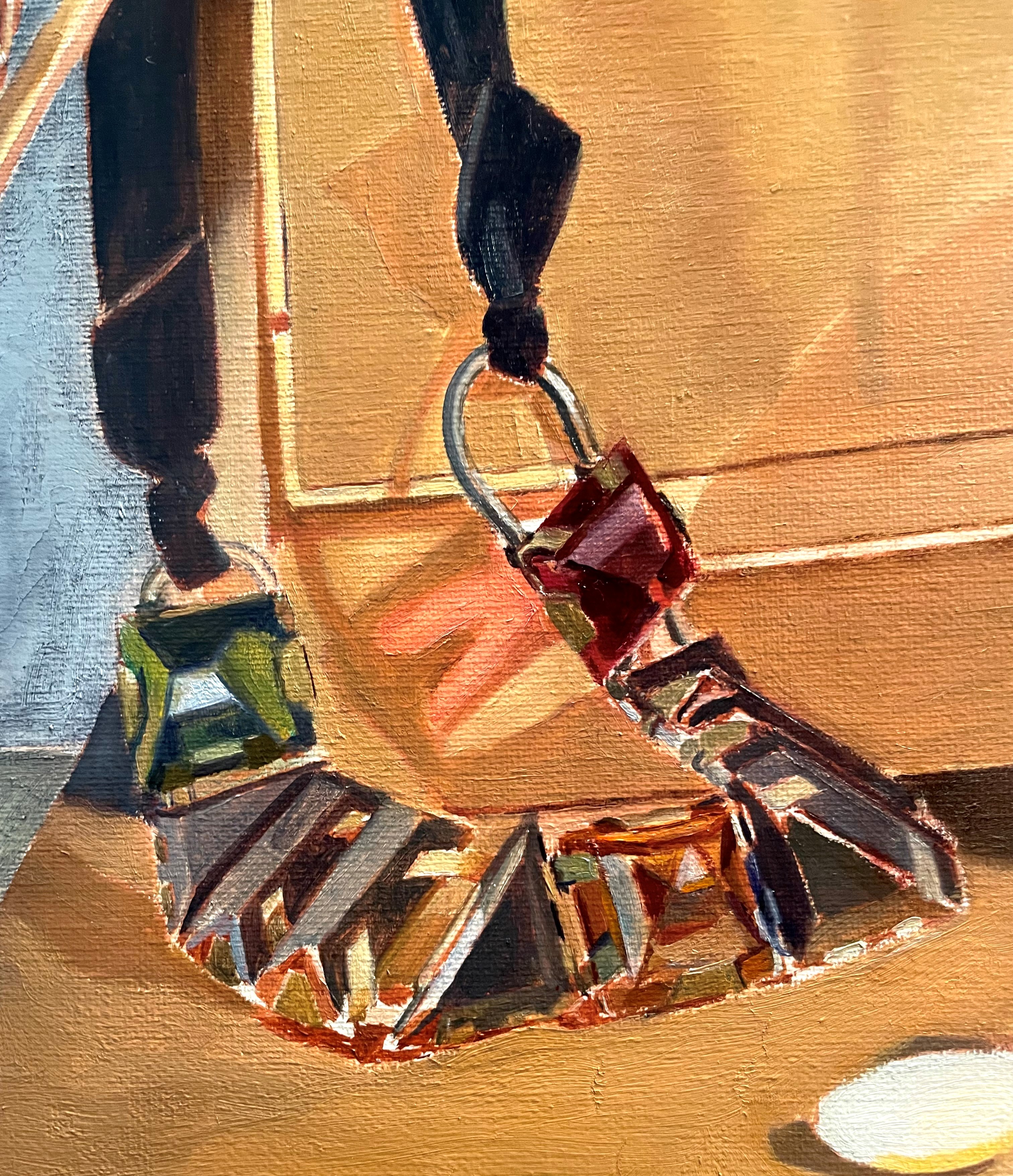
Below, I’m getting much more specific about shapes, colors, and values. It’s much easier this time than the last go I had at it! It keeps getting easier. The adjoining areas have progressed at the same pace as the necklace, so it’s easier to see how everything relates now. I spent some time observing the color of all of the reflections. The ones on the left are coming in from a window, so are bluish. The ones on the right are from my spotlight, a warm yellowish color.
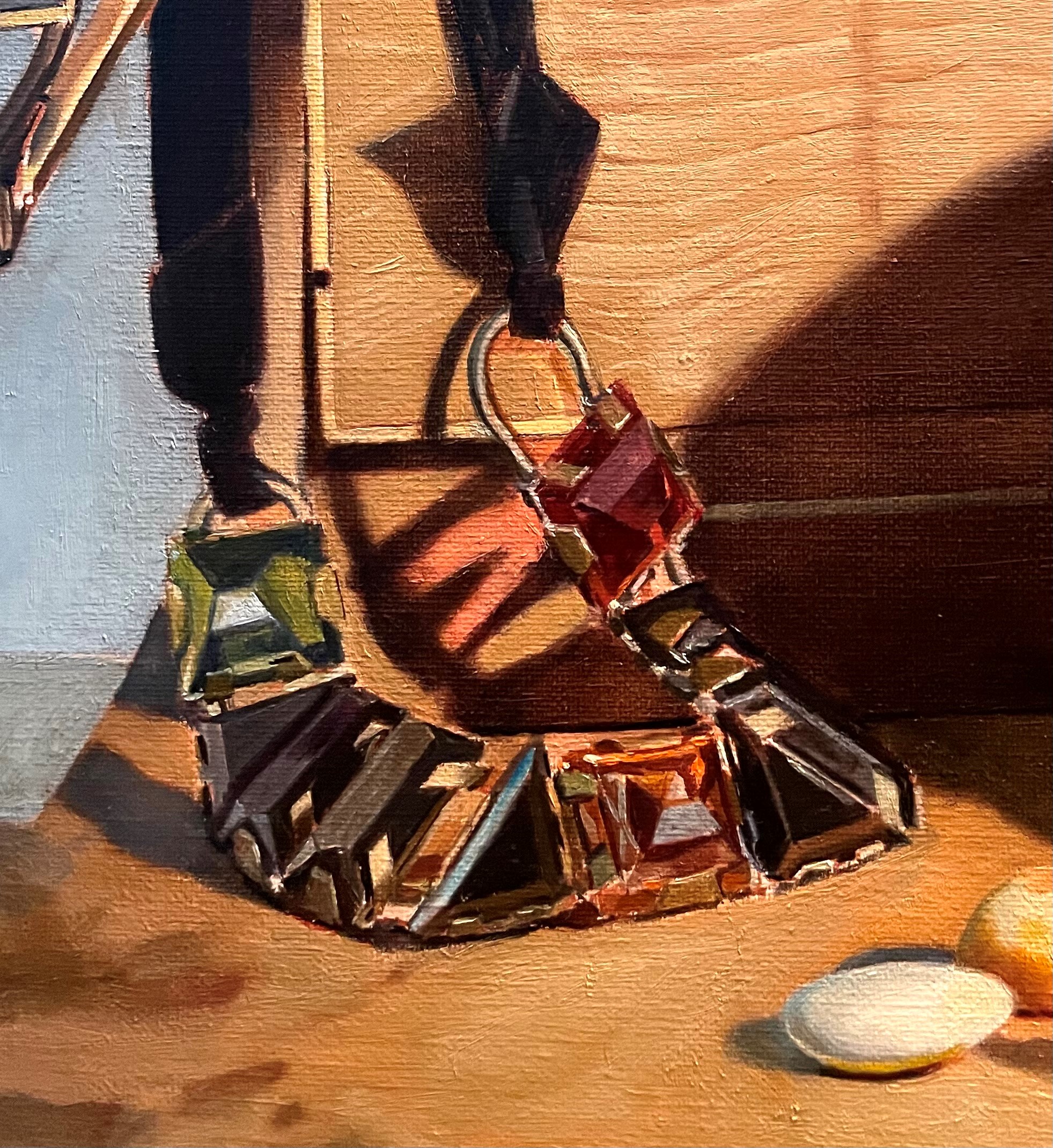
Below, I’ve begun indicating the texture of the metal chains, and refined some shapes. I studied the structure of the necklace, so that I could see it better and then simplify it for the painting.
Below, I’ve softened some edges on the chain and crystals, added more reflections from the window, and firmed up some of the smaller bits of metal hardware, especially around the orange crystal.
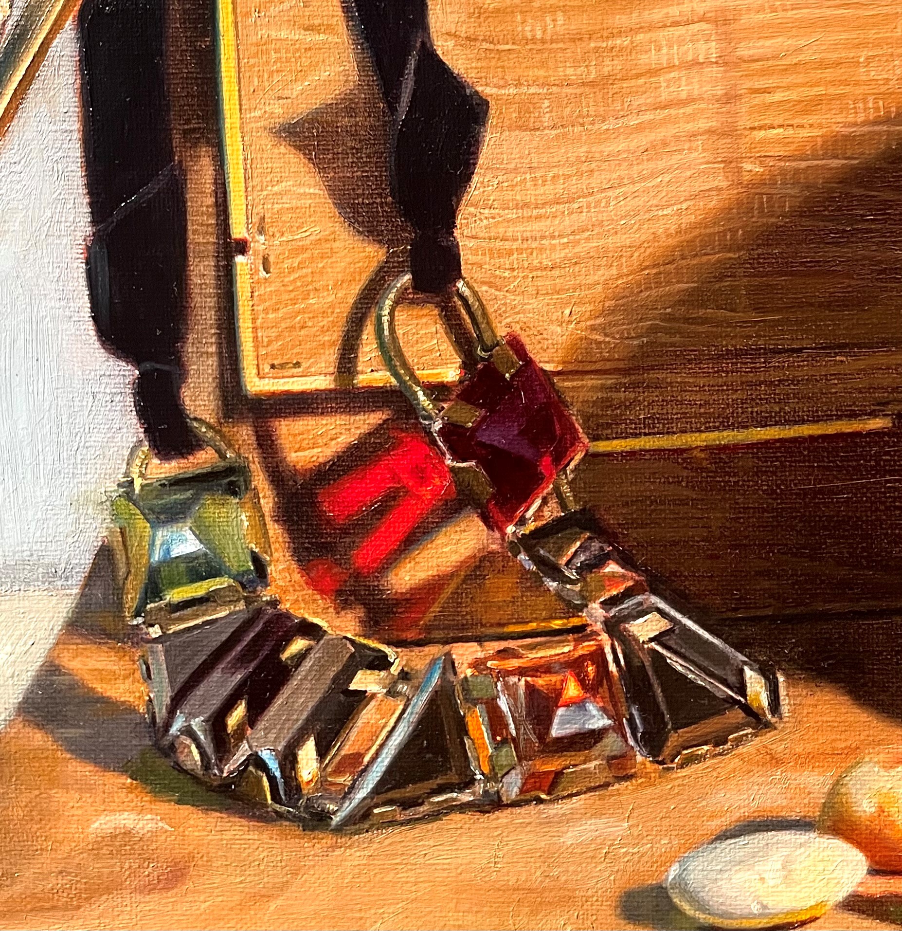
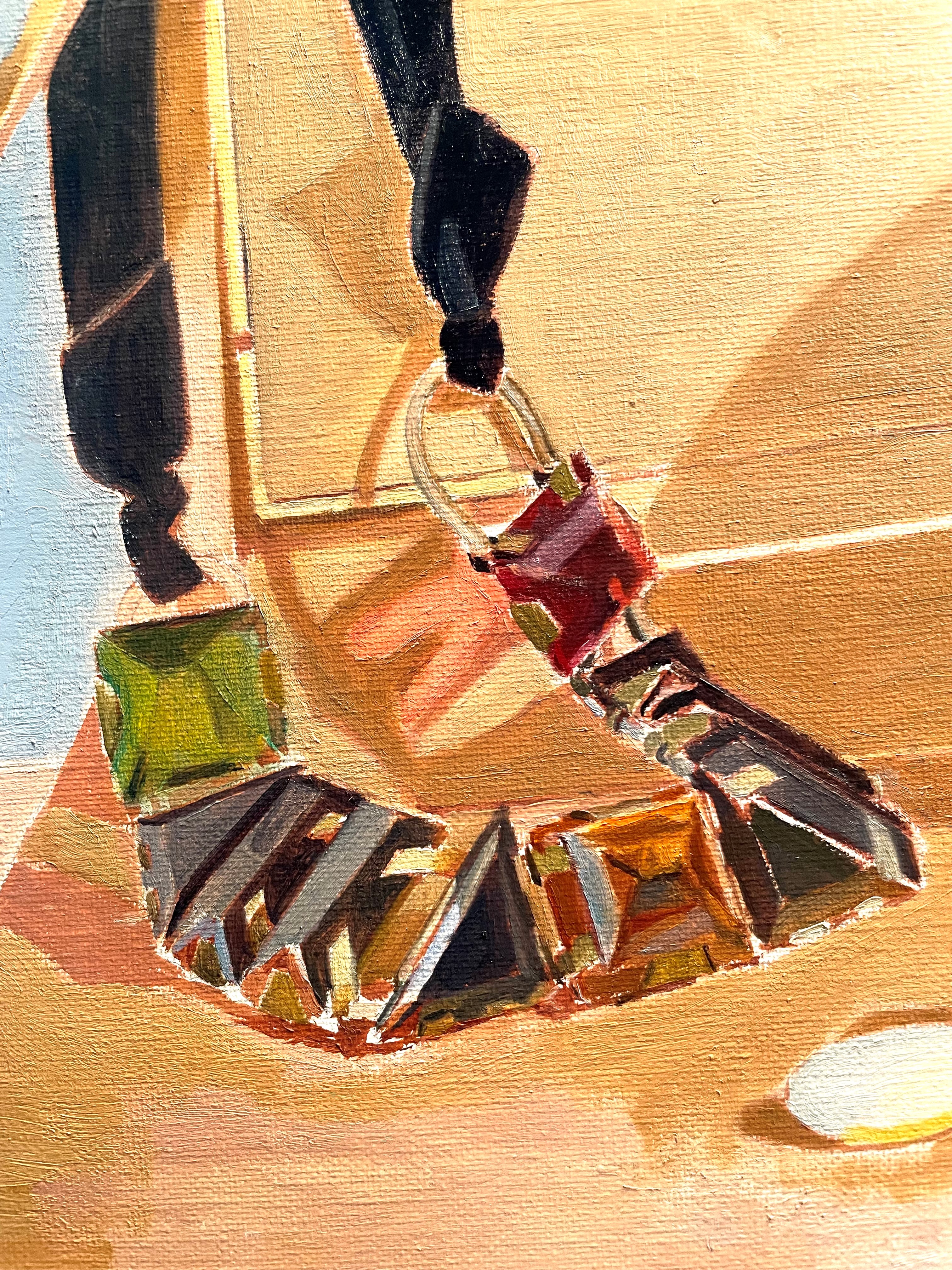
The final version is below. I re-painted much of the orange crystal. I also refined the highlights on all of the hardware. I softened some more edges. I say it’s done, but I may yet see something I want to fix!
I knew from the start that the texture on the snakeskin handbag would be very difficult to paint. As always, the trick is to have enough detail to be convincing without painting every little bump and line! To begin, I simply put down my best guess as to the color and value. I painted the shadow area a bit darker, but still kept it light, as I plan on glazing this area later.
As I got more paint down, I could see that I got the color and value wrong. Below, you can see that I darkened and warmed it up a bit.
To begin to indicate the texture, I painted the broad wavy stripes that are the easiest part to see. The intricacies of the pattern are still beyond me at this point. It’s so confusing! I try not to get discouraged. The more you look and paint, the clearer things become. It always astonishes me, but it’s true. I also put in a glaze in the shadow areas.
Just for fun, above is a photo of the actual handbag, so you can see how complex the pattern is. Again, I do not aim to paint this in detail. I try to paint what a human can actually see from a distance of about 5 feet (the distance between me and my set-up). However, to suggest, you have to understand, so I studied this picture to get the general idea into my head. That way, when I’m looking at it from a distance, I can better understand what I’m seeing. The brain informs the eye!
Above, I’ve started putting in some of the details, painting some tiny vertical lines between the strips. The trick is to keep the value difference minimal. When you squint your eyes, it should all but disappear (just as it does when looking at the set-up). I painted more of the gold hardware on the edges, noting that even though parts are in the shadow, they still look light as they reflect the light. I painted some of the tiny stiches.
The photo above has some glare on the left, but on the right you can see the beginnings of my showing the complex patterns. As usual, I end up overstating these at first, in an effort to get it right. I’ll mute much of it at my next session. Next time, I’ll also paint some generalized detail in the shadow area. Details are always muted in the shadows. I’ll keep them very close in value to the rest of the shadow area so they won’t stand out too much.
Below is the first quick layer of paint I put on the strap, just to indicate the local colors. I’ll glaze the brown strap darker when this layer is dry because I decided that I wanted to scumble a lighter tone over it to show the light reflecting onto it from the window on the left. Scumbles are thin transparent layers of light-colored paint, rubbed onto a darker base. They have a cooling, lightening effect and produce pearly tones impossible to achieve with direct painting.
Below, is how it looked after glazing the strap darker, letting it dry, then scumbling a haze of a pale blue-gray over it. I’m pleased with the effect. I also painted some of the details of the hardware and the push-pin. This is as detailed as I’ll get for now in this area. I’ll now move on to another part of the canvas, to keep it all developing at the same speed.
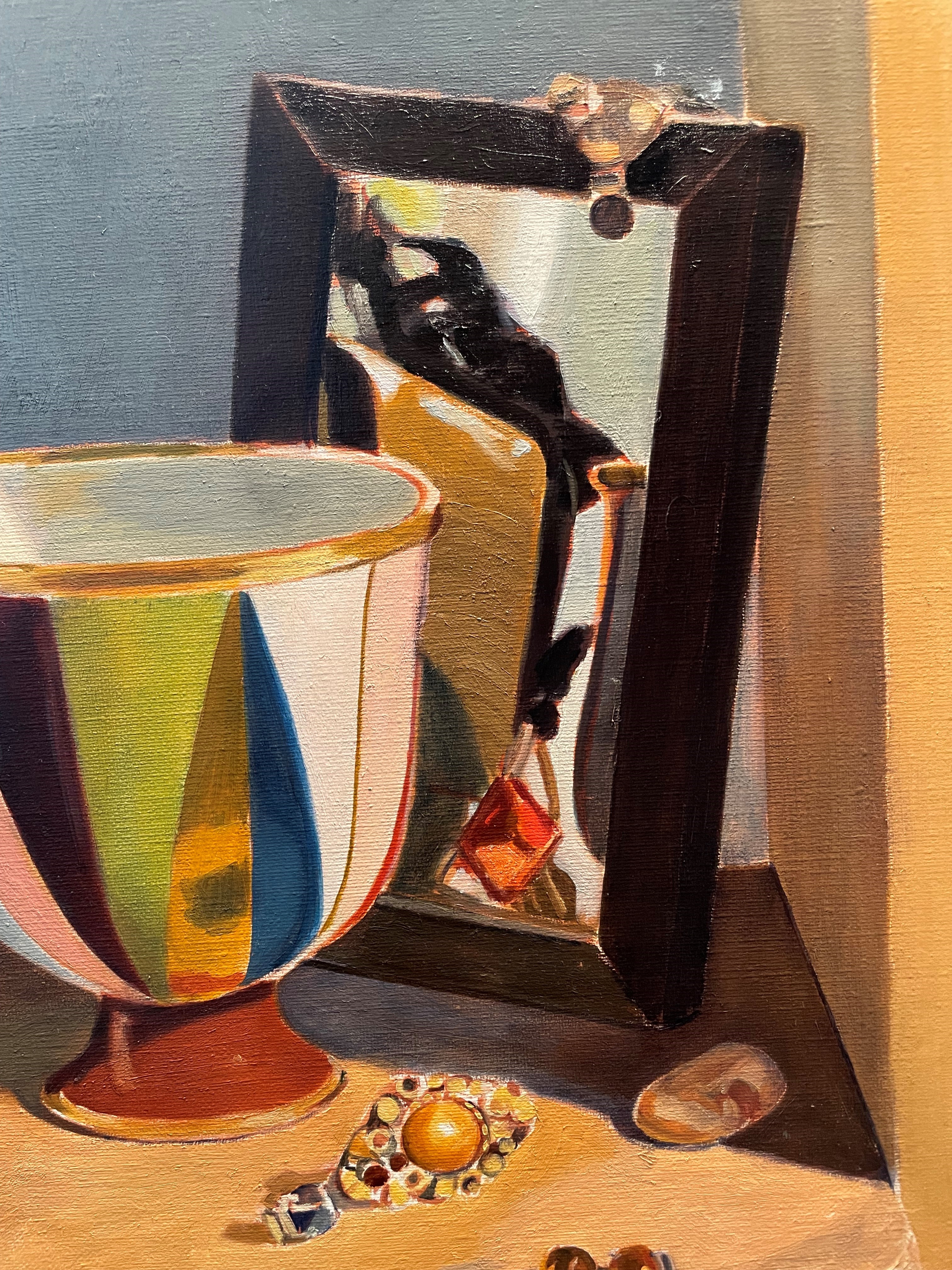
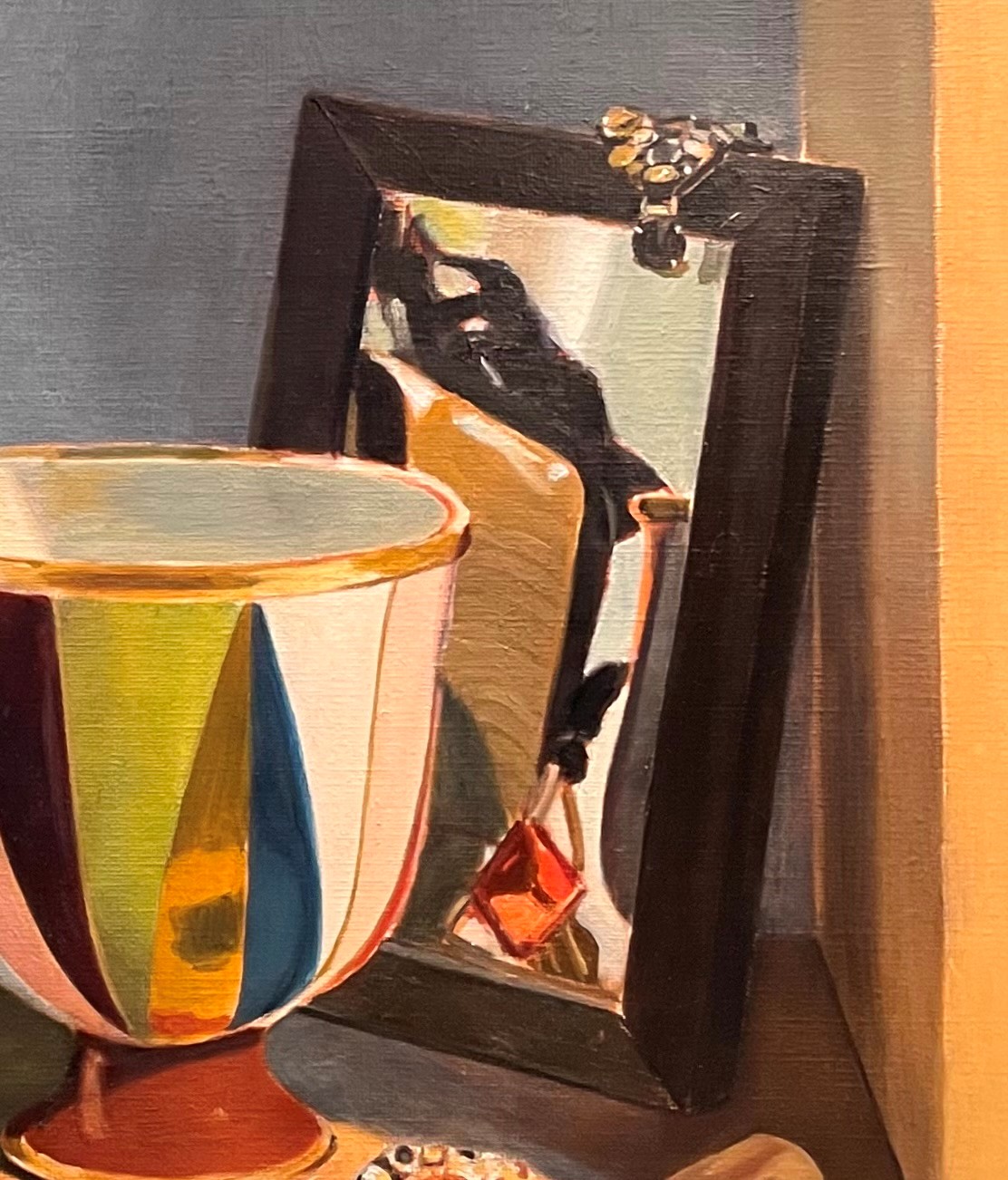
Here’s how the mirror looked in the underpainting. I realize now that there was no point in indicating the pattern on the frame, as it’s much easier to paint the frame’s base color, then ‘draw’ the pattern on top after it’s dry. If I tried to paint the whole thing together (pattern and base color), I’d be trying to paint around complex shapes, then when I made a mistake (which is guaranteed), it’d be hard to correct. Alternatively, if I’m painting the pattern over a dry base color, I can keep wiping off my errors as much as I want without messing up the base, Oh, well! I went to a lot of trouble to see and paint the pattern. It’s probably not all wasted effort, though, as I got to know the pattern. It’ll be easier to do the second time.
Below, I’ve put in the local colors very simply, with no effort at detail. As with the handbag strap, I decided that I wanted the frame in a darker value, so that I can scumble over it later to get that pearly tone caused by the daylight coming in from the window on the left.
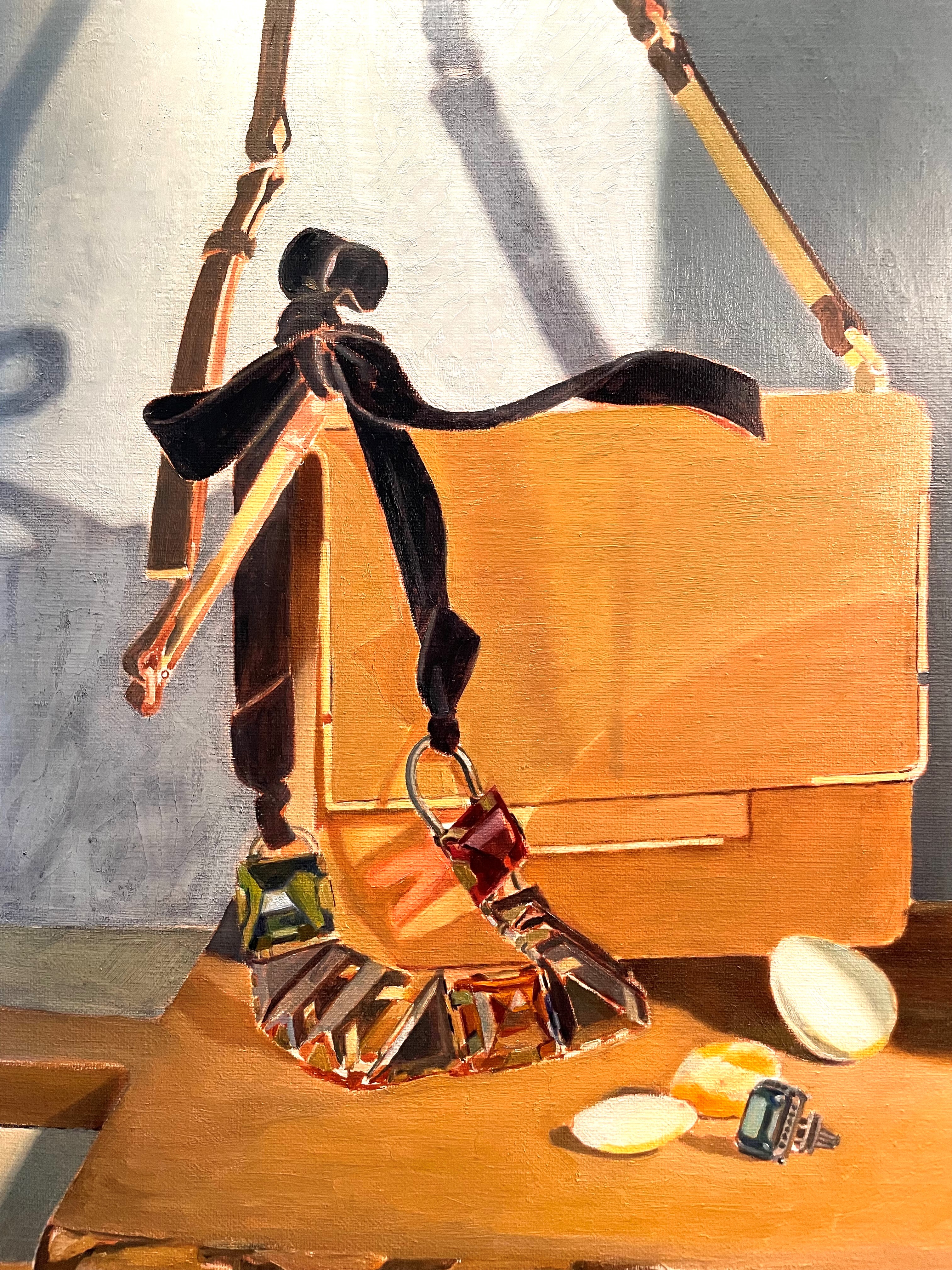
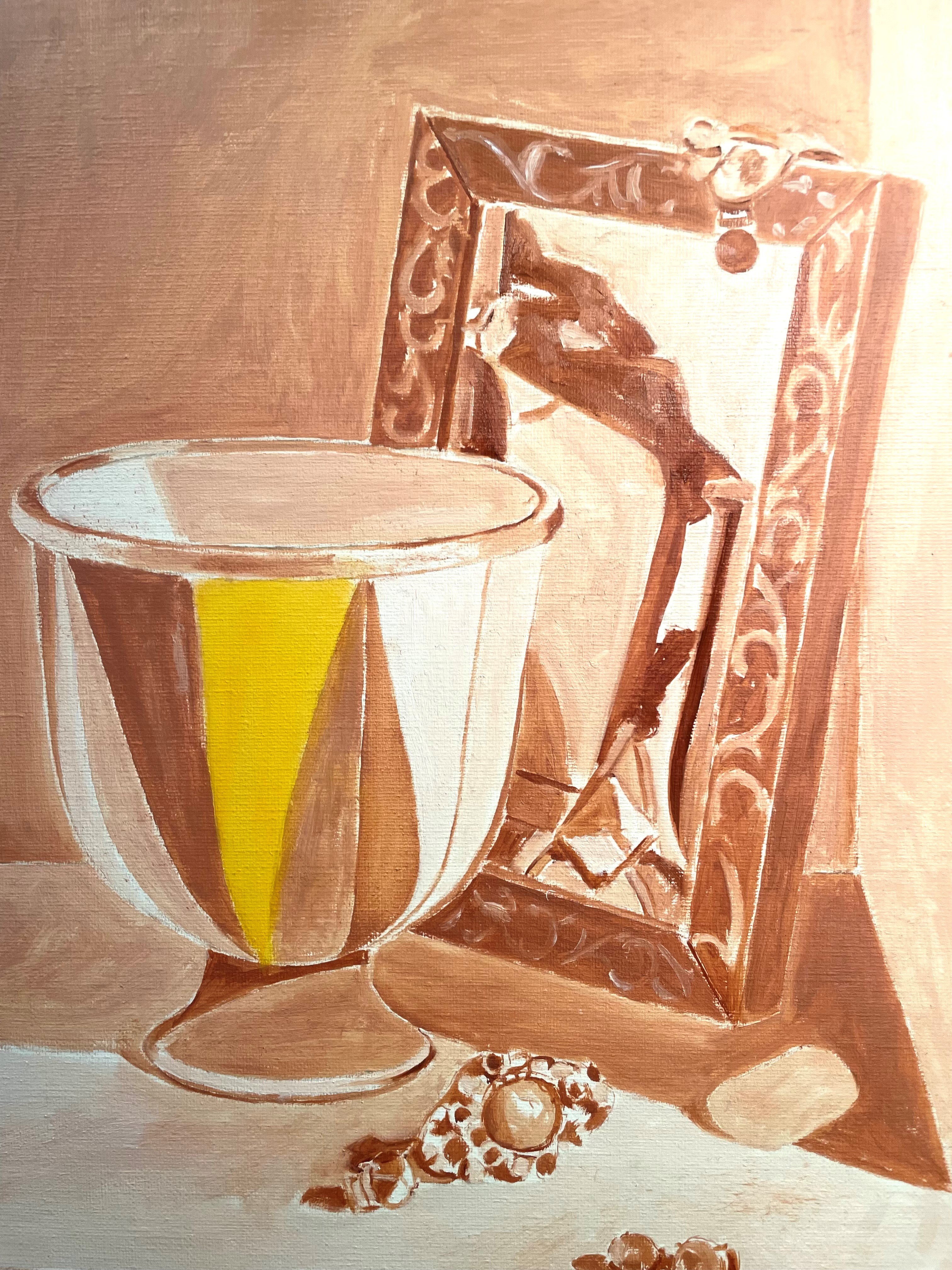
Below, I’ve indicated some texture on the handbag reflection, glazed in the cast shadow on the bag, clarified the background light tones, and did some corrections on the reflection of the red crystal. I glazed the frame darker, in anticipation of the lighter scumble to come.
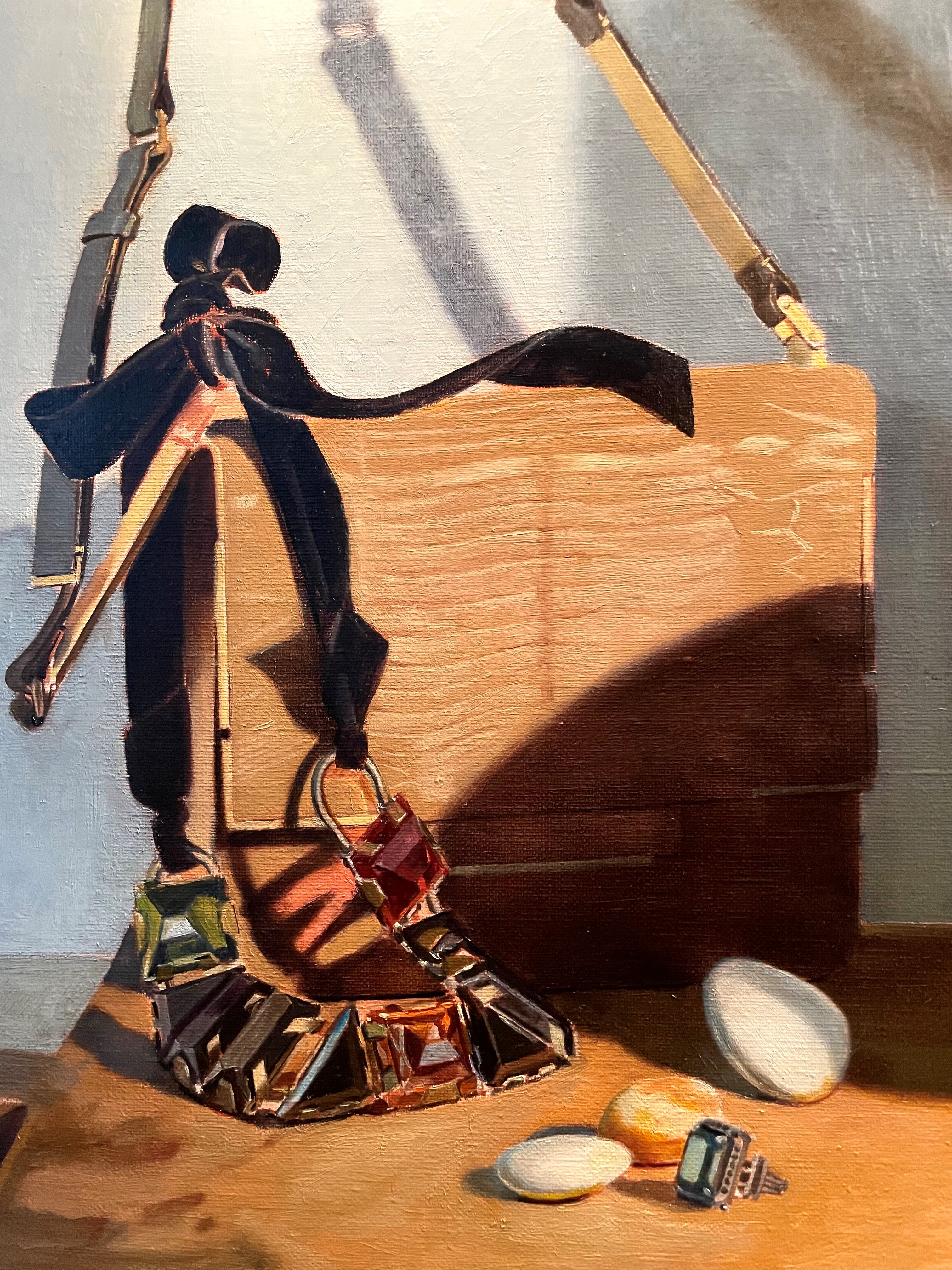
I noticed that the sides of the mirror frame were not parallel. How does this go unnoticed for so long? I don’t know, but there always seems to be some mistake. I suppose it comes from being too immersed in the drawing. After I’ve been away from trying to see and draw for a while, errors stand out. I’ve fixed it, below. You can also see an improvement in the painting of the earring draped over the mirror. This wasn’t easy to see or paint. Every time I try, it gets easier. The more paint that is down, the easier it is to compare and correct- the essence of getting it right.
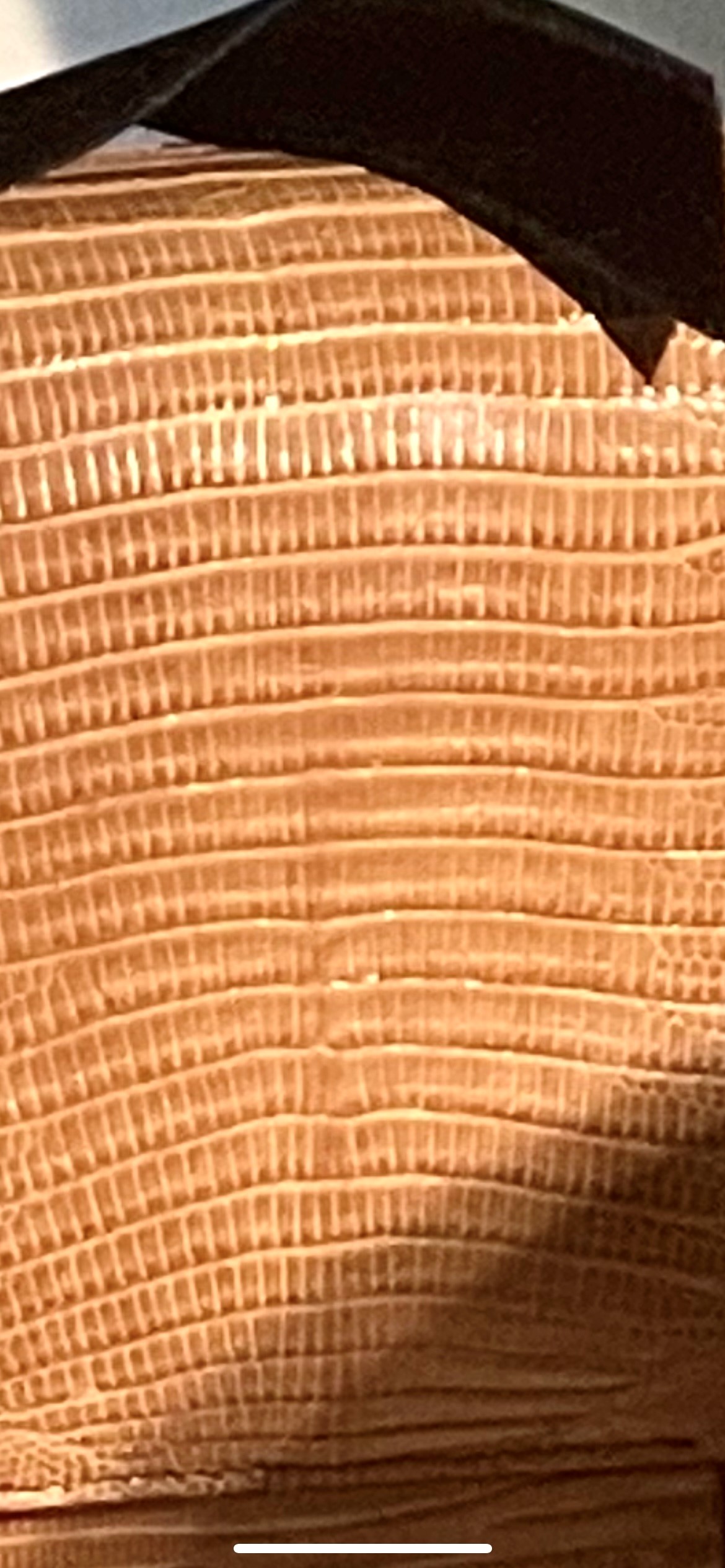
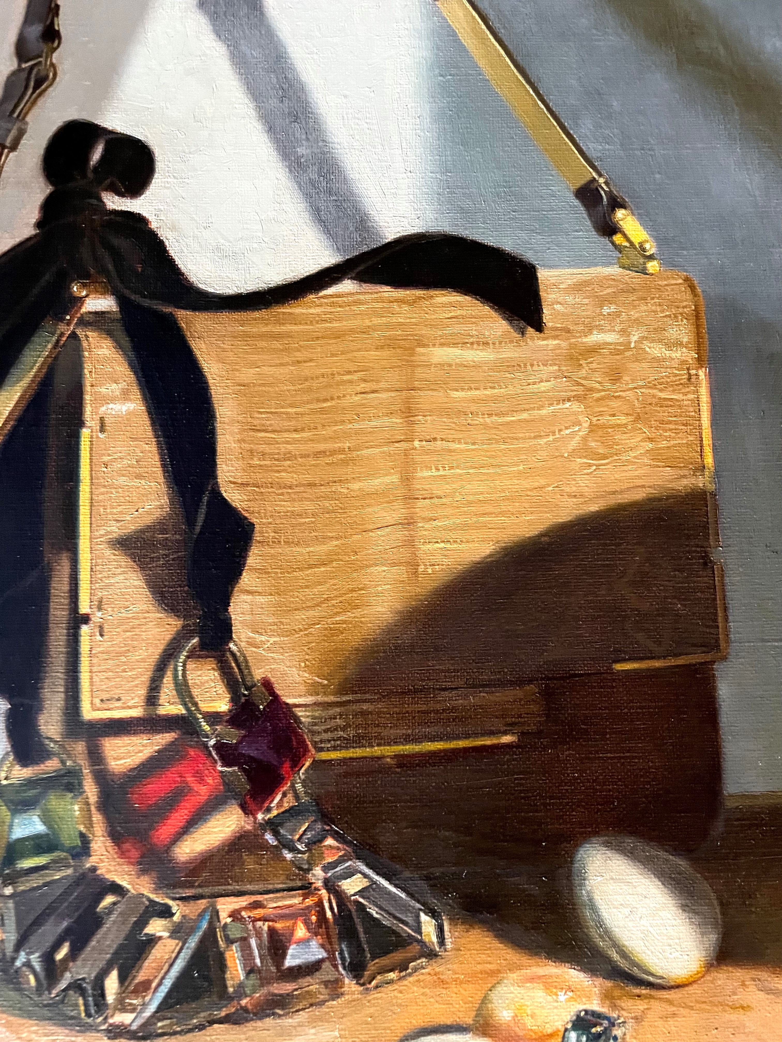
This canvas is large and it takes a lot of time and paint to cover it! Below, I’ve finished the first layer on the rest of the strap, again painting it darker than it will be to allow me to scumble over it later. I refined the shadow on the wall a bit. In this shot, you can see the texture of the wall. I tried applying the paint in a different way from my usual approach. I decided to try using a palette knife, since I wasn’t liking the look of brushstrokes. After, I went in with a brush to get more control of borders, and to smooth out some rough areas. Overall, I like the effect. It looks more like a plaster wall this way.
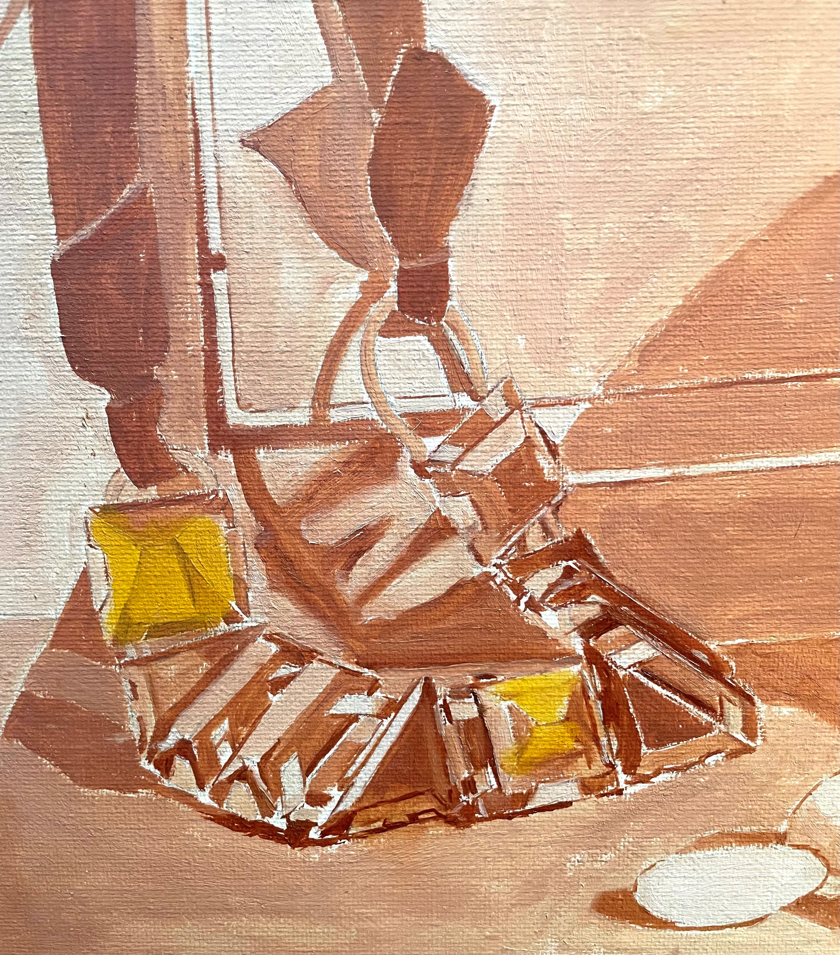
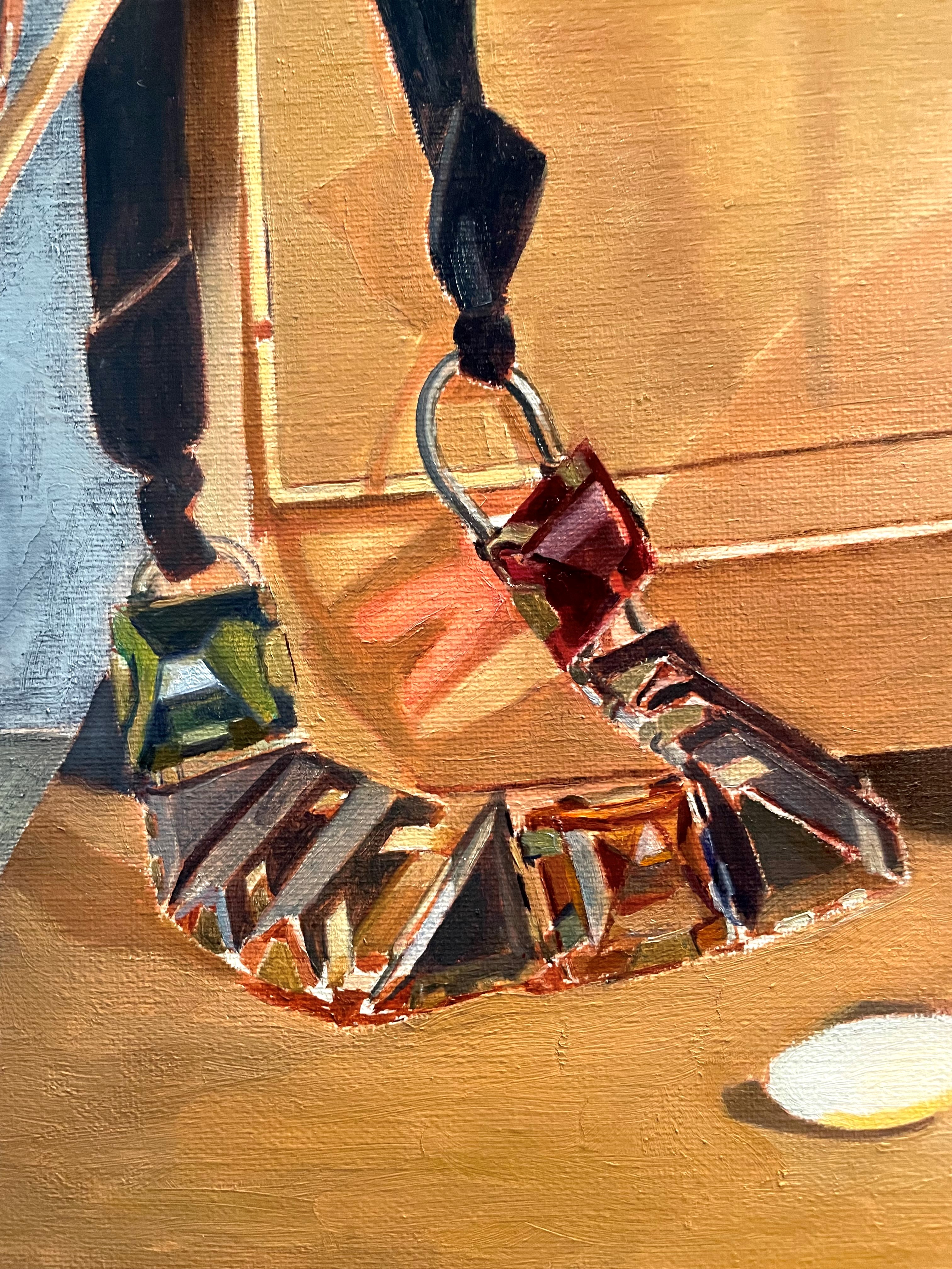
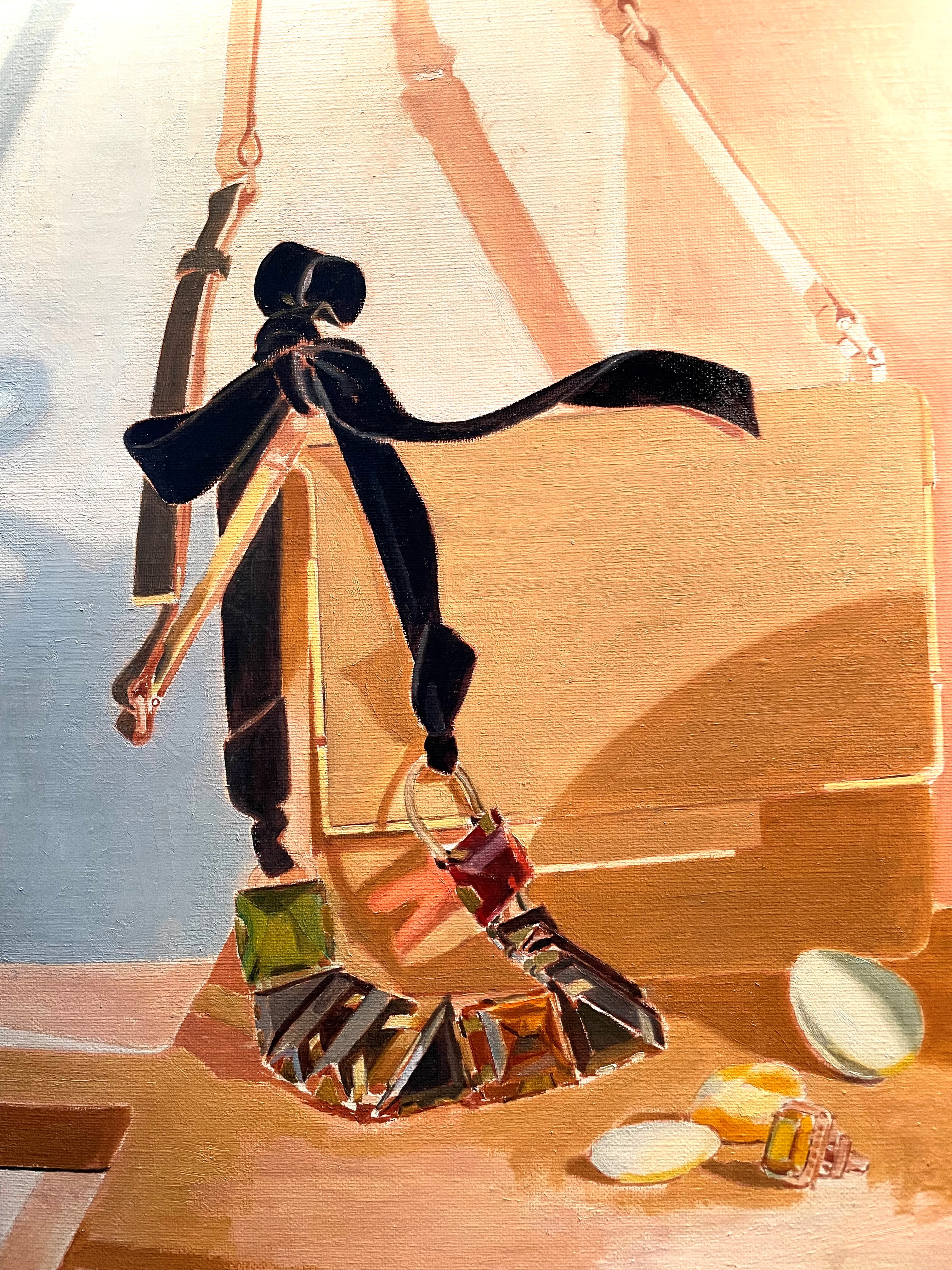
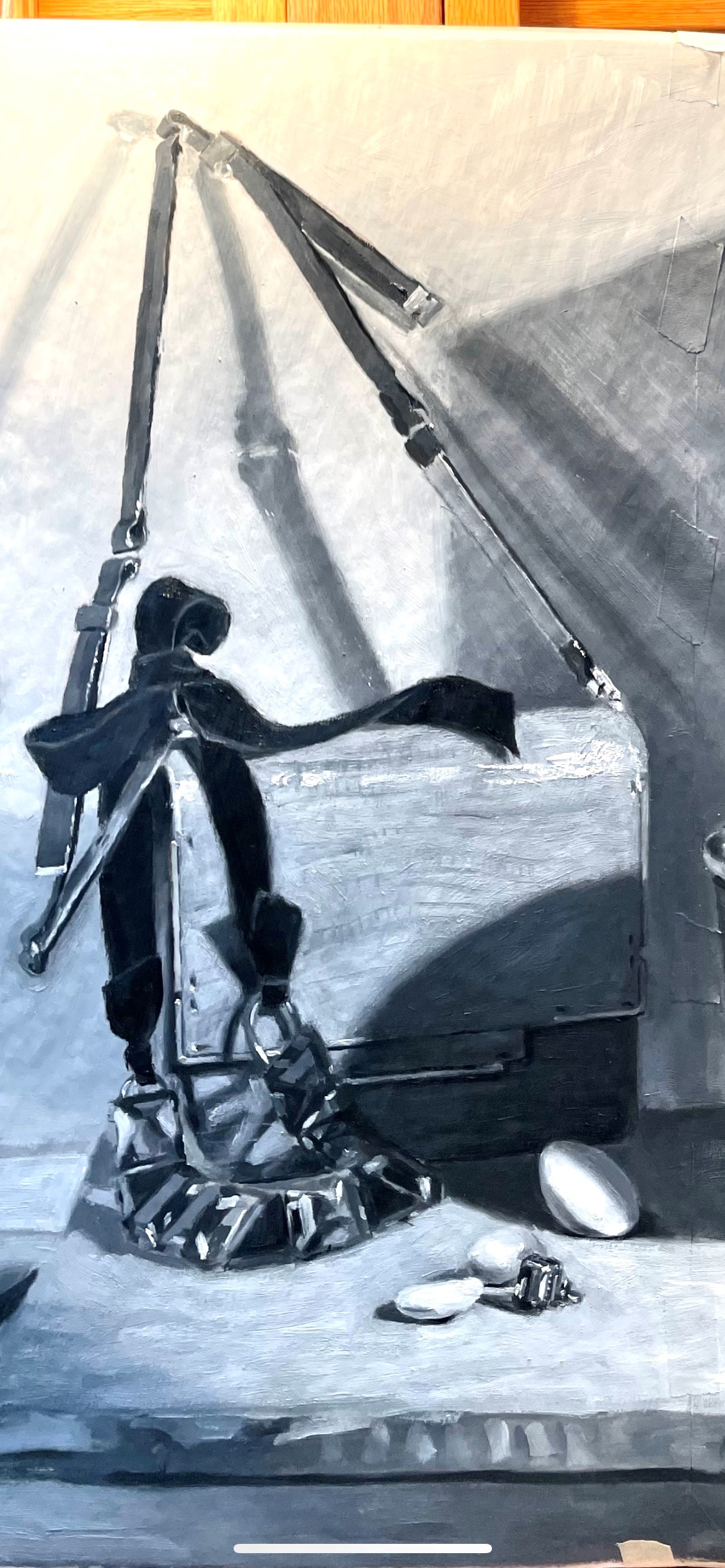
The sparkly jewelry was very hard to see, as usual. I did my best to see big shapes and basic colors. I know from experience that each attempt to see it and paint it, will make the next session much easier. It can be frustrating at first, because nothing is really correct. Each layer provides a base for further observation, which gets easier as there are more landmarks added.
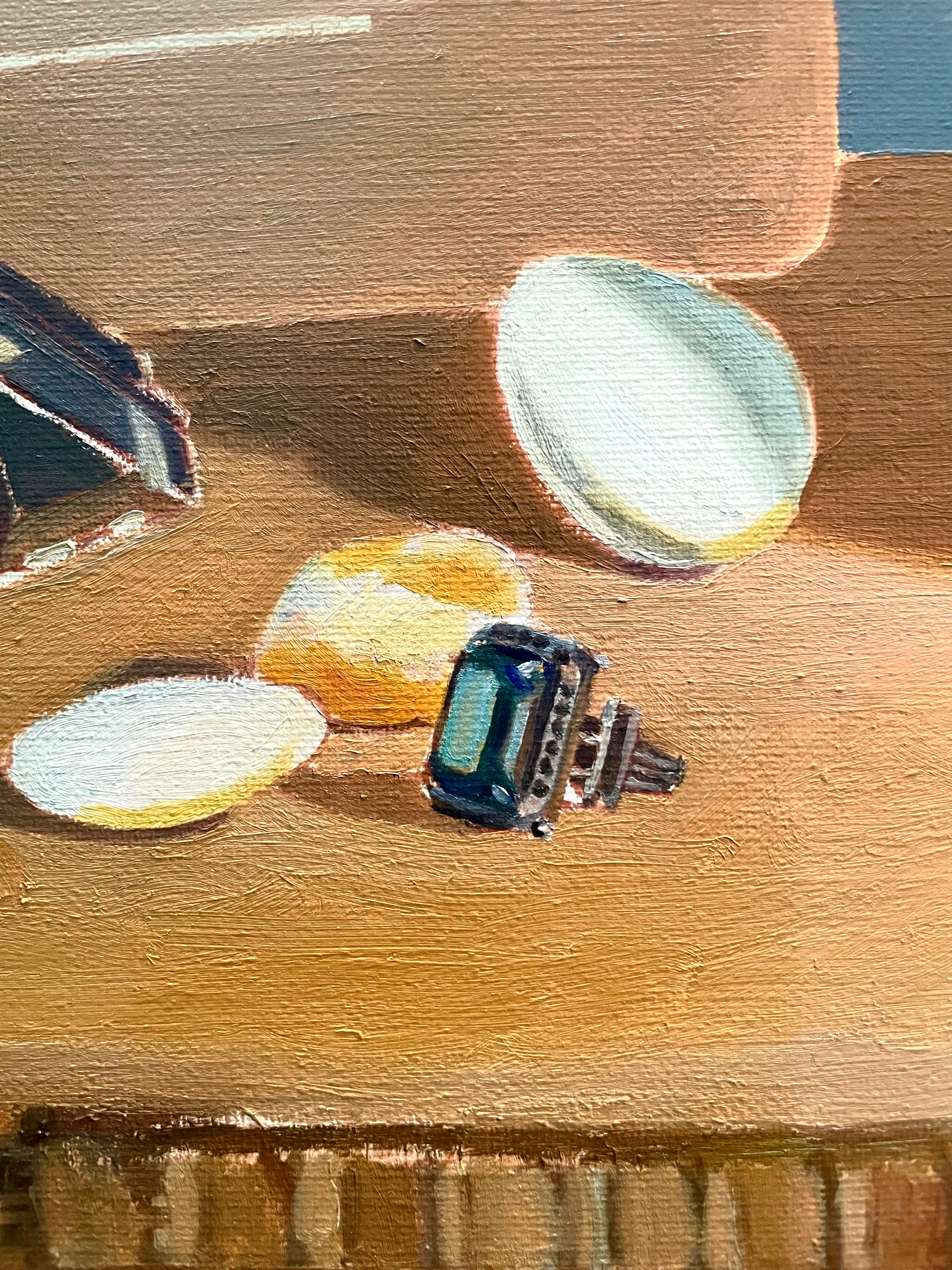
Below, I tackled the ring. This was so hard to see that I went up to the set-up and shot a photo for me to look at, so I could understand the structure. Though I never want to paint more than I can see from my easel, knowing the structure actually makes seeing easier. The brain informs the eye. I look at the photo to understand, and then go back to paint from looking at the set-up. I’m not sure yet how I’m going to get the bright green highlight on the ring to glow. Pigments are limited when you compare them to what the eye can see in reality. No paint is as bright as real light! I’ll have to resort to tricks to make that area seem to glow. More on that later in the painting process.
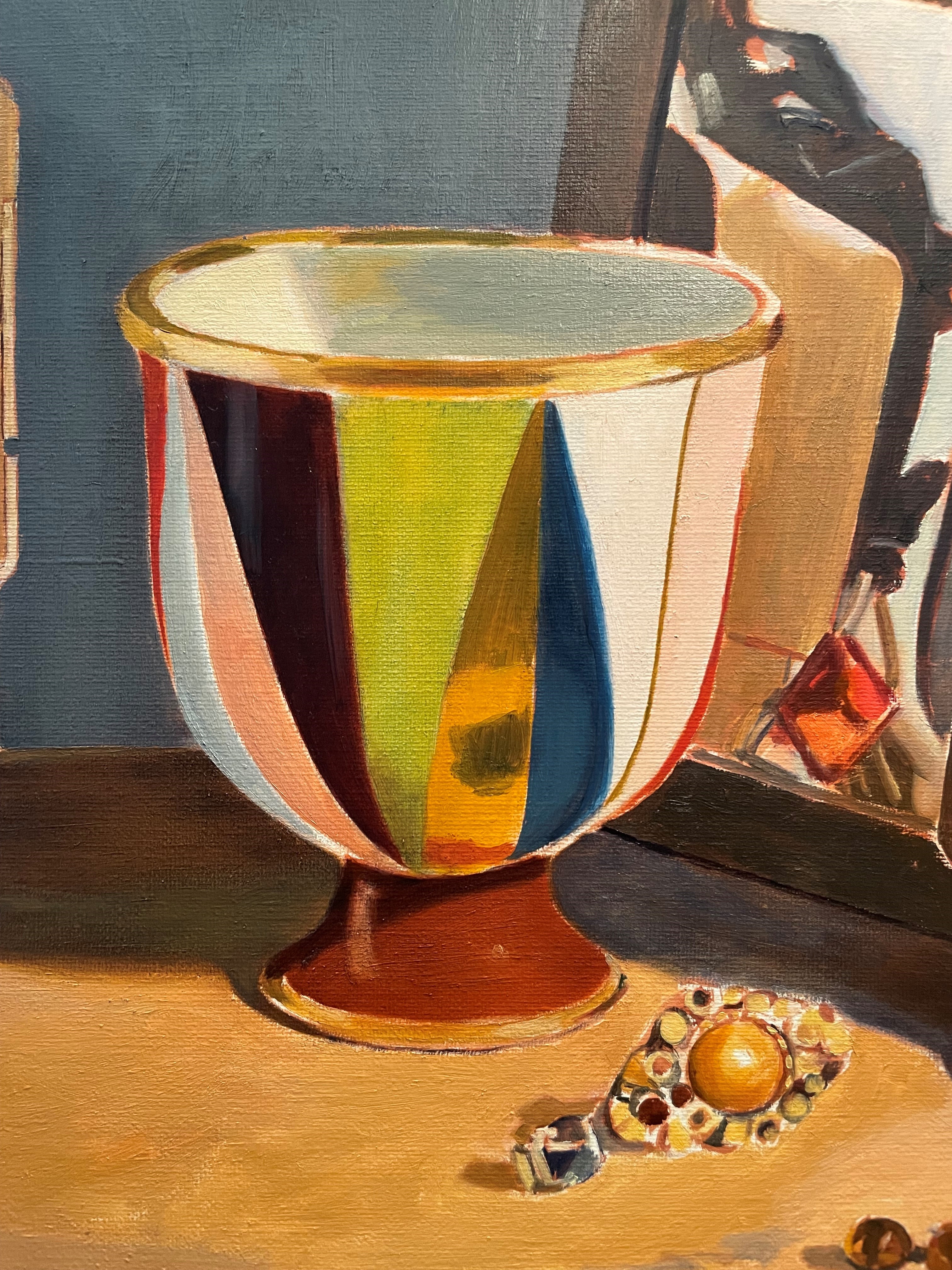
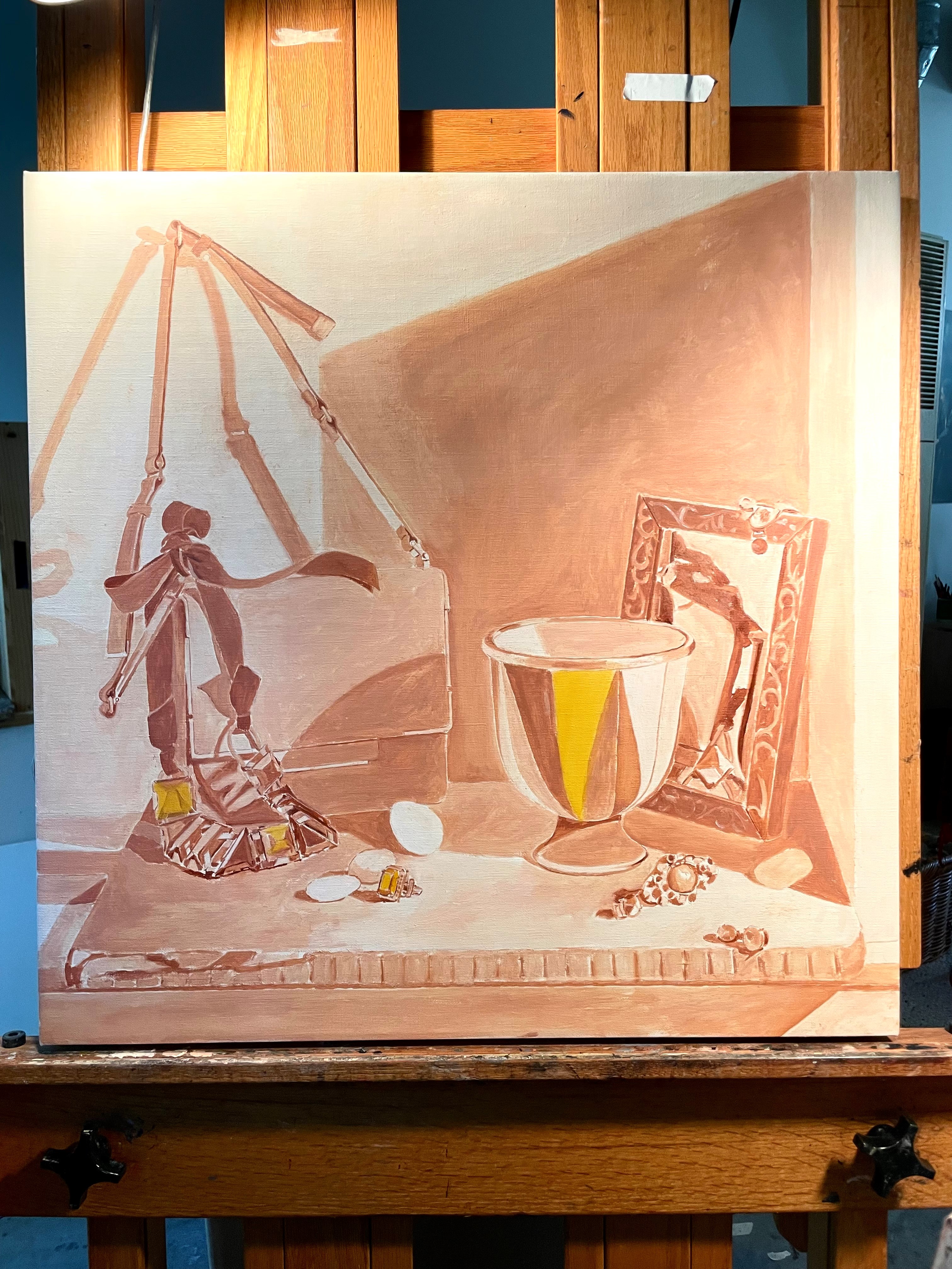
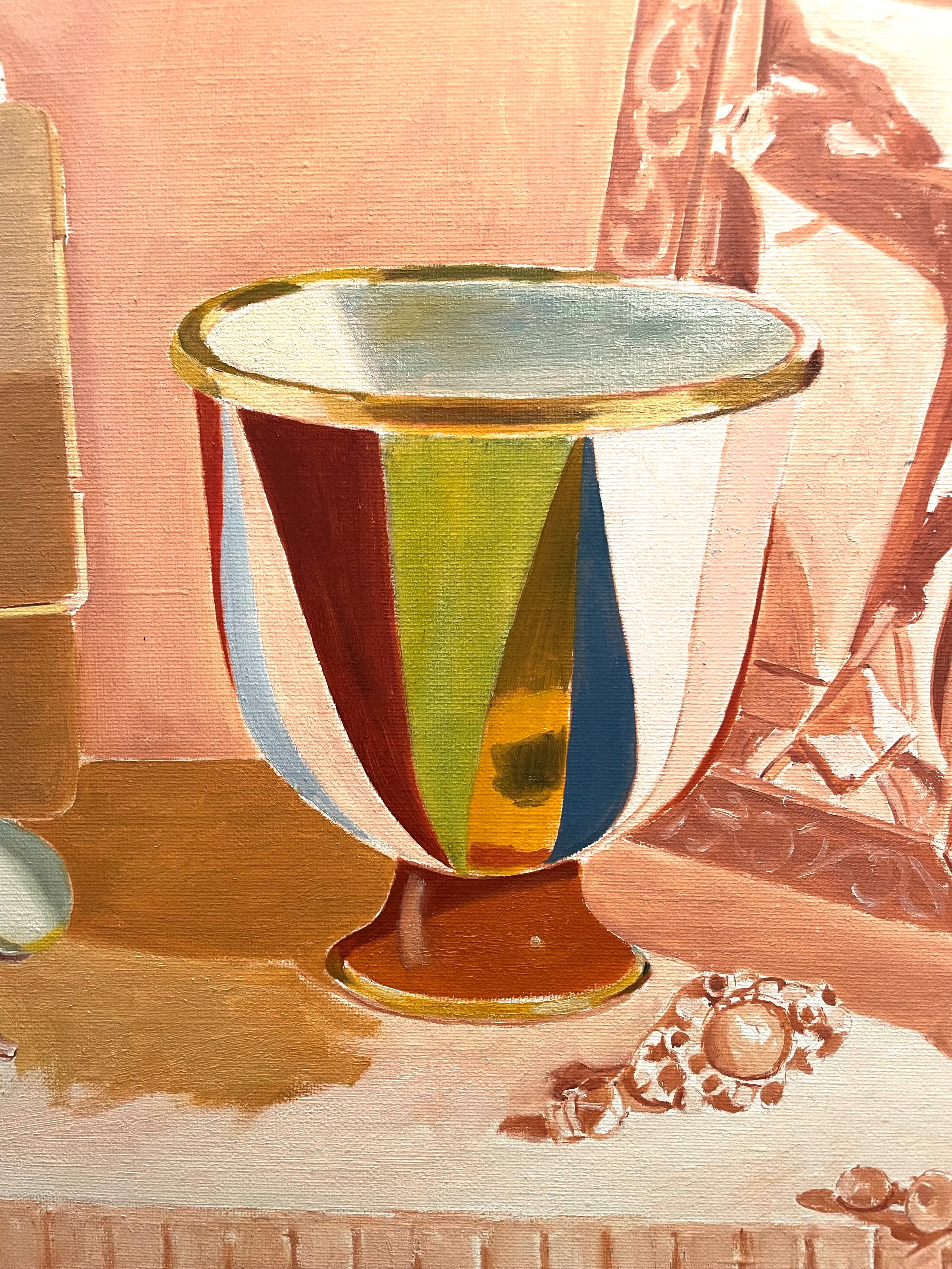
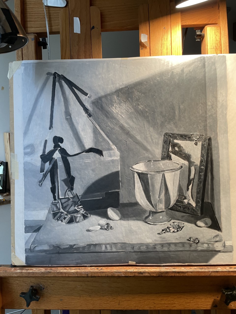
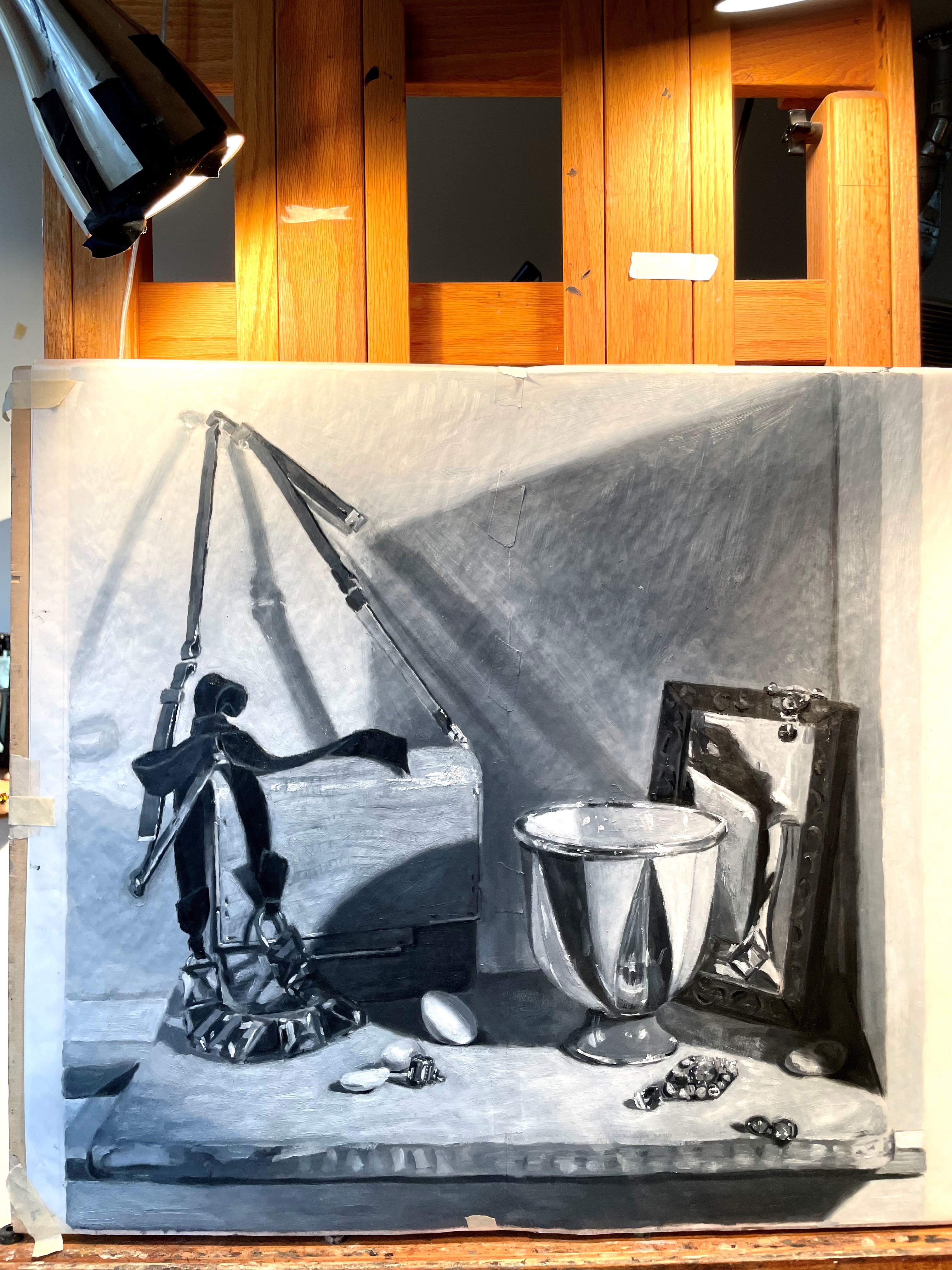
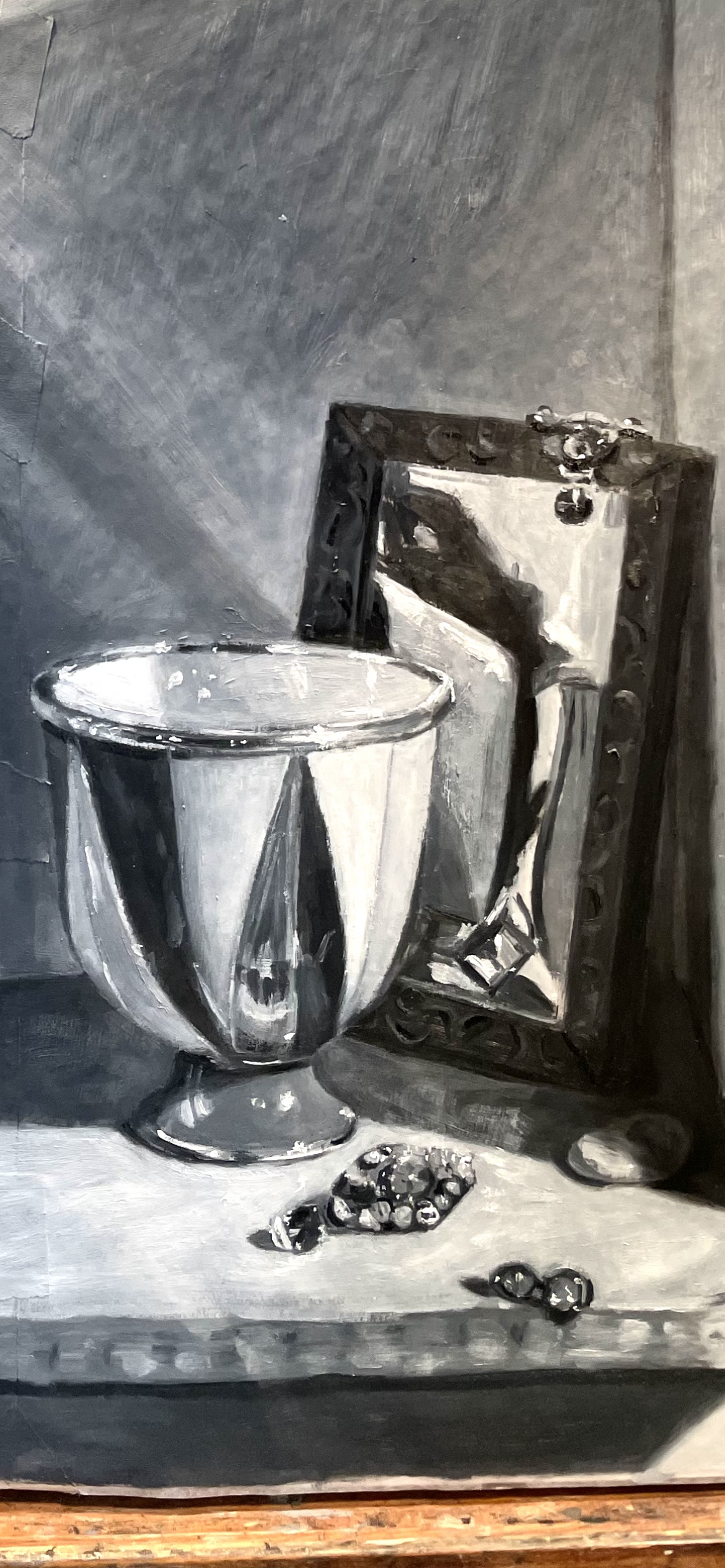
Below, I’ve worked on the vase. I corrected some shapes, glazed the purpley/brown area darker, and corrected the value on on the left side. I glazed in the shadow cast on the foot from the body of the vase.
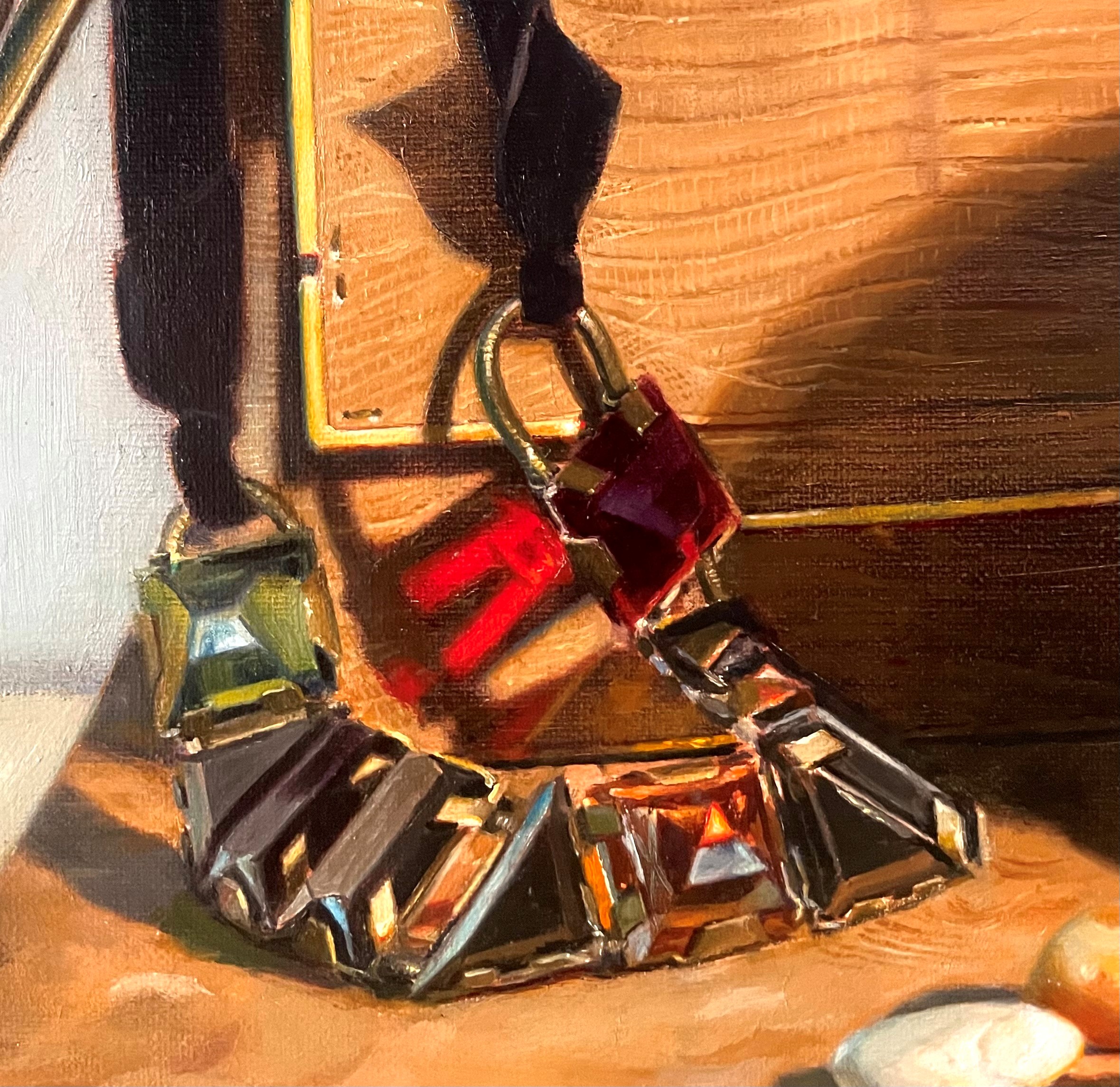
Finally, I worked a bit on the necklace, as the first layer was dry. I re-painted much of the green crystal. It was tricky, as the reflections changed with even the slightest movement of my head. I just need to pick a look I like and stick with it. Next, I painted the red crystal. This was very hard to parse. When I looked at it later that evening, after some time had passed, I noticed that I had painted the red crystal too small! It’s also not at quite a steep enough angle. It’s amazing that a mistake should make it this far into the process, but it seems like it always happens. Luckily, I can correct, even though it’s a pain to re-paint. I’ll make these corrections as soon as this layer is dry.
I spent quite a bit of time figuring out what the color of the wall in shadow was on the far right. Some colors are so tricky to see! It ended up to be a dull green shade. I’m sure I will correct it later. One last change is that the shadow on the wall seemed the wrong shade of blue. It had too much of a greenish pthalo blue cast, and not enough of a redder, ultramarine blue cast. I glazed a thin layer of ultramarine blue over it.
I corrected the color on the handbag, and did a very rough coat on the cutting board. That was enough for a day!
Below you can see my finished underpainting. I decided to underpaint the green part of the vase and the green bits of the jewelry with yellow so that I can glaze over these areas with a transparent green. This will produce a more intense green than I could have by just using a solid green mixture and painting it directly.
Below you can see the level of detail in the underpainting. It needs to be accurate to serve as a guide for painting but doesn’t need to be detailed.
Below, I’ve begun to lay in the local colors of the vase. I glazed a thin layer of green over the yellow area. I’m still not trying for much detail. Until I get the whole canvas covered with paint in approximately the correct colors and values, I can’t proceed to the finer points.
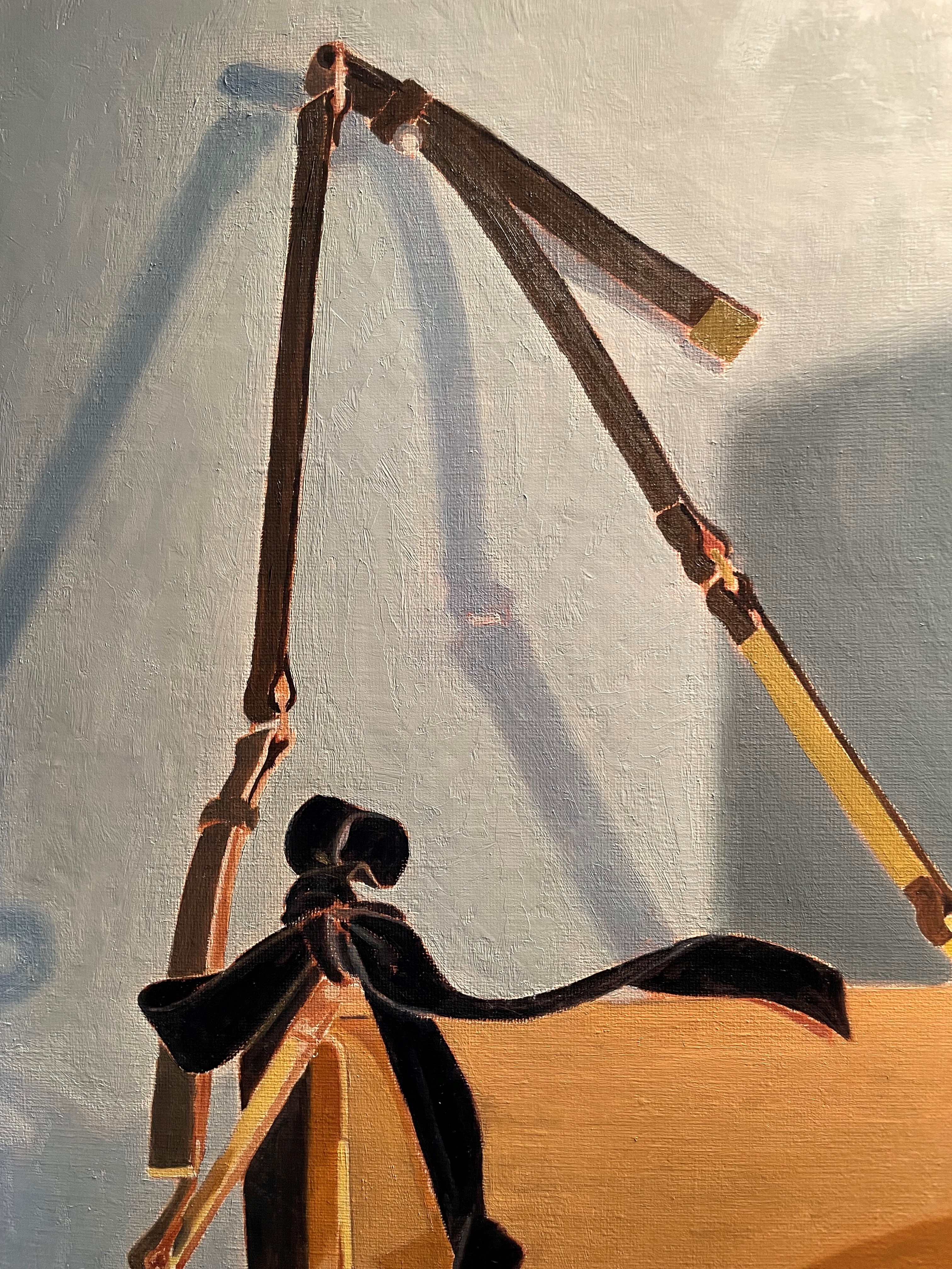
Below, I’ve painted the ribbon very simply, with just two tones of black and light gray. I have also begun working on the handbag strap. I’m painting the strap in a darker value than it will be, because I plan on scumbling a light gray over it. This will lighten the value and produce a cool, pearly light, which is exactly what I want to show the cool daylight coming in from the window on the left. Scumbling a thin layer of light paint over a darker tone always cools a color and lightens its value. The effect is much more subtle and vibrant than merely mixing the correct color and painting it directly.
Painting the crystals of the necklace was very difficult. There were so many reflections, that it was hard to see what the shapes really were. Again, I found myself re-seeing and correcting. It is a comfort to know that I don’t need to paint it perfectly at this stage. One of the great things about a layered approach is that I can work up gradually to the finished image, with no pressure.
Below, I’ve painted most of the back wall. The shadow side was much bluer than I thought it should be. I kept checking by making a window with the thumb and forefinger of each hand through which to view both the set-up and my canvas simultaneously. This is a great way to compare colors and values because it isolates them from their surroundings and allows you to see them next to each other.
Below, you can compare the color of the shadow in the set-up and in the painting. I might eventually decide to paint this shadow with less blue, but for now, I’m going to paint what I see. I decided not to tackle the diagonal warm shadow cast by the strap from the window on the left until this layer of paint is dry. Getting the smooth transition was hard enough without having to deal with this shadow. Always try to make it easier!
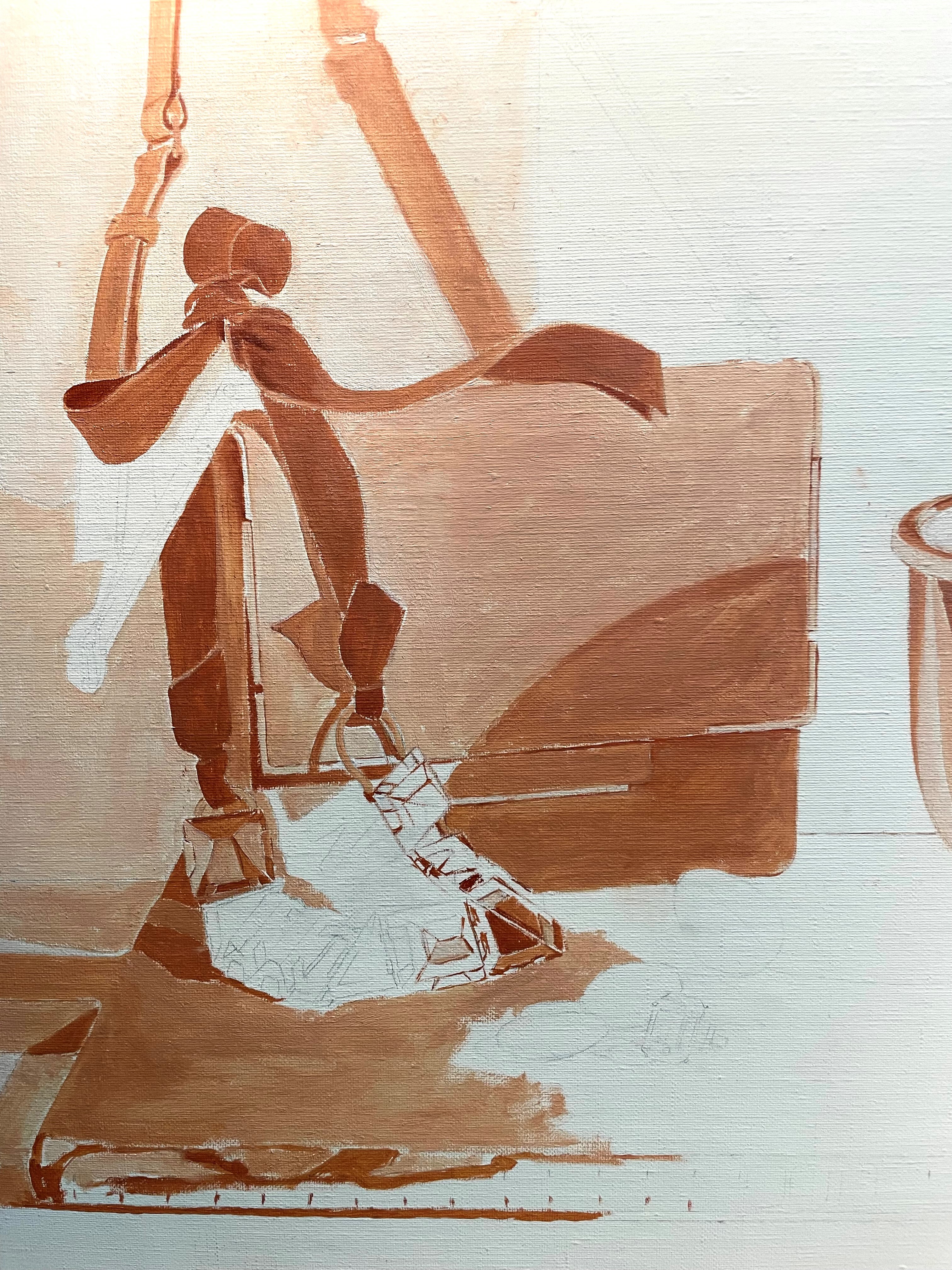
I transferred my drawing to the canvas, using a tracing I made. See Transferring the Drawing to the Canvas for details. After that was done, I went over the lines with pencil on the canvas again, while observing the set-up, making corrections, as always. It still amazes me that I have to correct the drawing at every stage of the drawing and painting process, but I’ve found that it is so! After spraying a very light bit of fixative onto the canvas, I mixed 9 values of a lead white and burn sienna mixture. The lightest was white, the darkest, a mid-tone pure burnt sienna. I won’t need anything darker, because I like to keep the underpainting lighter than the finished image. I find that the colors in the finished painting look more vibrant on a lighter ground.
My aim is to cover the canvas with a very thin layer of paint, keeping the edges sharp, so that I don’t lose my drawing. Even edges that will be soft later are kept sharp here. This underpainting will serve as my guide when I begin painting. I don’t worry about details, such as indicating textures or subtleties, since this under-layer will be almost entirely covered with subsequent layers of paint. Also, I’m hardly ready to think about details at this early stage!
I add no medium to my paint, except occasionally when it is too thick to paint a clear edge. If that happens, I dilute the paint with just a bit of turpenoid. I paint everything several values lighter than it will be in the finished painting.
It will take me a few more days to complete the underpainting, and then maybe a week for it to dry completely, so that I can begin to really paint!
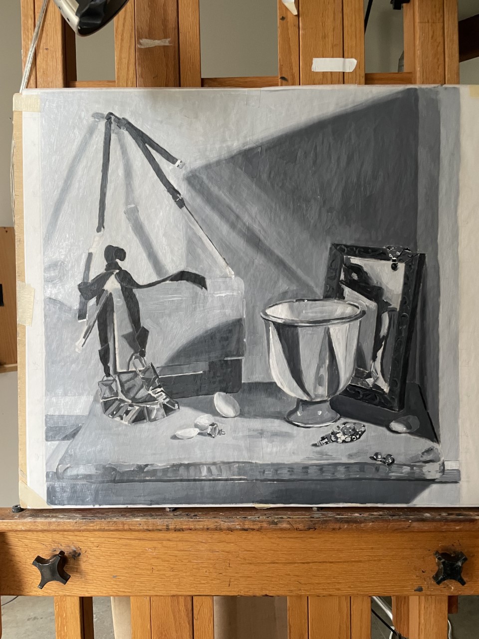
My value study is dry enough to make corrections. Below you can see how I left it. I can see now that I need to make many of the lights lighter and the darks darker. Also, I notice that there is too much space between the bag and the vase.
Below, I have made many value adjustments. The wall on the left and the tabletop needed to be lighter. The mirror frame and the ribbon needed to be darker. Overall, I made the composition have more contrast between dark and light. I then added highlights and a few more details. I moved the vase closer to the handbag and made the ribbon thicker.
Below you can see the level of finish. It’s very rough as compared to a painting, but it serves to help me see the composition and make these adjustments.
It’s interesting to see how adding the highlights adds to the sense of reality and sparkle.
My next step is to transfer all of these changes to the drawing underneath. When that is complete, I’ll transfer the drawing to my canvas.
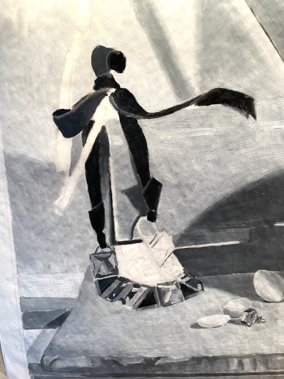
Before I get too far on my drawing, I like to pause and do a black-and-white study. After mixing 9 values of paint, I tape tracing paper over the drawing, so that I can use the drawing as a guide. My goal is to do a very loose study, to better judge the composition without the distraction of color.
At first, it’s very hard to judge the correct values. Once more paint is down, and I can make comparisons, it’ll become simpler. For now, I take my best guess. When I’m not sure of a value, I find it helpful to isolate the bit that I’m looking at by making a little window with my curled thumb and forefinger. I view the set-up through this window. I then make a similar window with my other hand, through which to view the same place on the painting. I can look at these two windows at the same time, to compare the value of the bit I’m trying to paint. Seeing the two at the same time, isolated from their surroundings, makes seeing so much easier.
I don’t worry about detail. I just need the big shapes to see the composition. It’s amazing how dark black velvet is!
In the painting of the earring, above, you can see how loose the painting is.
After getting most of the paper covered, above, I took a break. When the paint is wet, it’s hard to get crisp touches without everything blending together. After the paint is dry, in a week or so, I can start correcting the values.
I took the photo above, after I re-worked some of the areas a week later. The photo is a bit over-exposed, but you can see that some areas have been adjusted and many shadow areas darkened.
One challenge is that this set-up is near a south window, because I wanted to let in some cool daylight to contrast with my warm spotlight. It looks very different on a rainy day and on a sunny one! Once I get painting, I’ll decide which look I prefer, and do subtle value and color observation on just one kind of day.
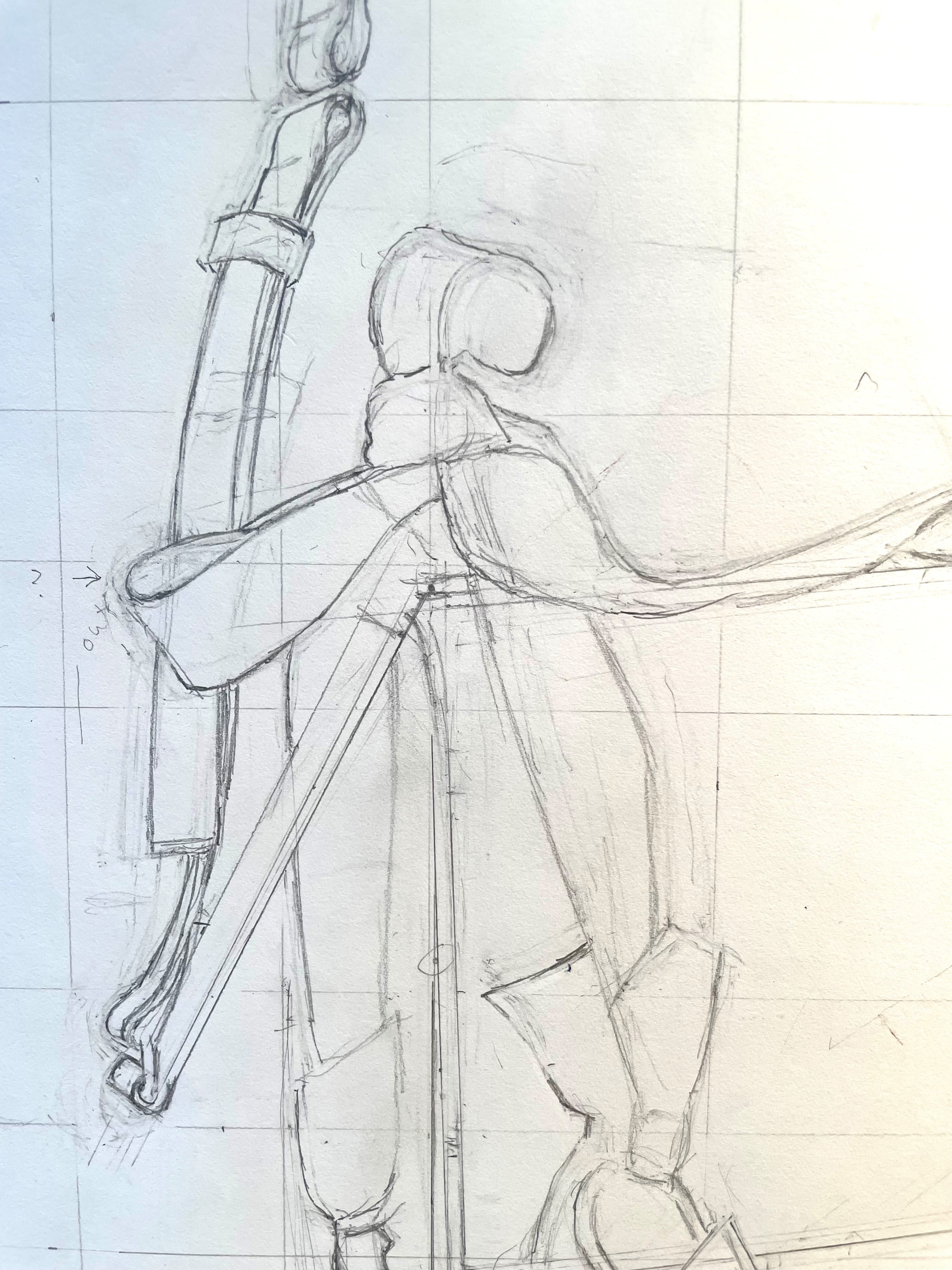
Here’s my new set-up! I’m happy with it, so it’s time to start the drawing. My first step is to decide how big the painting will be. Since I like to paint objects their full size, I usually measure the front of the set-up to get an idea of the width of the painting. This usually takes a bit of juggling until I arrive at the right size. Once that is decided, I draw a rectangle (or in this case, a 24″ square) of the correct proportions on my drawing paper, add 1/4″ on each side for the overlap of the frame on the finished painting, and then mark off a grid dividing it into halves, thirds, etc. These markings are also on my cardboard view-finder, which has corresponding tick marks. I mark the boundaries of the composition on the wall and set-up with tape, as a guide to frame the set-up with my view-finder.
Below you can see me holding up my view-finder with a skinny knitting needle held against it, using the tape marks as a guide. I then position the knitting needle at a convenient tick-mark and see what objects in the set-up line up with it. I then mark these positions on my drawing paper.
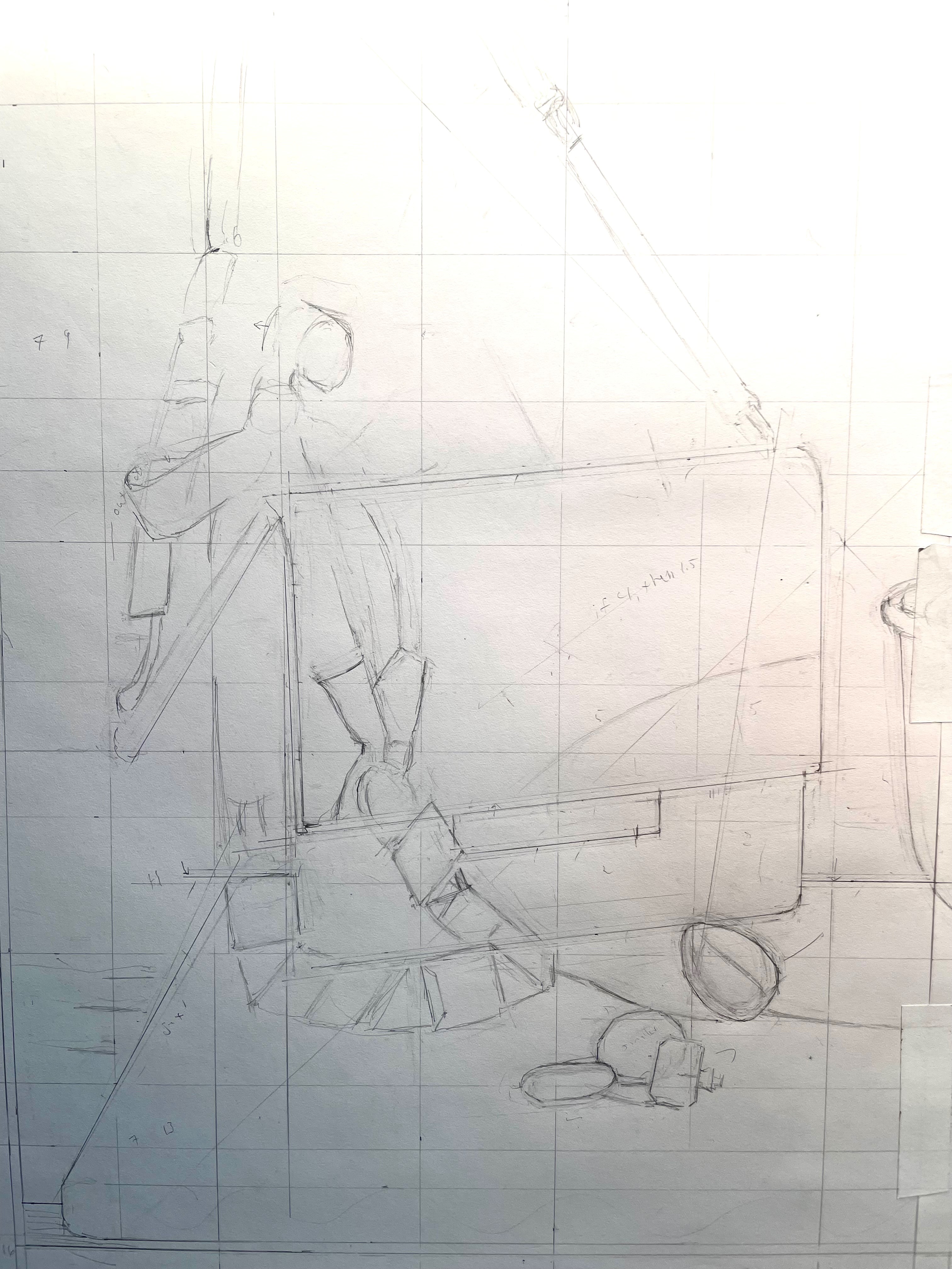
After I have located some major spots, I can begin drawing, constantly checking and measuring with the view-finder. I naturally draw sight-sized, so using the viewfinder and grid keeps me drawing at the correct size.
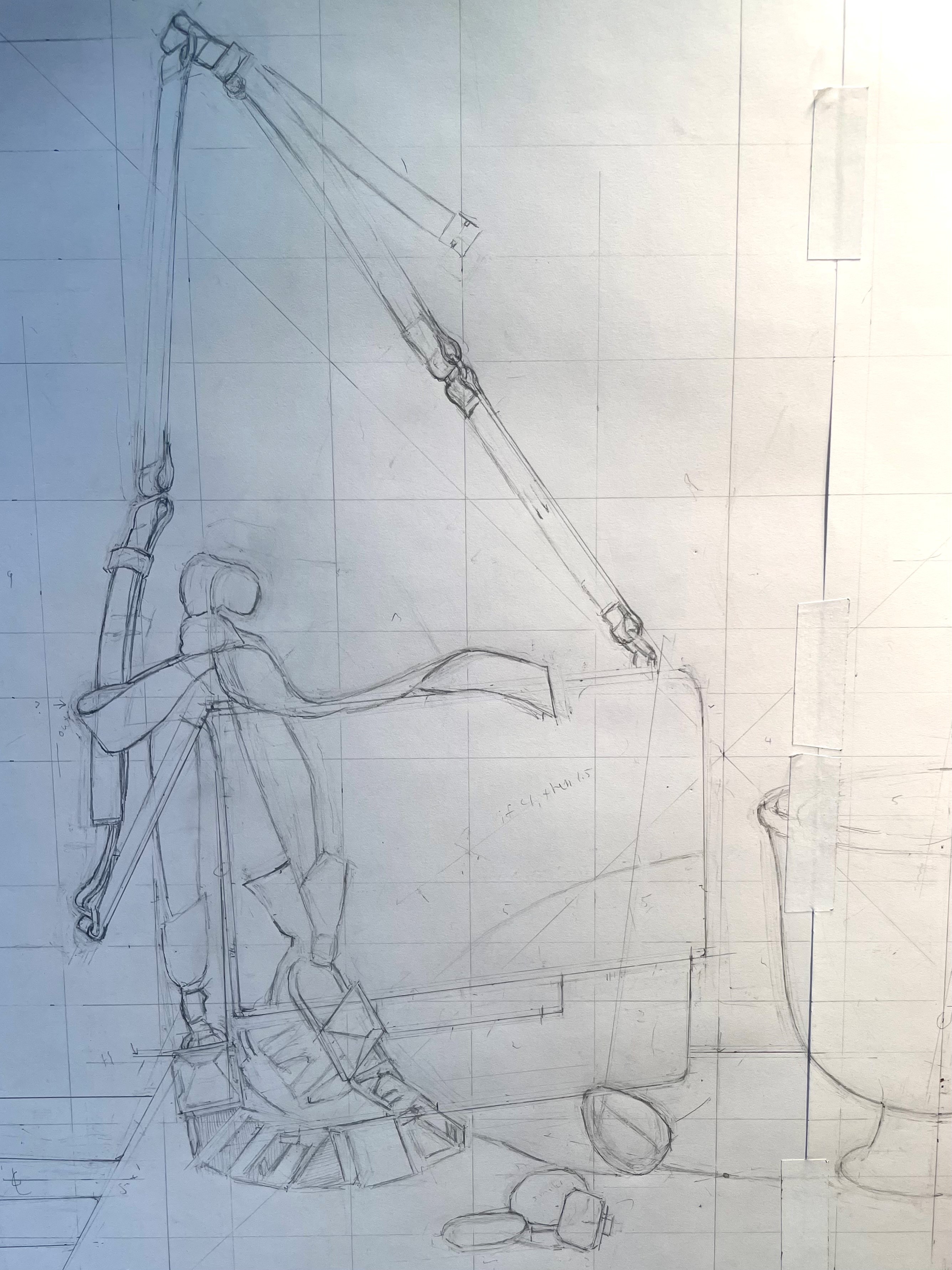
Above, I have drawn the basic shapes of the handbag, necklace, and stones. I erase and correct constantly, especially because my hand shakes a bit when I hold up the view-finder, and the knitting needle can look a bit blurry so close-up to my eyes. All of this leads to much human error. My solution is to measure repeatedly and use the measurement that I come up with most often. Most importantly, I keep comparing the drawn image with the set-up. What I have drawn by measuring and what exists in reality don’t always agree! Tempting though it is to always believe the measurement, the eye is always right. Sometimes I spend 30 minutes measuring and drawing something, only to look at it with my unaided eye and see that it’s totally wrong!
Here’s the right side of the drawing. The vase was very hard to get right. Complex curves are tricky, especially getting both sides of a symmetrical shape to match. A great trick that I use to get symmetry is to trace one side of an object after I get it pretty close, and then flip over the tracing paper, and use it as transfer paper to trace the other side like a mirror image. It always works.
Above you can see evidence of my many corrections. It’s important not to be reluctant to erase and begin again if something isn’t right. Even though it’s a pain to begin again and loose time, I know from experience that I’ll never be happy if I know the drawing is not correct. Often, I will return to my drawing after being away for a day, and mistakes are glaring. When you’re working very hard on something it’s easy to get tunnel vision and convince yourself that something is right when it’s not. Take advantage of those first few moments of re-seeing your drawing to notice errors.
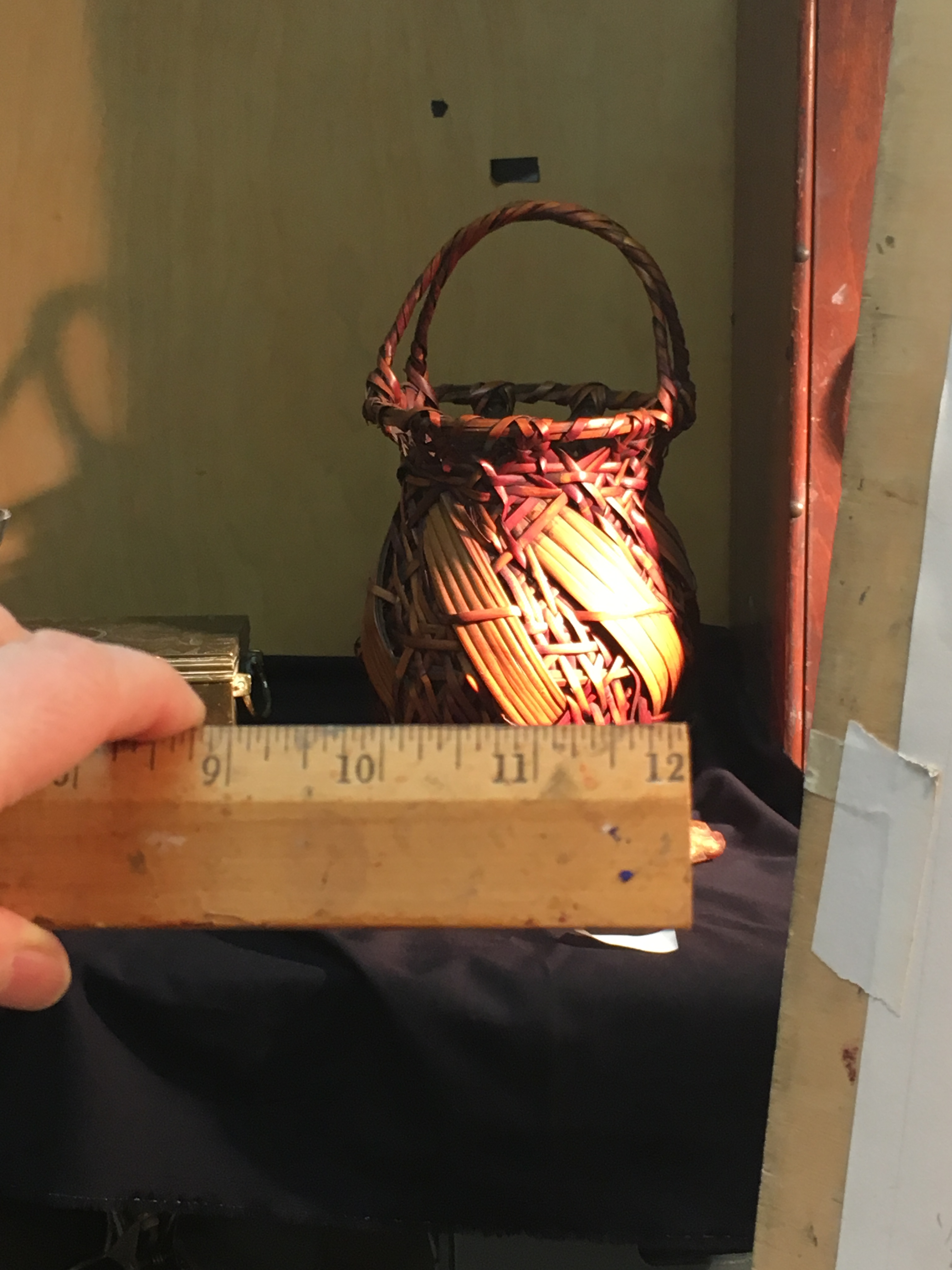
I use a few other measuring tricks. I’ll demonstrate with an older painting of mine. One of the most useful is holding up a ruler to the set-up and comparing relative sizes of different objects. In the painting above, I measure 2″ for the width of the basket. If I hold the ruler at the same distance from me, I could shift it a bit to the left and measure some other object, say, the box, and compare the two. It might be that the box measures 3″. I could then check if the proportions are correct in my drawing.
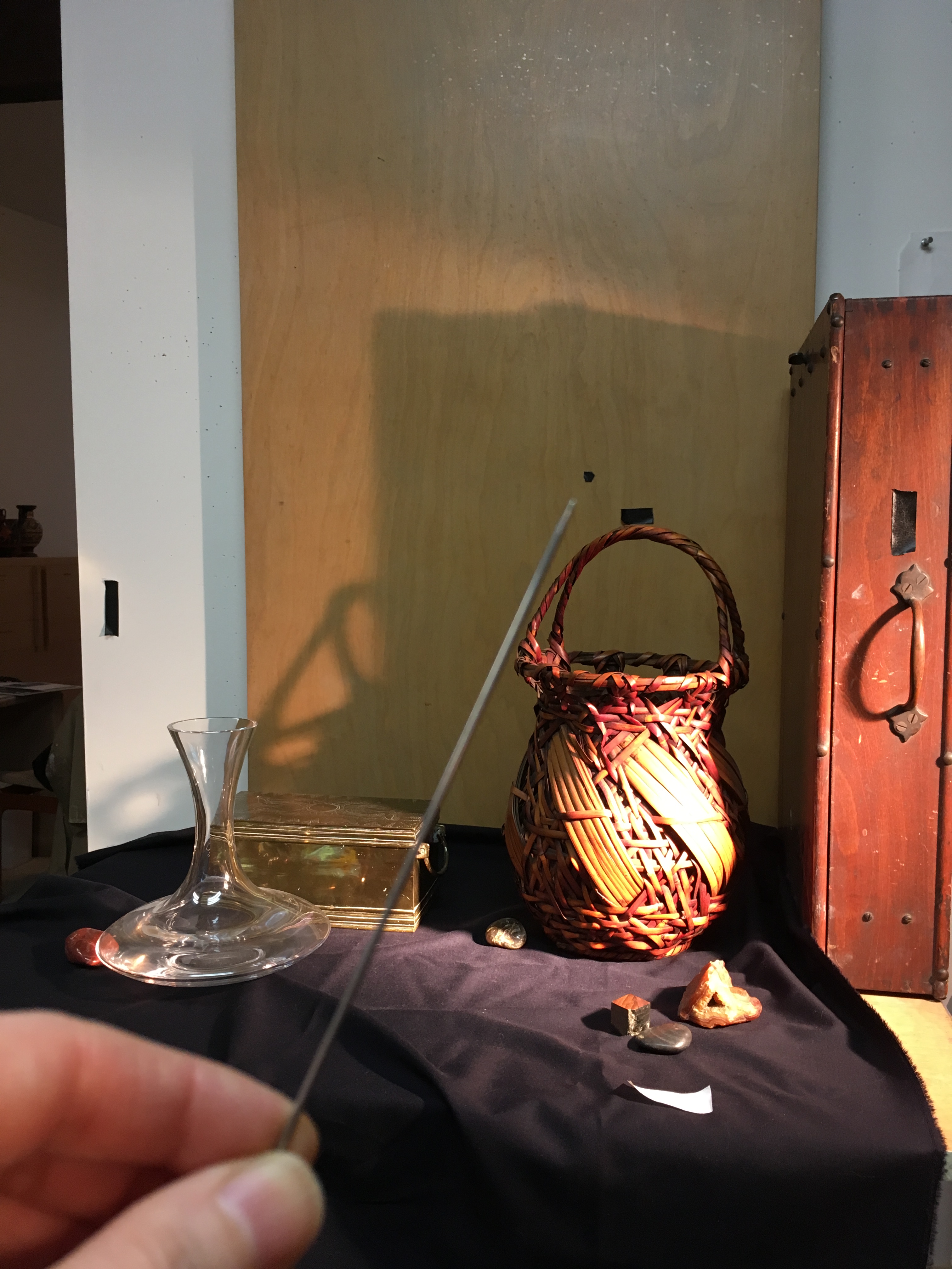
Above you can see me using another measuring method, crossing two knitting needles to mark the height and width of the basket with my thumbs. Holding the needles in this position, I can then move them as a unit over to my drawing, adjusting the distance from my eyes so that it lines up with the drawing, and then check if my drawing is in these same proportions.
Finally, you can use a knitting needle to align with an angle in the set-up, either between two points in the set-up or along an edge, and then swivel to look at the drawing, comparing the angle to your drawing, keeping your arm steady. This one is a little trickier to do. I find that if I sit in my swiveling stool, it’s easy to shift positions without changing the angle.
I still have a lot to do. I’ll check on it on Monday, and I’m sure that I’ll see that I need to make lots of corrections!
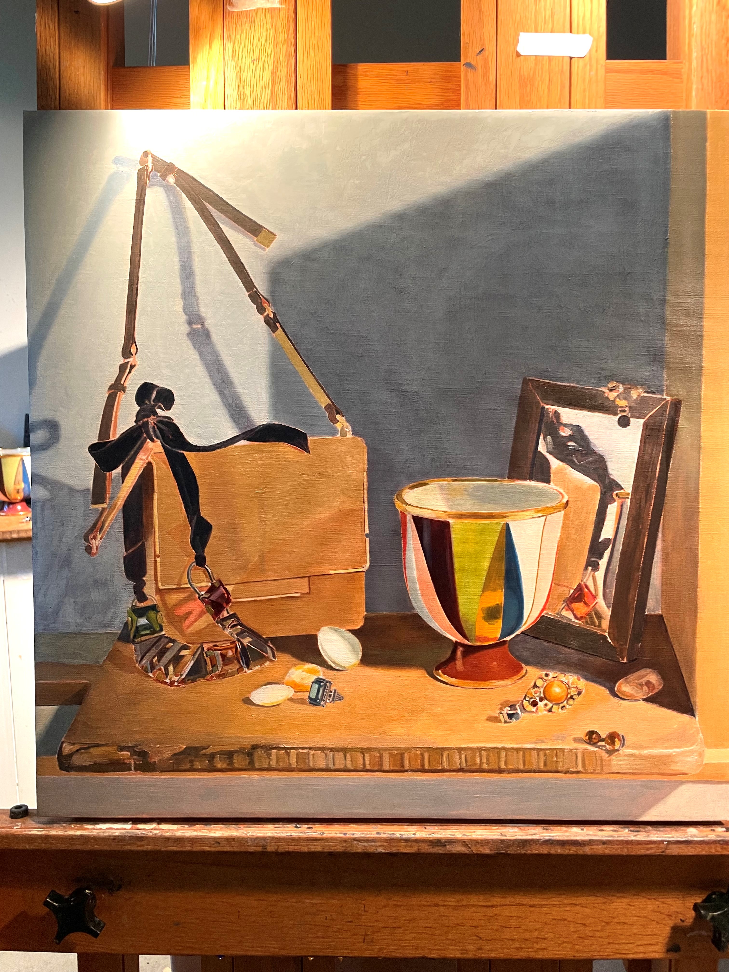
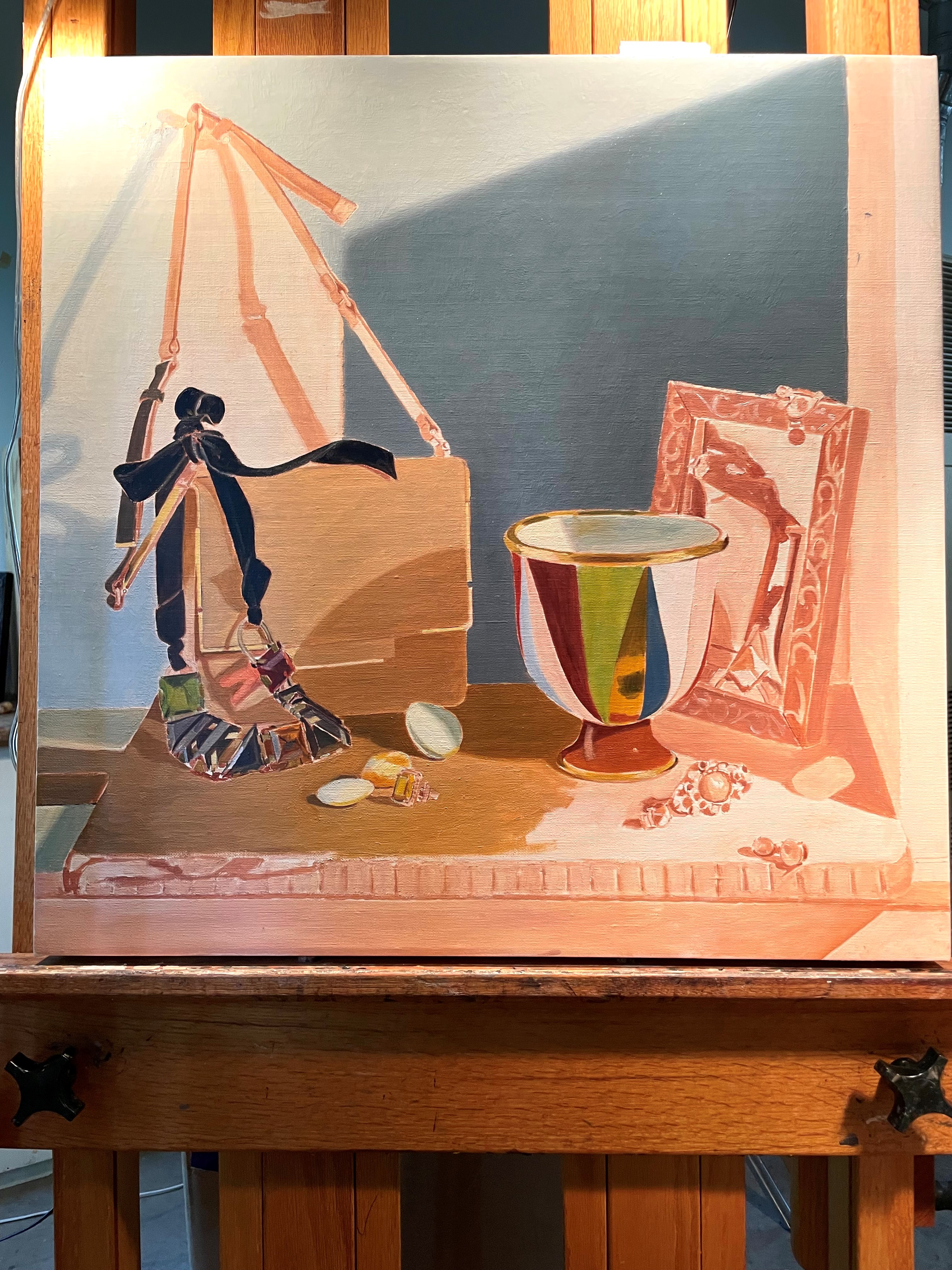
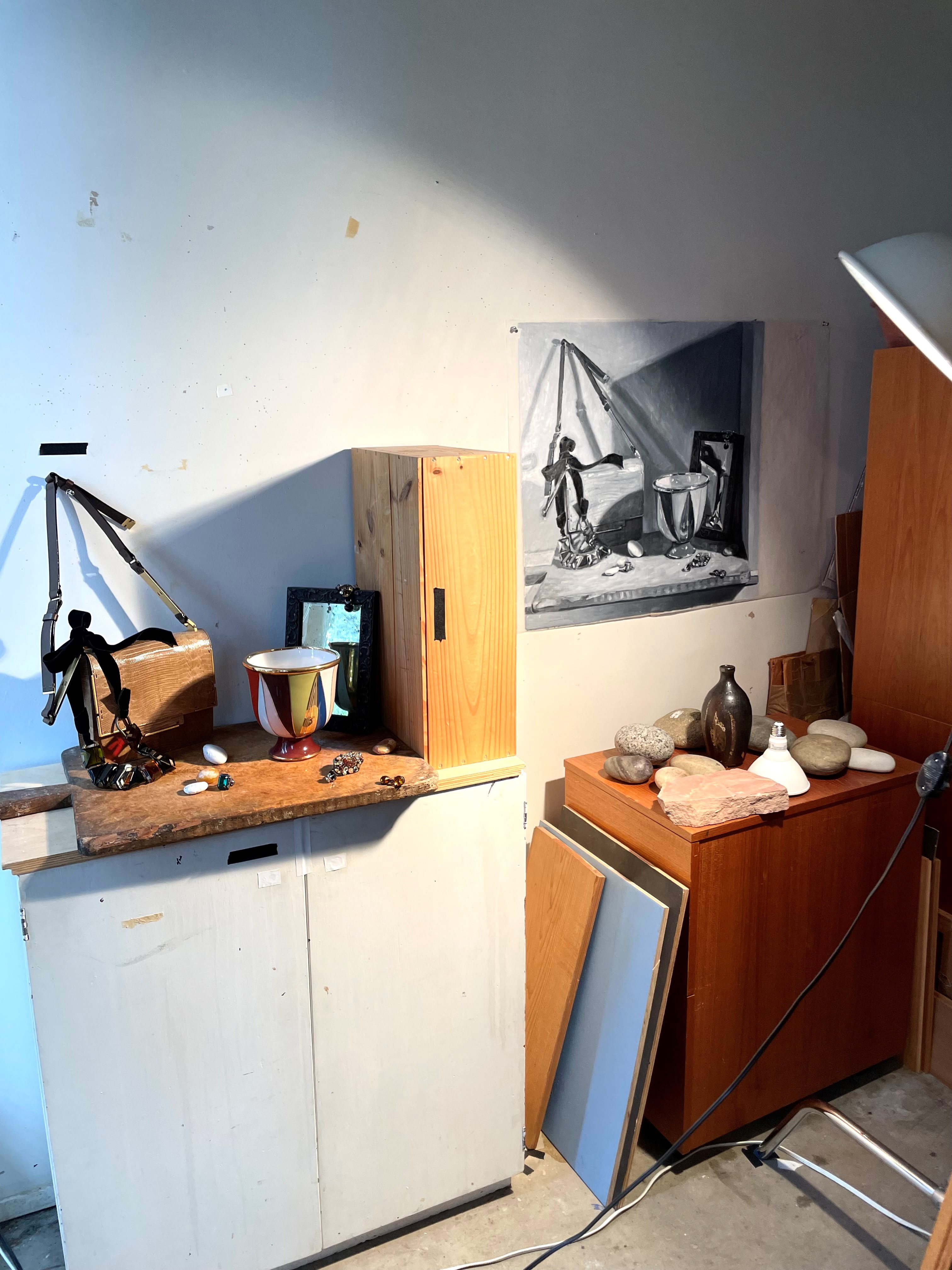
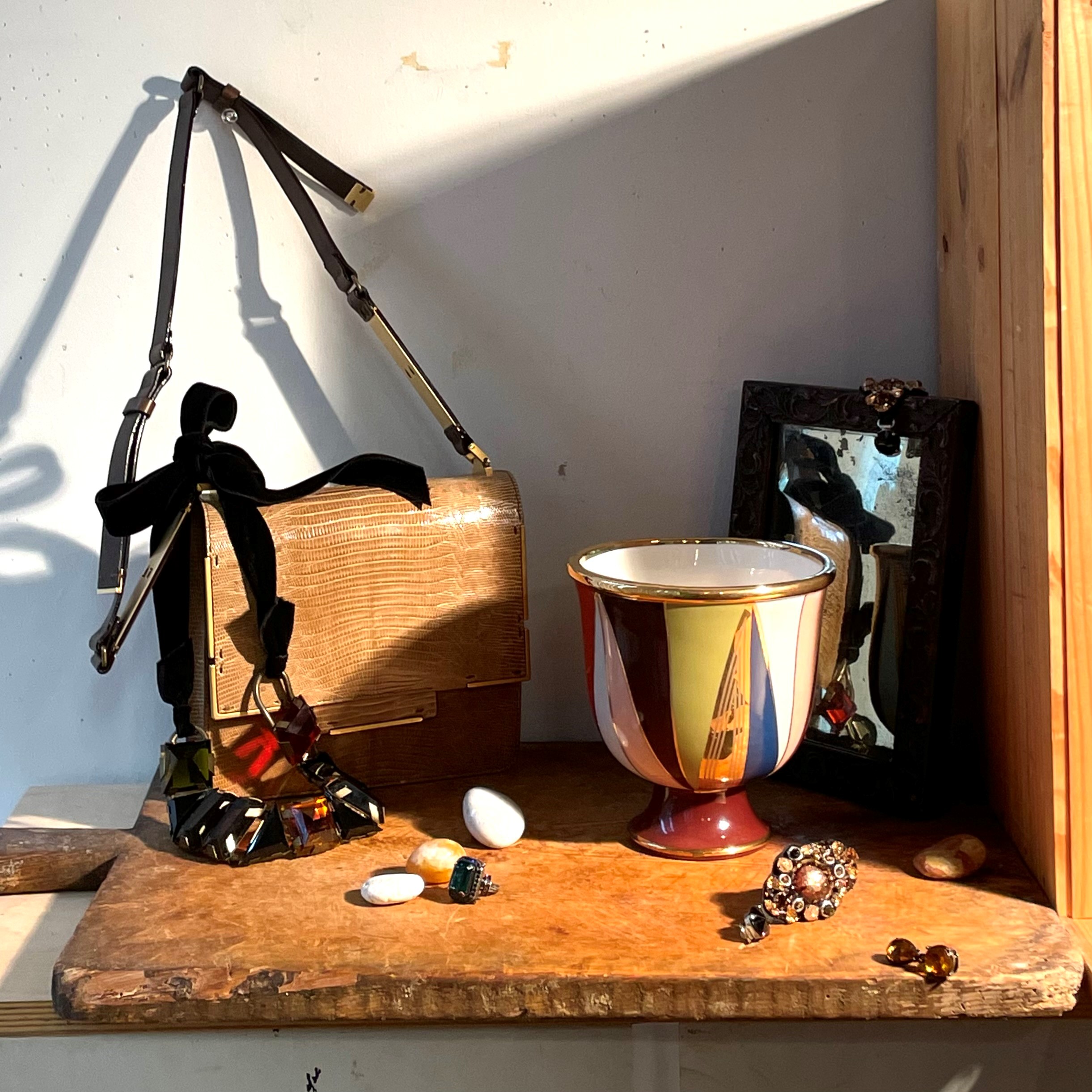
People often ask me how I choose items to use in my still lifes. The general rule is that I have to love the things I paint. I often spend over 7 months studying them, so it’s great if they’re interesting to look at. I have been enjoying painting pieces of my costume jewelry collection in my last few still lifes, so I decided to feature a favorite Lanvin neckace in my new one. I thought that its bold colors and graphic shapes would make it a good focal point. I’ve often wanted to include a handbag in a composition but could never figure out a way that didn’t look forced and precious. I think that this Lanvin bag has such an interesting form that it might work, and it’s a good contrast to the necklace. I bought the mirror at the antique store last year and have been wanting to experiment with painting reflections in it.
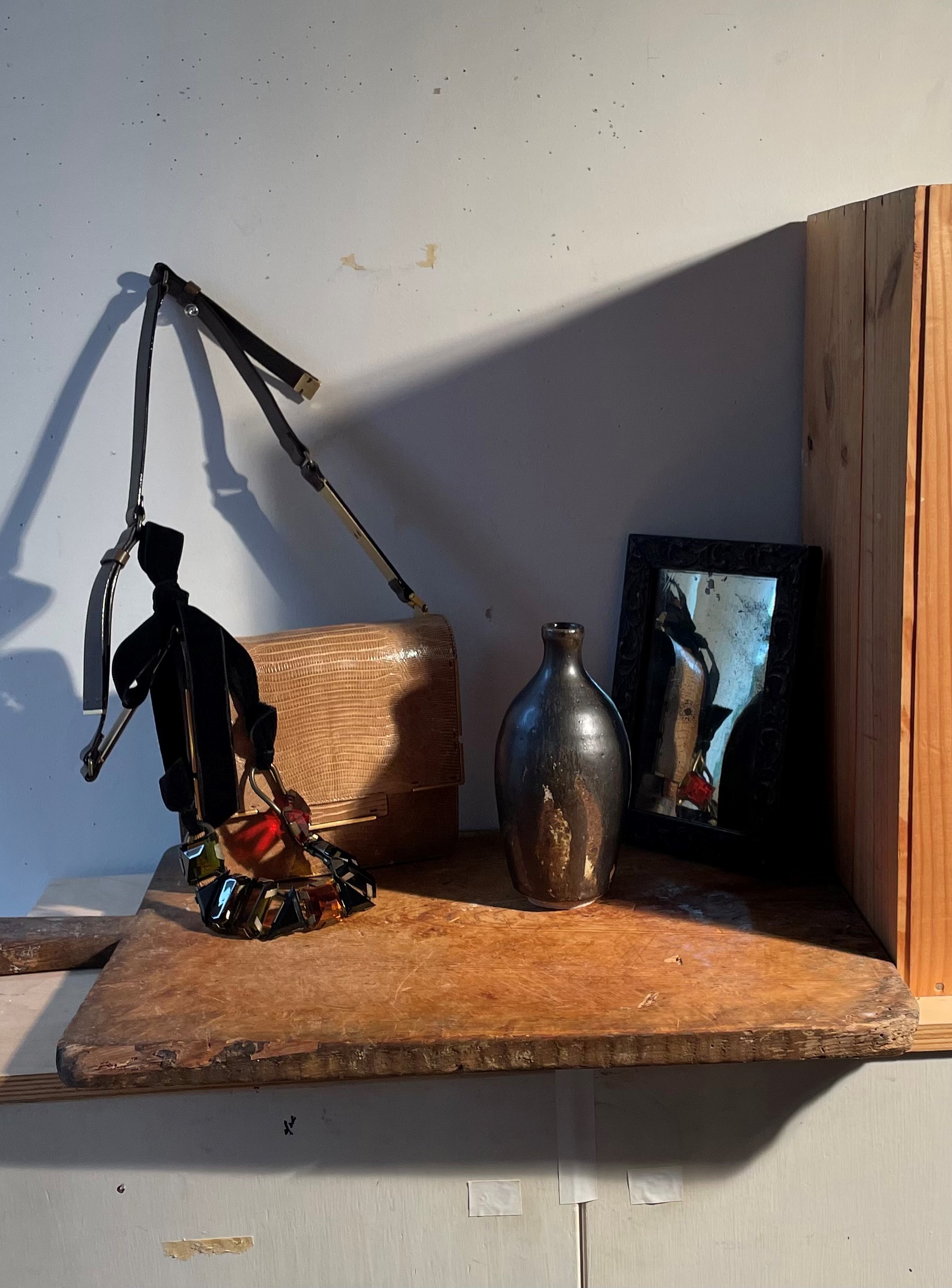
The next step is to put the objects on my table and shine a light on them. My spotlight is on the right. To add dramatic shadows, I placed a tall box on the right to cast a shadow across the set-up. Just for fun, I threw a black cloth down on the table. I tacked up the handle of the bag onto the wall because when it was laying down, the shapes were confusing. Below you can see this first step.
I decided that the fabric was too busy, so I removed it. I needed another object, so I added the black vase. I really like seeing the reflection in the mirror of the red stone in the necklace. It’s a subtle way to get unity in the composition by repeating a color and shape. You also get variety because the shape is a bit different in the reflection.
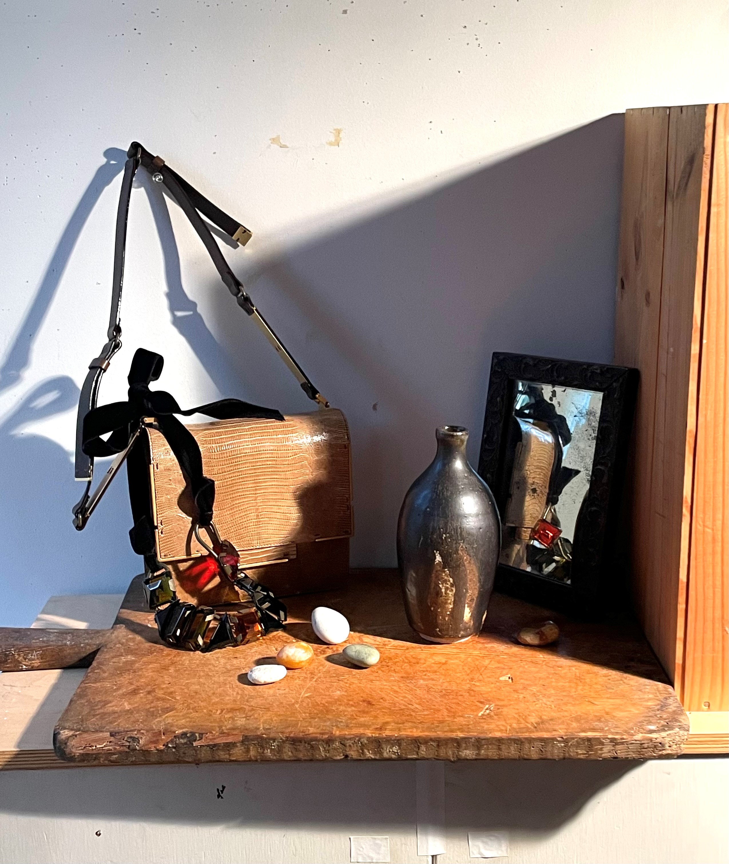
I liked this, but it needed some more detail. Below, I added the stones.
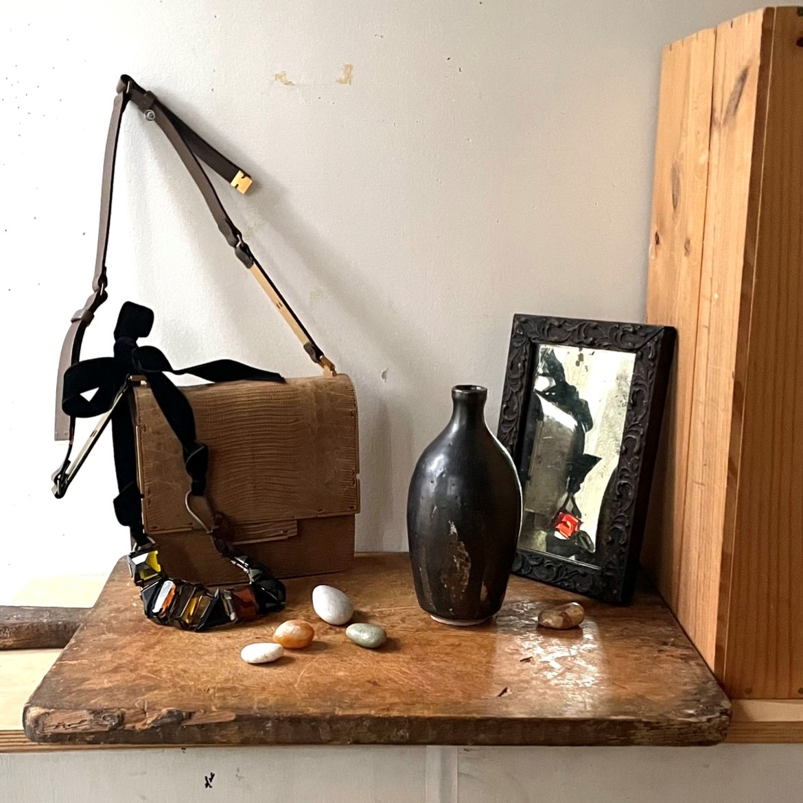
The front on the right looked a little empty. Also, I wanted some more jewelry to echo the necklace. Below I added a ring and a few pairs of earrings. I draped one of the fabric dangling earring over the mirror. The biggest change is that I tried the set-up as a square. I think that I prefer it as a square. I’ve only used a square format once before, in ‘Noguchi Lamp, Jewelry, and Scarf.’ This set-up almost looks as if it could be a companion piece to it.
I wanted some cool daylight in this painting to balance all of the warm yellow tones. I opened the window shades a bit on the left to let in the indirect north light. You can see this in the blue cast to the lights coming in from the left. Doing this made me wonder what the composition would look like entirely in cool natural light. Below you can see.
I actually like this quite a bit, though I miss the drama and contrast that a spotlight brings to a composition.
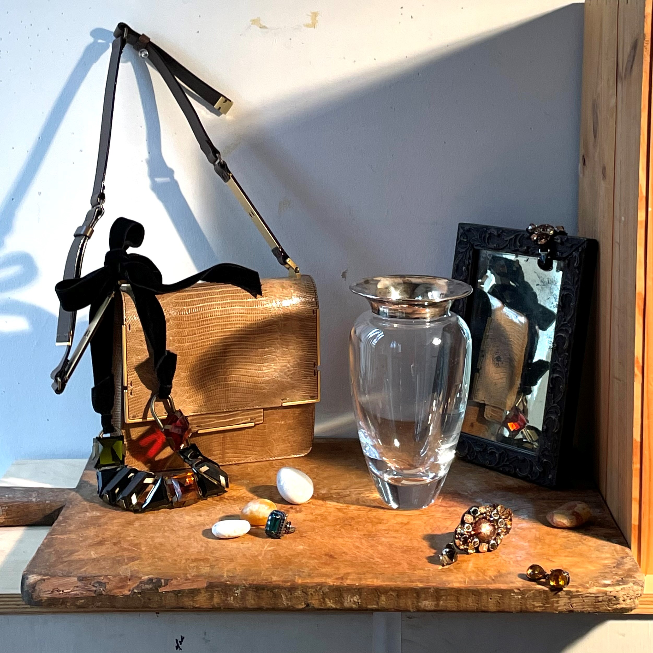
As an experiment, I replace the black vase with this glass vase. It’s not bad.
Next, thinking I wanted some more color and a contemporary feel, I tried this Jonathan Adler vase I just bought instead of the glass vase. I like it! I like how the reds in it tie together the red in the necklace and reflection. It adds excitement to the composition.
As a check, I took a picture and edited it to be in black-and-white. I have found that it’s often better to judge a composition this way without the distraction of color. I think it works. It might be a bit busier than I usually prefer, but I’ll live with it for a while and see how I feel.