Below you can see my finished underpainting. I decided to underpaint the green part of the vase and the green bits of the jewelry with yellow so that I can glaze over these areas with a transparent green. This will produce a more intense green than I could have by just using a solid green mixture and painting it directly.
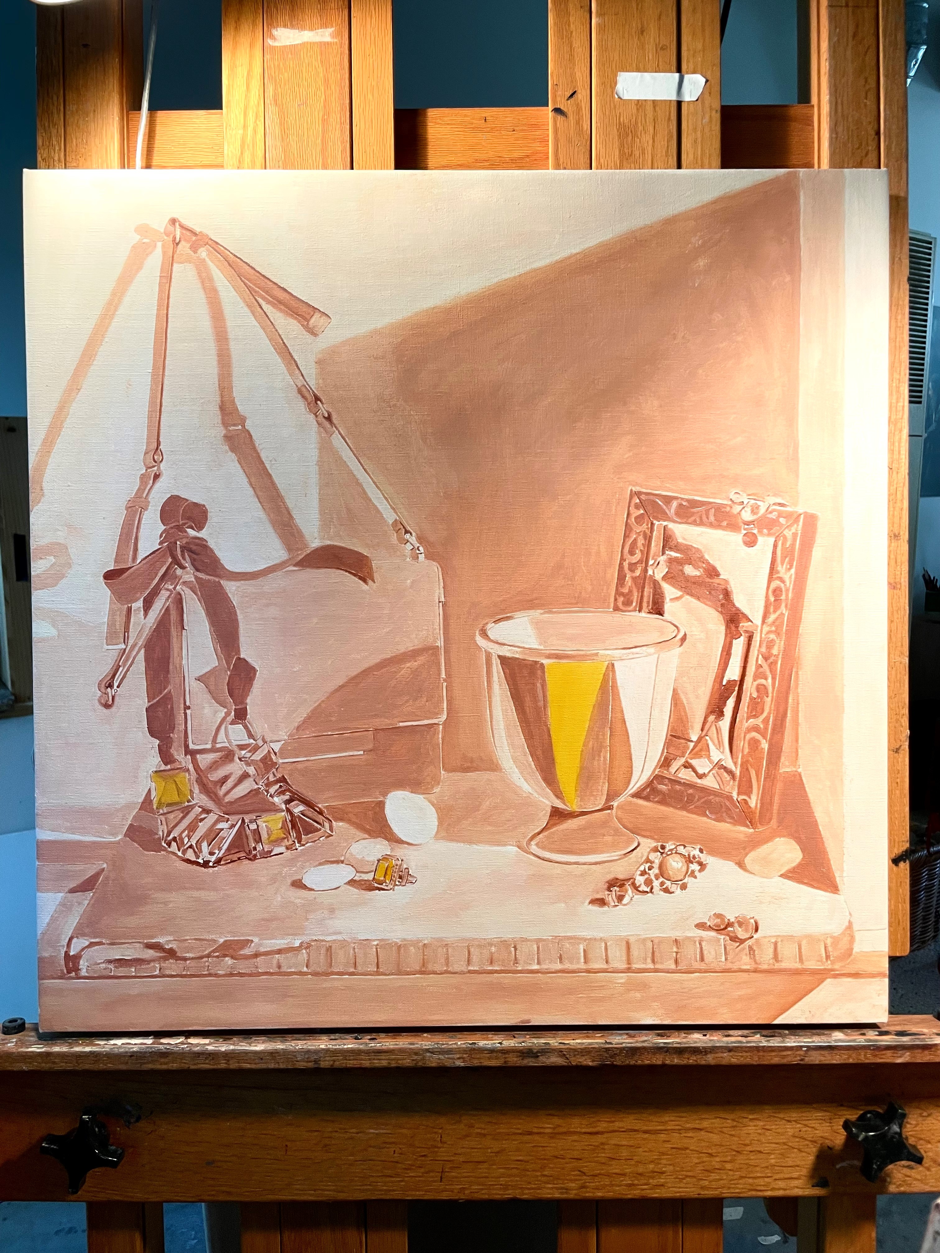
Below you can see the level of detail in the underpainting. It needs to be accurate to serve as a guide for painting but doesn’t need to be detailed.
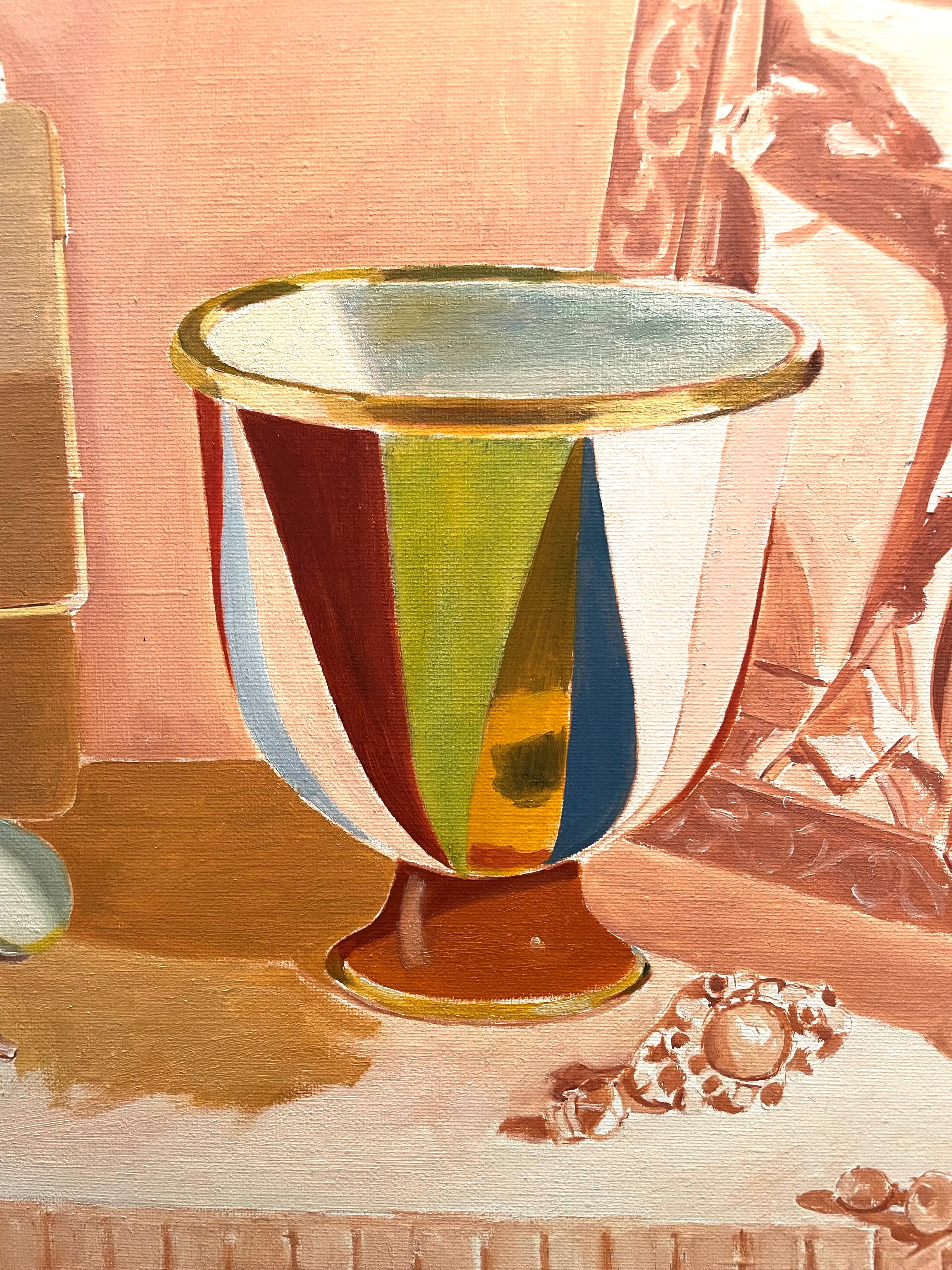
Below, I’ve begun to lay in the local colors of the vase. I glazed a thin layer of green over the yellow area. I’m still not trying for much detail. Until I get the whole canvas covered with paint in approximately the correct colors and values, I can’t proceed to the finer points.
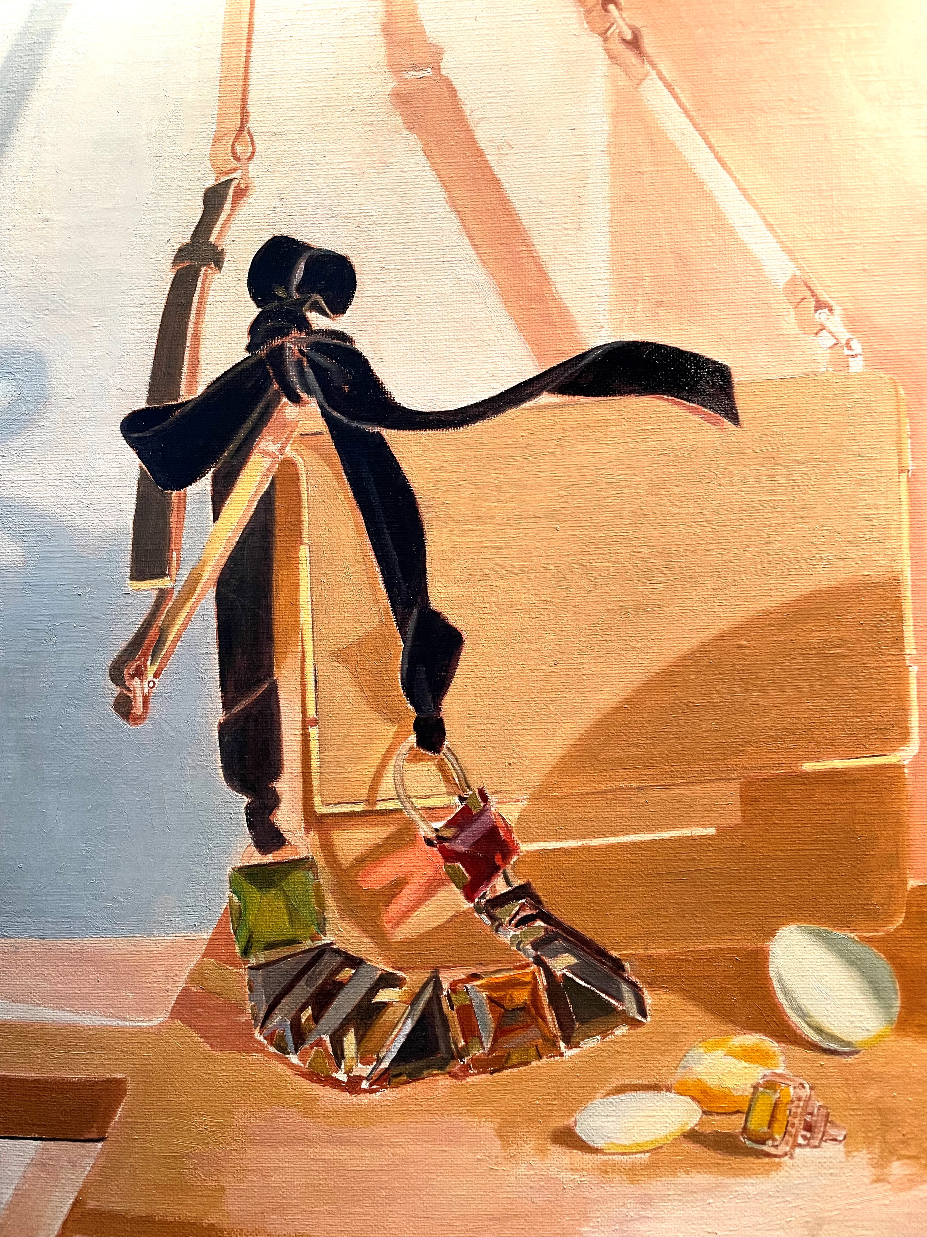
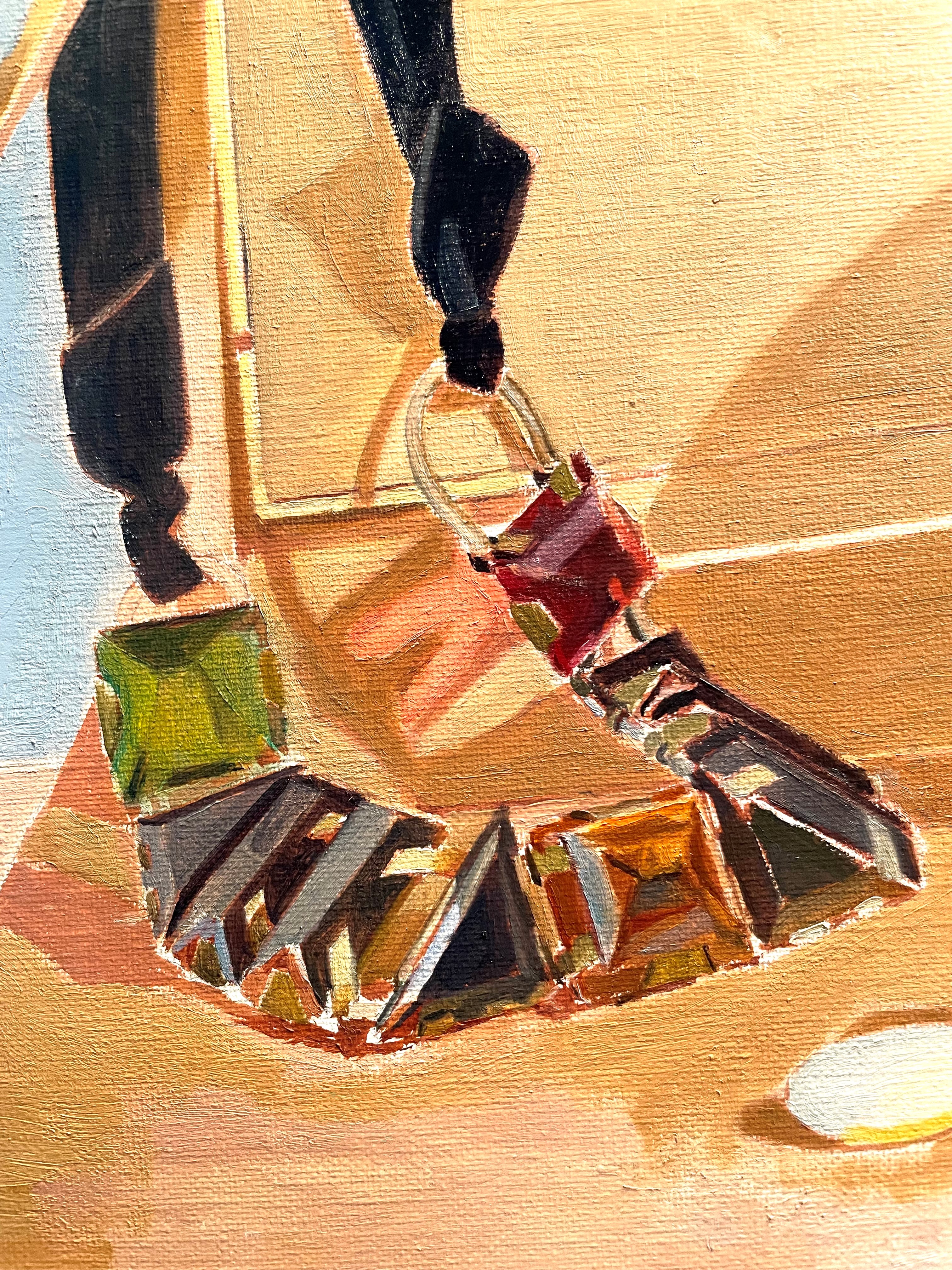
Below, I’ve painted the ribbon very simply, with just two tones of black and light gray. I have also begun working on the handbag strap. I’m painting the strap in a darker value than it will be, because I plan on scumbling a light gray over it. This will lighten the value and produce a cool, pearly light, which is exactly what I want to show the cool daylight coming in from the window on the left. Scumbling a thin layer of light paint over a darker tone always cools a color and lightens its value. The effect is much more subtle and vibrant than merely mixing the correct color and painting it directly.
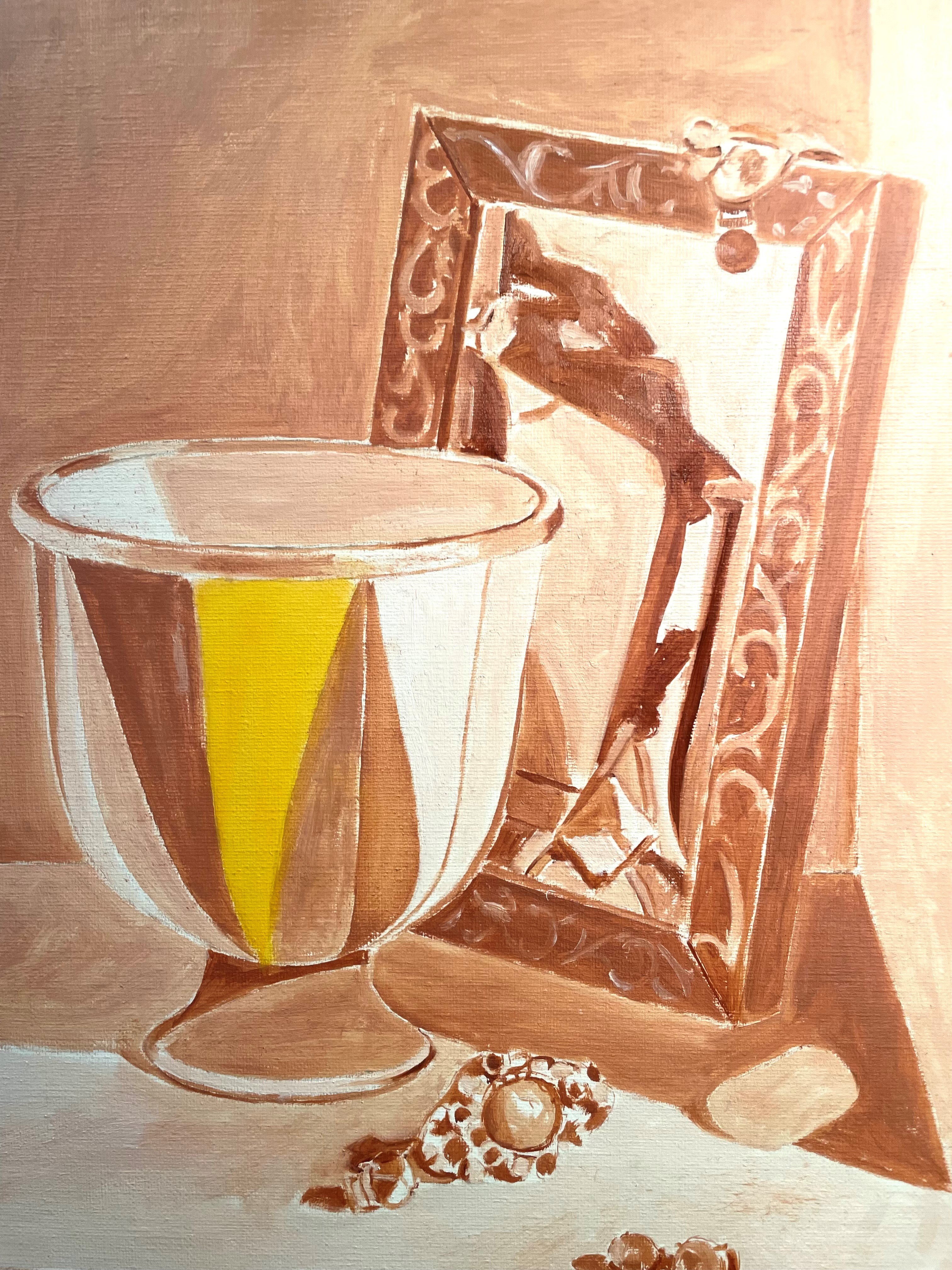
Painting the crystals of the necklace was very difficult. There were so many reflections, that it was hard to see what the shapes really were. Again, I found myself re-seeing and correcting. It is a comfort to know that I don’t need to paint it perfectly at this stage. One of the great things about a layered approach is that I can work up gradually to the finished image, with no pressure.
Below, I’ve painted most of the back wall. The shadow side was much bluer than I thought it should be. I kept checking by making a window with the thumb and forefinger of each hand through which to view both the set-up and my canvas simultaneously. This is a great way to compare colors and values because it isolates them from their surroundings and allows you to see them next to each other.
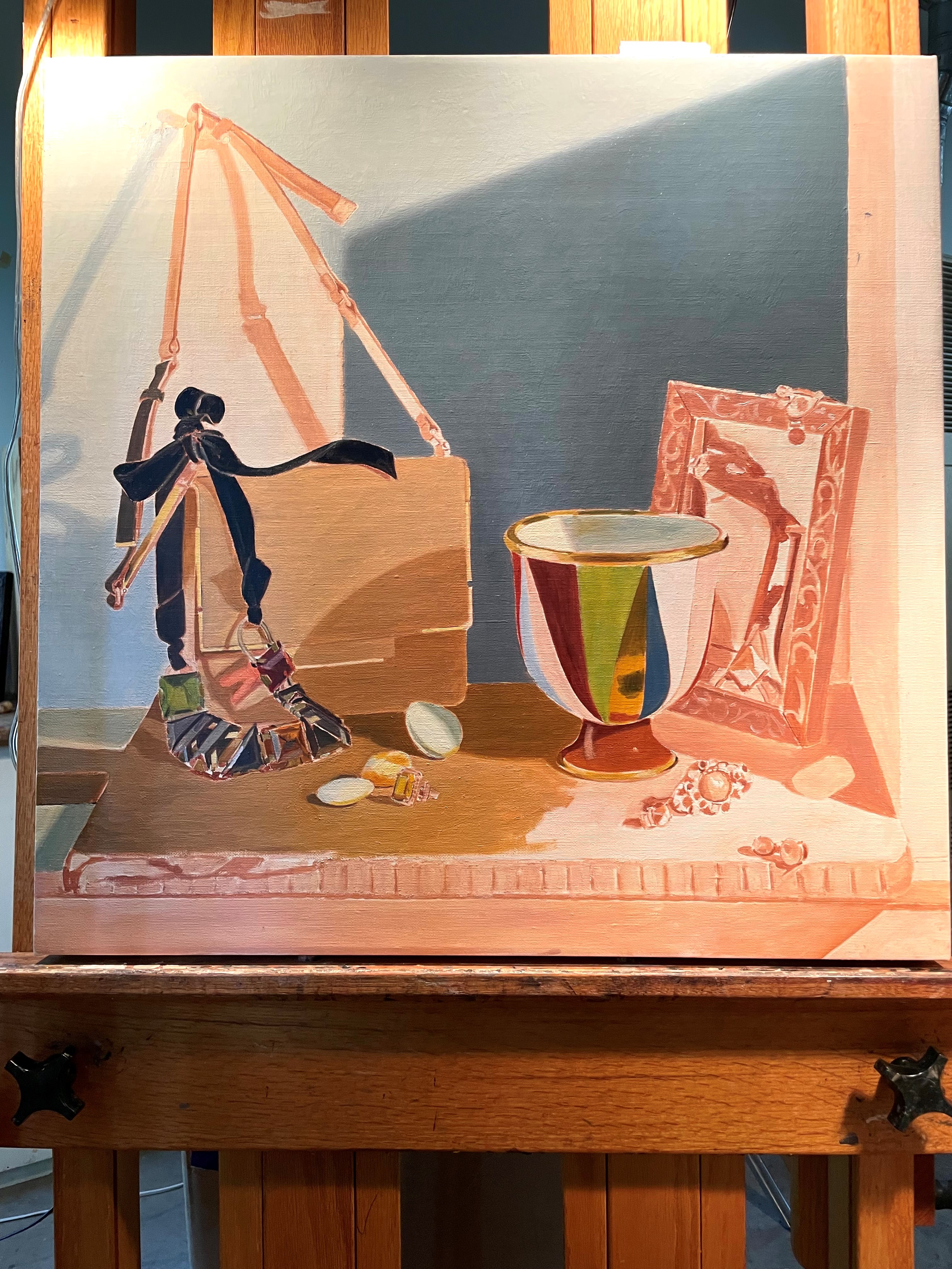
Below, you can compare the color of the shadow in the set-up and in the painting. I might eventually decide to paint this shadow with less blue, but for now, I’m going to paint what I see. I decided not to tackle the diagonal warm shadow cast by the strap from the window on the left until this layer of paint is dry. Getting the smooth transition was hard enough without having to deal with this shadow. Always try to make it easier!

