You can now find my writing on Substack: https://lindamannartist.substack.com/ It is a format that allows me to share directly with readers, either by email or in the app. This WordPress site will remain as an archive, though I will no longer be posting new work here. Thank you for reading—I look forward to continuing the conversation on Substack.
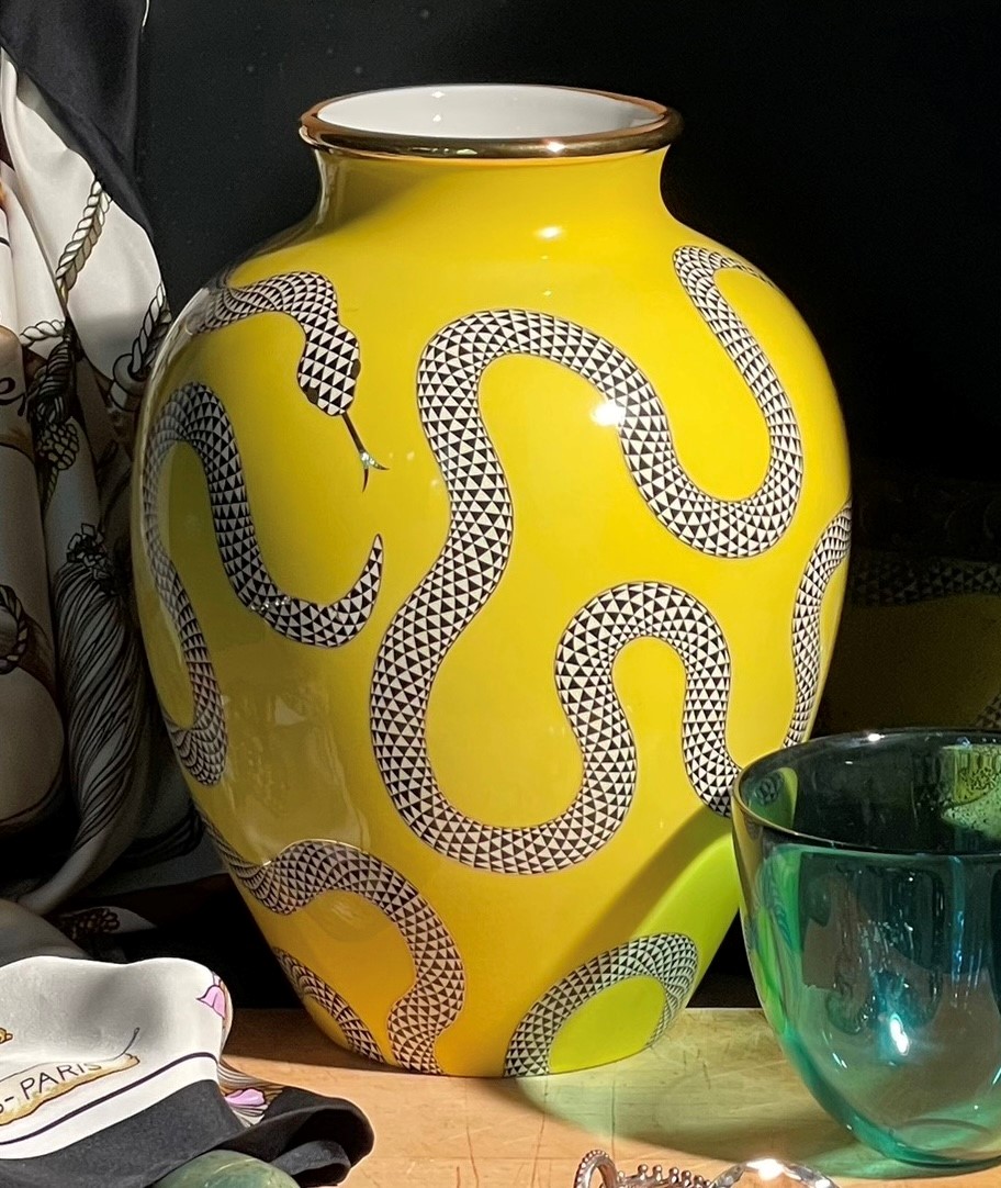
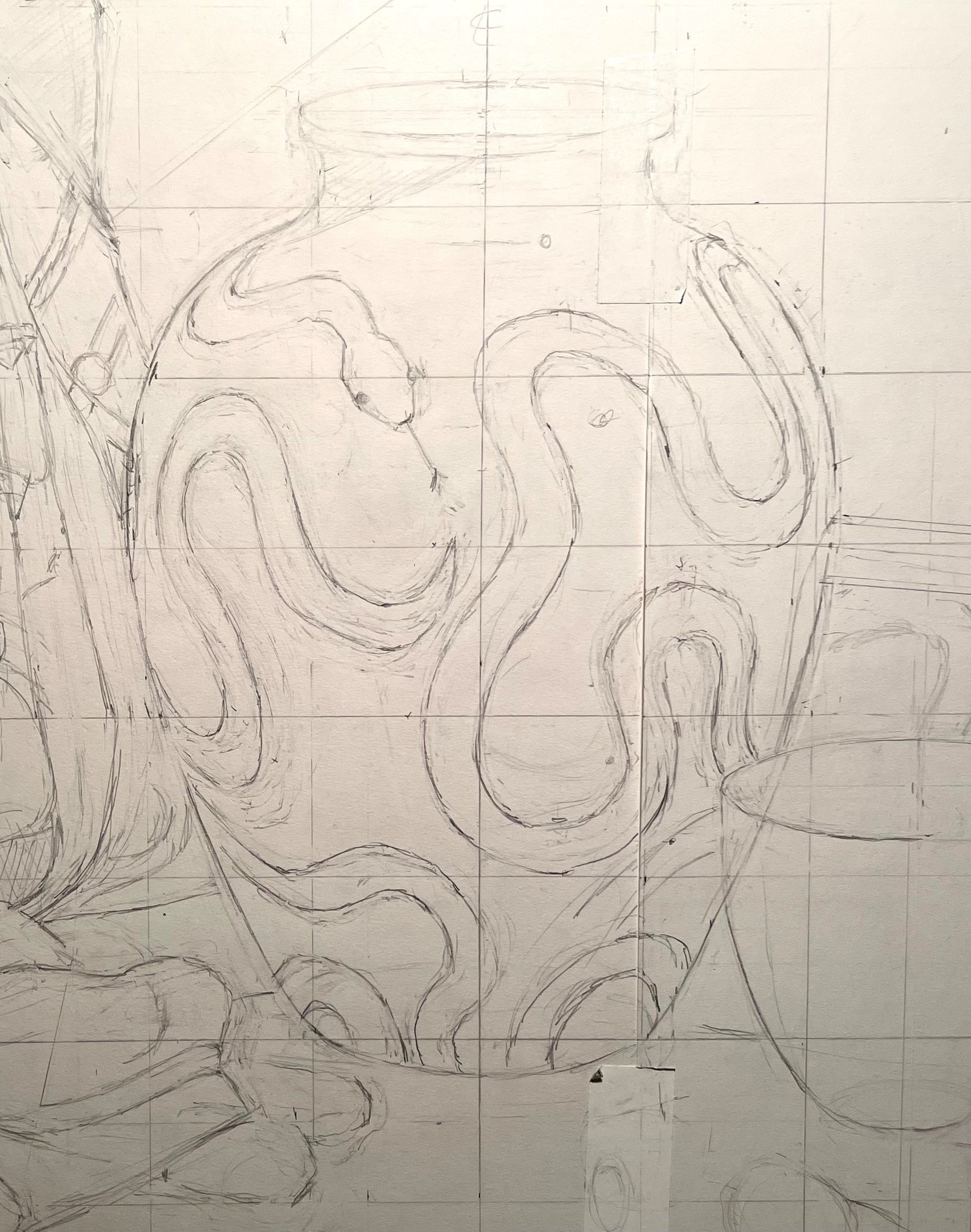
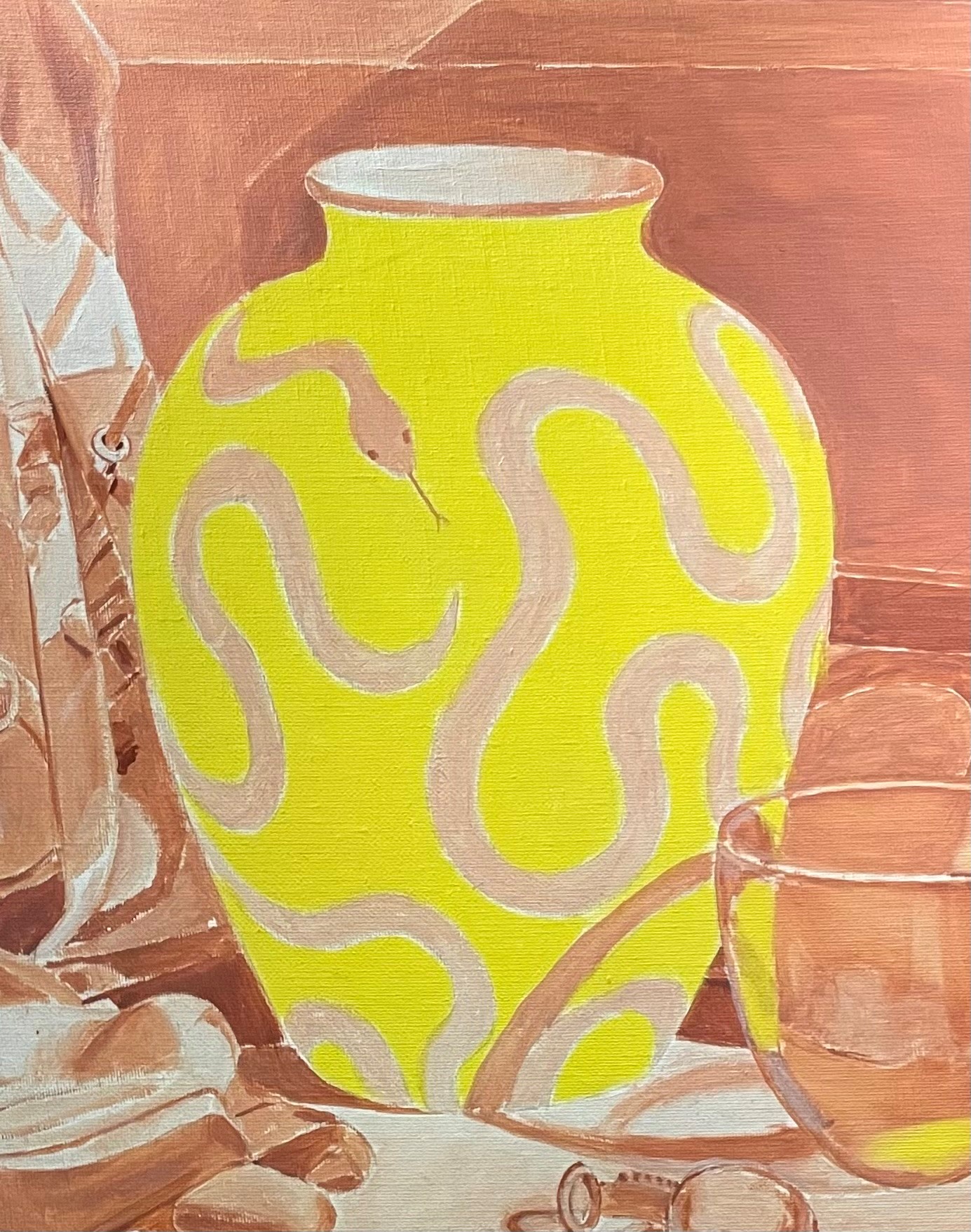
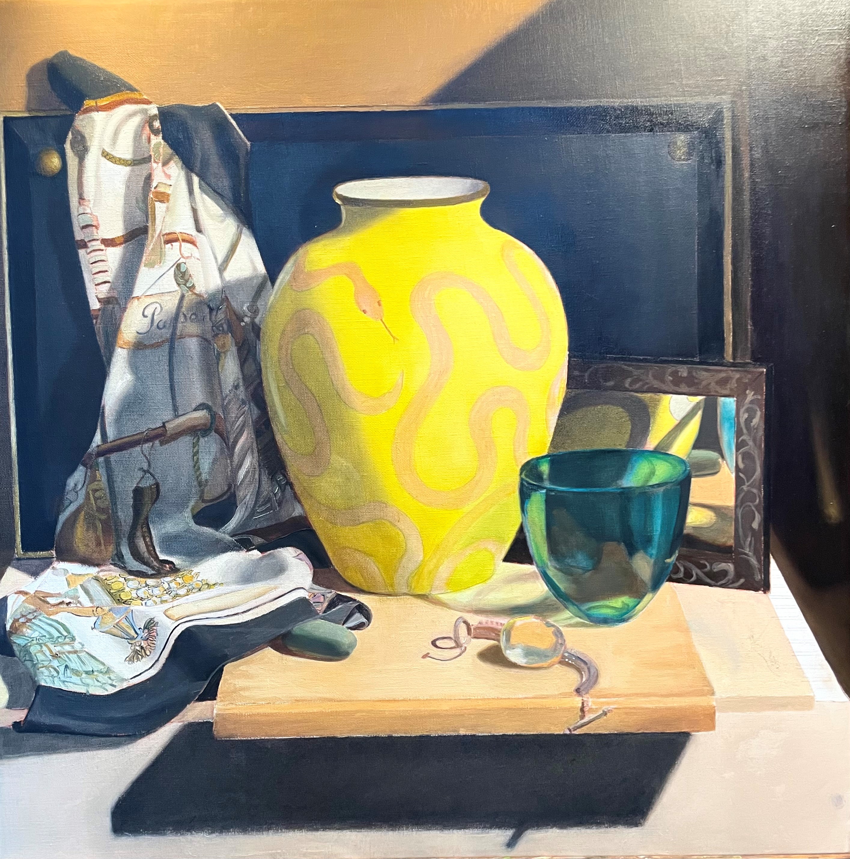
Jonathan Adler sent me this fabulous snake vase to include in a still life! I was really excited about painting it, but didn’t really consider how difficult it would be to draw and paint. I usually think that I can figure out how to paint most anything, but this took all my resolve and patience. The main problem was that simply suggesting the pattern of the snake scales wouldn’t work because the vase was the focal point of my composition. It would look odd not to see the pattern clearly. I could mute the details in the shadow areas, but that presented its own difficulties! (More on this later.) I also couldn’t work it out in my pencil drawing ahead of time, because transferring something so complex would never work. I ended up having to ‘draw’ with paint, which is never easy. In my drawing, below, I just indicated the outlines of the snake. This was harder than you might think. Curves are subtle and often hard to capture correctly. I’d return to my drawing the next day and see my errors clearly.
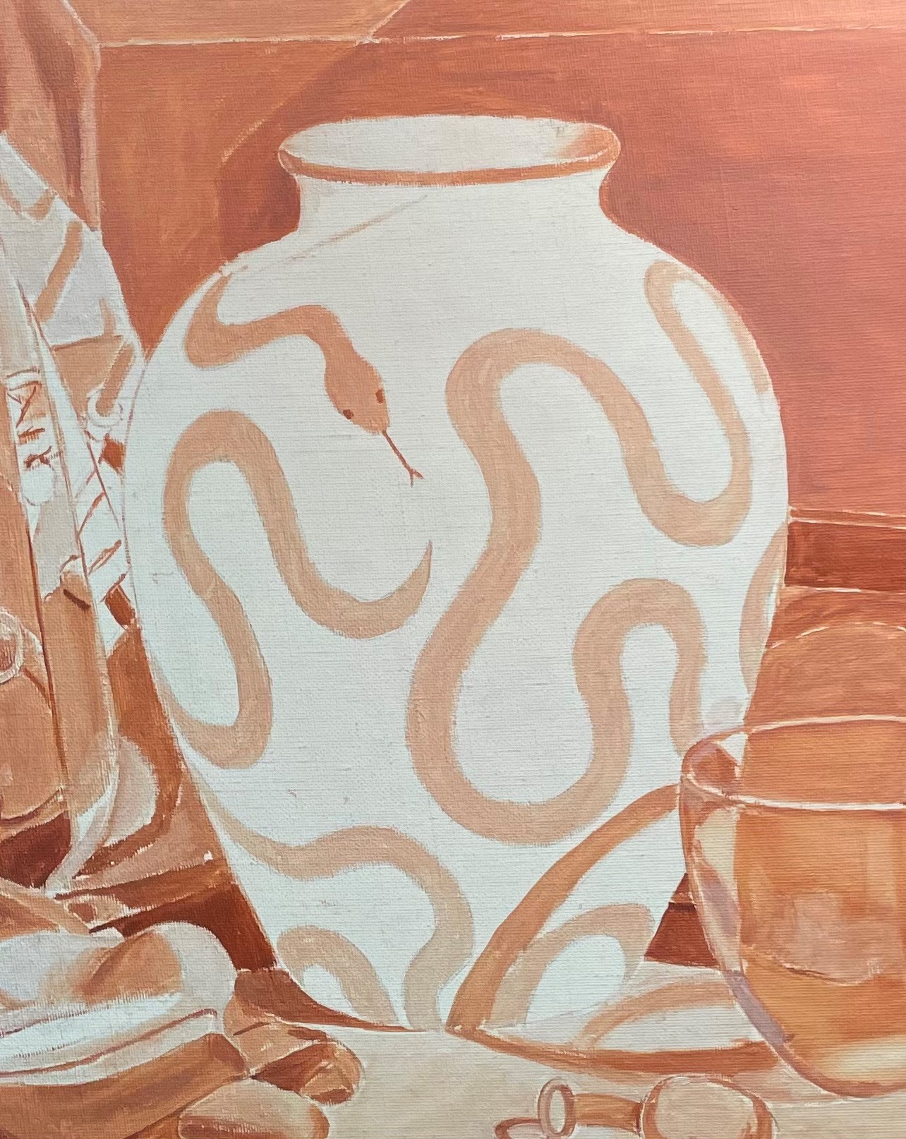
After I transferred my drawing to canvas, I did a monochrome underpainting. I never include small details on the underpainting, because I’d just have to paint over it. No point in duplicating such effort.
The next step was to put in the local colors, as best as I could guess at this early stage.
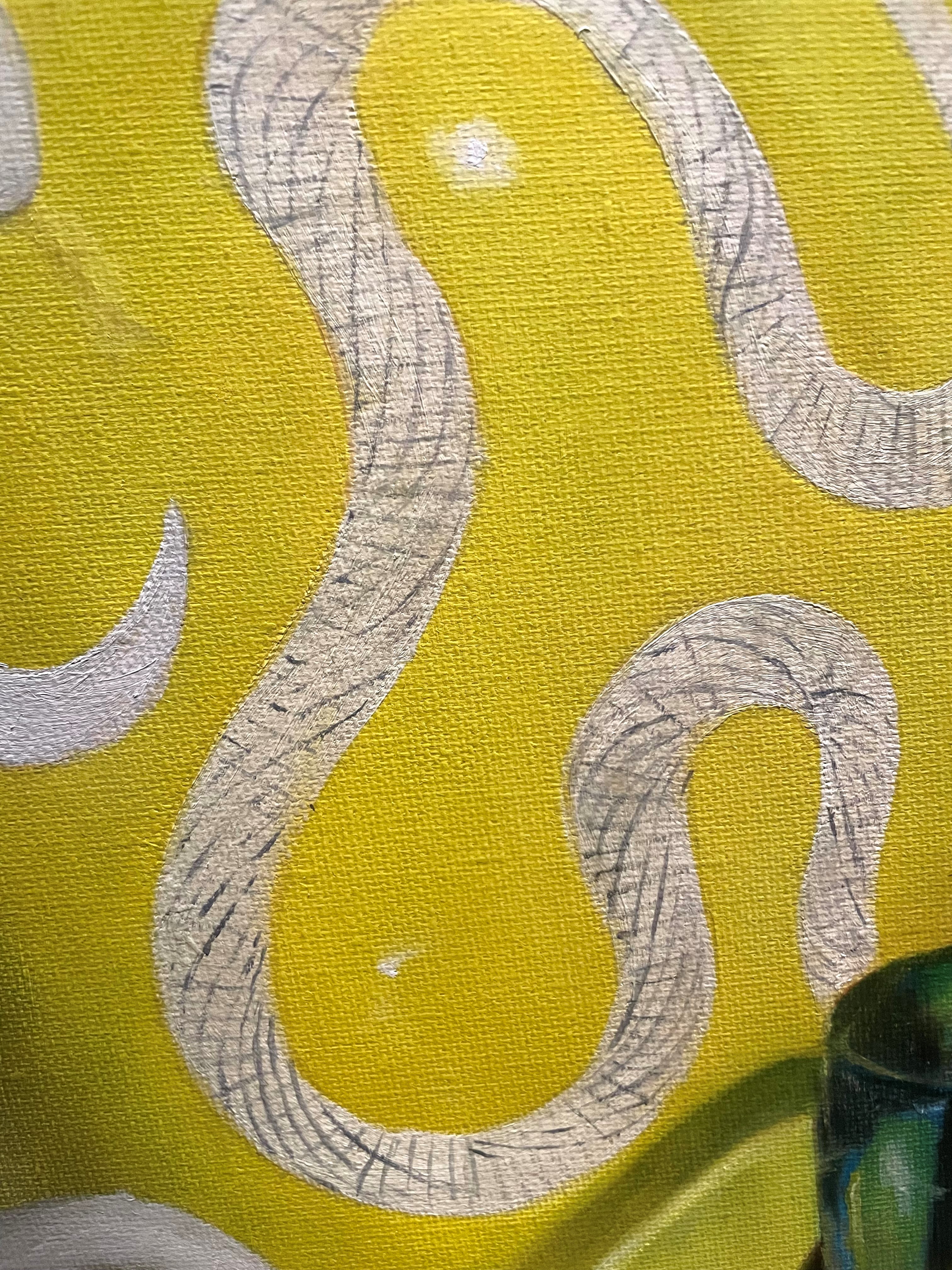
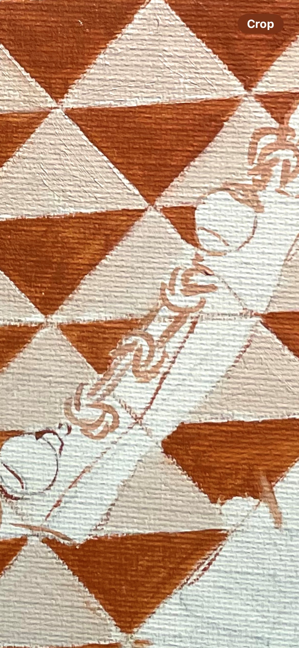
My initial idea was to paint in the lighter color as a background, and then do the small triangles in the darker value. It was hard to know what value to paint this white. The pattern was so broken up in tiny triangles, that to really see values was hard. I could see the general value of the whole snake if I squinted my eyes, but the individual triangles were almost impossible. I took a guess, knowing I’d have to come back many times to correct.
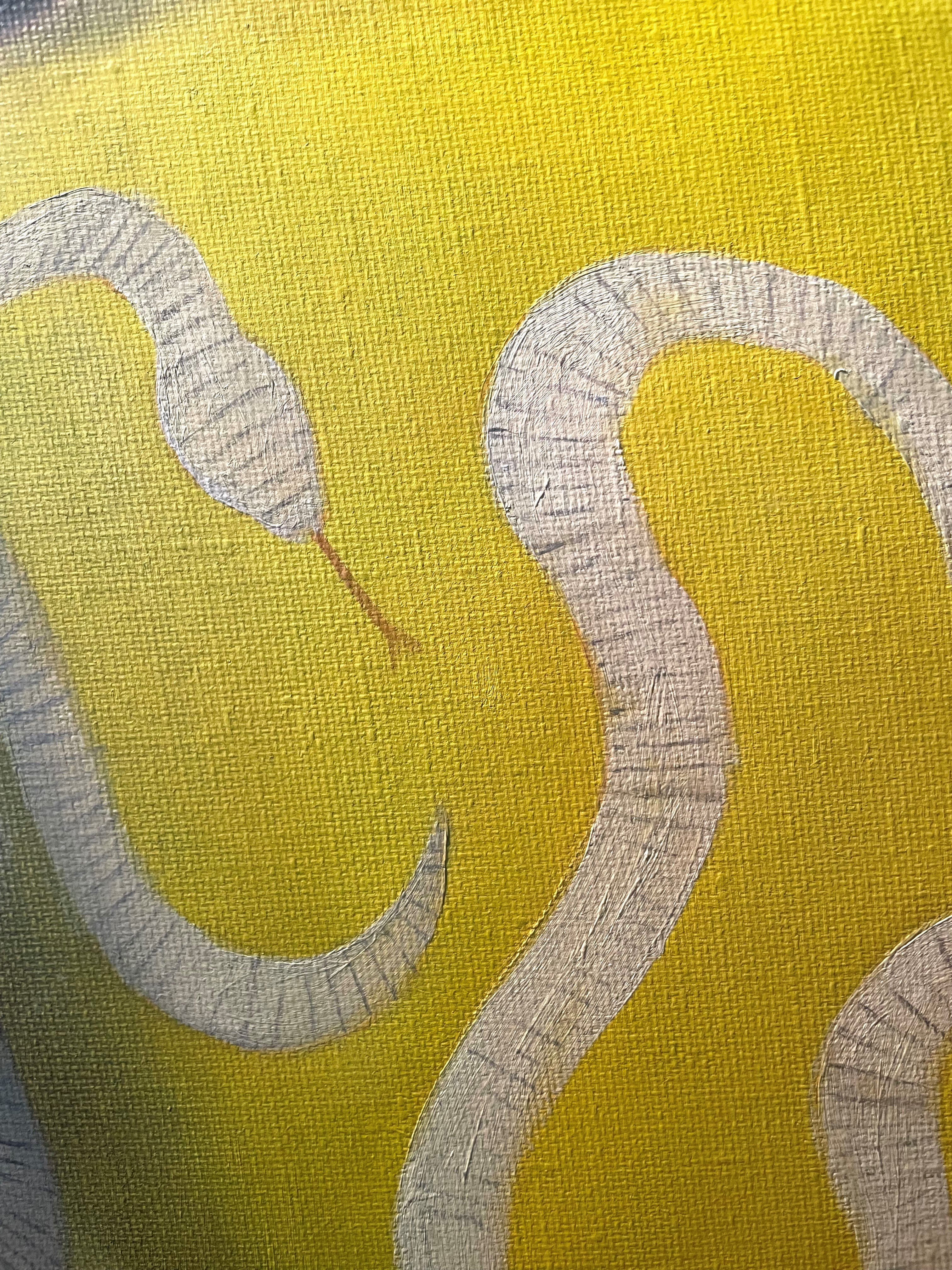
After studying the snake scale pattern, I saw that it consisted of parallel rows. These rows angled out as the snake curved. You can see this above.
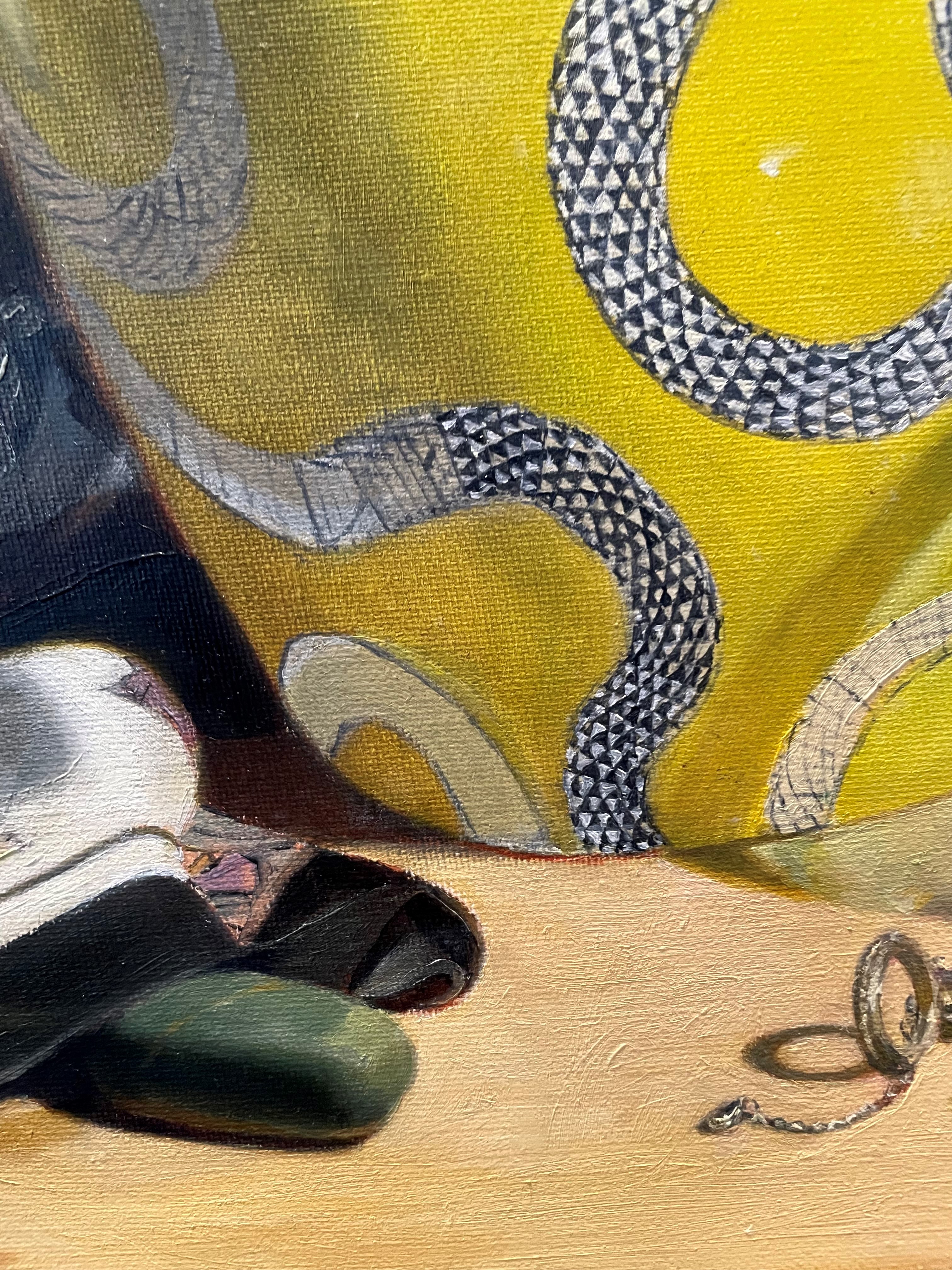
Now, it got complicated. The triangle pattern followed two opposing sets of curving lines that twisted around the snake. Seeing these was very tricky, but I needed them in order to know where to paint the triangles. This is where I wanted to give up!
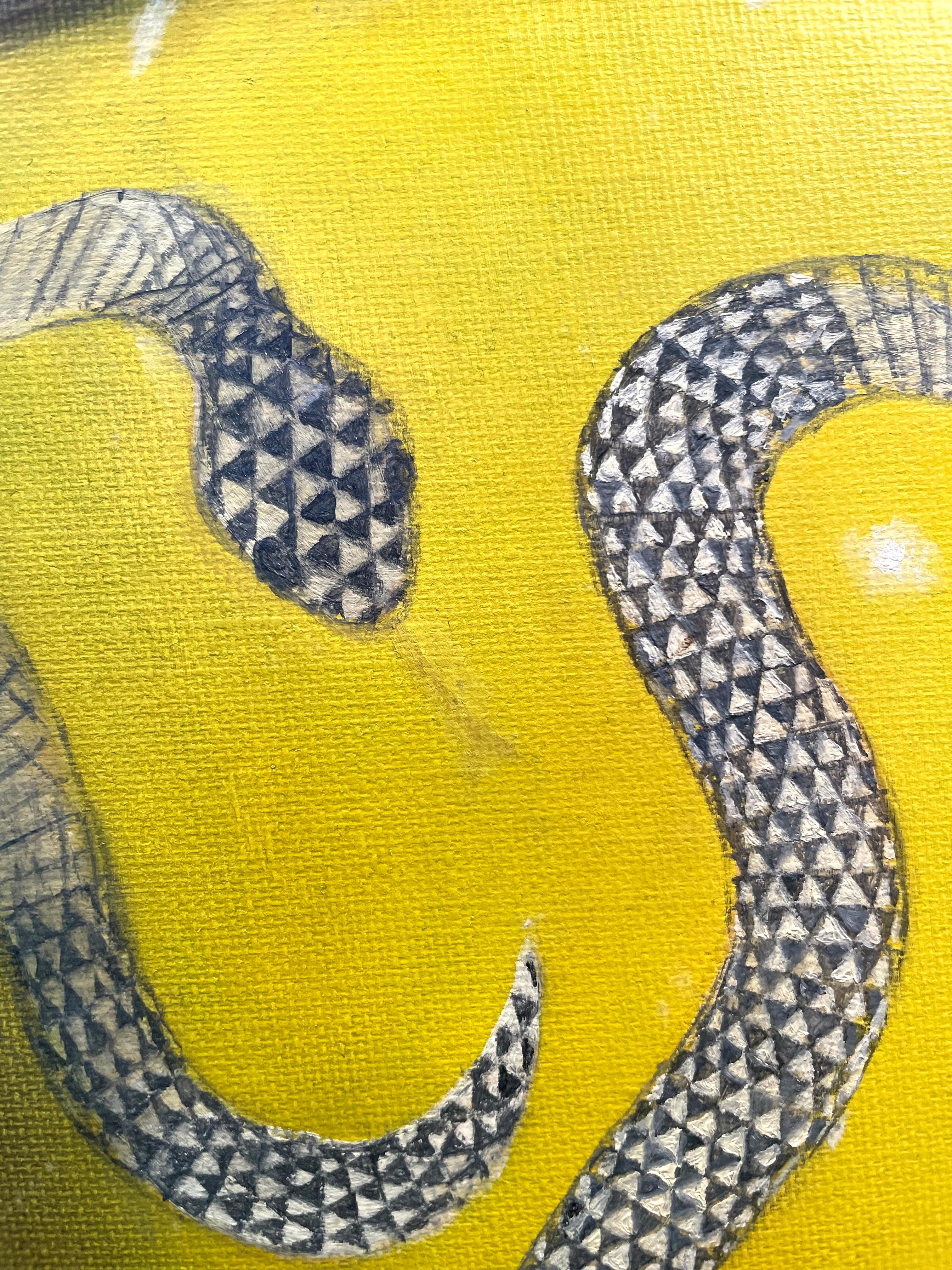
Finally, I began putting in each triangle. It seemed amazingly fussy, yet I saw no other way to do it. I figured that I would come back later and simplify areas so as not to have it too detailed, which would look odd. Though I am a realist painter, I am not a photorealist, and don’t like to put in too much detail. I find that my subjects look more natural, and as a human would actually see them, if things look as they would if you were standing at the distance that I am painting from.
It seemed to take forever. I had to remember that the triangles got smaller towards the edges. I didn’t always capture that, but there was only so much I could do!
I discovered quickly that my values were off. Normally, I’d glaze an area to darken, or scumble with a light tone to lighten, but this strategy didn’t work with this alternating dark and light pattern. If I glazed the whole snake darker, the lights would get too dark, and if I scumbled the whole snake lighter, the darks would get too light. The only way was to repaint each triangle.
As the pattern turned into shadow, I needed to mute the details. As it turned out, this was very difficult to do. Simplifying such a complex pattern took some doing. I had to see the basic pattern and try to suggest it. Above you can see how I approached this.
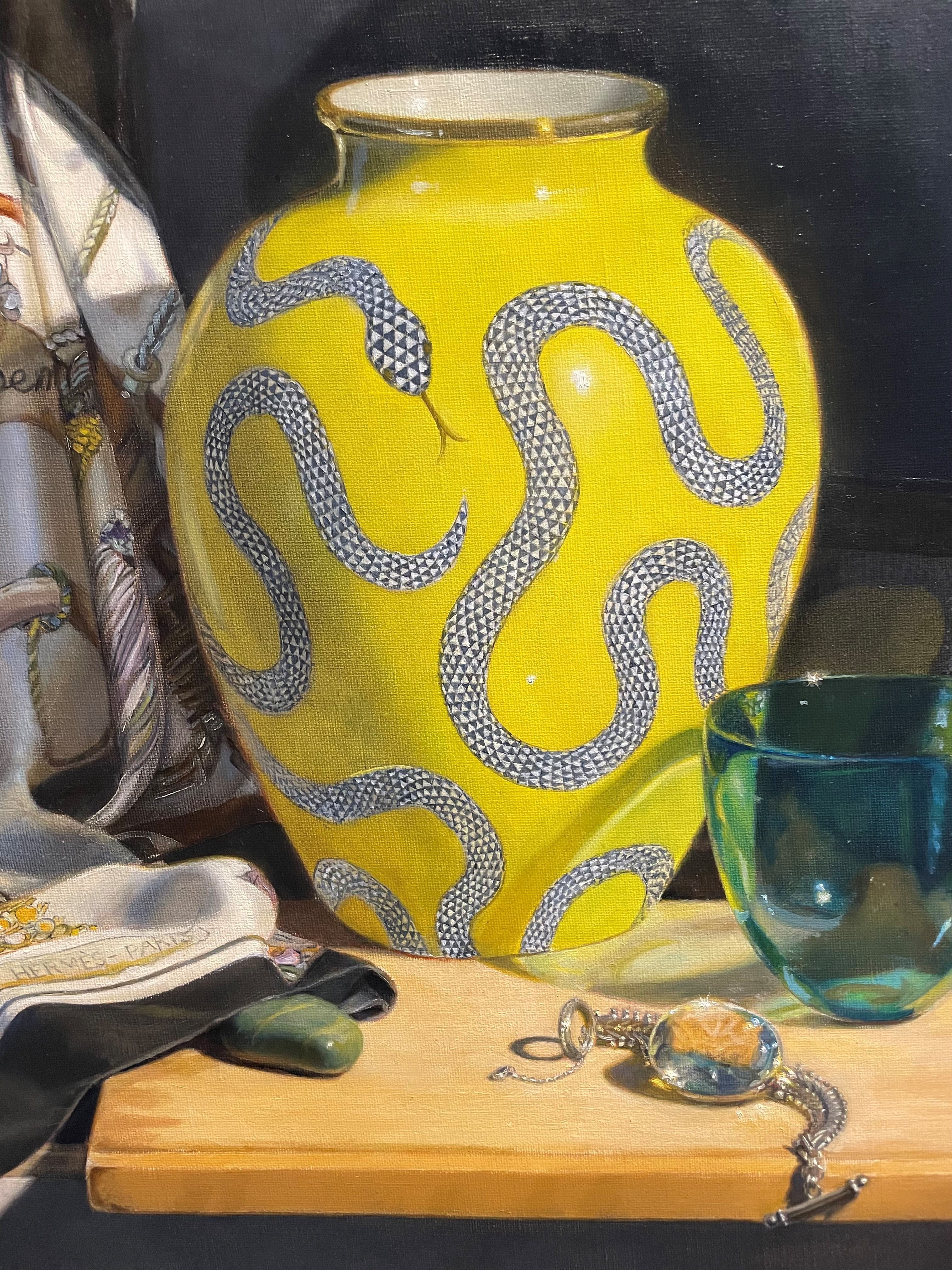
Above is how it looked after I got all of the snake painted. Now was the time to look at the values on the snake and the rest of the vase, so that the pattern would seem to be an integral part of the vase.
Finally, I worked some more on getting the colors and values correct on the shadow side on the left. Shadows on yellow are notoriously difficult to paint- what pigment makes a darker yellow? In this case, it was a greenish hue, since that side of the vase was catching some outdoor cool light from a window. I also made the triangles in the shadow area cooler for this reason. It’s mostly finished, but I’ll probably see a few more things to fix!
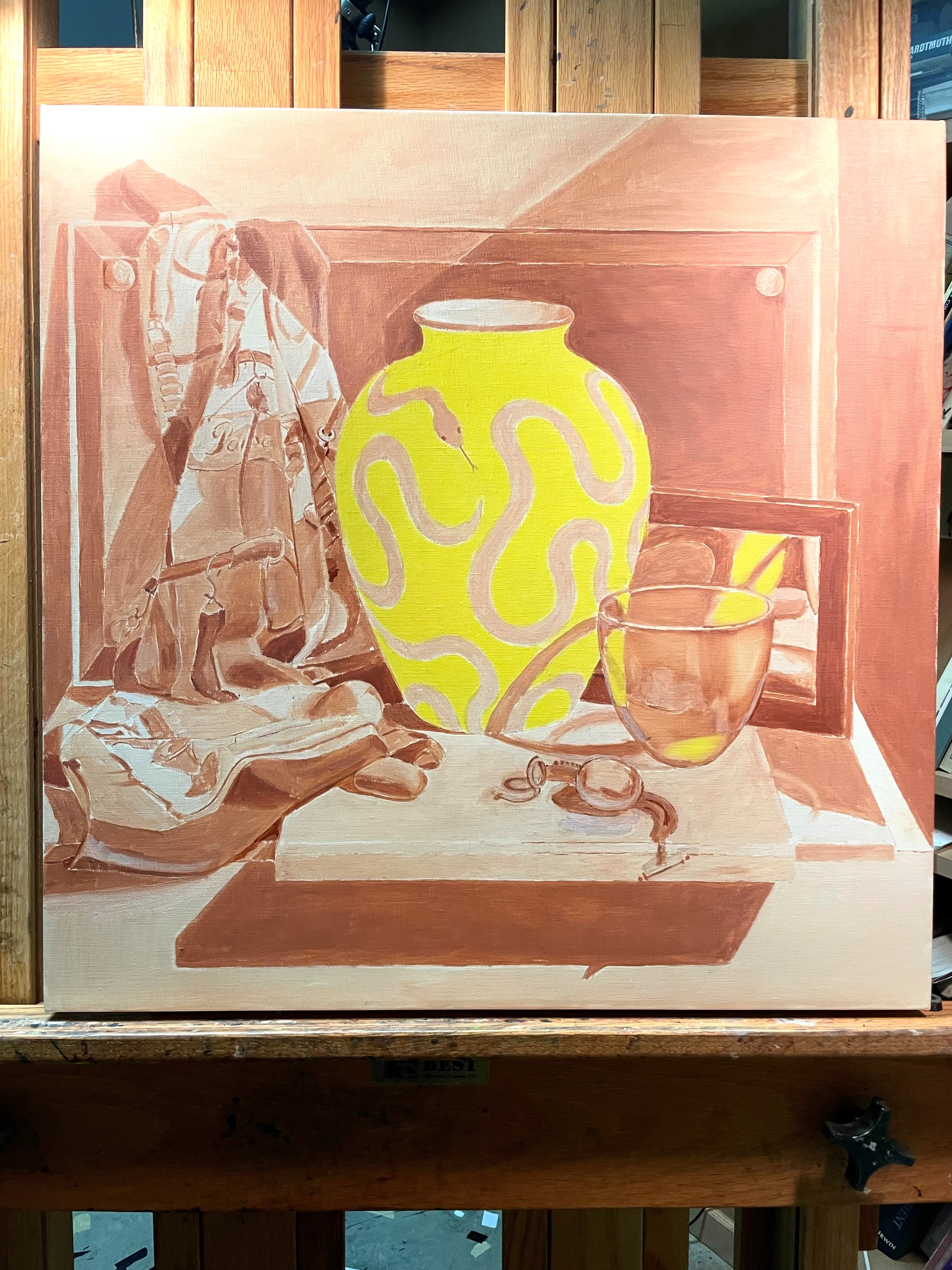
Here is the underpainting for my new still life. You’ll notice that it’s not my usual monochromatic version! The vase I’ll be painting is bright yellow. I can get a more pure color if I underpaint it in yellow. The finished yellow won’t be this bright. Having burnt sienna under it would have dulled the finished vase a bit. I’ve also used the yellow in the reflected bits of the vase in the mirror and the bowl. For more on underpainting, see Underpainting
Above, you can see the blue glass bowl that I have glazed with pthalo blue. In this case, the underpainting is definitely showing through. This isn’t a problem since the blue is very intense, and the burnt sienna will neutralize it (orange and blue are opposite on the color wheel).
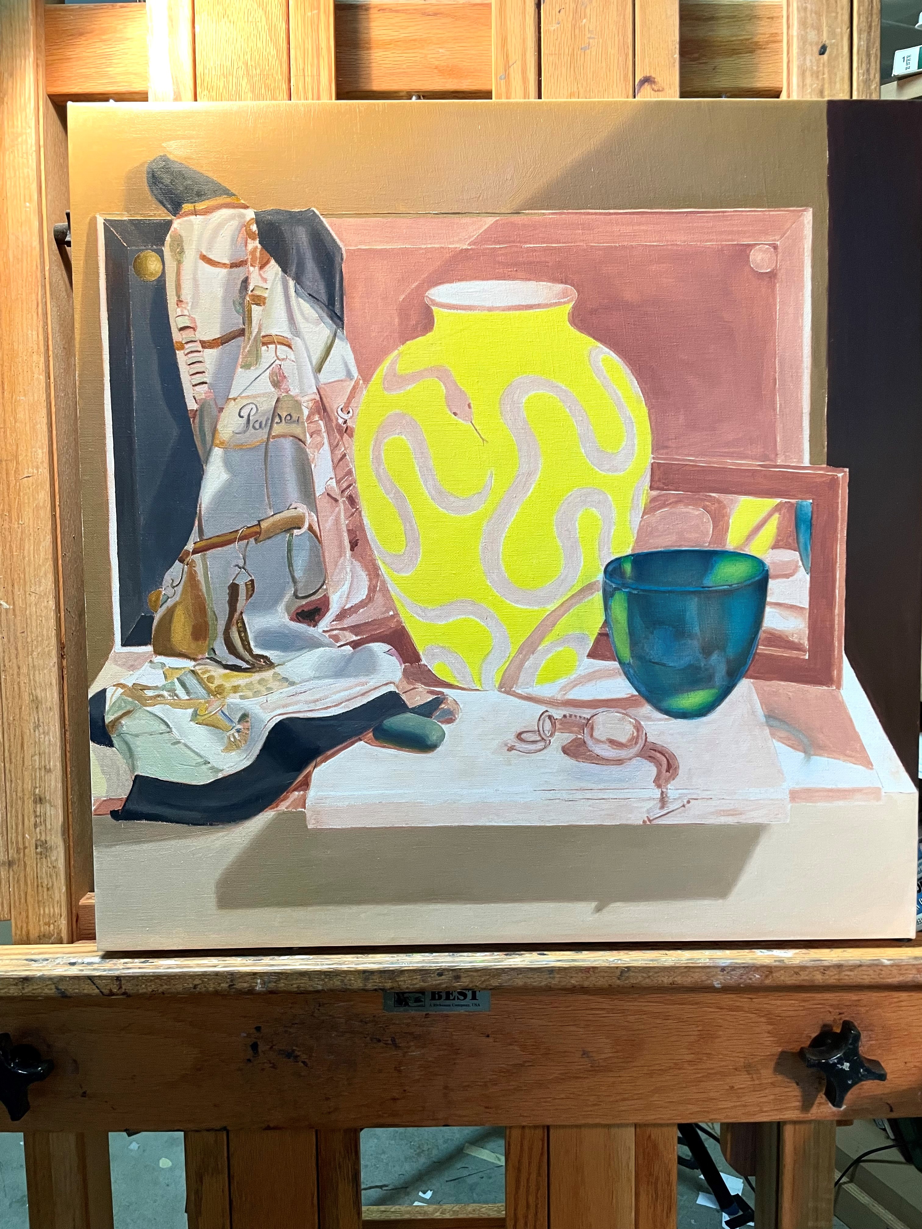
Above, I have started to cover up the underpainting with the first layer of paint. This first layer is simply laid in without too much worry about if the values or colors are right. I also don’t bother with too many details at this point. Until the canvas is covered with paint, I won’t be able to judge values and colors properly. There is no point working on details that would probably need to be changed later.
Above, I’ve almost finished the first layer on the scarf.
Above, I’ve completed the first layer of paint. Now I can really begin to compare and fine tune the values and colors.
I’ve been getting a lot of questions about painting glass lately, so I decided to teach an on-line class on the subject! The class will be a live, 4-session class in mid-January. The details are at https://lindamann.com/class-description if you’d like to join me. Spots are filling up, so sign up soon if you are interested!
For this post, I thought I’d give you a little preview of some of the subjects that I’ll be covering in the class.
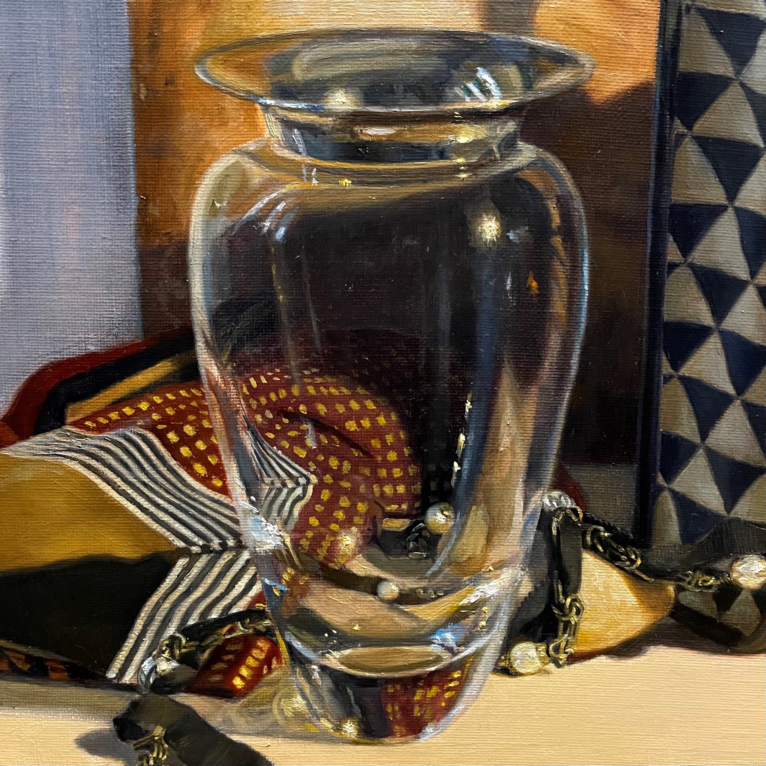
Painting glass can be confusing. There are so many complicated shapes and colors in the glass that it’s natural to not understand what you’re looking at and be overwhelmed. You can’t paint what you don’t understand. You also can’t paint unless you can train yourself to really see. The first thing to remember is that when painting transparent glass, you are painting what is behind the glass, altered by the way that glass objects distort forms. Above, you can see the brass box behind the glass decanter. The shapes, however, are curving to follow the shape of the decanter. What at first seems like a lot of confusing shapes, can now be understood and more easily seen and painted. Below, you can see the same phenomenon with the gold lines on the tray being bent when seen through the glass globe.
Another useful thing to notice when looking at glass objects is that often the edges are illuminated. See how the outlines of the glass globe are highlighted. You can see that in the image below, too.
Finally, glass is reflective and acts as a mirror. The triangles in the bag are reflected onto the top right side of the vase, above. Also, the window is reflected onto the vase. It appears as a curving blue line. All reflections follow the form of the object.
These are just a few pointers to get you started thinking. Once you understand how glass behaves, it stops being perplexing and starts to be really fun to see and paint. I hope you can join me and we can paint together.
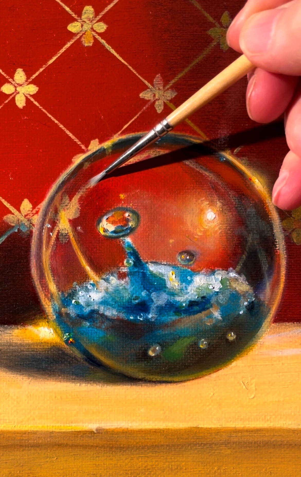
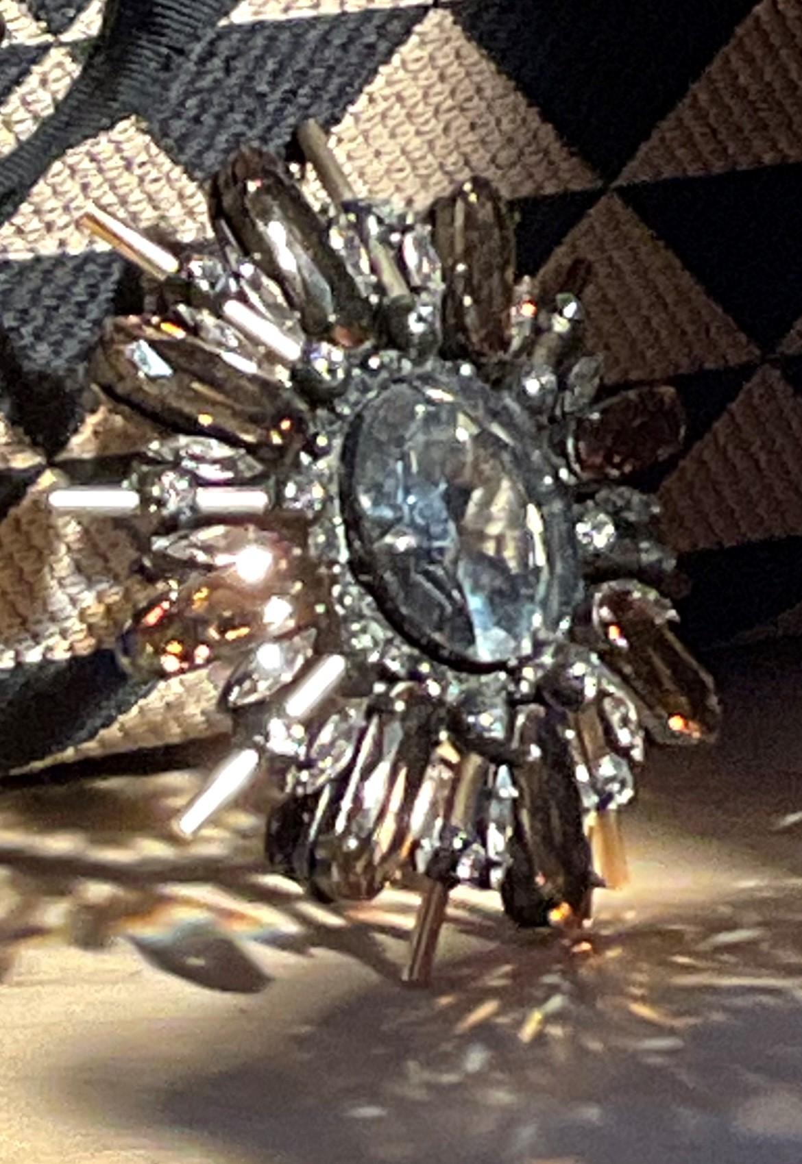
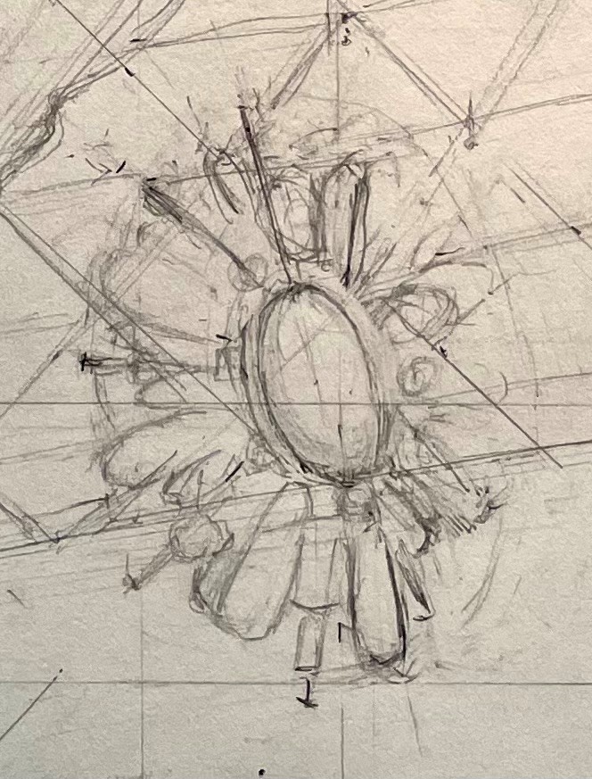
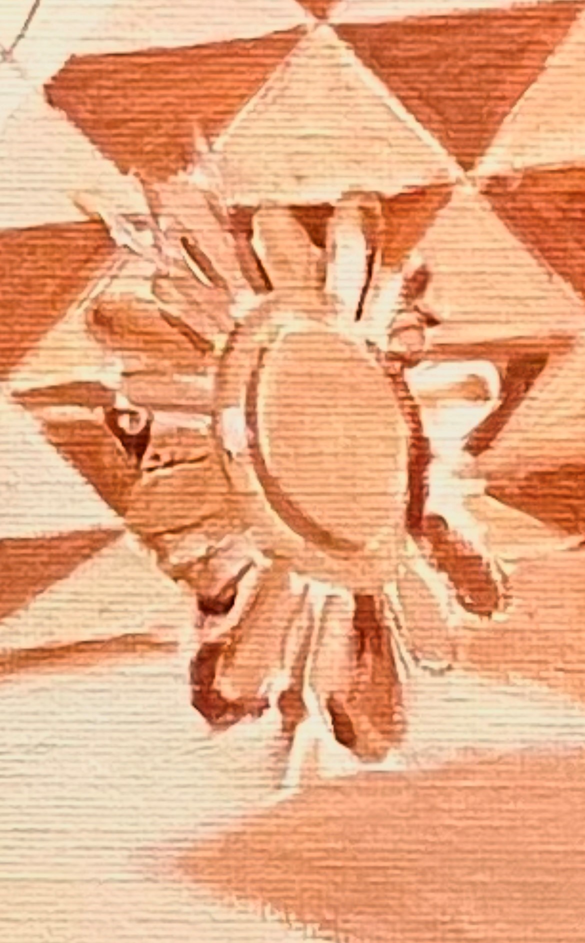
One of the hardest things to paint is a highly reflective surface, such as this crystal brooch in my latest painting. There is a photo of it below. The first difficulty is actually seeing the forms. The reflecting light is so bright that it obscures the forms. Sometimes I take a photo with my phone so that I can see the shapes more clearly. A photo, however, distorts the colors, reflections, and even shapes, so it’s not reliable to paint from. It can be helpful, though, just to make sense of what you’re seeing, especially in complex objects like this.
First, I do a very rough pencil drawing to locate the various shapes. I don’t go into a lot of detail, though. Most of it would be lost after the underpainting and first layers of paint, so I save myself the trouble of getting it all down now.
After the drawing is transferred to my canvas, I do a monochrome underpainting in lead white and burnt sienna. I keep the values light and the paint thin. I also don’t attempt any details yet. This layer is meant as a guide for future painting.
After the underpainting is dry, I paint the first layer of color. I ignore the subtleties of reflections and just try to get a first guess in as to local colors and general shapes. It doesn’t have to look good at this point.
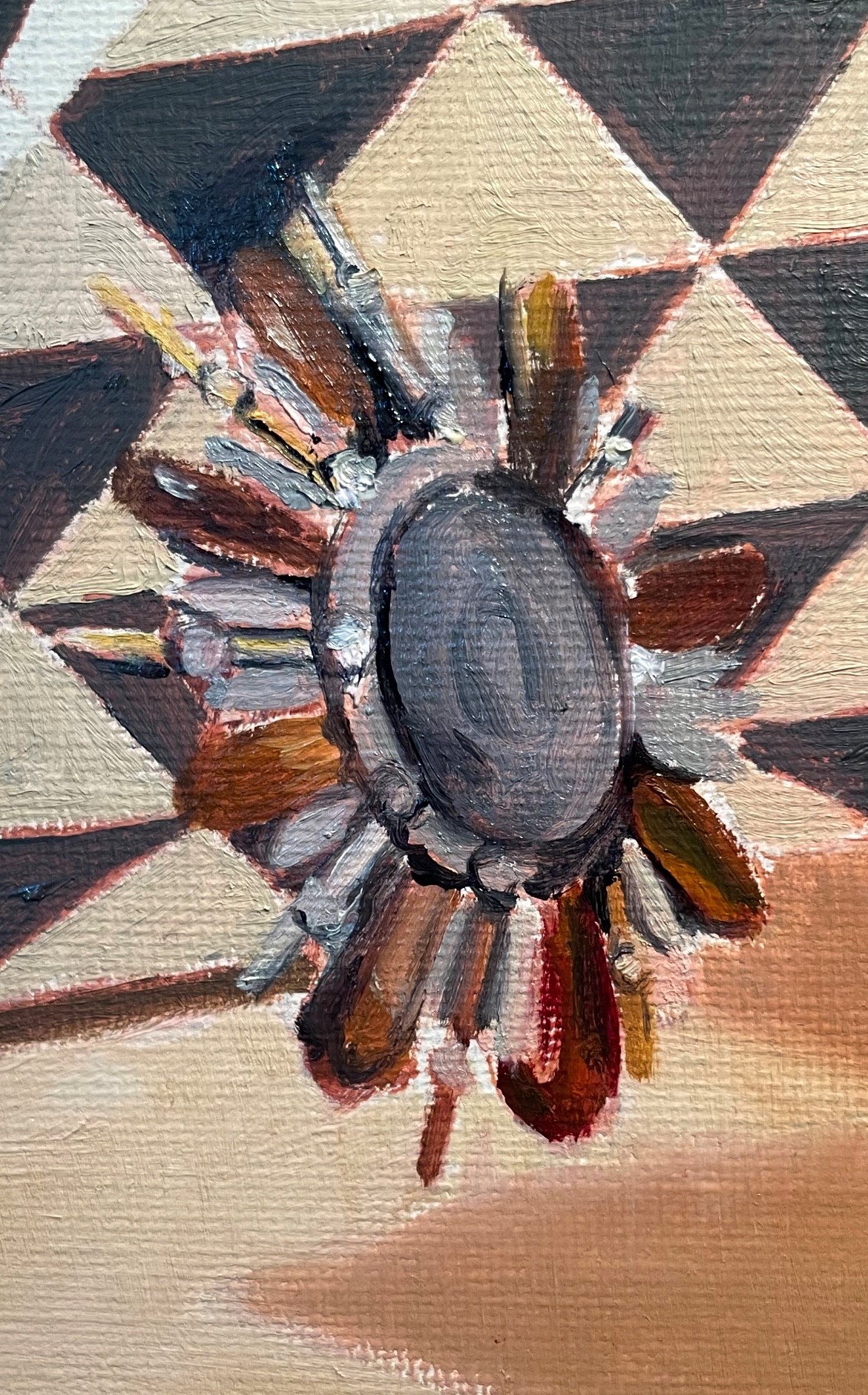
In the next session, I adjust some colors and the drawing. I reduce some of the contrasts in values, since all of the light bouncing around means that nothing is really dark.
Below, at the next session, I adjusted the shapes again. I had to refer to my photo sometimes, because many of these shapes were completely obscured by reflections at my distance from the set-up of 6 feet. After I made the corrections, I put away the photo and observed my set-up. It’s amazing how much difference there is between reality and a photo. Things that seemed sharp in the photo were actually very blurred and indistinct in reality. I had to make sure to reproduce this indistinctness in the painting and not be too clear, otherwise my painting wouldn’t look convincing. This is one reason that paintings done from a photo will never look as real as ones painted from life. It seems counter-intuitive, but it’s true! Below you can see the shapes becoming less distinct.
Next, I continue to correct colors and I add warm haloes around the reflective crystals. This mimics the light bouncing off of the forms. You can see this effect on the gold spoke on the left side of the brooch. The highlight is the lightest value, with the edges fading to yellow, then to a dark gold.
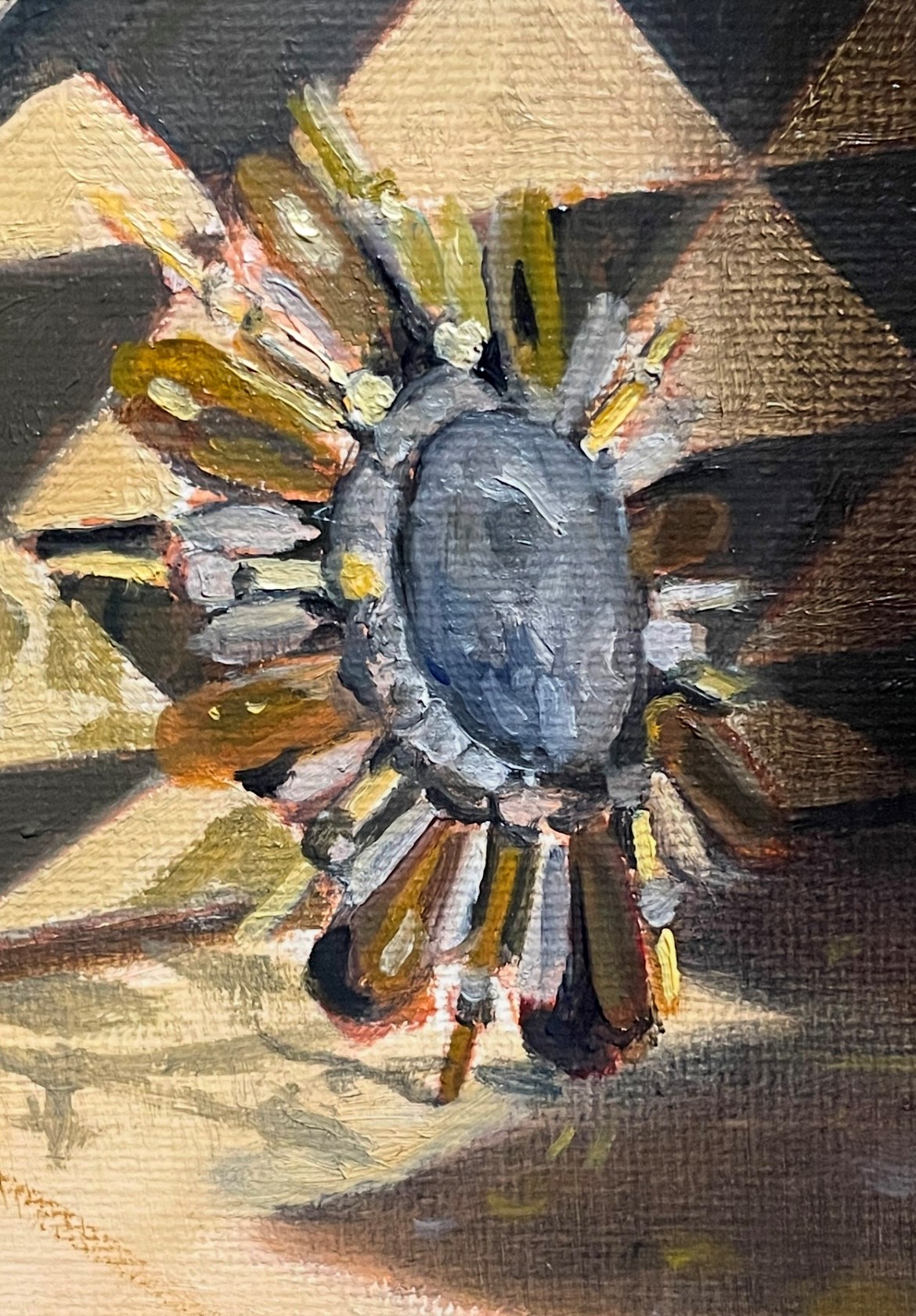
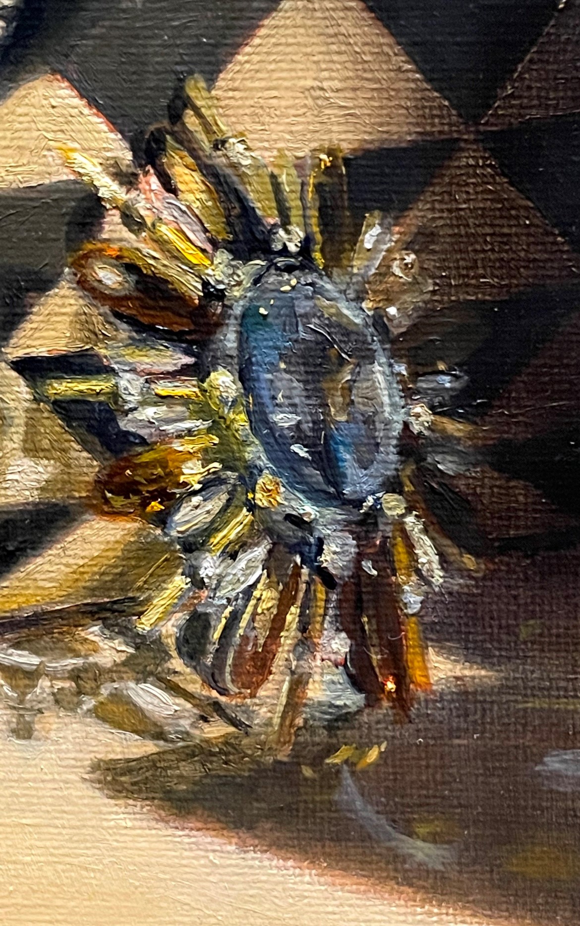
Finally, I continue to blur edges and add the brightest reflections in lead white with just a touch of yellow to represent light coming from a warm light source. I also make sure that there are not too many darks near the reflective elements. (In the photo below, the darks appear darker than they are in the painting.) Even though areas might seem dark when you focus on them, if you take in the whole scene, you will notice that in the area of the reflective objects (here, the brooch), everything is bathed in light. So, keep the darks brighter and warmer than you think. Finally, resist the temptation to show detail that is impossible to see from your vantage point.
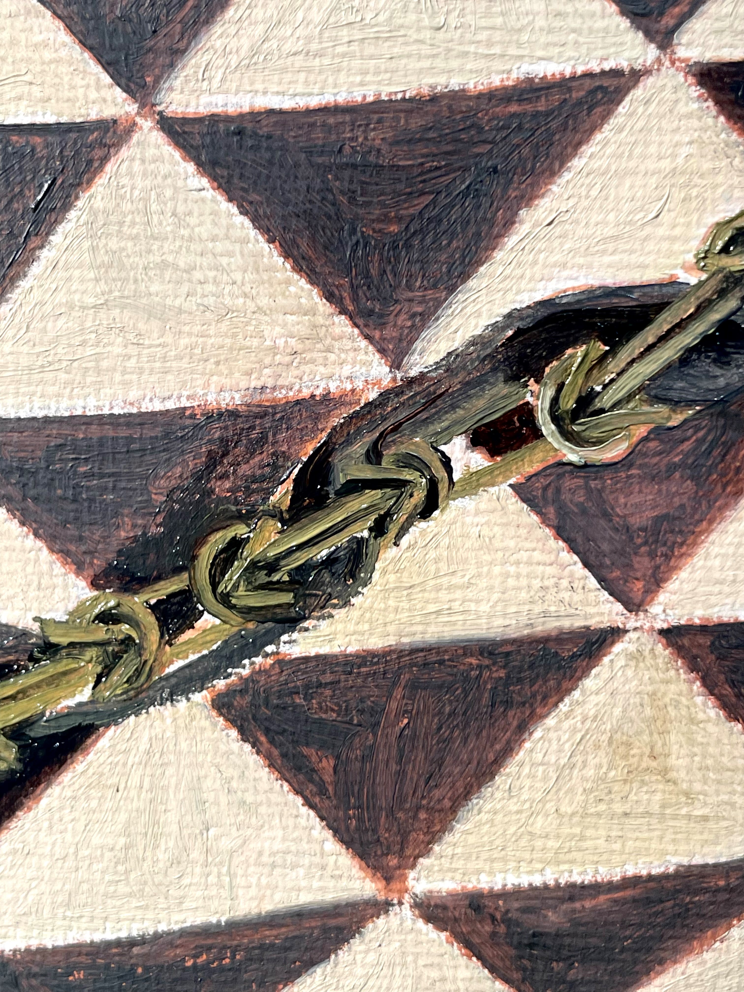
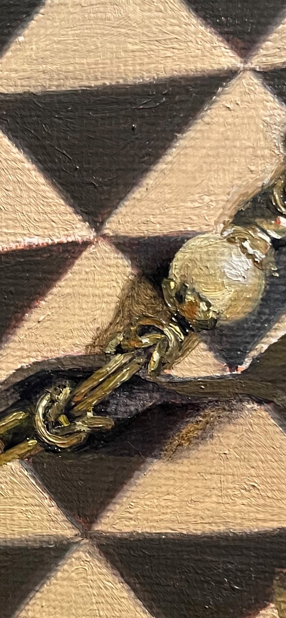
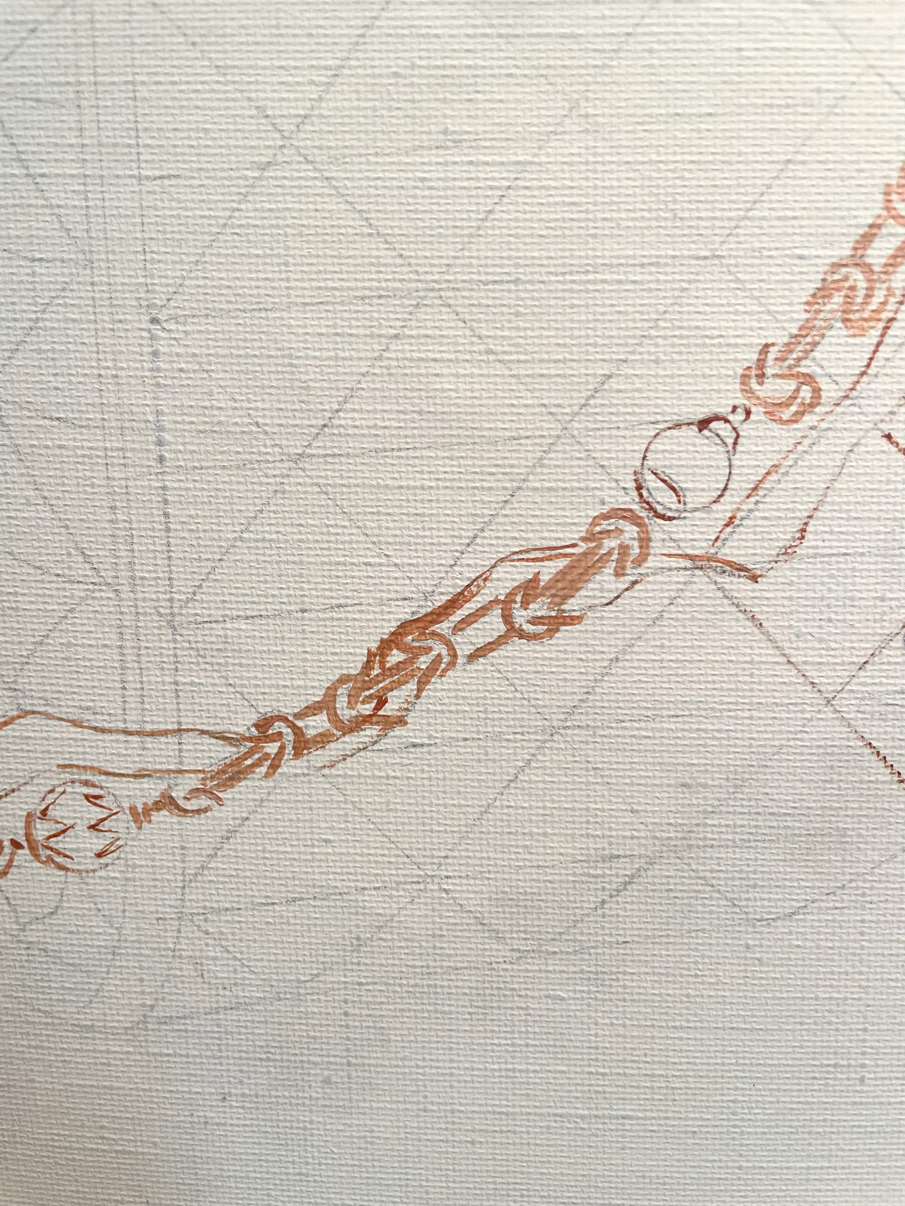
For something as complex as this chain, I didn’t bother to paint it too specifically in the underpainting. Otherwise, I would have to paint the details twice! I just indicated the position of the important links.
Then I mixed up a few colors: a dark for the shadows, a basic link color, and a highlight. Getting the color right on this was difficult. I wanted it to be a dark muted yellow, but not too green. This is always tricky! Below, the color was too green. I corrected this later. This mix was naples yellow, cobalt blue, and raw sienna. I painted the basic shapes of the links with a #2 sable brush, filling in the dark spaces between and adding just a few highlights. I’ll go back over this many times, so there was no need to work it to a finished state. Working slowly gives me time to check my colors and shapes. If I had worked to completion, and found out that the color was too green, I’d have to do it all over again! This would not be a good use of time.
Below, at a later session, I made the color less green, softened up the edges, corrected shapes, and added more highlights. Sometimes on details like these, I have to take a photo and study it up close to understand the complex structures. Occasionally, I’ll even have to paint bits of it from the photo, but I always have to go back and check and paint it from reality. All of the details will not be visible in the finished painting. At the distance I’m observing the set-up, many disappear. Also, colors and reflections do not show up properly in a photo, so I can’t simply copy a photo if I want a look of reality. I’ll go back later and study the set-up, muting many details, correcting colors, and observing highlights and reflections, always using reality as my final guide.
It can be tempting to keep all of the details I worked so hard to see, but if they don’t add to the look of reality and serve the composition, there is no place for them in the finished painting.
Here is a list of some books that I found helpful to learn how to paint in oils. Some of these are still in print, but many are not. You can look on addall.com or bookfinder.com for the out-of-print ones.
Methods and Materials of Painting of the Great Schools and Masters, Sir Charles Lock Eastlake, vols 1 & 2
Oil Painting Techniques and Materials, Harold Speed
The Materials of the Artist, Max Doerner
Technical Drawing, Giesecke, Mitchell, Spencer, Hill
The Materials and Techniques of Painting, Jonathan Stephenson
The Painter’s Methods and Materials, A.P Laurie
Perspective for Artists, Rex Vicat Cole
The Techniques of Oil Painting, Frederic Taubes
The Artist’s Handbook of Materials and Techniques, Ralph Meyer
After posting a Reel on Instagram that mentioned that I am largely self-taught, using reference books from the 19th century, I’ve gotten many requests for a book list. I am putting one together and will post it here in a few days!
When I am working on a painting, there are two aspects of it that I must consider. First comes the design or composition of the picture. If you stand well back from a painting, this is what you see. You see it as an abstract design in two dimensions. This has to be pleasing and well-balanced. It also has to have elements that lead the eye of the viewer where you want it to go. I don’t think of details at this point- only the graphic composition. To see this more clearly, I often turn the study for the painting, and later, the painting itself, upside down or sideways to emphasize this aspect and take the focus off of the objects themselves.
Once I settle on a composition and begin to paint, my focus turns to the details of the painting-how to represent different materials, what colors to use, how the brushstrokes influence the colors and the surface texture, the way an underlayer shows through a transparent glaze, the look of an impasto stroke, and how all of this describes the objects and the light in a set-up. Later, these are the kinds of things that the viewer will have to get up close to the painting to see and appreciate.
If a painting has a good composition, but is poorly executed, with not enough thought to the details of representing the objects or how the colors and values and brushstrokes describe the quality of the light and shadow, the painting will be a failure. It won’t deliver up close what it had promised at a distance. If a painting has wonderful execution, with good drawing, skillful rendering of textures, edges, and quality of light, yet has a poor overall design, the painting will also be a failure. Without a well-considered structure and overall design, the painting will not attract and hold the attention of the viewer.
Though I always begin a painting by designing the composition, and then progress to considering details and execution as I paint, I constantly revisit looking at the composition as a whole, to make sure that it’s still working. So, just as a good fiction needs both a cohesive plot structure and compelling characterization and descriptions, a good painting needs both a well-considered composition and arresting details.
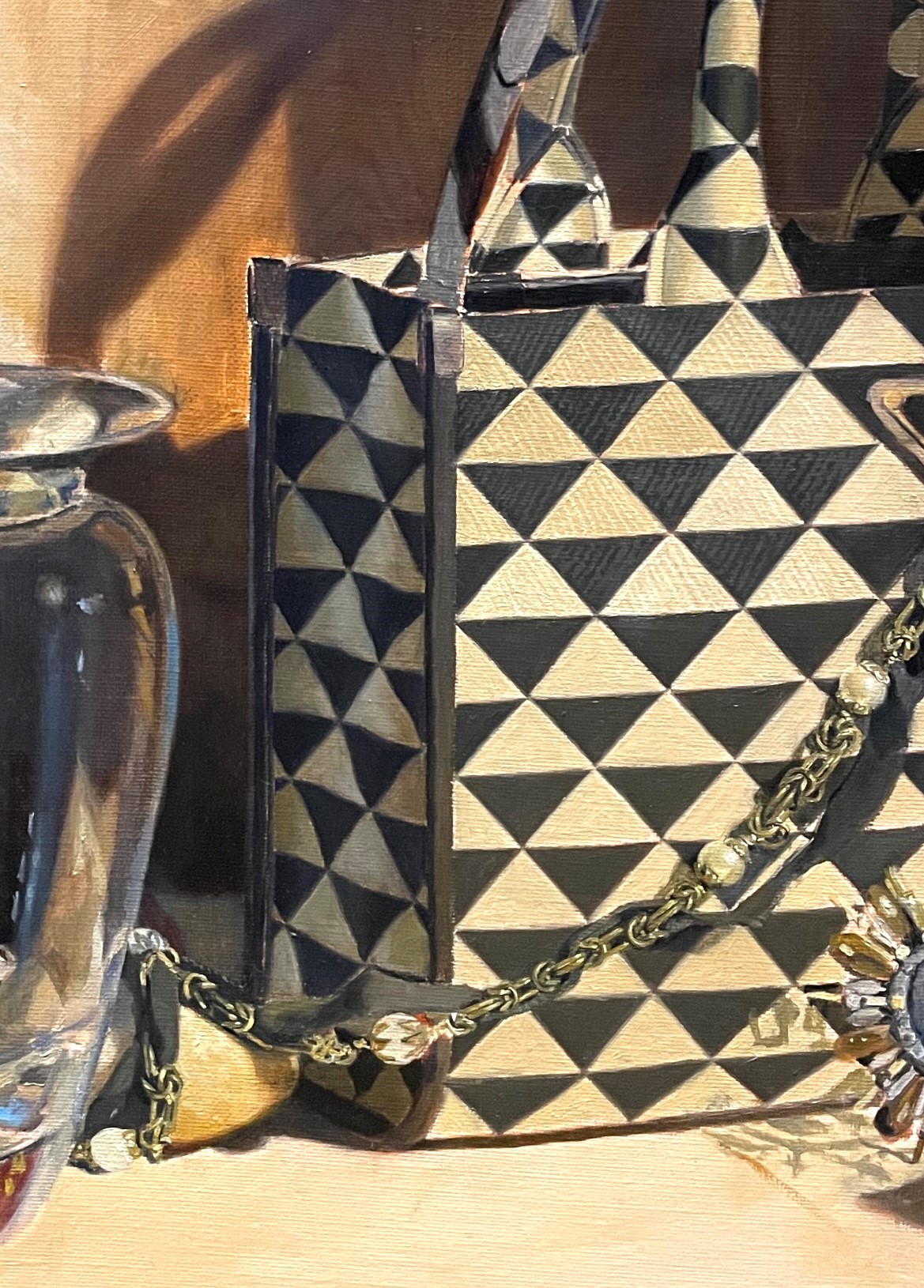
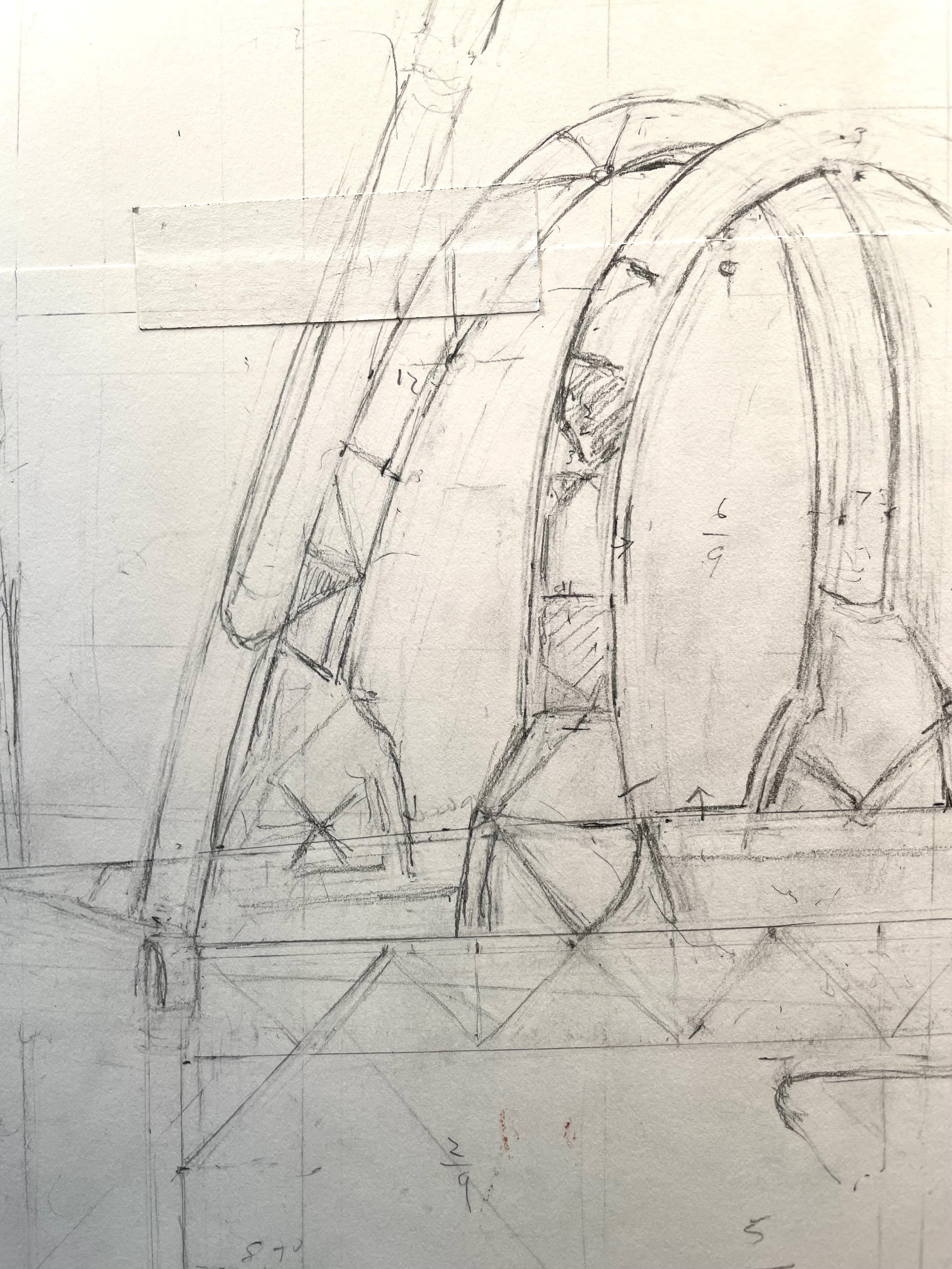
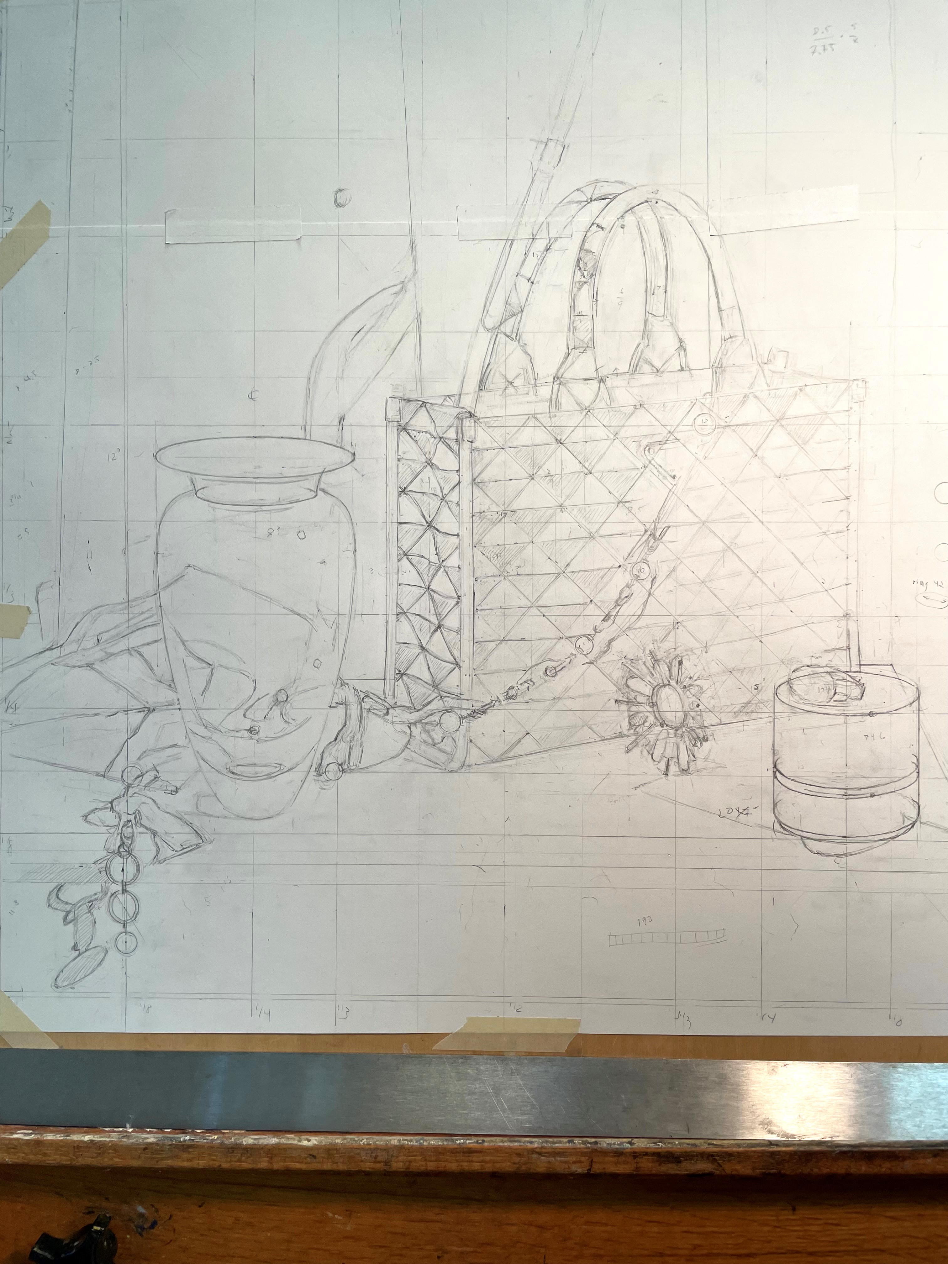
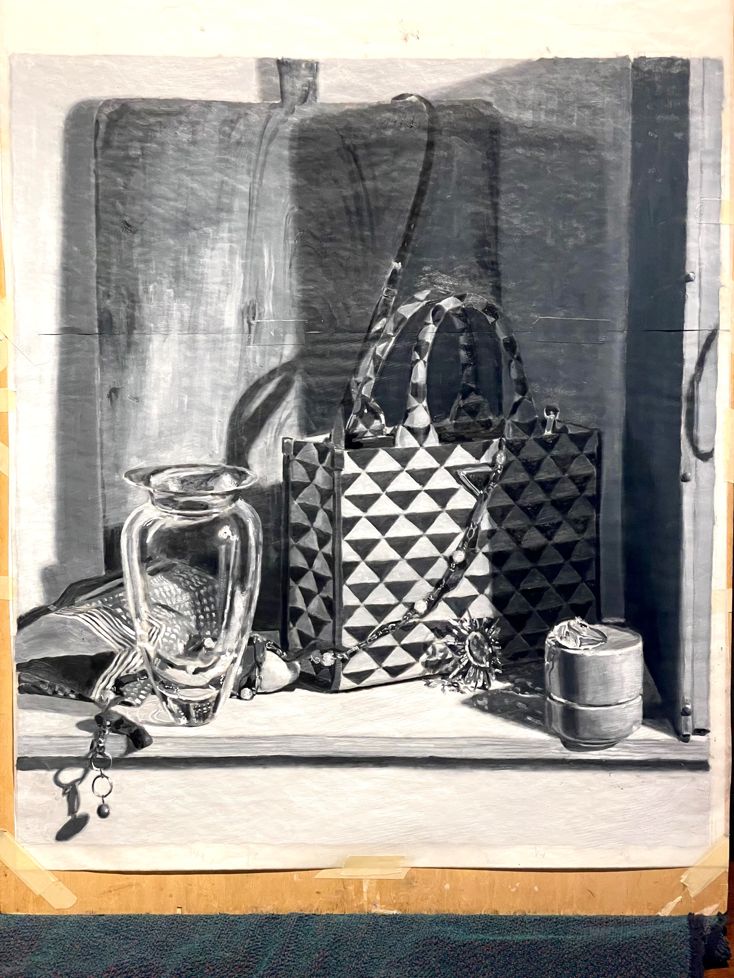
There is a lot of work to do before actual painting commences. First, there is the drawing. This always takes much time and effort. If the drawing isn’t right, nothing that follows will be right. Of course, the more detailed the objects, the more time it takes. This Prada handbag has a very complex pattern. If the bag were a strictly regular shape, it wouldn’t have been so bad, but the fabric is flexible and forms subtle curves- tricky!
I always draw from life, not from photos. You can’t understand forms by simply copying a photo. You always must check reality. Photos can distort and they prevent you from seeing.
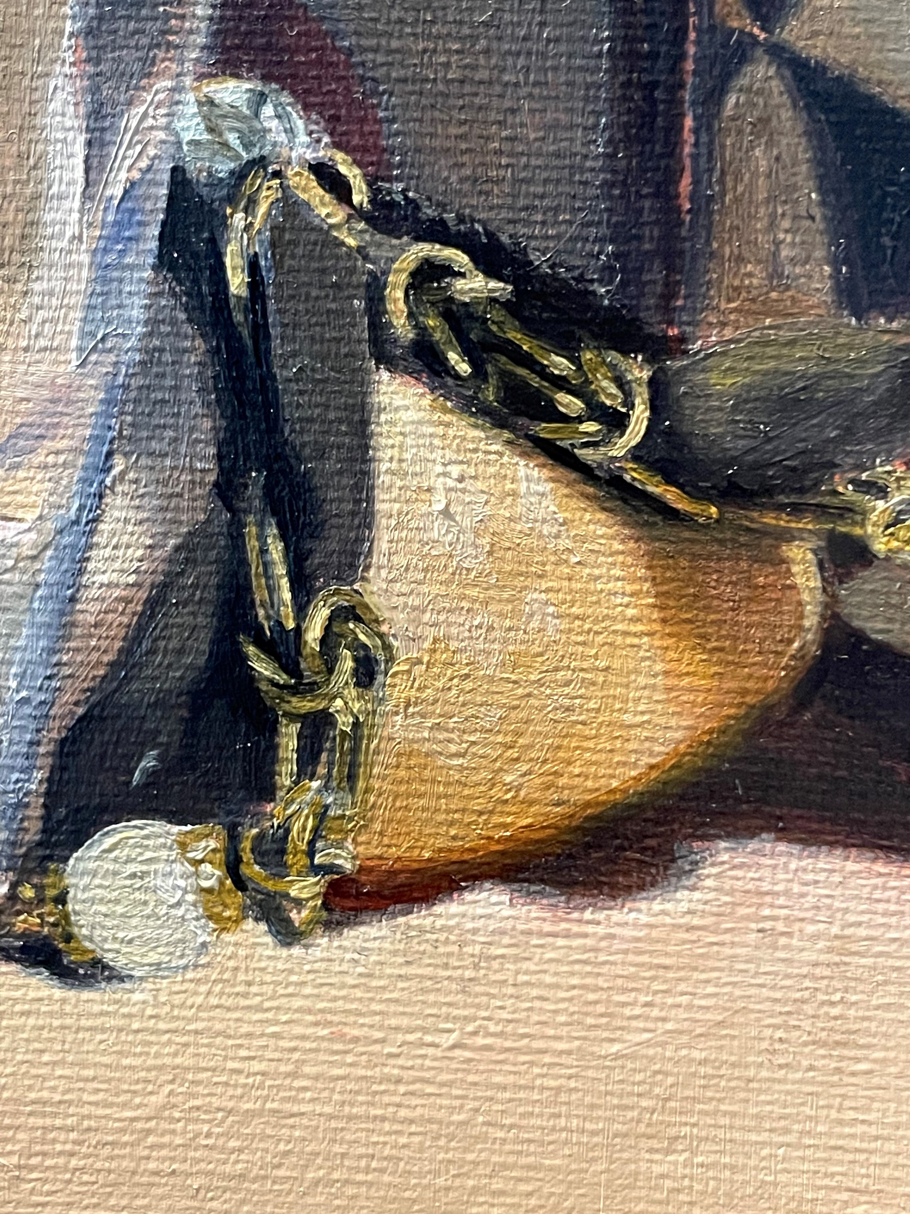
Also, the jewelry is very difficult to see. I had to get very close to study the links in the chain and the way the black ribbon is woven through it.
I use the drawing stage to fine-tune the design of the composition. This is where I choose exact placement of objects, considering every line and angle. I’m not simply copying the set-up that’s in front of me but making sure that there are no confusing alignments or distracting relationships. I take this opportunity to look at the composition in 2 dimensions, as a design, and check that it is working. I might move an object over, enlarge or reduce the size of something, or change an angle. Working from a photo would discourage this kind of fine-tuning, as it’s very tempting just to copy the photo indiscriminately.
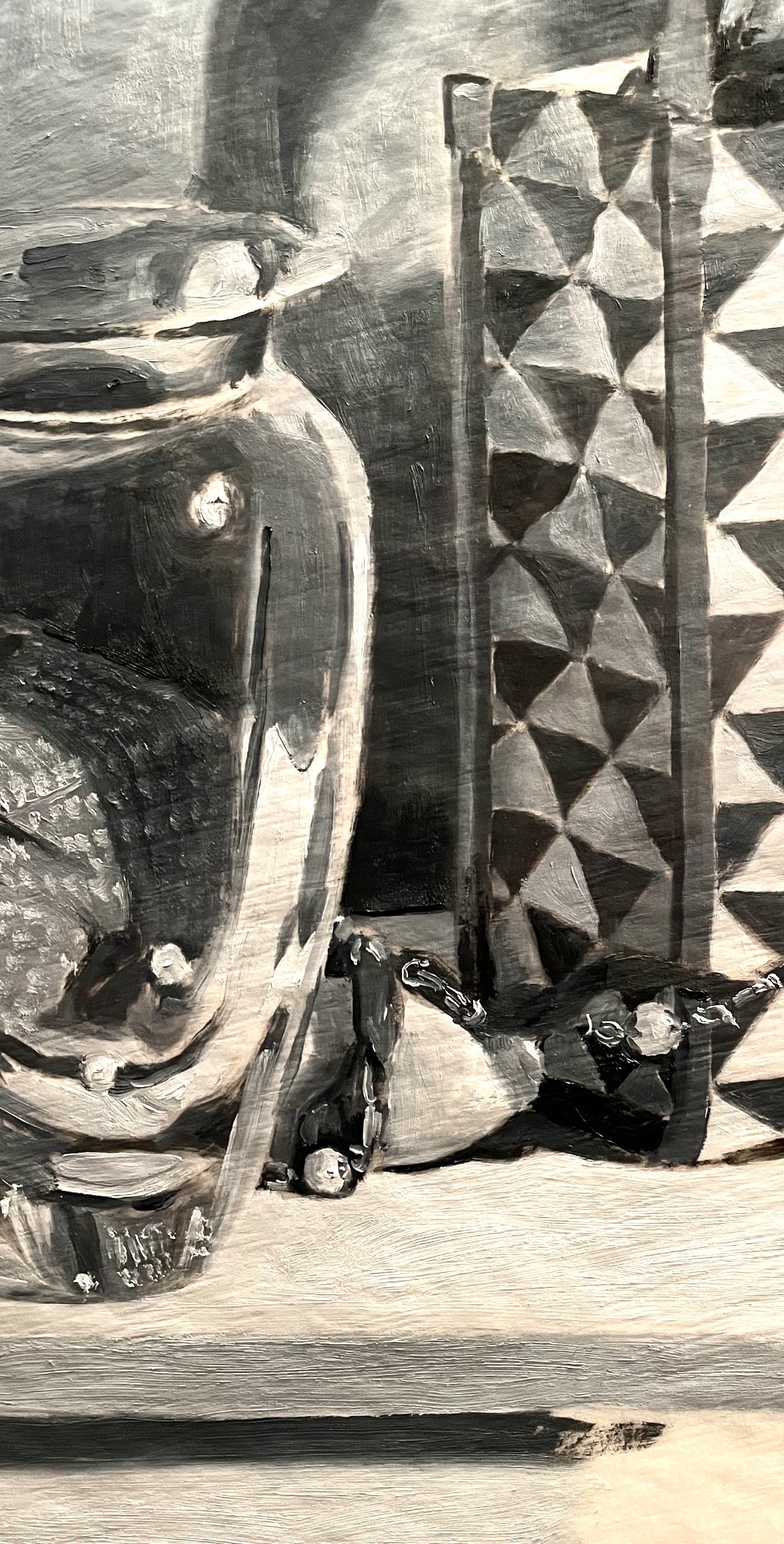
When the drawing is mostly complete, I tape a piece of tracing paper over it and paint a quick study in shades of gray. It’s easier for me to judge the composition without the distraction of color. Above you can see how loosely this is painted
Now, I can easily judge if I need to make any changes to the composition. If I do, I go back to the drawing and incorporate them.
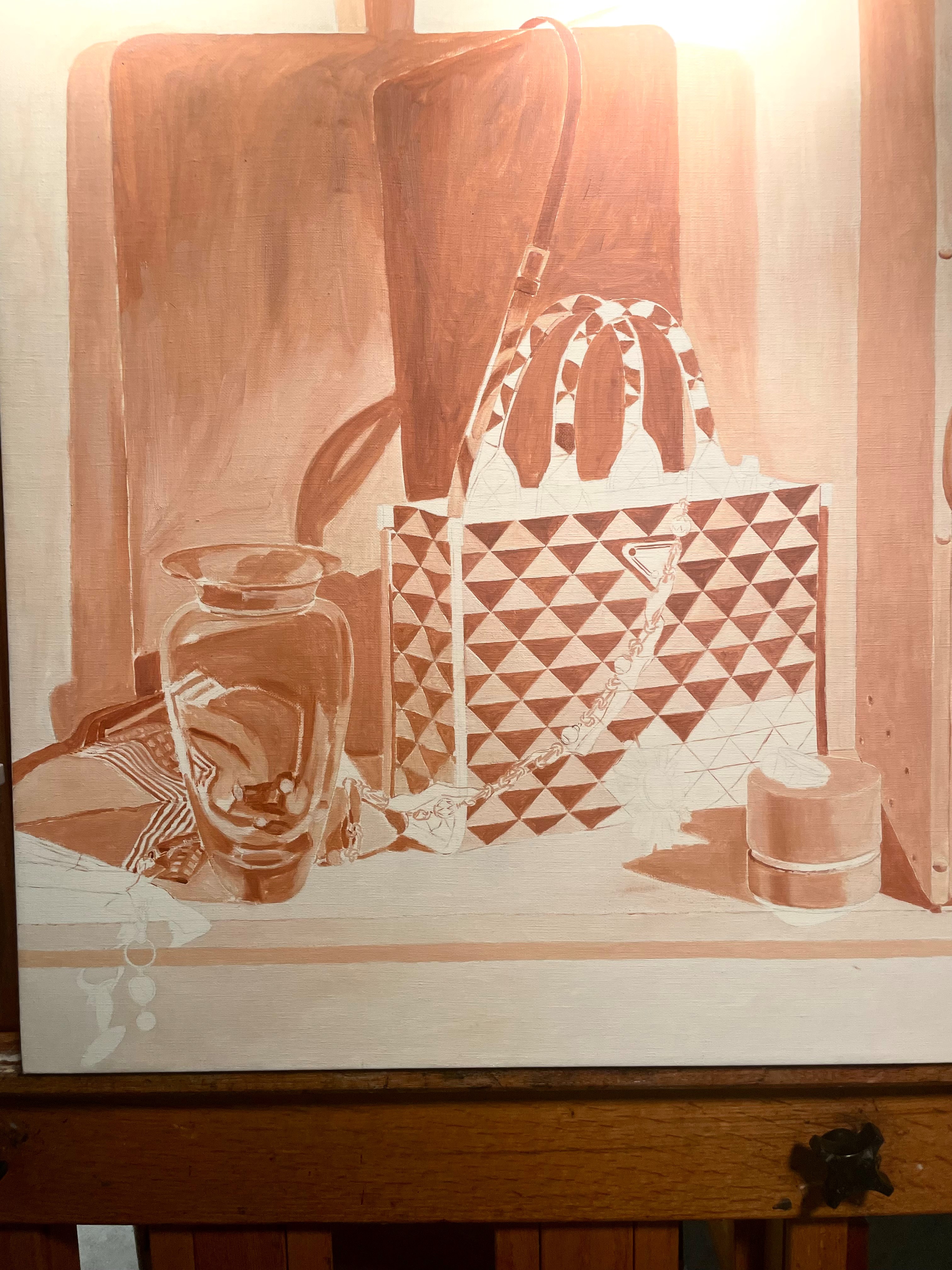
Finally, after transferring the drawing to my canvas, it’s time for the underpainting. I paint this in shades of burnt sienna and lead white in a very thin layer with no visible brushstrokes. It’s meant as a low-stress way to begin painting, as well as giving a unified tone to the whole painting. I paint it in much lighter values than the finished painting will be. I take great care to preserve the drawing by keeping the edges sharp. I also constantly check the set-up instead of merely following the lines I have drawn. Every time I put a mark down, I want it to be in response to what I’m seeing in the set-up. Otherwise, if I merely trace my previous drawing, error always creeps in.
When the underpainting is dry, in a week or two, I’ll begin painting in earnest!