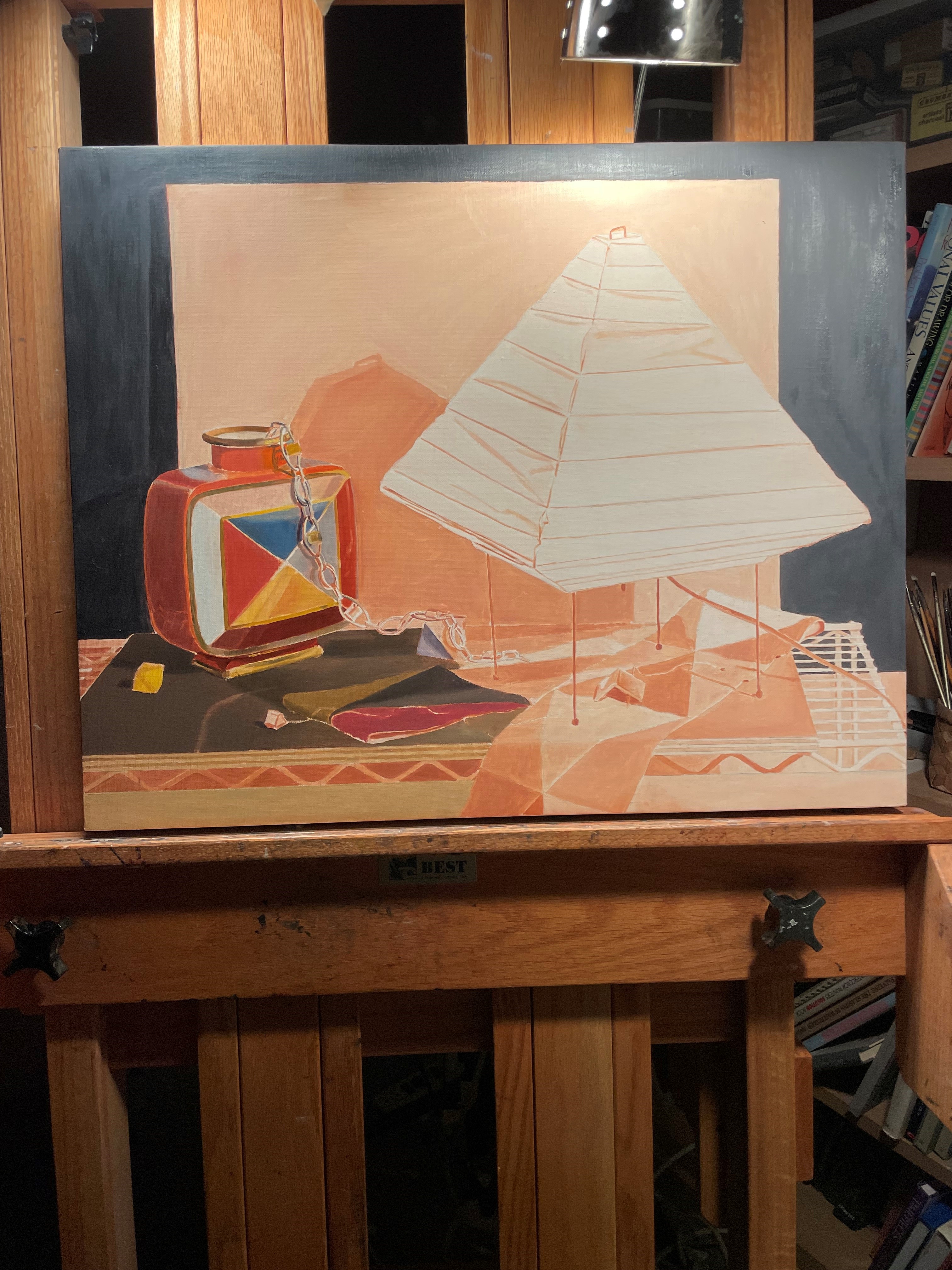
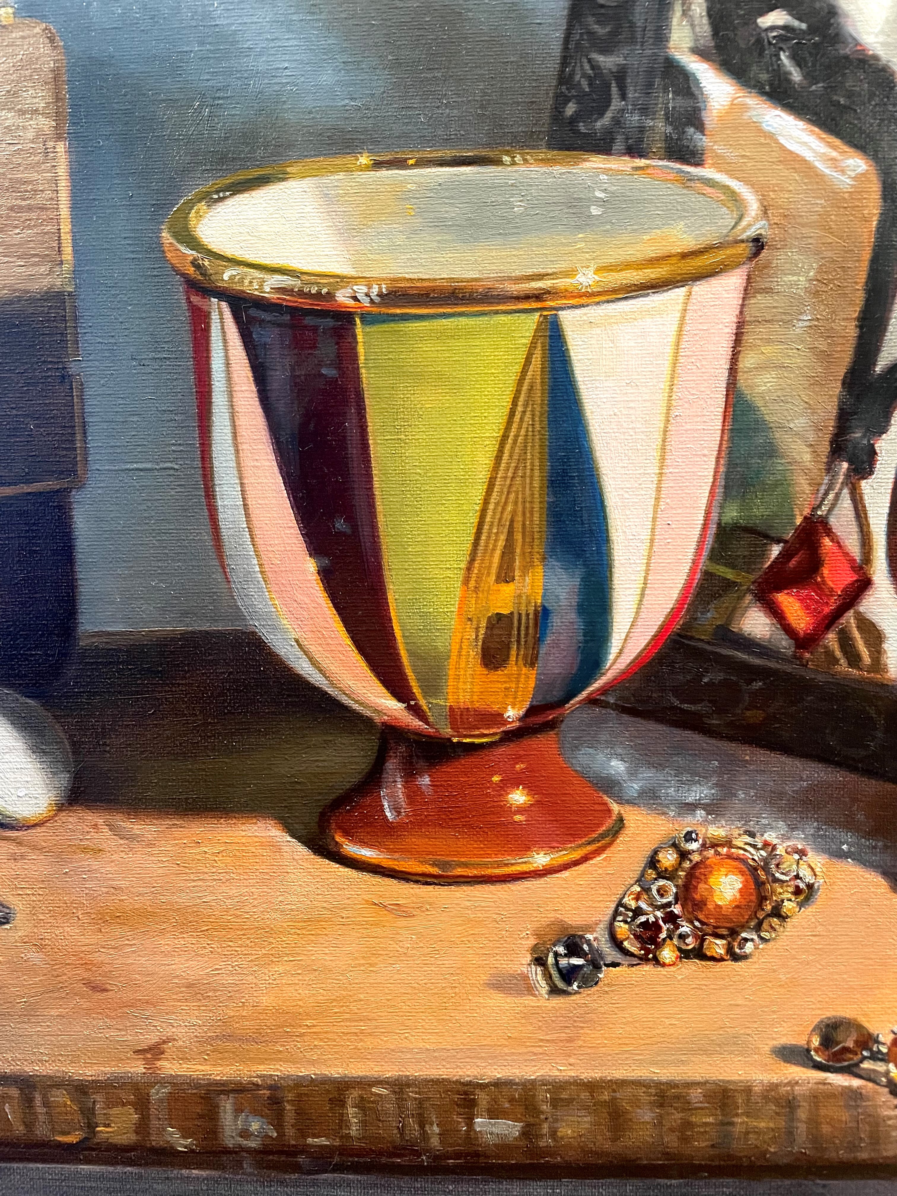
This still life will be the latest addition to my recent series featuring costume jewelry, handbags, and scarves. My starting points were the bag, scarf, and necklace. I liked the way the black triangle on the scarf echoed the black triangles on the bag. I also liked the colors. As a first shot, I simply placed everything on my table with this copper vase, put a drape behind them, and turned on the spotlight. It was promising, but I thought that maybe I needed something in a lighter value to add contrast.

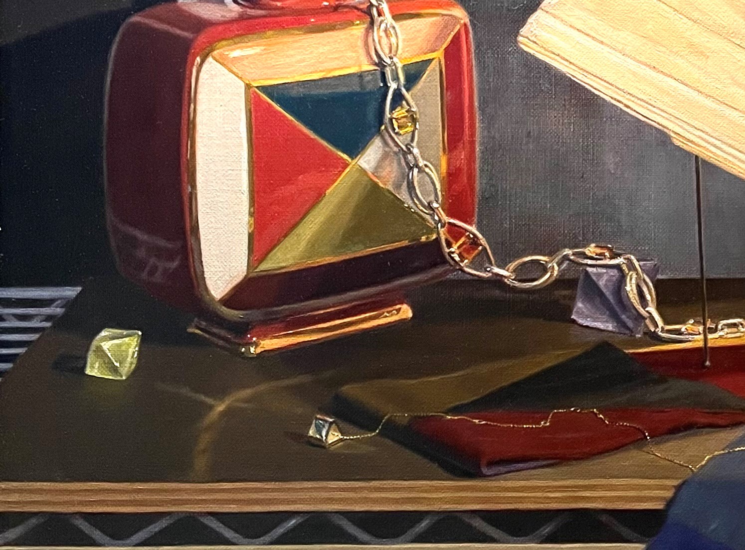
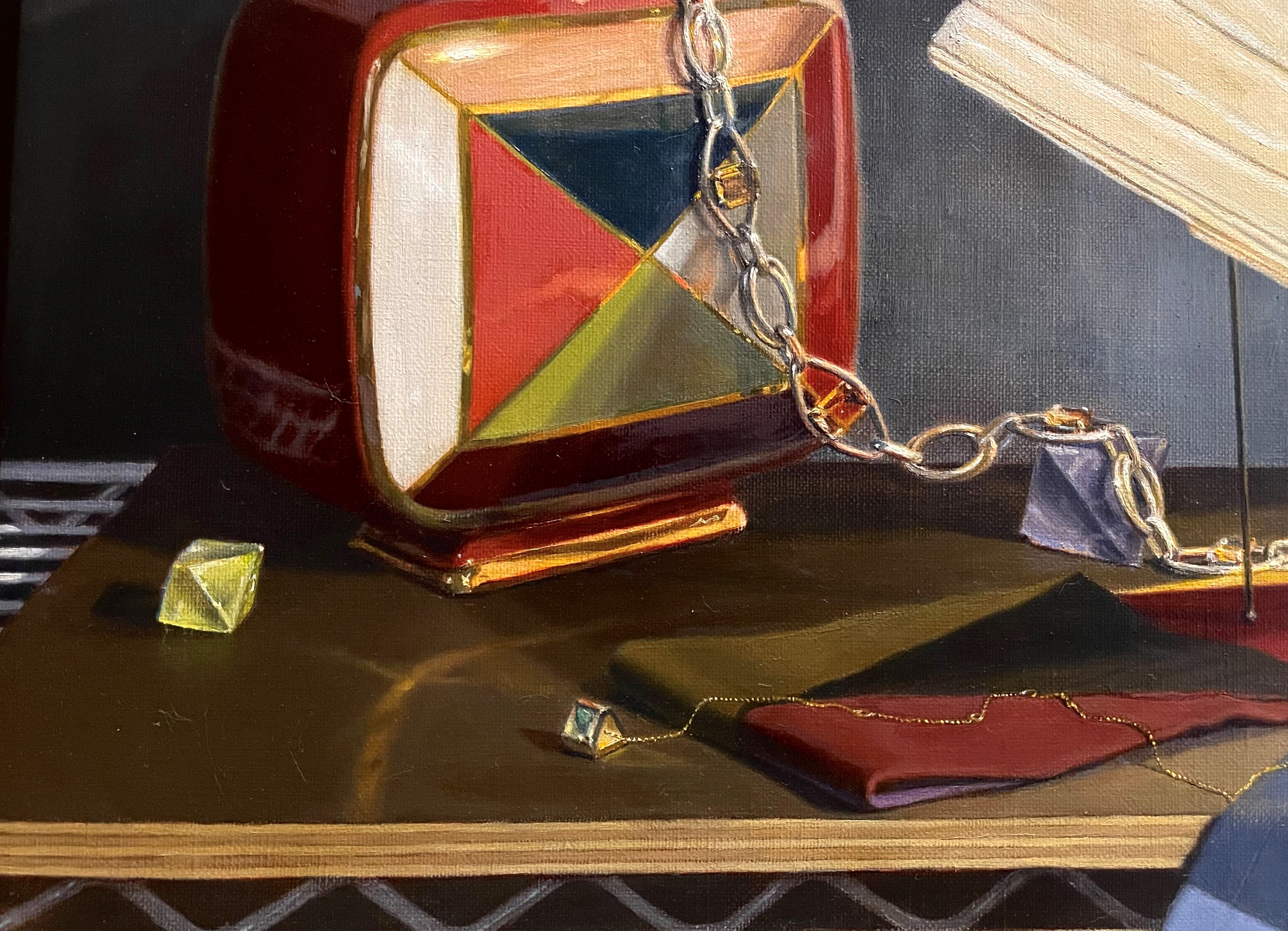
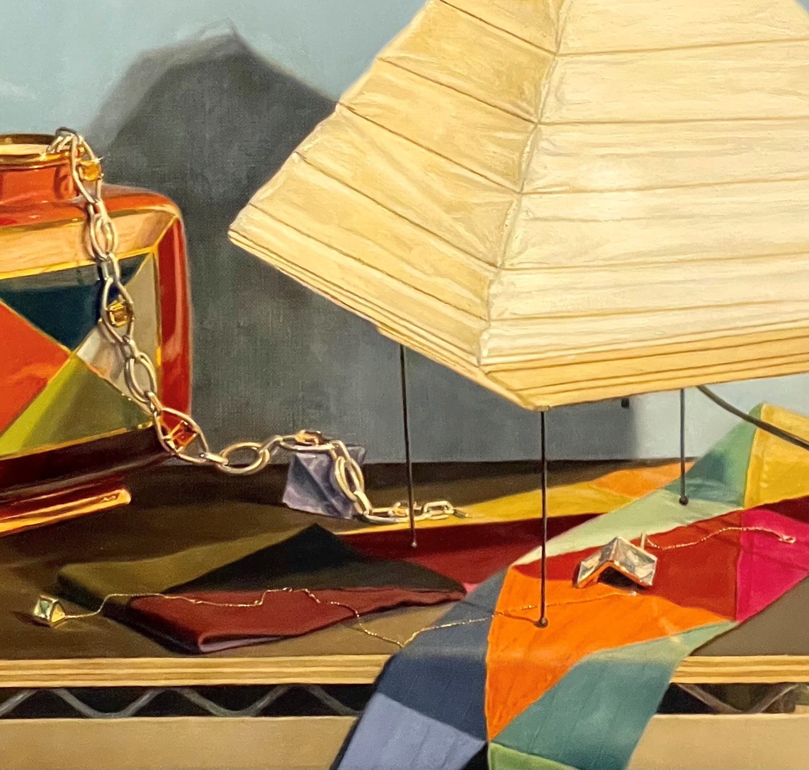
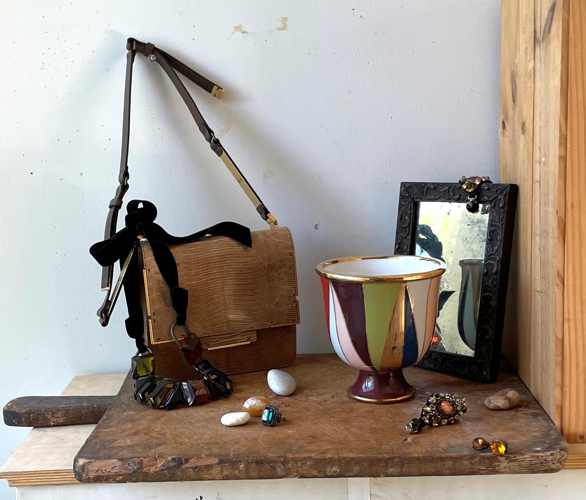
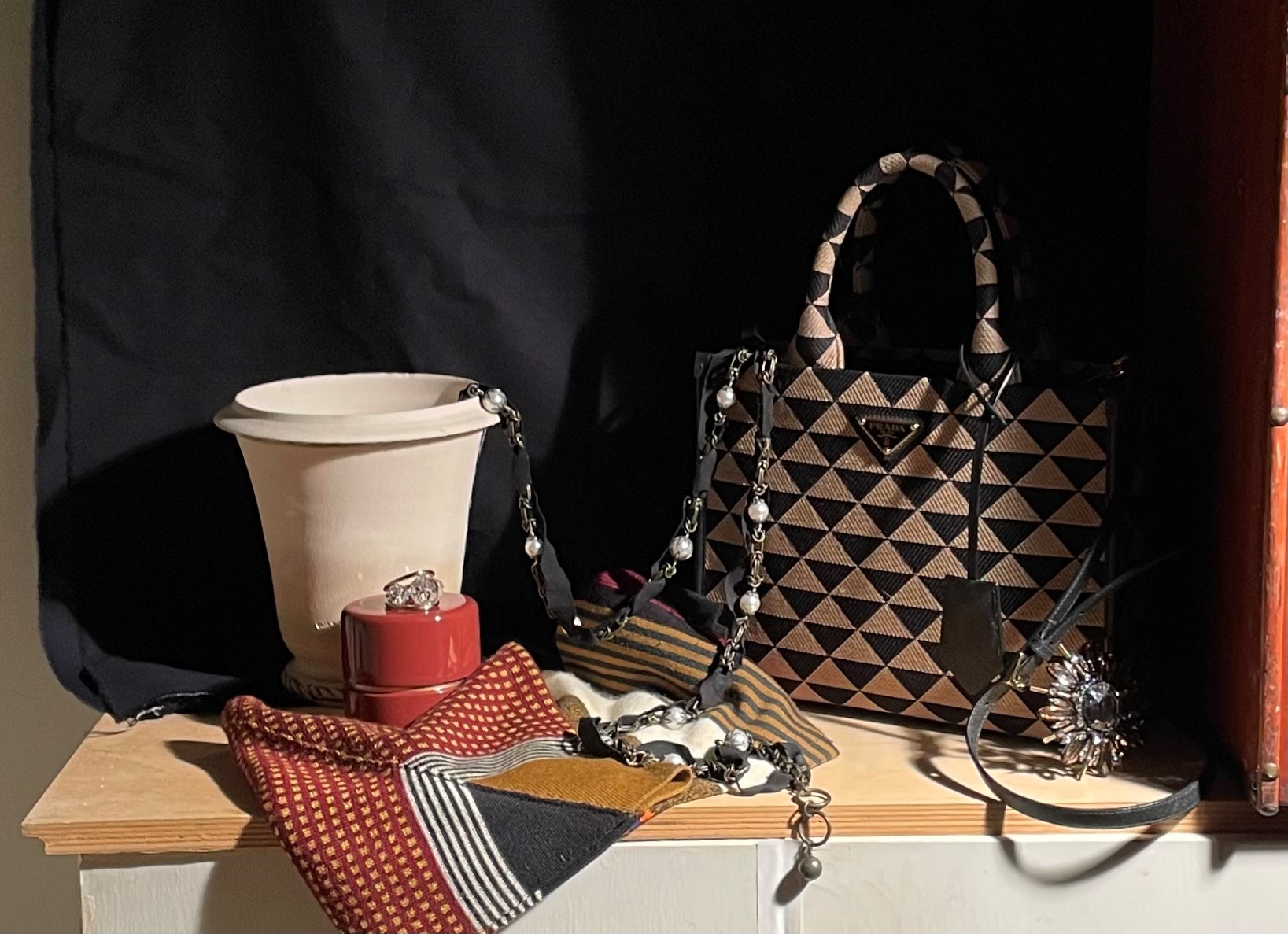
Below, I switched out the copper vase for a light tan clay pot. I also added the box on the right to cast a shadow. I draped the necklace and added the orange jewelry box and ring. I liked the cast shadows. I wondered what the composition would look like vertical instead of horizontal.
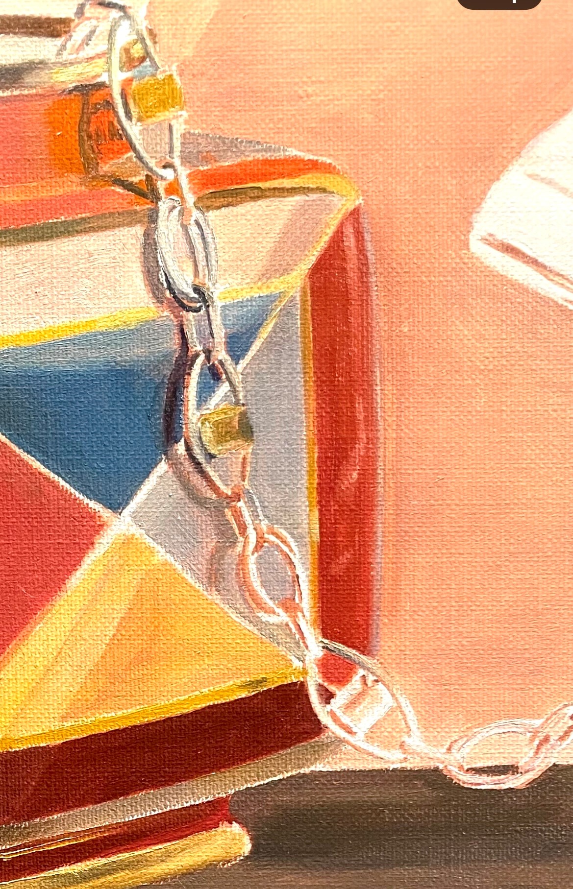
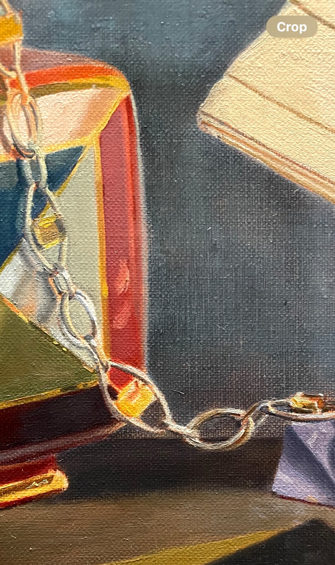
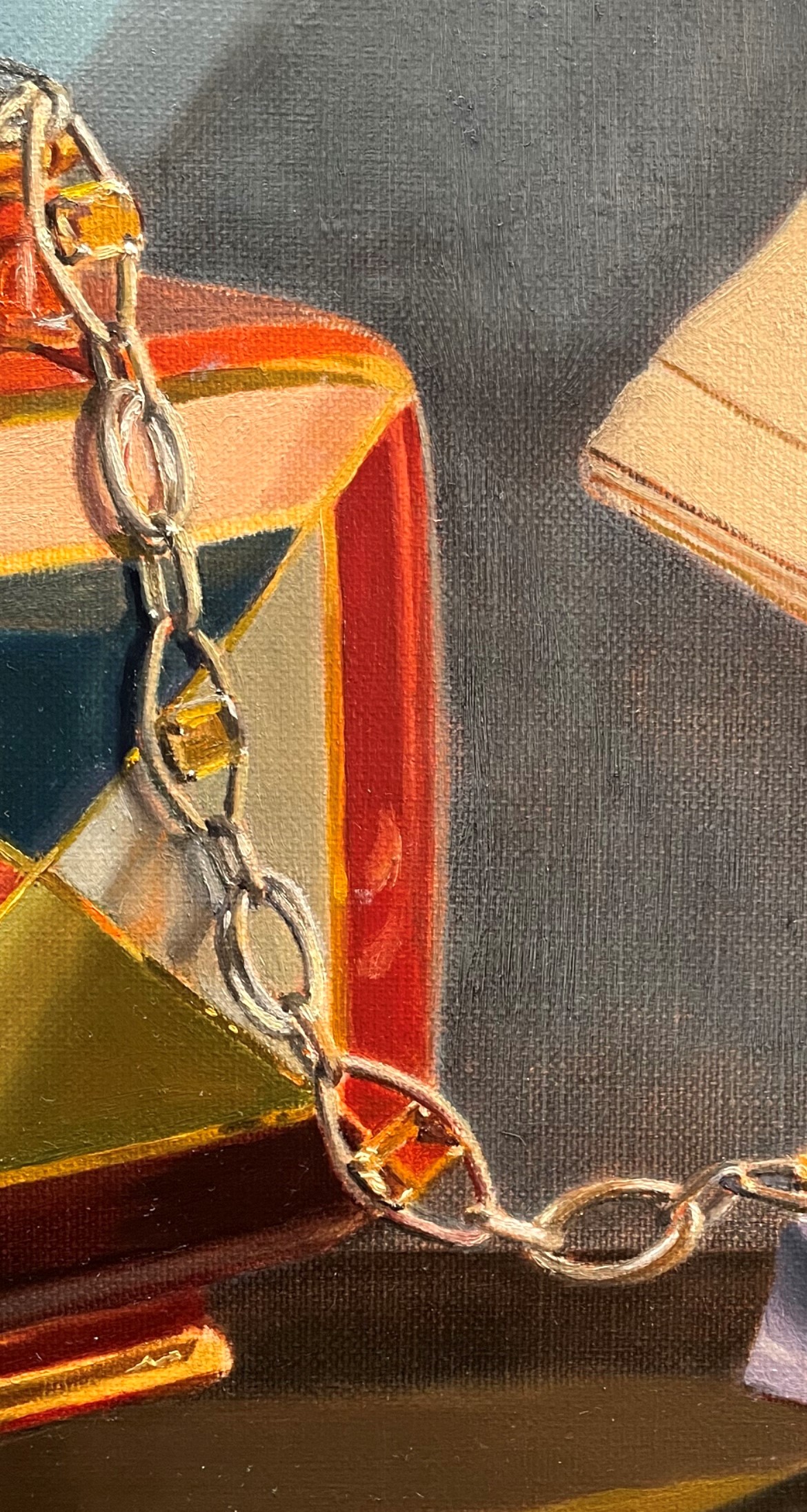
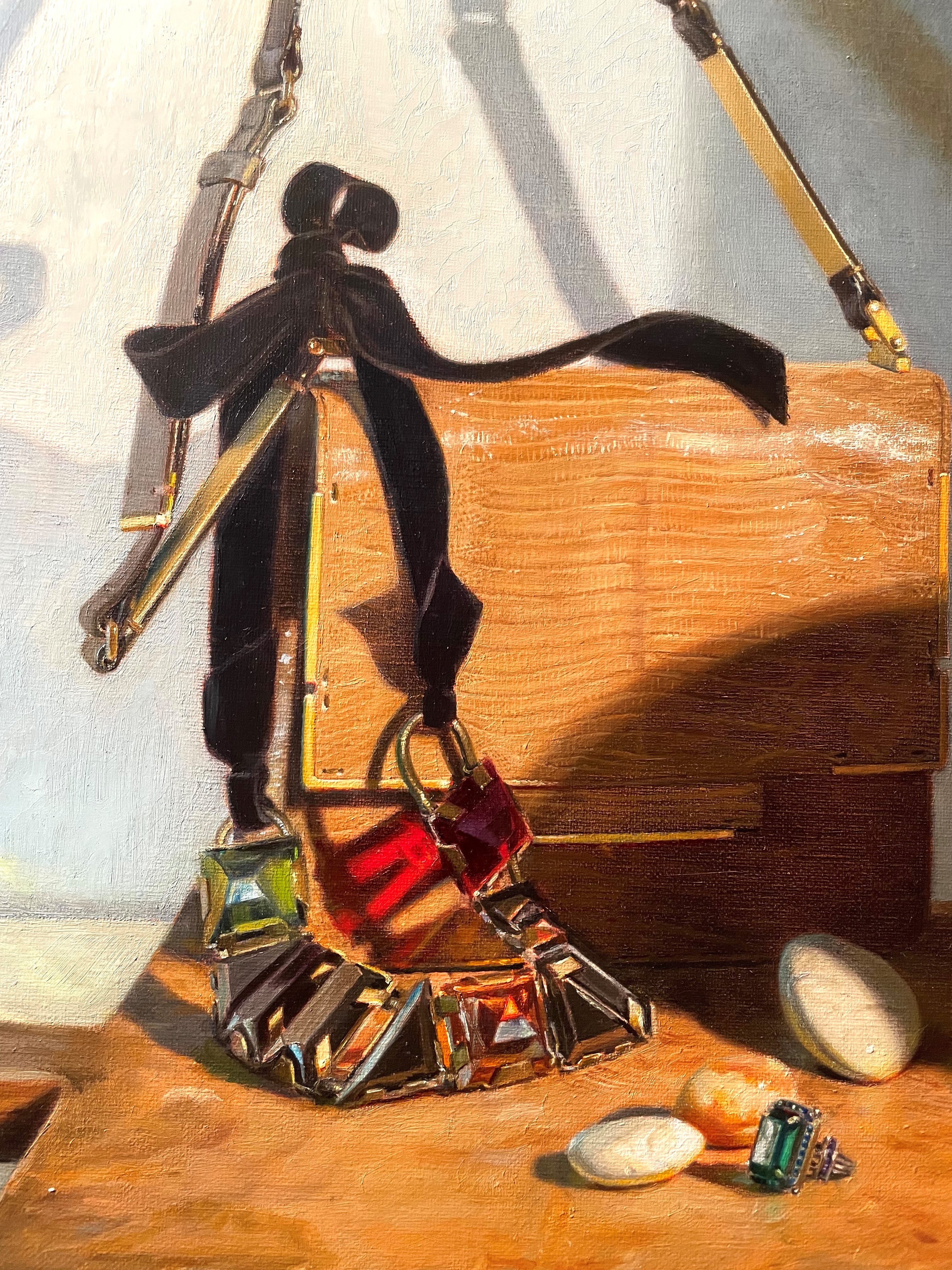
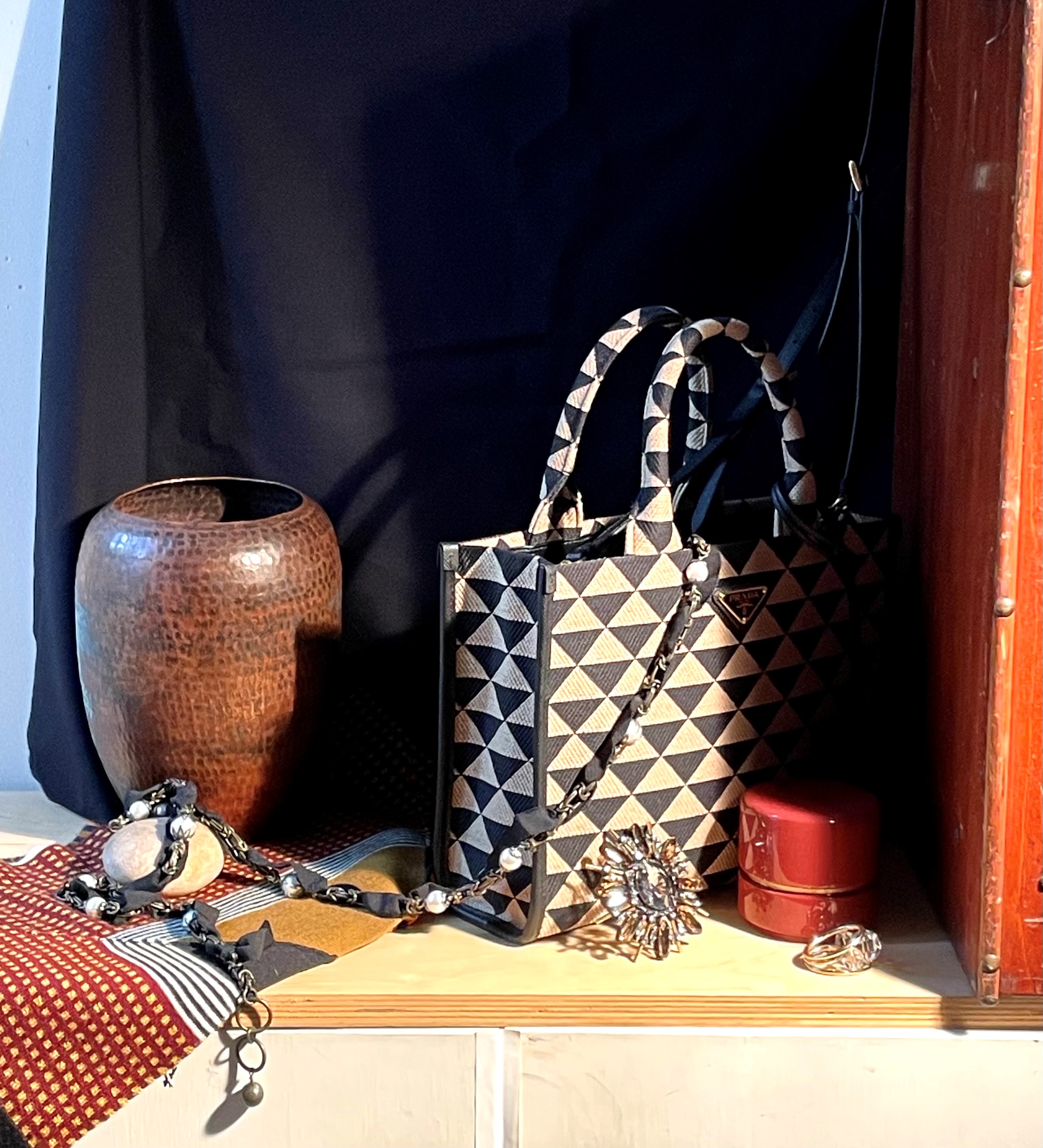
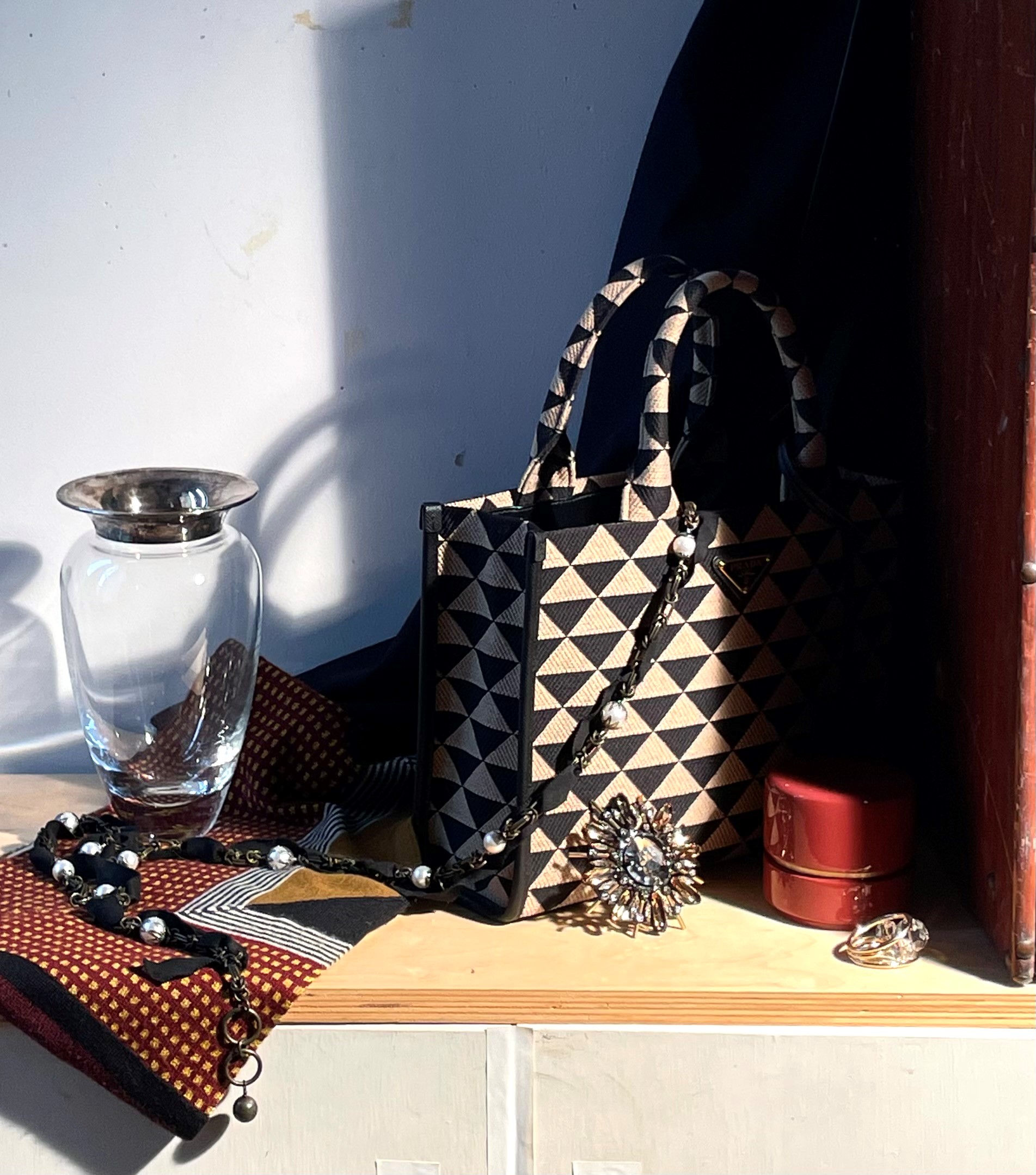
Below you can see what this looked like. I prefer the necklace draped this way. I think that it looks more natural and serves to unify the bag with the scarf and necklace. I also draped the handbag’s shoulder strap up to the right.
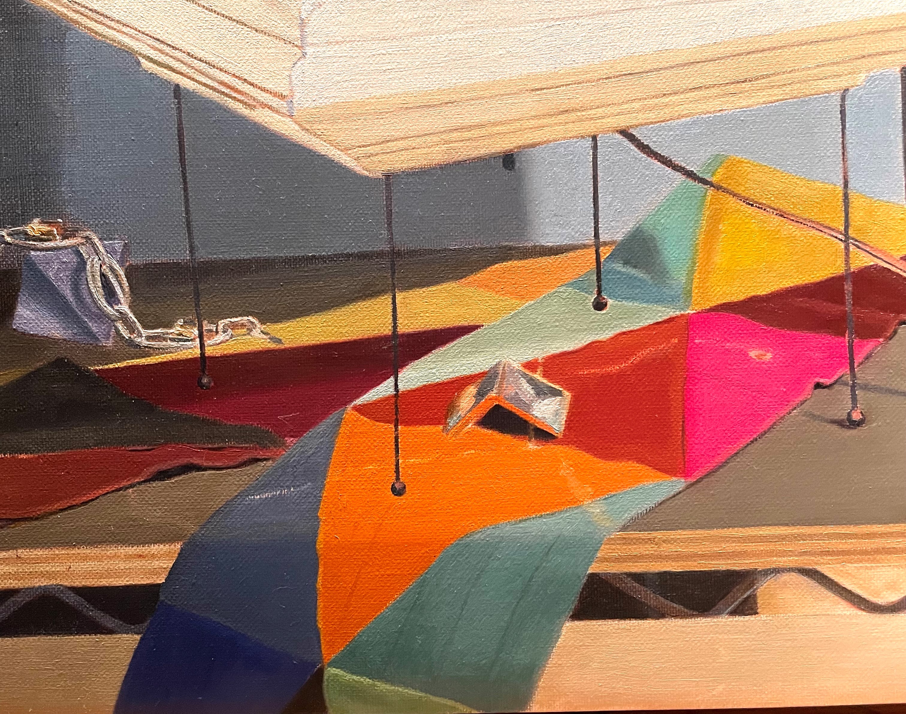
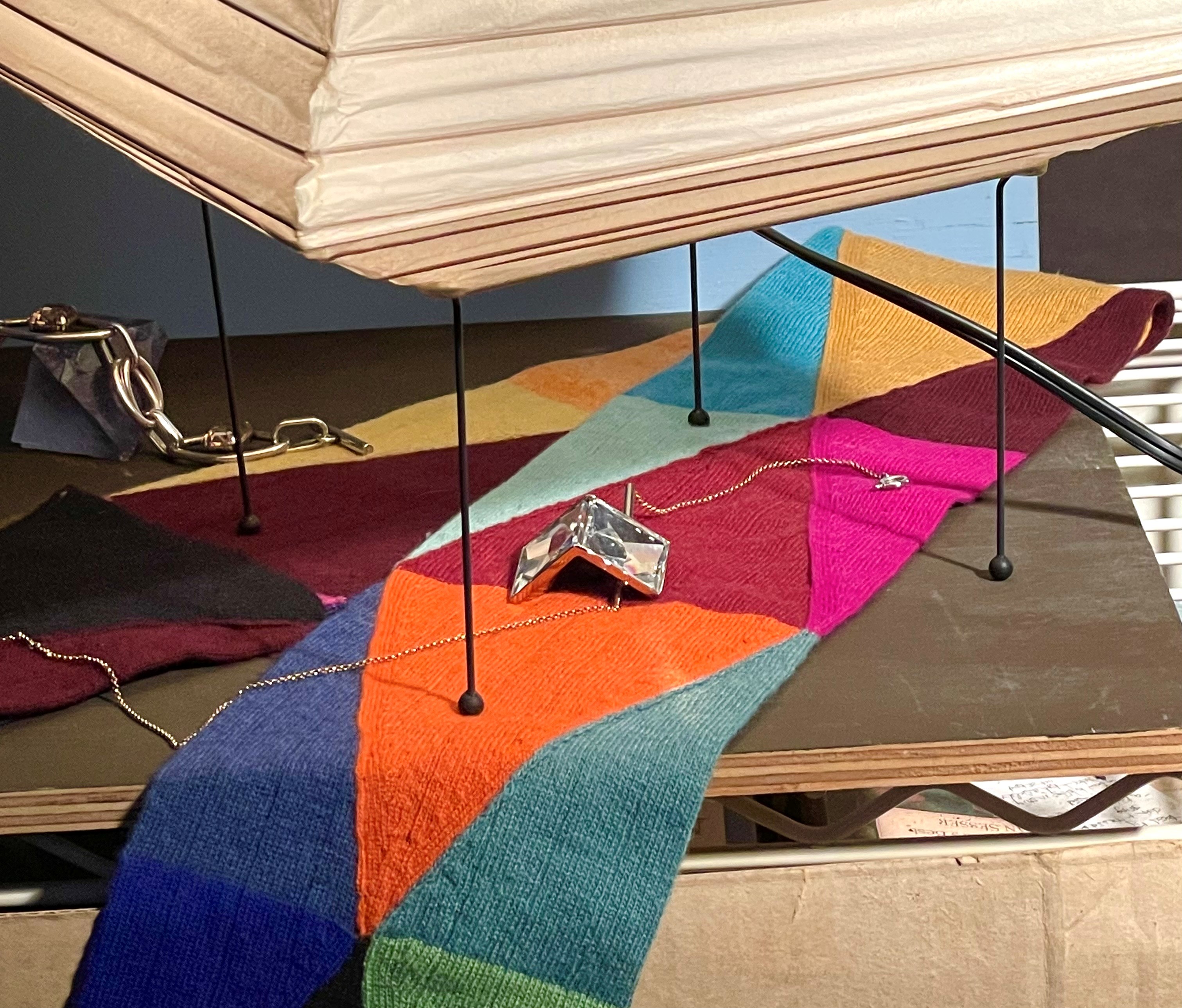
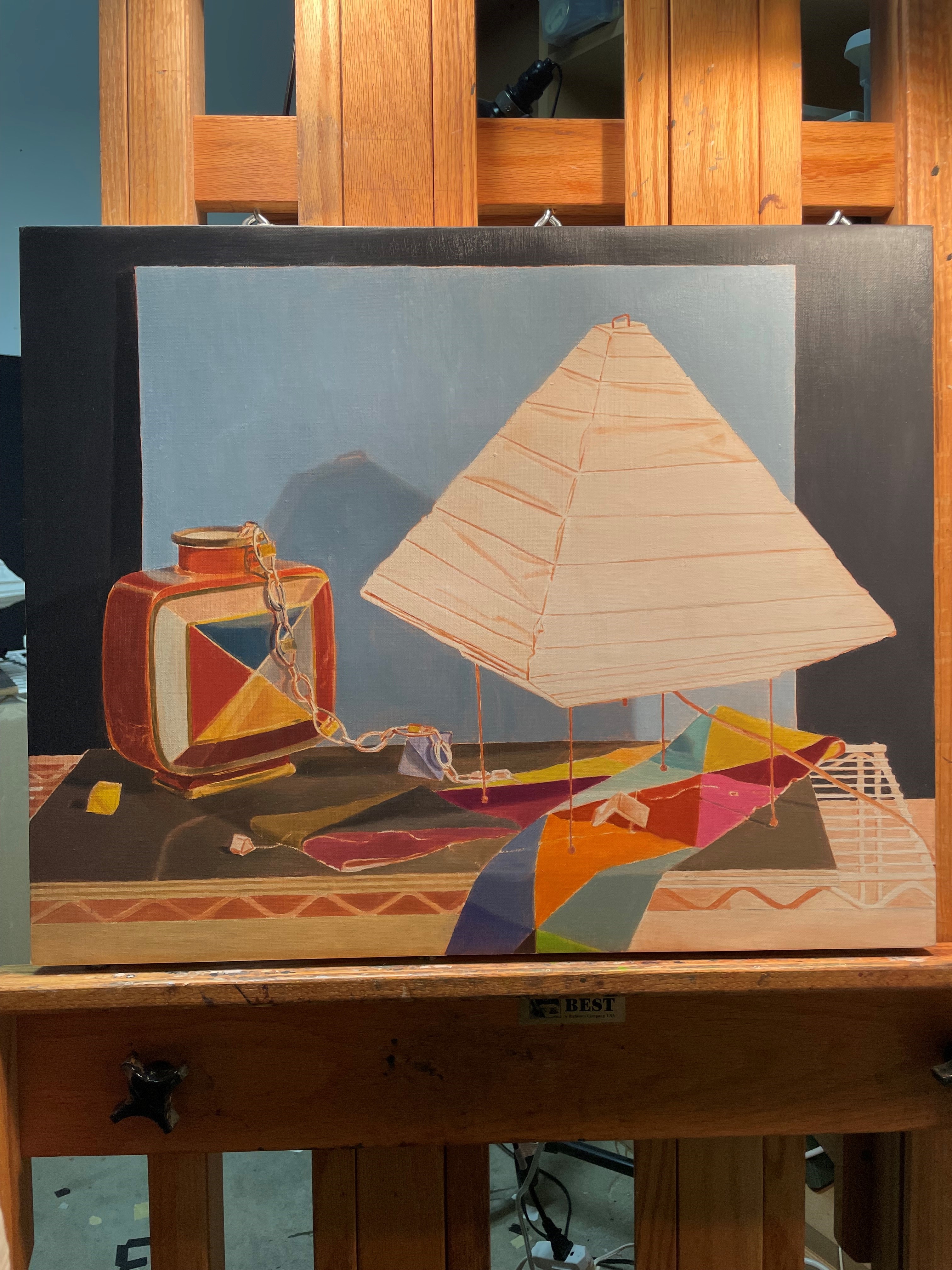
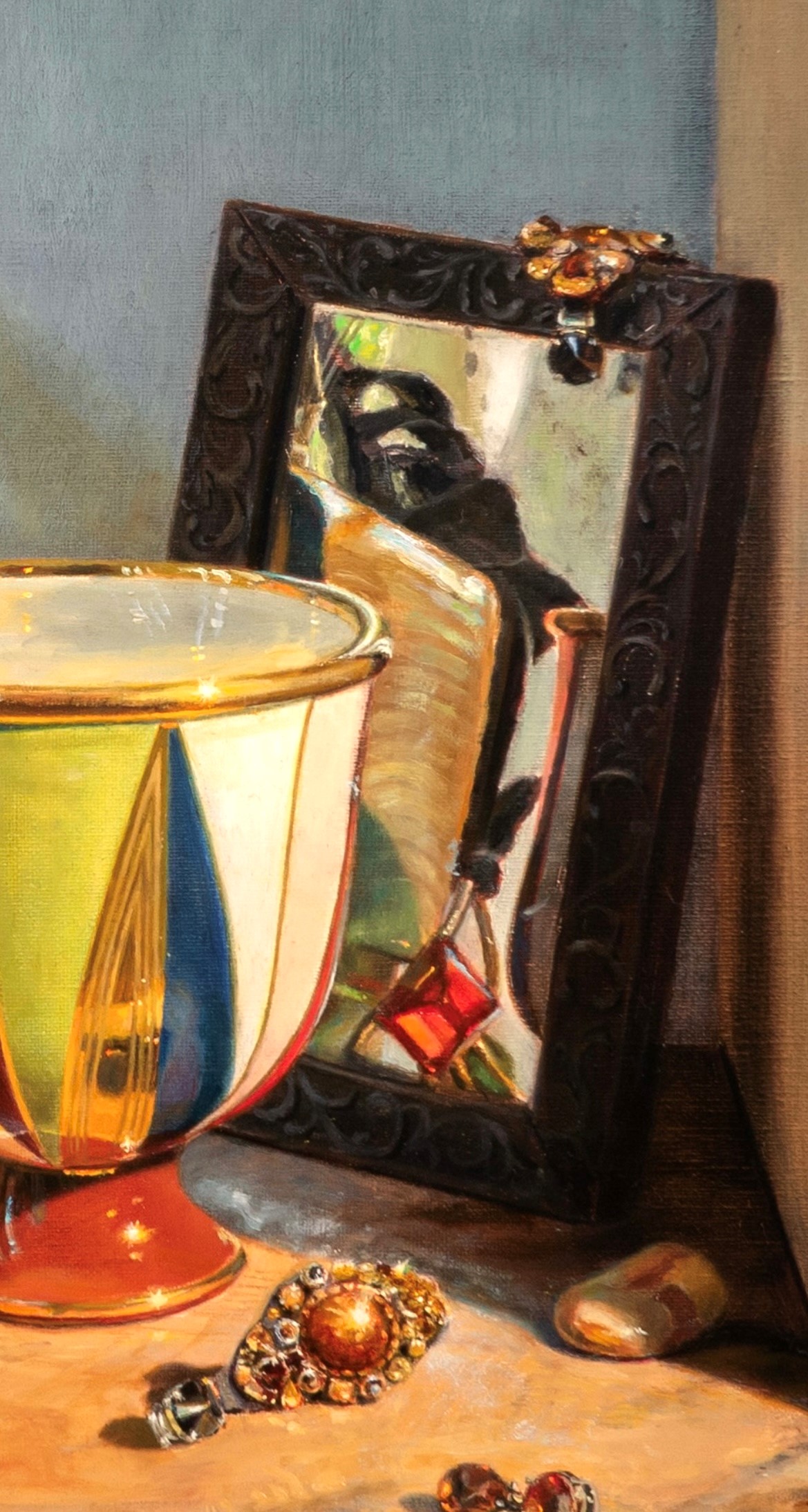
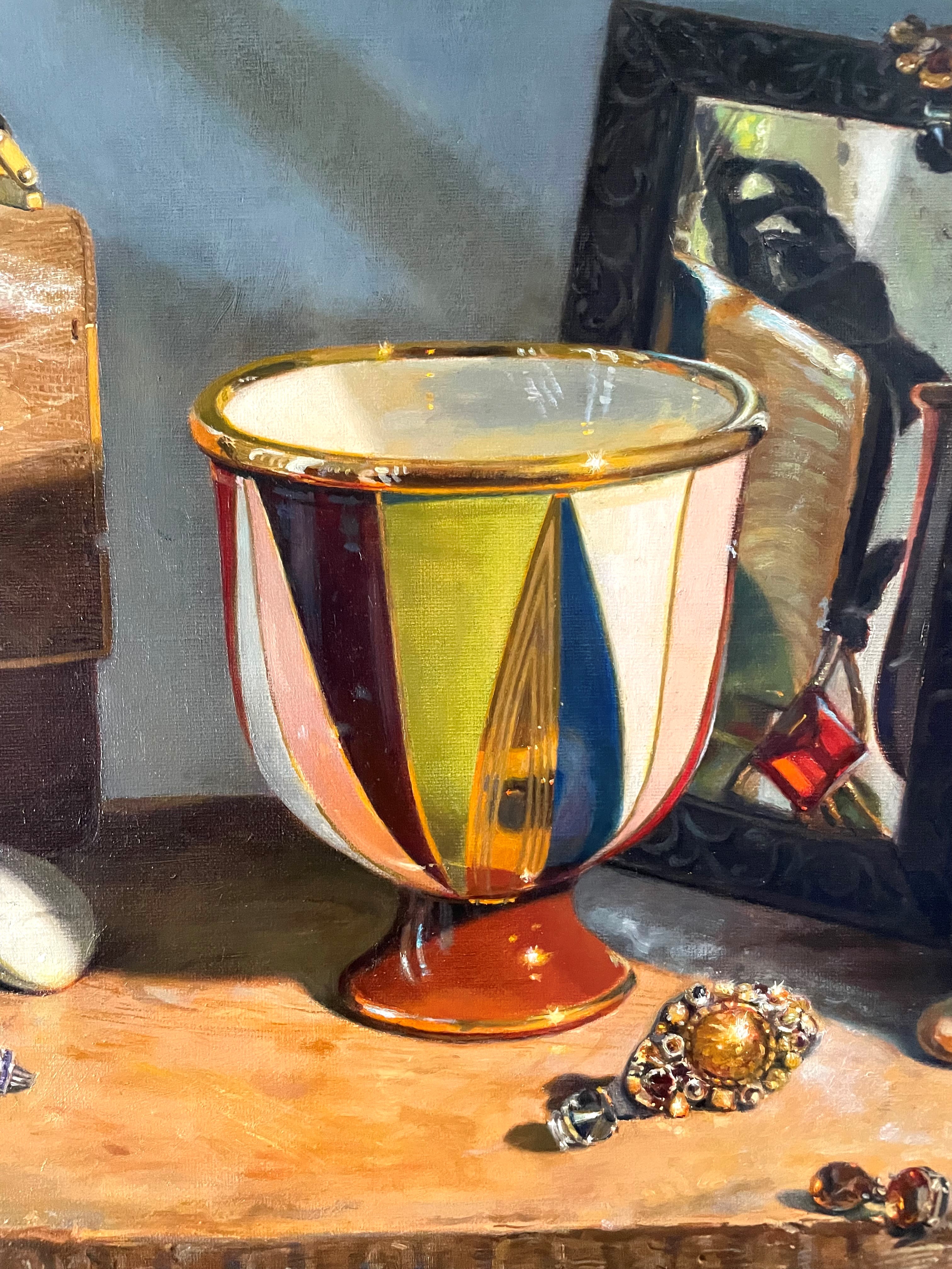
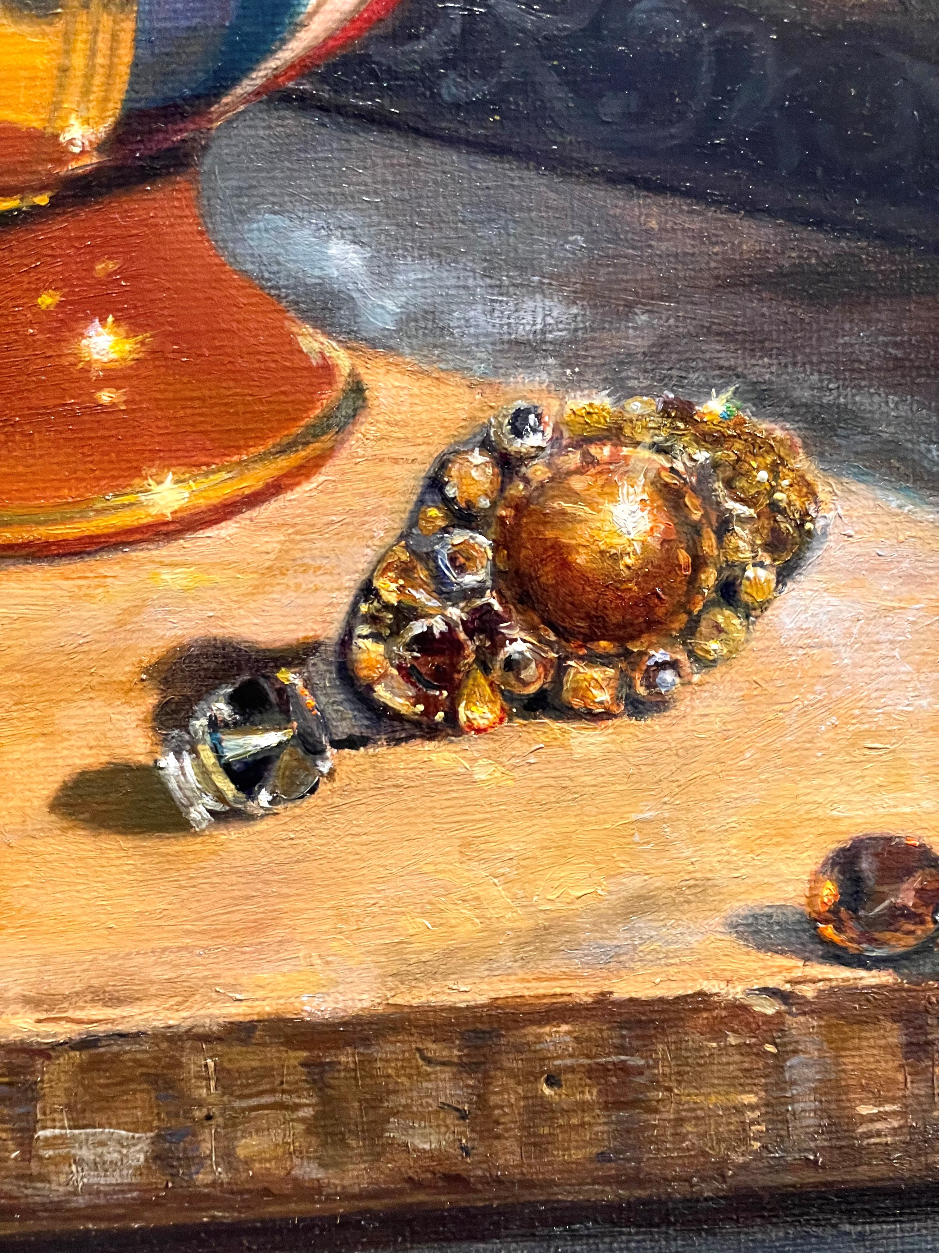
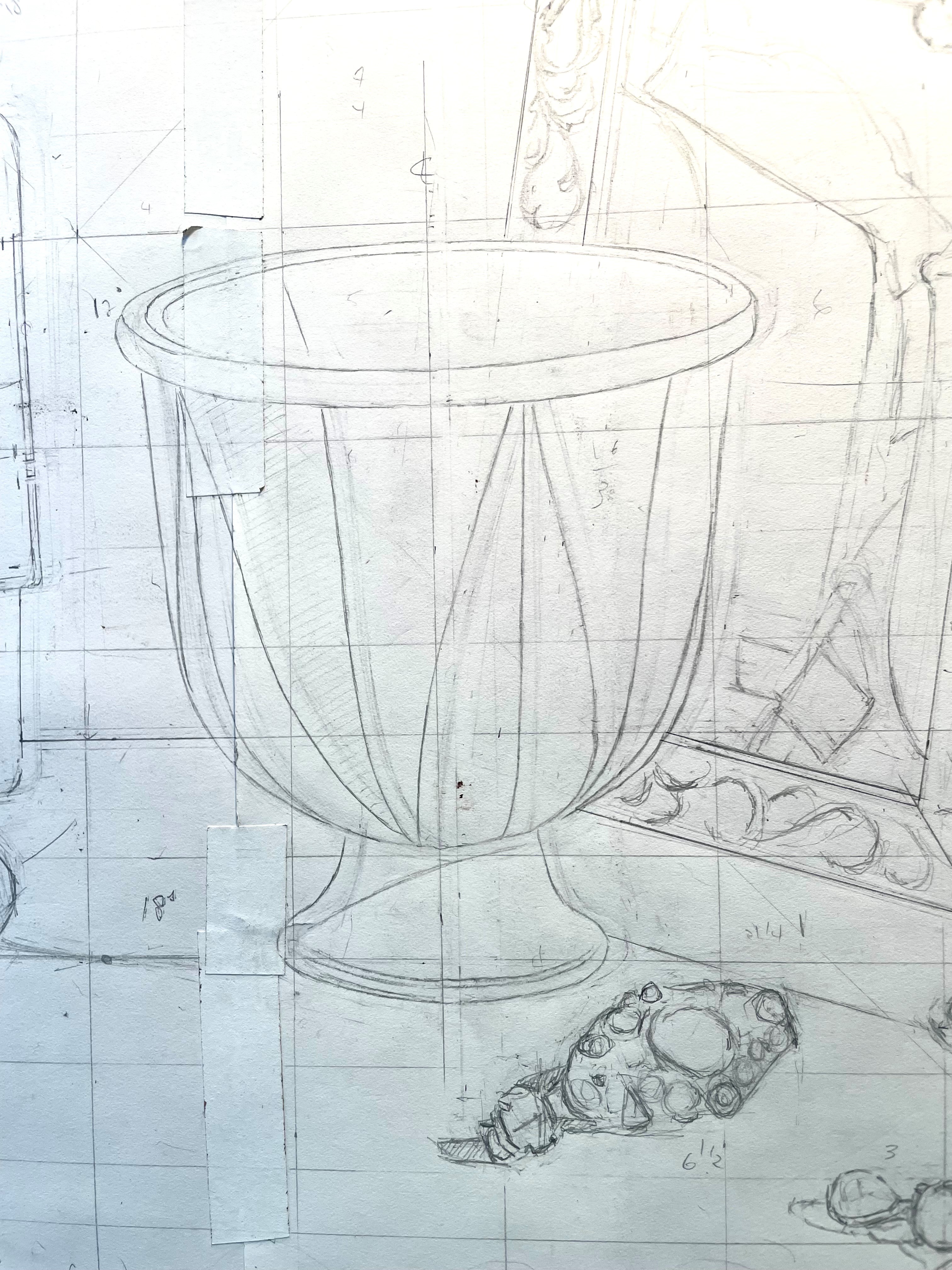
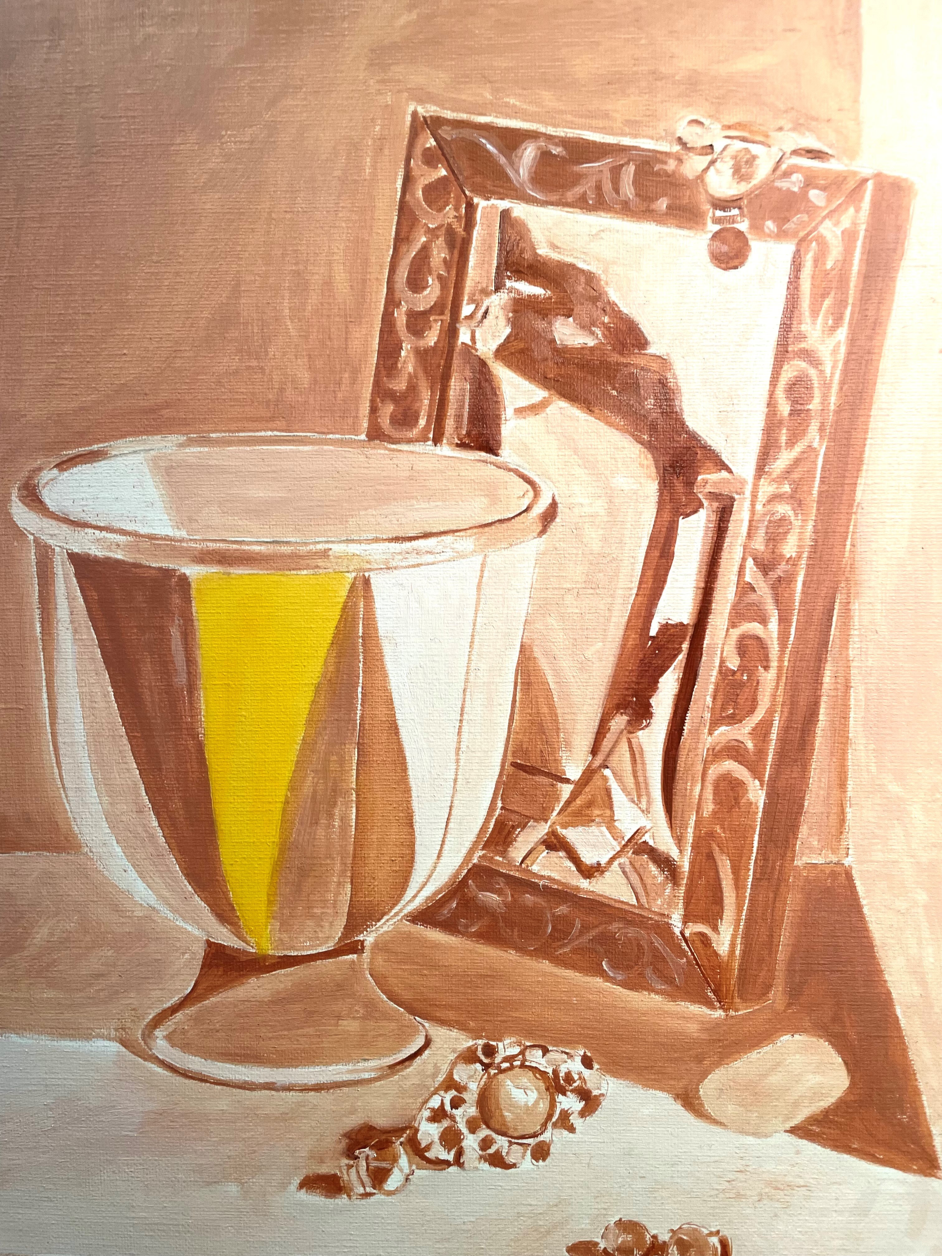
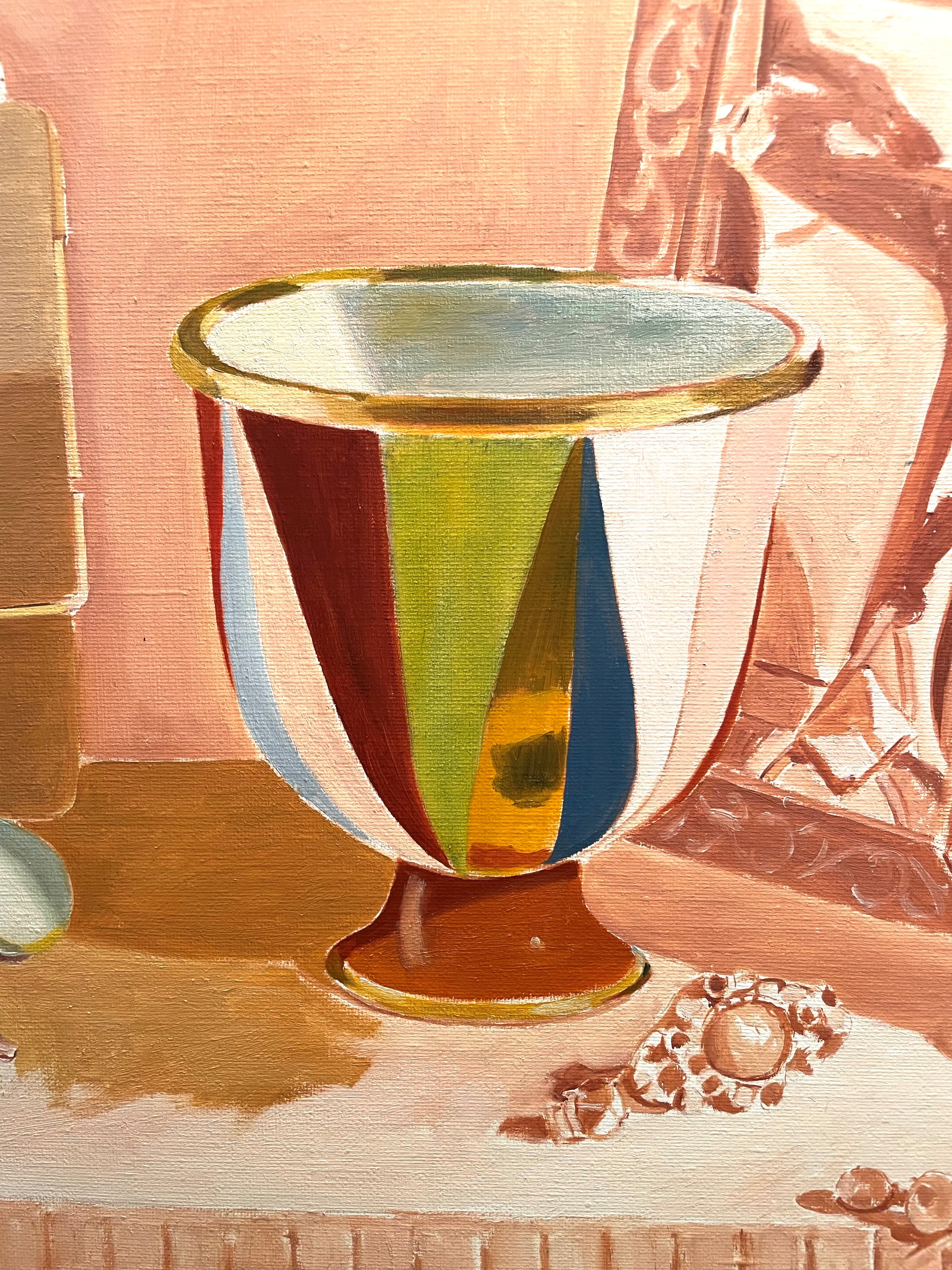
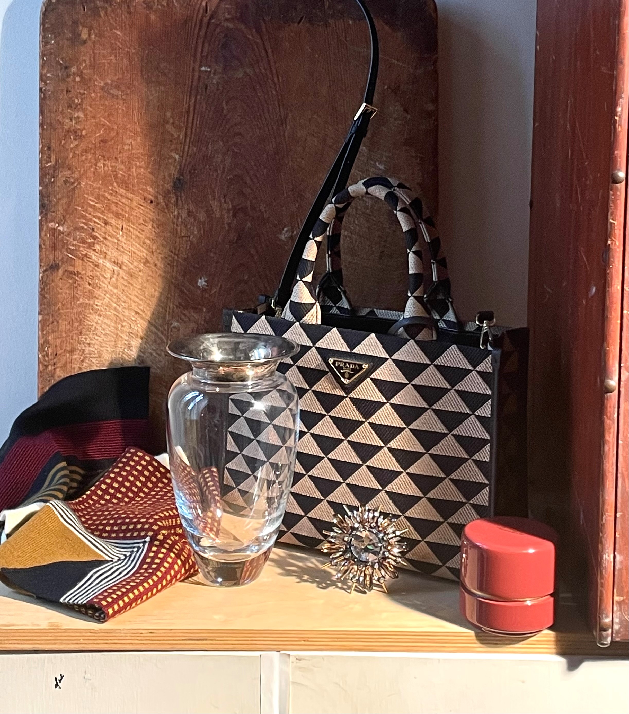
I thought that maybe the black drape looked too heavy, so I took it out and replaced it with an antique cutting board. I also thought that a clear glass vase might lighten things up. I experimented with taking away the necklace. I really liked the complicated shadow cast by the crystal brooch. You can see this change below.
It all seemed a bit crowded. I took out the cutting board and moved the vase and re-arranged the scarf.
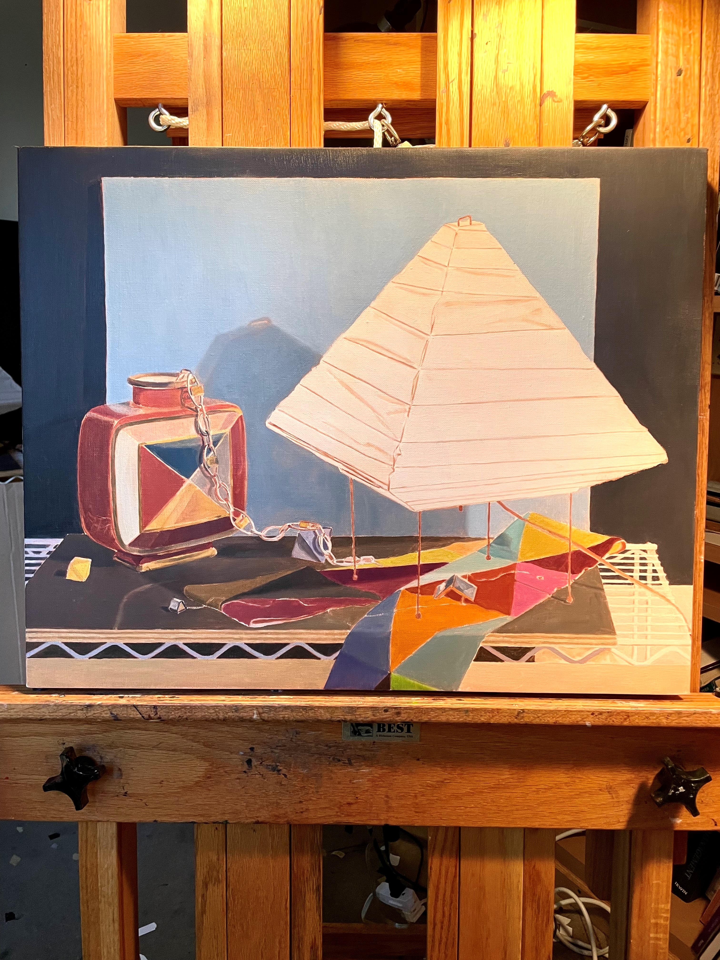
I thought that I liked the set-up with the cutting board more. I put it back, leaving the glass vase over to the left, not in front of the bag, as it was in the last iteration with the board.
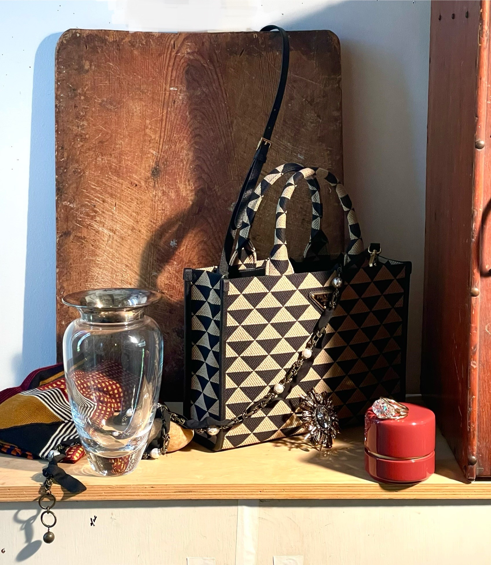
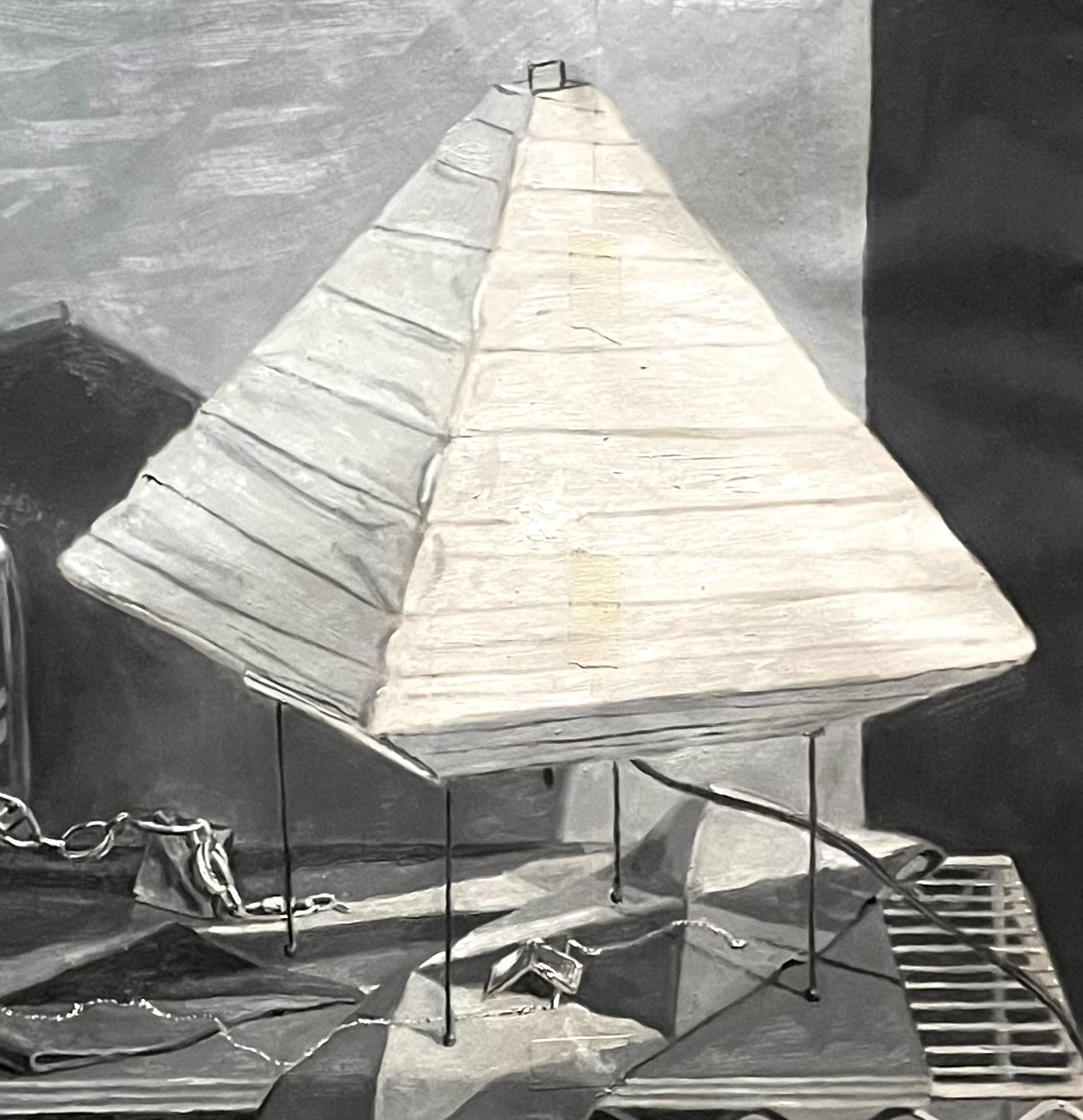
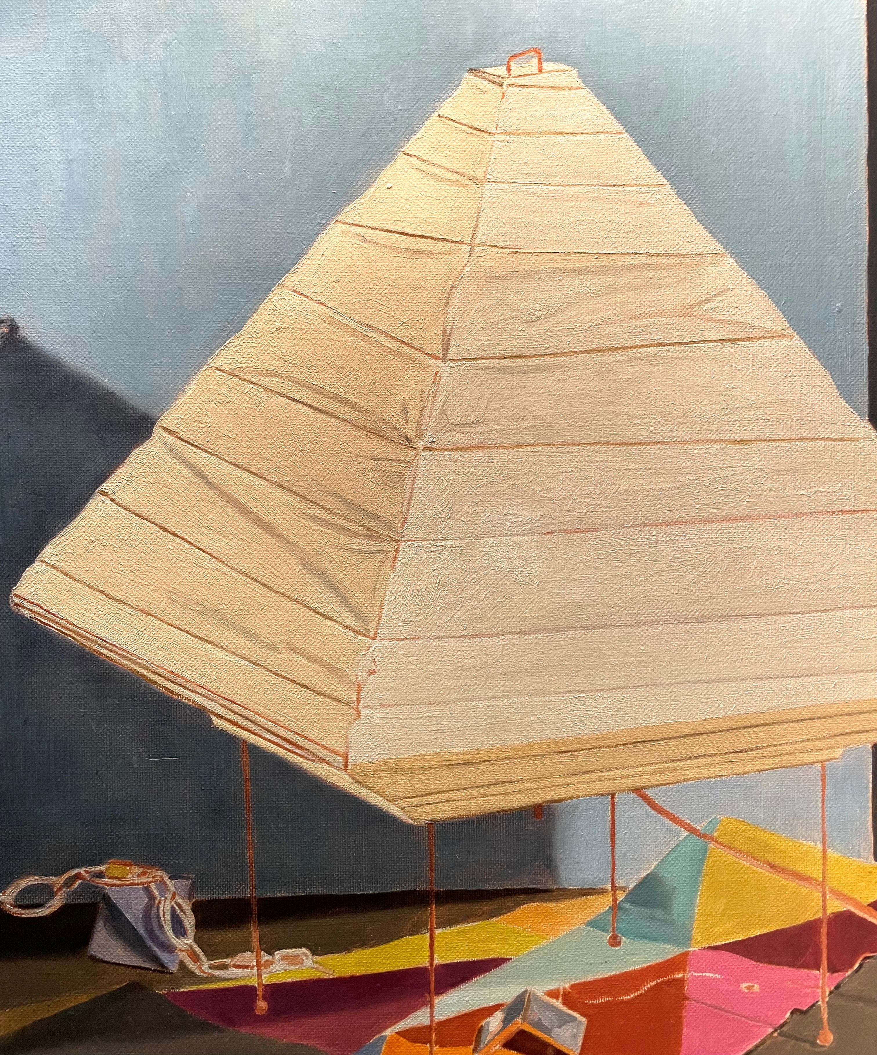
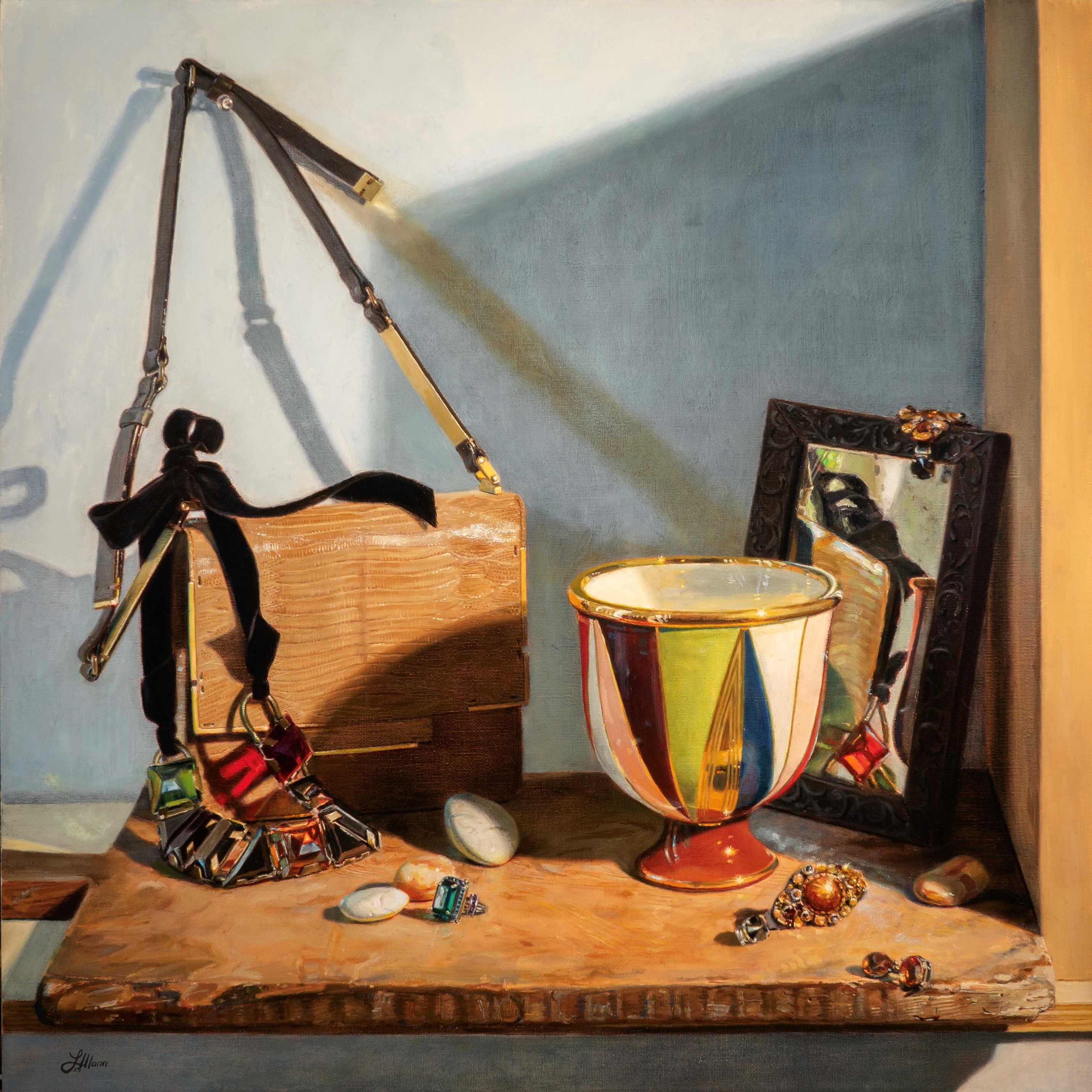
I really like this. I like the cast shadows and the way they echo the sweep of the necklace and strap. I also like the natural light coming in from the window on the left side and all of the reflections cast by the jewelry. I like the way the composition is both dynamic and integrated. I’ll do a drawing next and see if I need to make any adjustments.