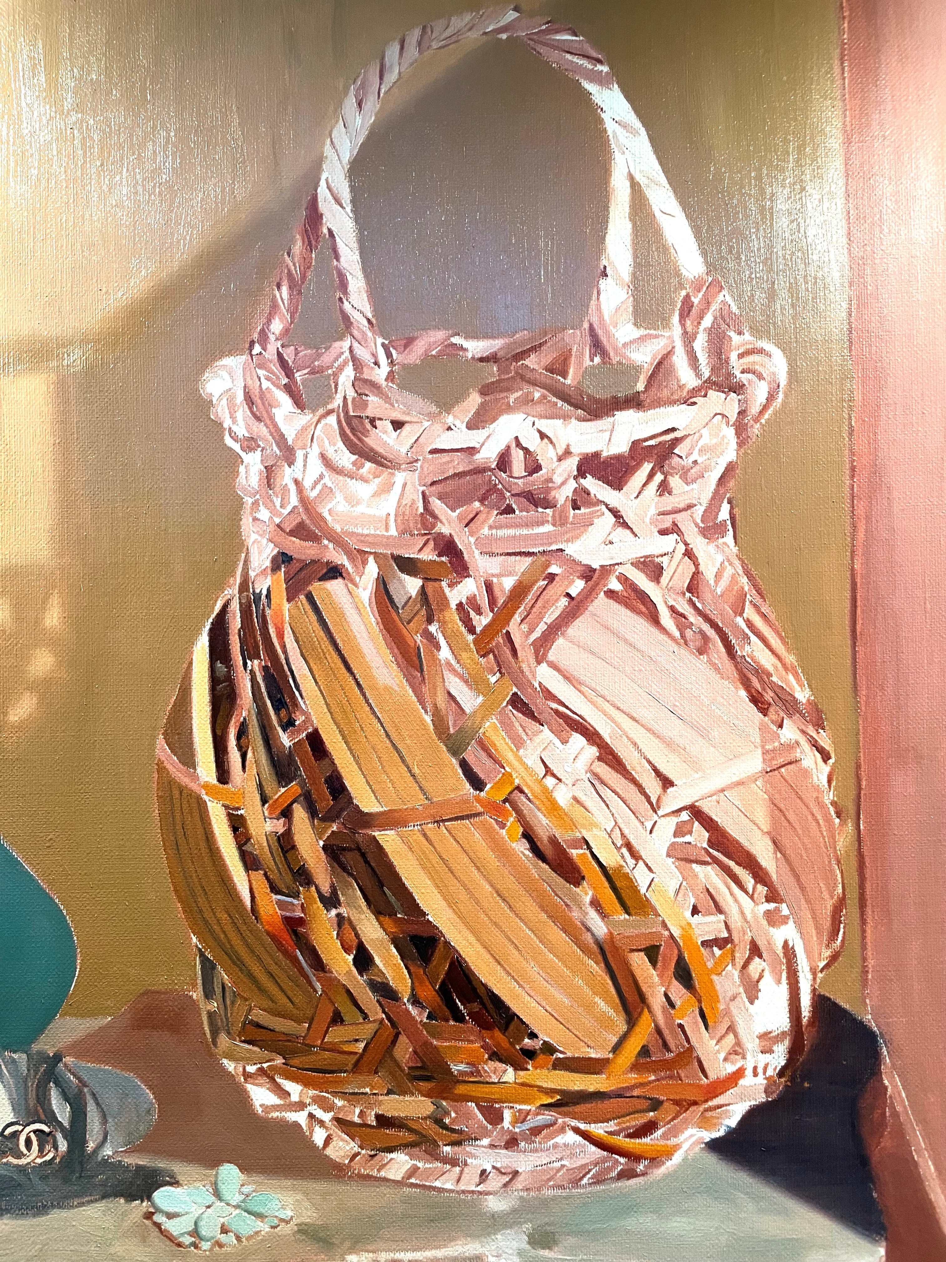
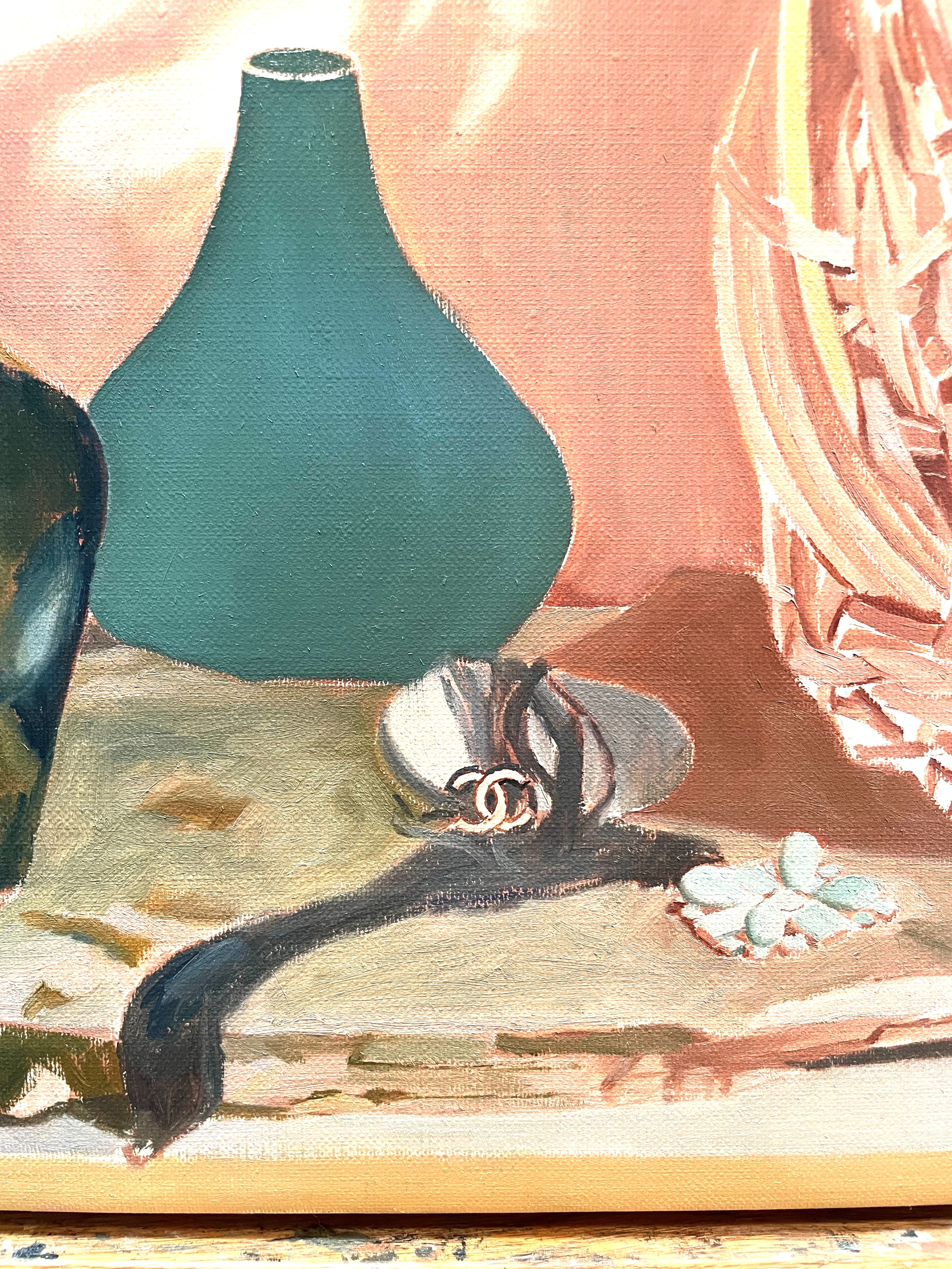
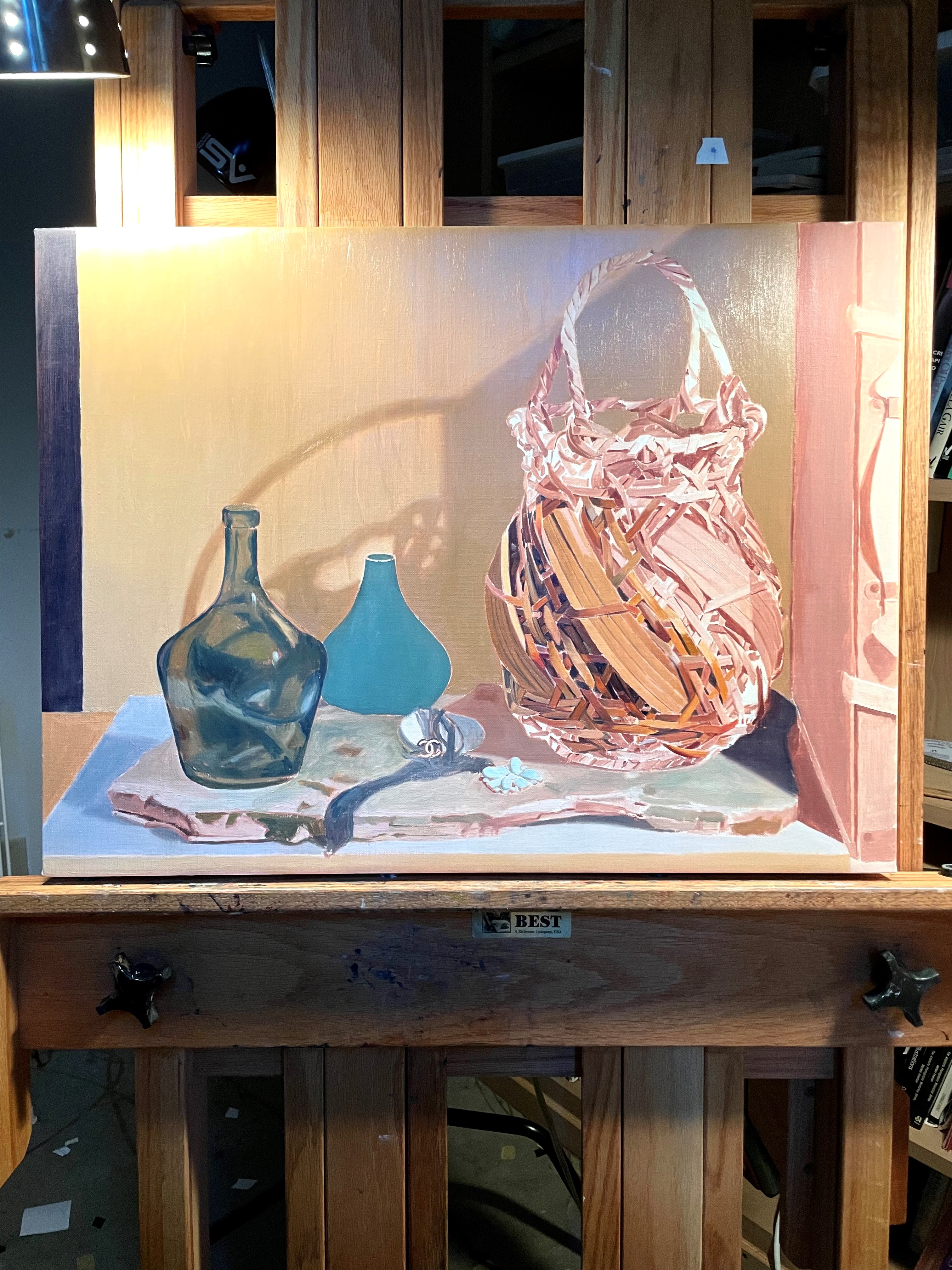
I knew from the very start of this painting that the black chain necklace, with all of its many reflections, was going to be very difficult to paint. Seen from the from the distance of the viewer, it looks like a mass of sparkles, with very little detail of the actual structure of the chains. I aim to give the viewer the sense of actually seeing the objects that I depict in my paintings. Shiny objects reflect light and light obscures detail. I strive to show these effects in my painting. If I were to somehow paint each link of the chain, it would greatly reduce the effect of reality. Such minute detail would not convey the sense of actually being in the room and seeing the brilliantly lit bracelet, yet to attempt an impression of the chains and reflections without a knowledge of the structure wouldn’t look convincing. I’d have to first understand the structure, and then think of a way to suggest the details convincingly, without being over-specific. I’ll talk more about that later.
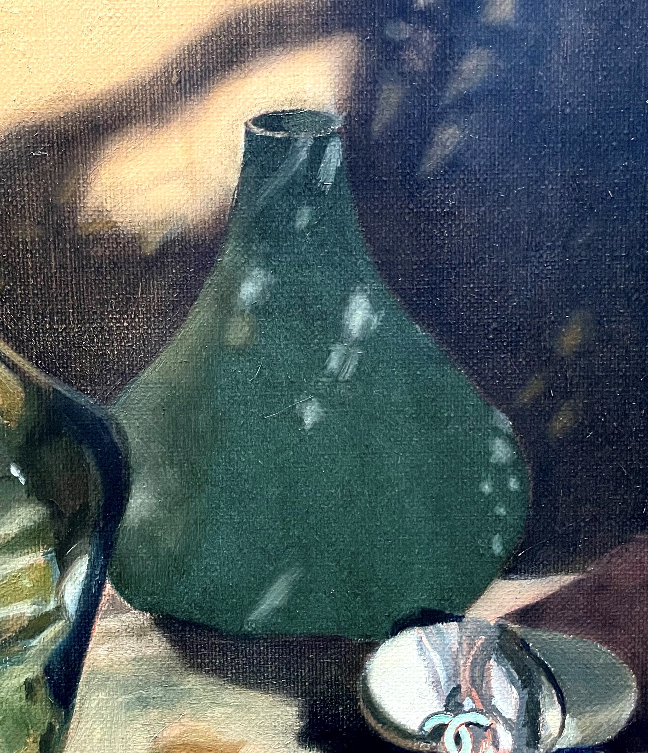
Below, in the underpainting, I started by indicating the chains with a rough outline of their mass. No more detail is required in the underpainting.
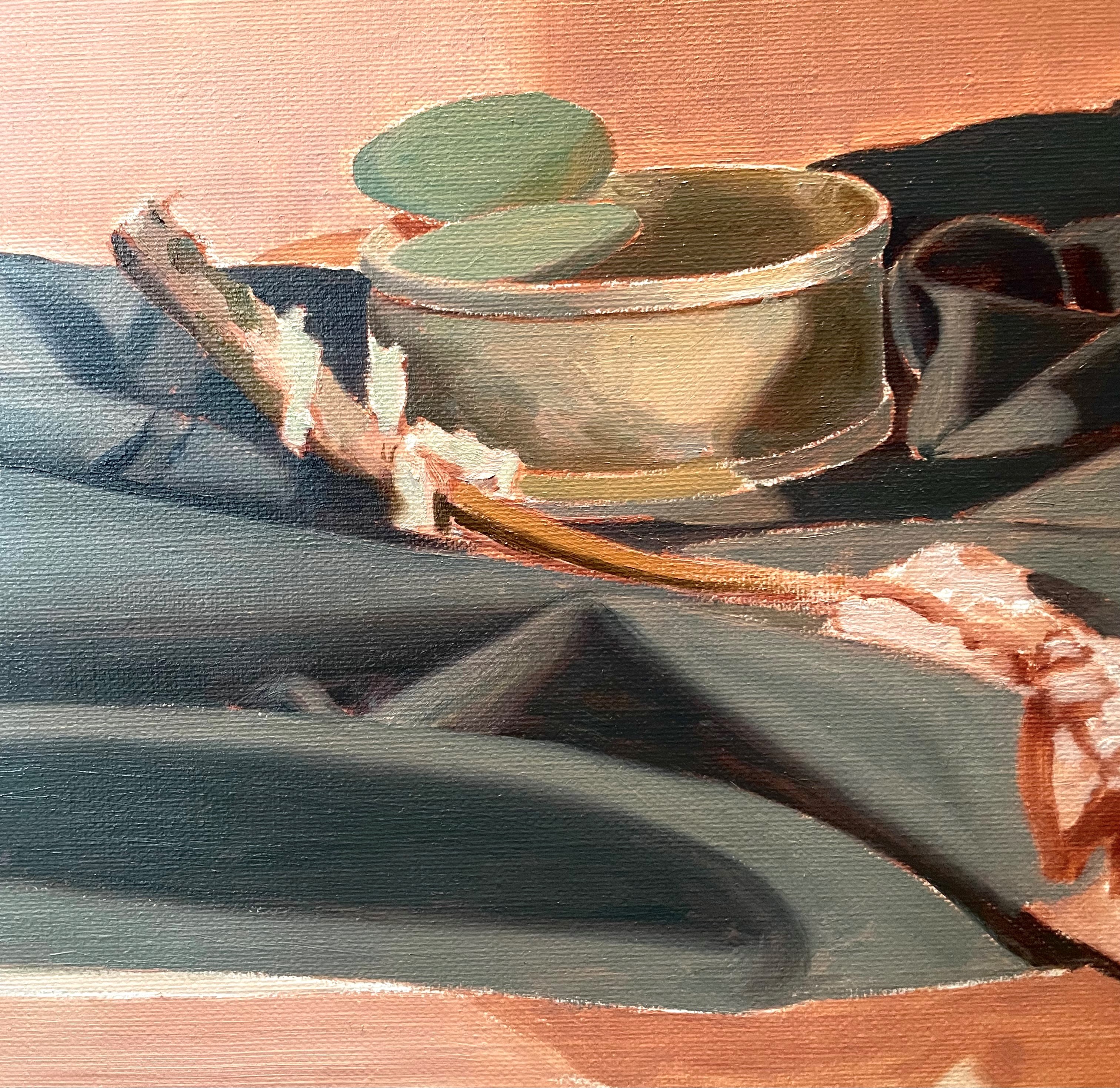
Below, I’ve begun to put in local colors. I decided to put in a dark area that would serve as the shadow area that would show between the highlighted areas of the chains. I roughly put in the shapes of the chains draped over the stone.

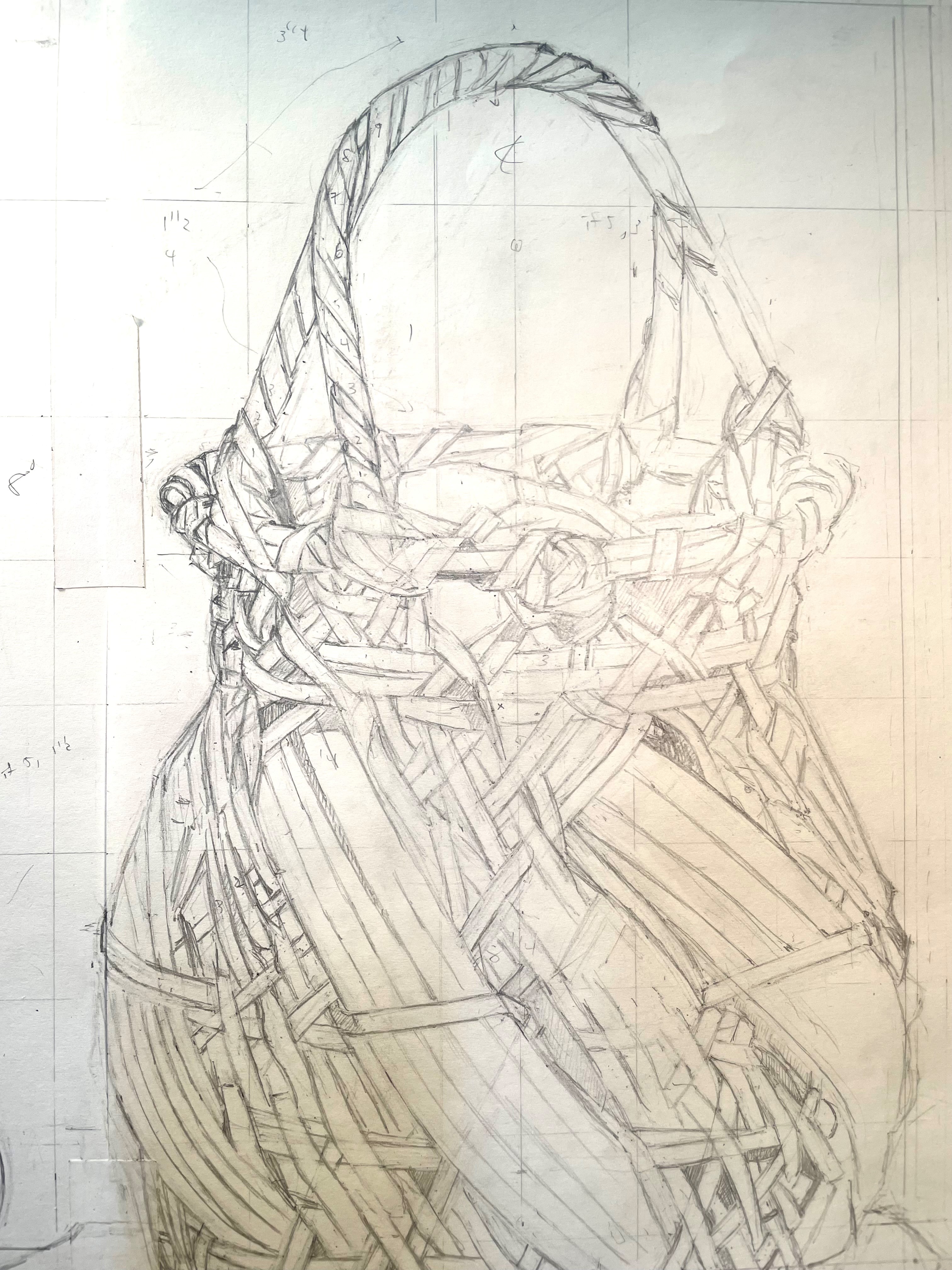
For the next stage, below, I needed to understand some more of the positions of the major chains. I did this as best as I could from my easel, though they were hard to see.

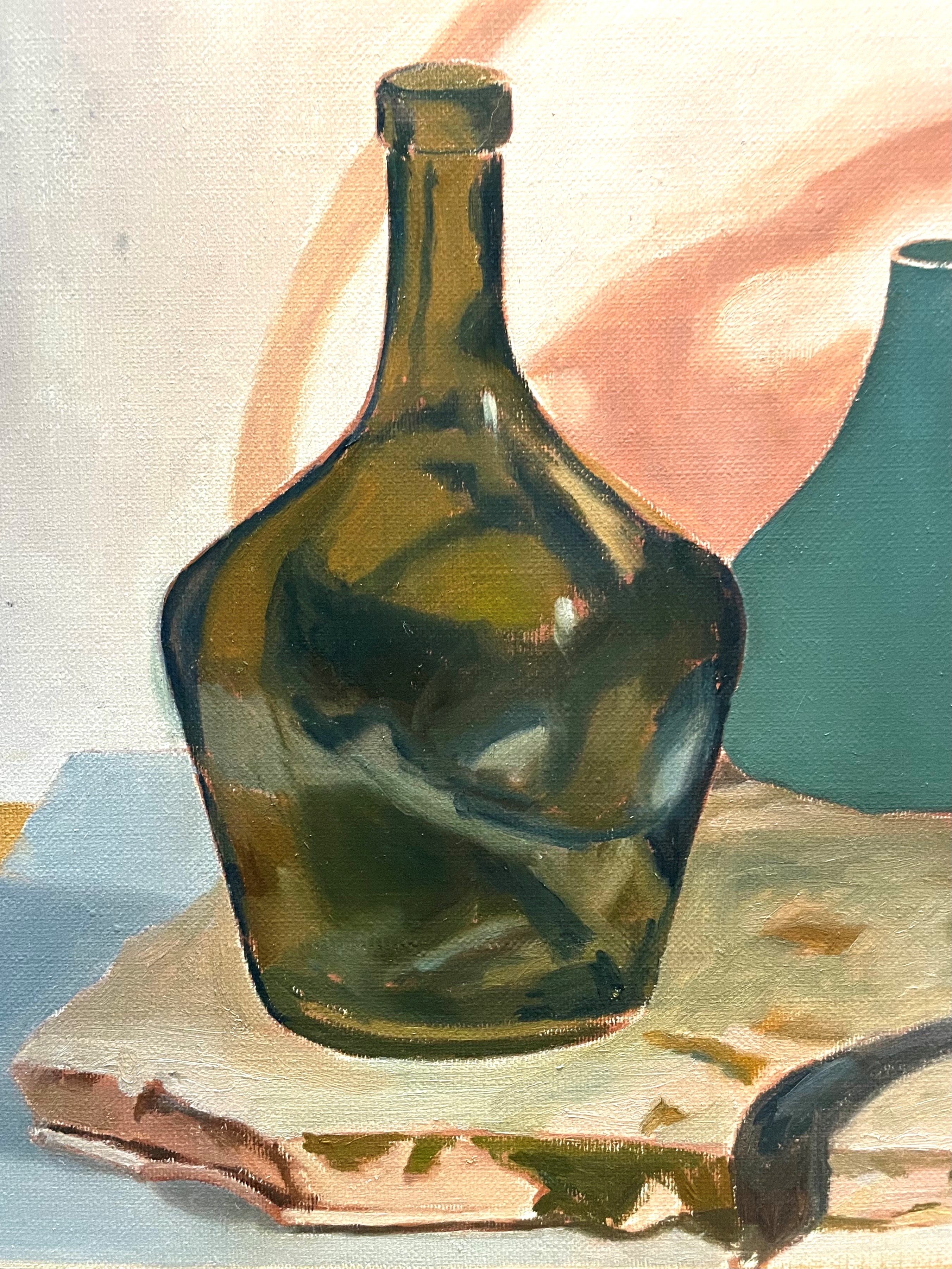
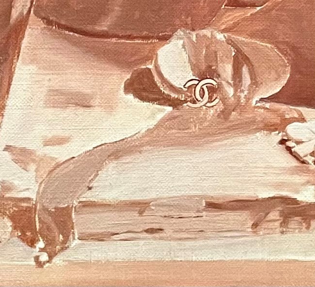
I thought it might be interesting for you to see what the actual bracelet looks like, so here it is, below. It’s complicated and hard to parse what’s going on!

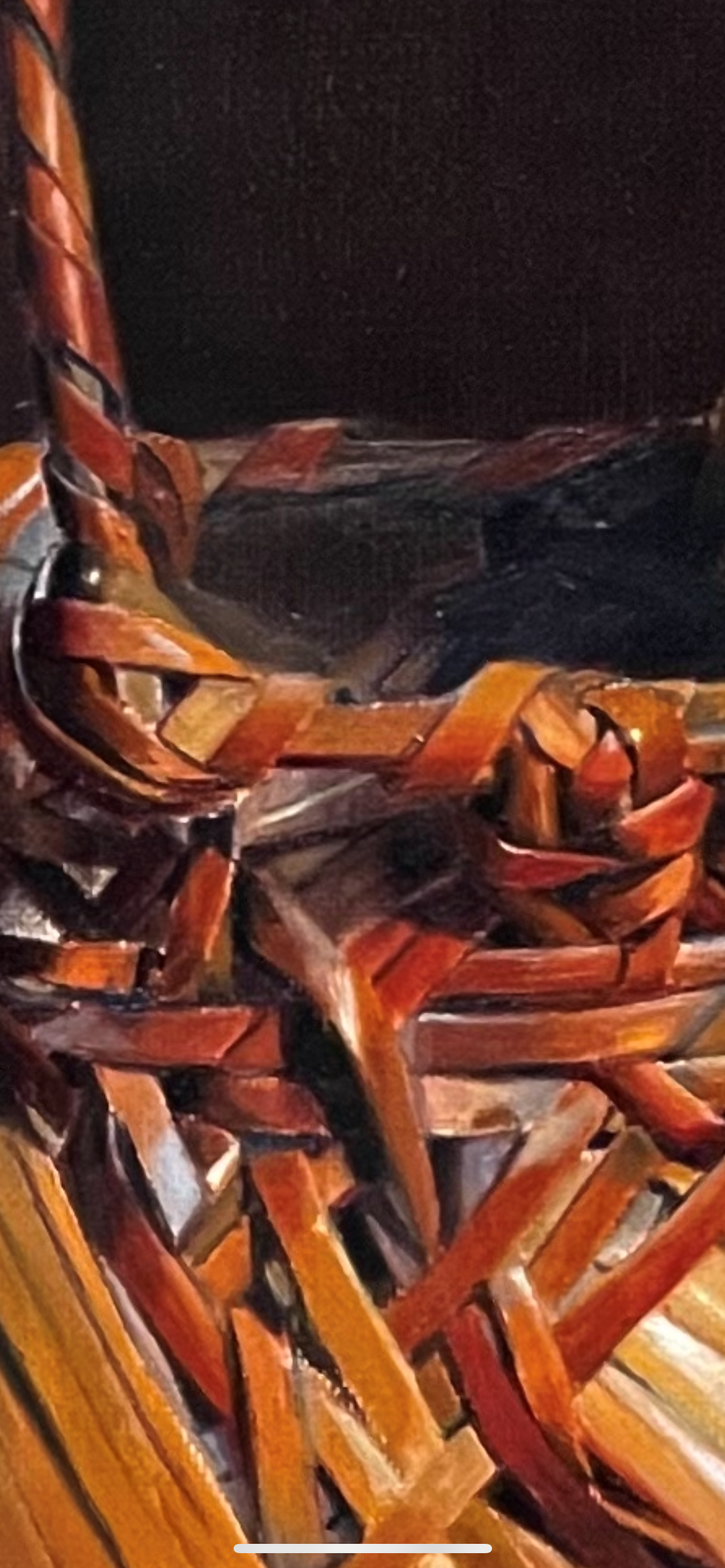
I still wasn’t seeing clearly enough for me to understand the forms, and which reflections were coming from which chains. This is one of the few circumstances where I make use of photography in my painting. When I can’t understand a form because of reflections or small size, I take a photo from close-up so that I can bring it back to my easel and study it. I find that information and knowledge fuels seeing. Once I understand what’s there from the photo, I can then look at the set-up with my un-aided eye and see what’s going on. What looked like a bunch of unrelated pinpricks of light now reveal themselves as reflections off of the top side of tiny links! I don’t paint from the photo, though. The set-up looks remarkably different when seen in a close-up photo and from back at my easel. I need to paint it with all of the obscurities and subtleties that come with distance, if it’s to look convincing.

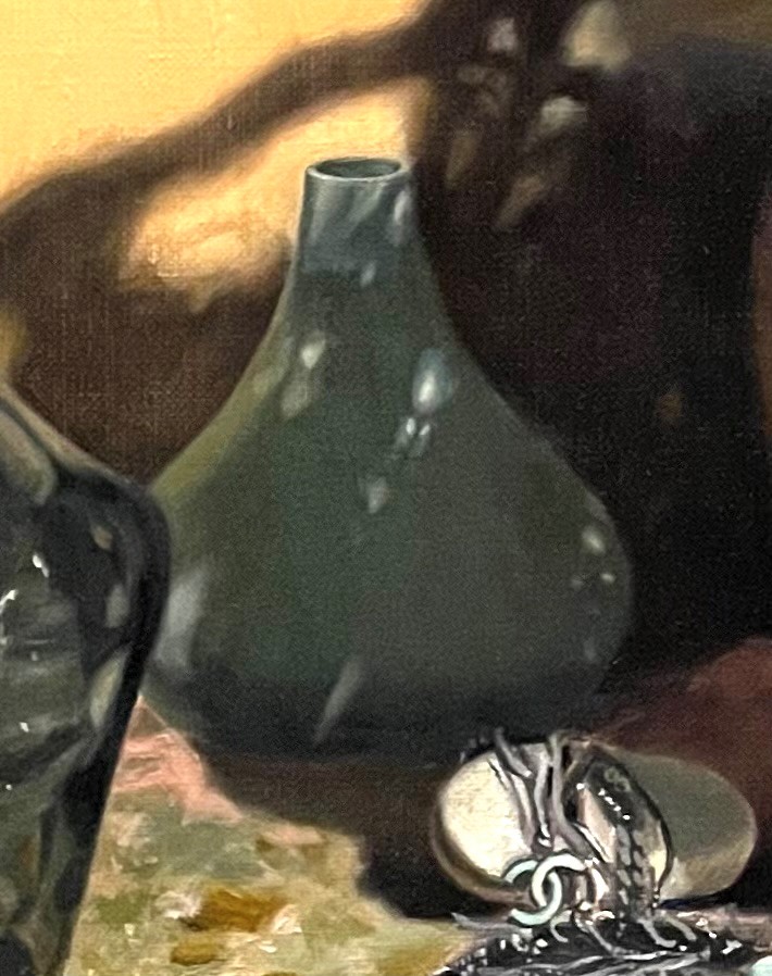
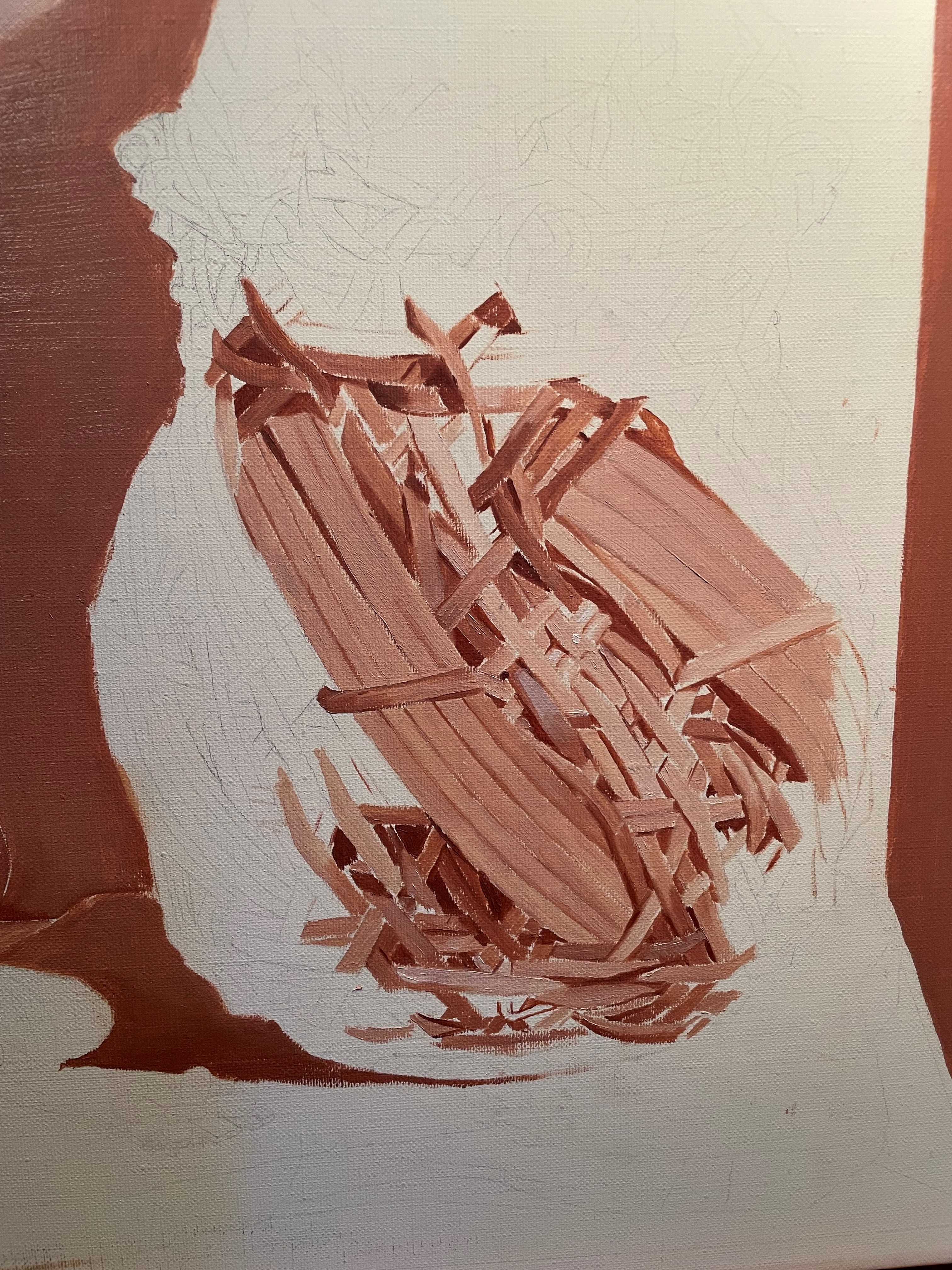
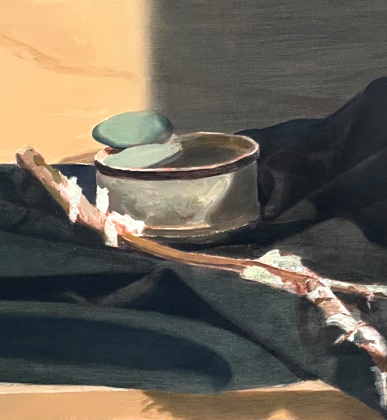
Above is my next attempt. The major chains are in their place, with dark and light areas indicated. It’s interesting that even at this early stage, the suggestion of chains is convincing!
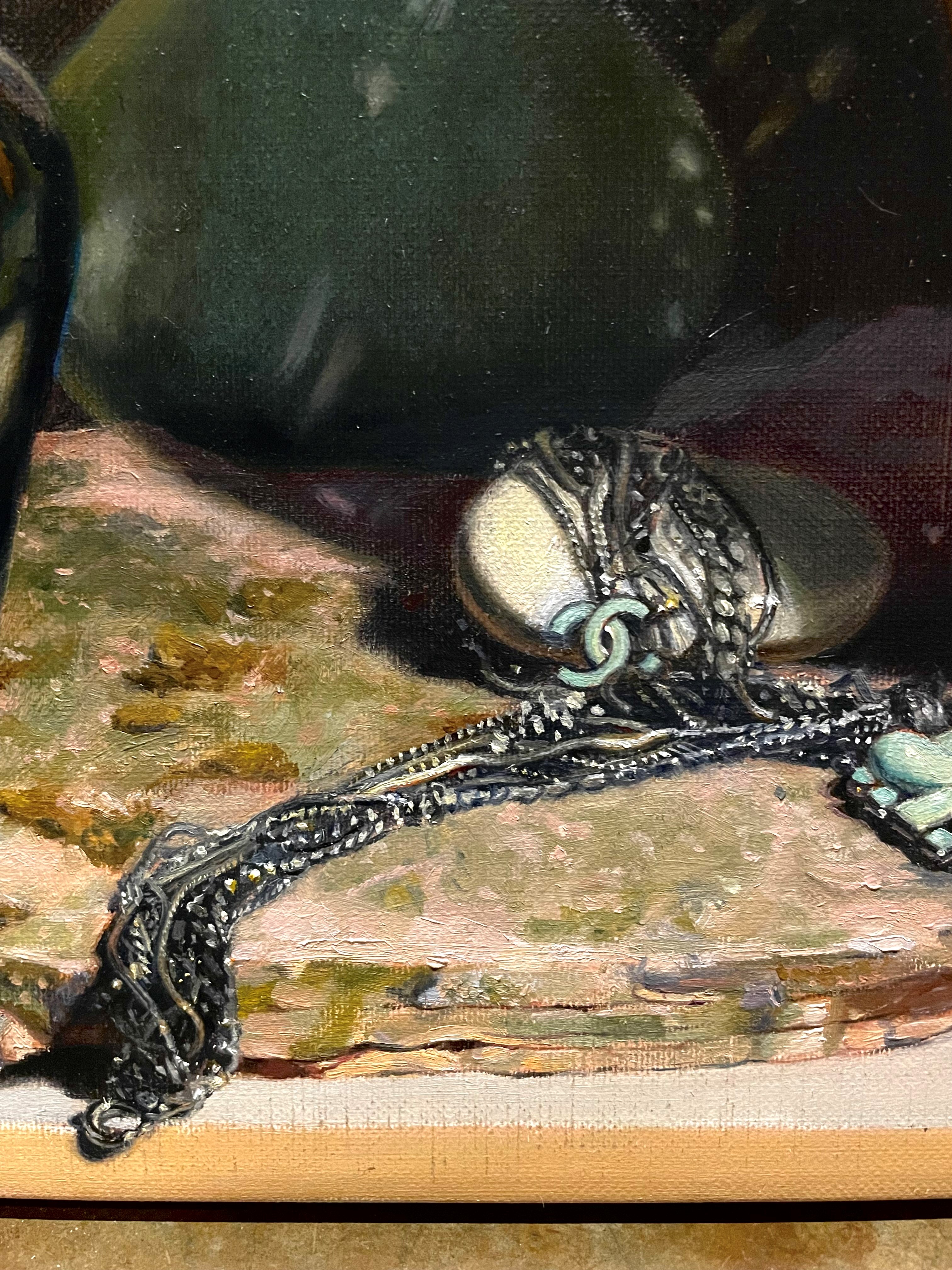
There are more refinements above. As I always find, the more that I’ve seen and painted, the easier it is to see more and paint more. I still need to work on the middle of the chain, under and to the left of the Chanel pendant. Also, I’ll be muting some details to suggest the idea of sparkling light.