Sometimes I find that something I put down in the very beginning stages of the painting as a first guess, stands the test of time, and still looks good even at the end. These stroke might not be technically perfect and accurate, but often have a spontaneity and freshness that is hard to duplicate at the end, when I’m trying so hard to see details and get it all perfect.
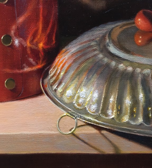
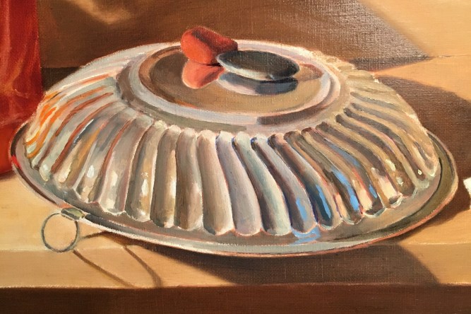
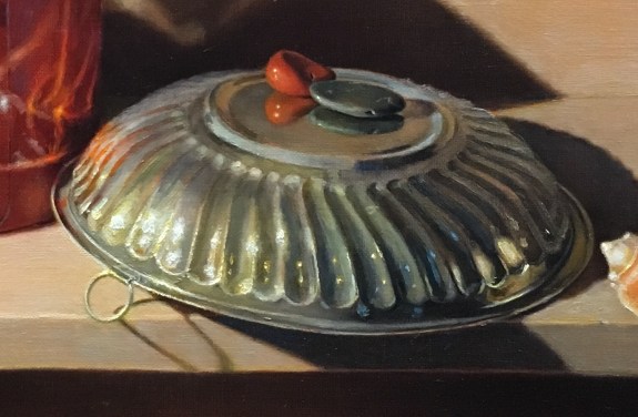
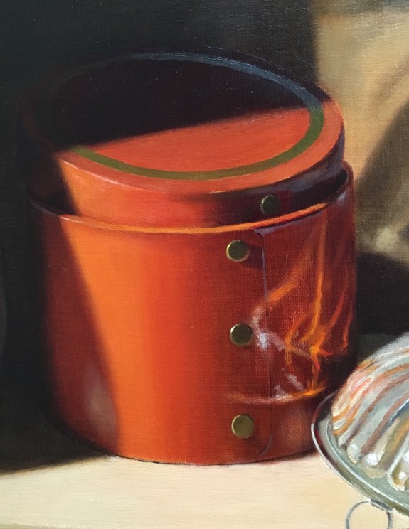
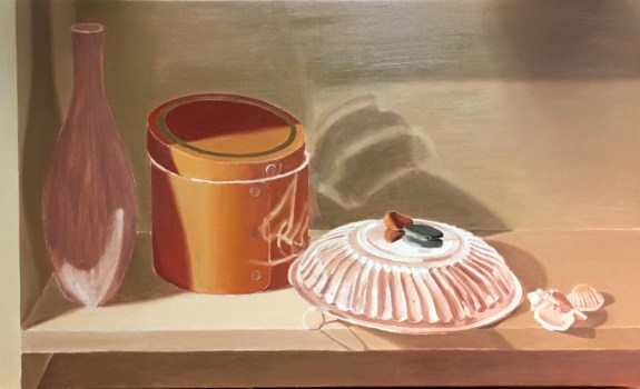
For example, the orange strokes on the left side of the silver bowl that reflect the orange box were put down in one of my first painting sessions. On later observation, they are perhaps a bit too bright and aren’t necessarily in exactly the right position. They also ought to be more faded out on their edges. They served their purpose well at the beginning, to show how bright that reflected light was and how important strong reflections are to the painting as a whole. I painted them very quickly and boldly in a looser style than I typically don’t use to finish a painting. I found though, that I ended up liking them at the end, too. Strokes don’t have to be perfectly accurate to convey a light effect in a satisfying way. My goal in painting isn’t to reproduce everything exactly as it appears, (this would be impossible!) but to convey the sense of how light flows over objects and reveals their textures, forms and colors.


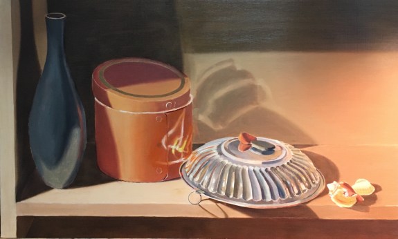
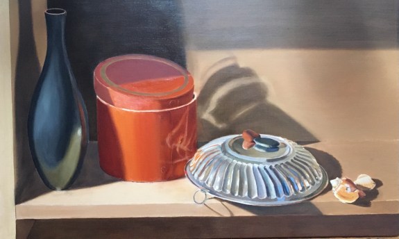
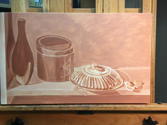
Here is another example of preserving an early paint layer without much modification at the end. On the left you can see the shadows and reflections on the wall as I originally painted them. At the time, I thought this was a very rough approximation, to be corrected later with many layers of direct painting, glazing, and scumbling. On the right is how the painting stands now. I glazed the shadow and reflections a bit darker, and softened some edges, but it’s largely unchanged. Again, I liked the spontaneity of the passage, and felt that any attempt to improve it would, in fact, not be as successful.


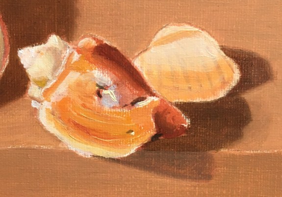
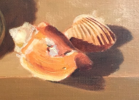
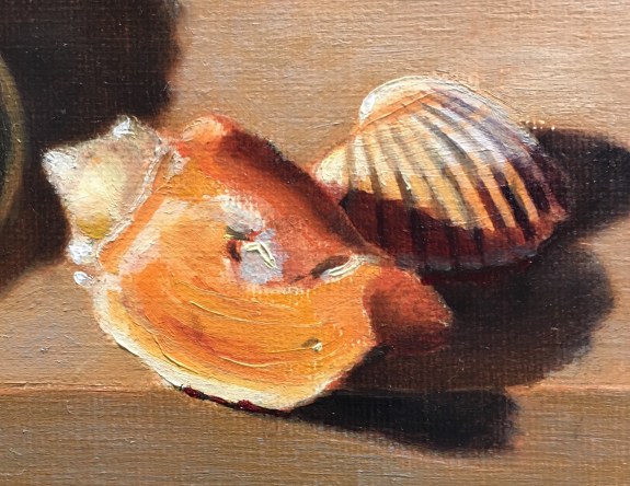
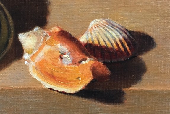
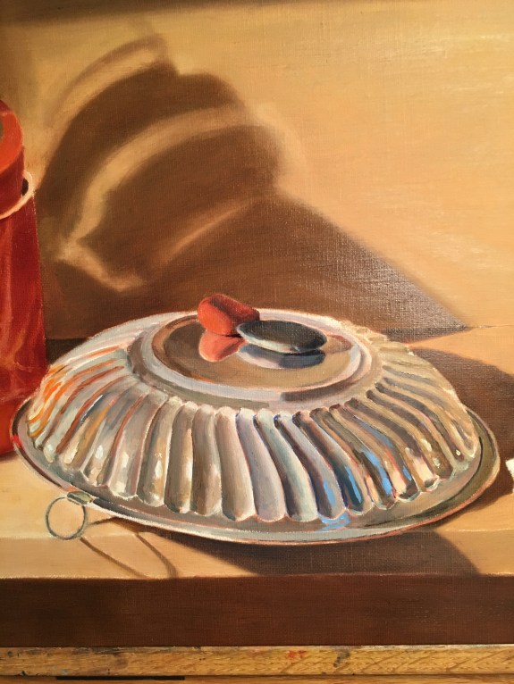
There are also some places on the shell that remain largely unmodified. The bright orange curved area in the front was later scumbled over a bit (as seen in the photo on the right), but still shows through. The impasto brushstrokes also show through. Typically, on a first layer, I’m careful not to lay in heavy impasto strokes, as they will show through subsequent layers of paint. If things need to be moved, this can be a problem, unless you scrape the dried paint off with a palette knife before making corrections. Even at the start, though, I was sure that these heavy strokes were following the form of the shell and wouldn’t be a problem. The small, bluish area in the center of the shell has also remained unchanged throughout.


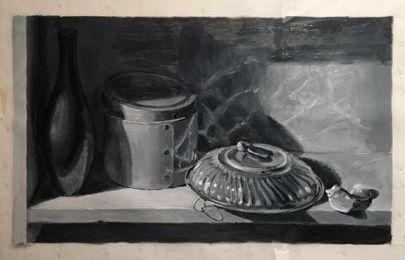
 I’m slow in the summer, but I’ve finally completed my underpainting! At this stage, I need to decide how I want to handle my cast shadows. I always like to glaze them, as opposed to painting them in body color, because they look more transparent. My usual method would be to ignore the cast shadows in both the underpainting and the initial overpainting. For example, I would paint the wall one uniform color. When the overpainting is dry, I would glaze the shadow over it. The advantage to this method is that it beautifully mimics the look of a transparent shadow cast onto a colored surface, since the actual color of the wall would show through the glaze. There are two problems with this method. First, it can be difficult to achieve a soft edge on the glazed shadow. Second, I’d be left with no guide as to the location and shape of the shadows, since I would have obliterated my drawing with the under and overpainting!