The first layer of paint is dry, so I can put down my first glazes. Usually, if my set-up is lit by a warm artificial light, the shadows appear cooler and bluish. In this case, there were so many warm colors bouncing around from the orange box and warm tan walls, that many of the shadows looked warm, so I mixed up two glazes. One was my usual cool mix of ultramarine blue and raw umber (with more blue in the mix). The other was a warmer mixture using the same pigments, but with more of the raw umber, plus transparent golden ochre and alizarin crimson. All of these colors (except for the raw umber) are naturally transparent, and make good glazes. You can glaze with any color, but the effect is always better with a transparent pigment.
I made the glazes rather thin. I can always add more layers to adjust both the color and the value. I let this layer dry for a day before applying the next glazes.
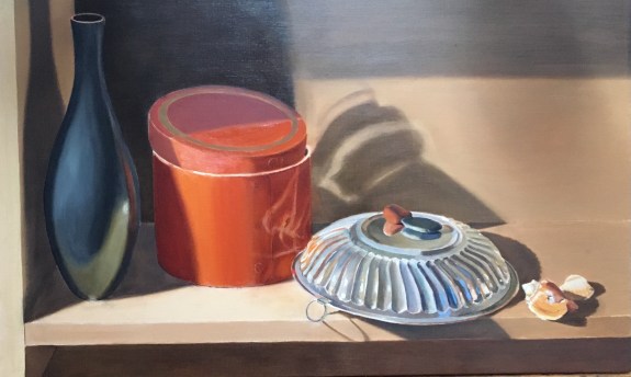
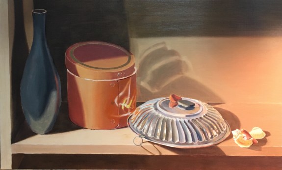
Next, I darkened the left side of the vase, the left side of the orange box, the shadow on the wall above the silver bowl, and the rest of the cast shadows. Now that the shadows are closer to their true values and colors, I can begin to paint my objects more carefully.
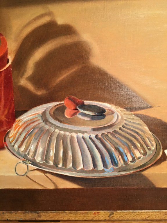
Here I’m struggling with all of the complicated shapes and reflections on the silver bowl. As often happens with repetitive designs, it’s hard to keep track of which section I’m studying. By the time my eye flicks back to the set up to check if a stroke is correct, I’ve lost track of where in the bowl I am! My little piece of black tape helps as a reference. I try not to worry too much about if everything is correct. Every painting session I’m able to see more and record more. What at first looks like a wild mess of obscure reflections will eventually be easier for me to see clearly (and paint clearly!), after I get the basic shapes and colors down. It doesn’t even matter if these are completely correct or not. A first guess at the shapes and colors can serve as a means of comparison from which I can later say “Actually, this is more yellow,” or “this has a sharper edge” or “this angle should be more shallow.” The more information I’ve recorded, the easier it is to compare and judge if something is correct or not. Oil paint is very forgiving. I can change shapes and colors as I go along.
