It’s time to tackle the silver bowl again! I’ve been avoiding it, because it’s so difficult to see all of the shapes and colors. Here’s how it stands:
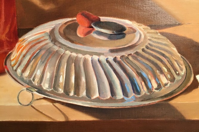
The first thing I did was to soften some edges. At first, I had to paint all of the forms clearly and sharply, so that I could see them clearly. Now that they’re mostly indicated, I can blur the edges to suggest their softer contours and light flowing over them. Also, now that the basic shapes and values are in, I can begin to see more detail.

I adjusted some of the values and colors on the top of the bowl, and softened the orange reflections on the left. I added some highlights on the orange stone and its reflection.

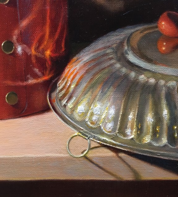
At my next session, I did some major value-correcting. I darkened the right side and the top of the left with a cool glaze. I also darkened the top of the left side above the bright highlighted area This will make the light highlights stand out. A light can only look light if it can contrast with a darker value! I darkened the patterns on the right side, and overall tried to correct shapes, values and colors. I refined the reflections of the shells on the right side of the bowl, adding detail and correcting color.
I worked on the stones, deepening their colors with glazes. I added details, such as the little nicks and patterns. I darkened the reflection of the green stone.
I added a lot more white and yellow paint to the reflections. I put this on very heavily, as a strong impasto suggests light bouncing off of an object (as opposed to a glaze, which suggests shadowy depths).
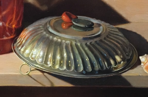
At my last session, I added some small highlights in the middle of the bowl. Also, I wasn’t happy with the ellipse on the small ring, so I repainted it, correcting the drawing. I now took the time to paint the small details of the ring, indicating where exactly the shadows were, and the highlights. Its easy to overstate these at first, painting the darks too dark, for example. This is because when you’re studying a small part of the set-up, the darks do seem very dark compared to the lights. It’s not until you step back and see that dark in the larger context of the whole painting that you realize that though darker than the highlight, it’s still relatively light. This is because the ring is actually bathed in direct light from the spotlight and reflected light from the bowl.
It seems that I could keep refining the bowl forever, because of the complexity of the reflecting lights. At some point, though, I’ll need to decide if it conveys the feeling of the bowl. It needs to satisfy the eye, but it doesn’t need to be (nor could it ever be!) an exact replica. I think it’s pretty close to being finished now.
