Even though the paper on the right will be in deep shadow, I still want to get the wrinkles right. Enough detail will show through the shadow glaze to make the effort worthwhile. I’m painting this portion of the paper in lighter values than it will ultimately be, because of the dark glaze to come. Seeing this area is very difficult, both because it’s in shadow and because the folds are complex. I spent a lot of time staring at a small section of paper, only to loose track of where it was located when I looked at my canvas to paint it. Another difficulty is keeping the edges soft. There is a great temptation in the beginning to paint the edges crisply, because that simplifies the shapes and makes them easier to paint. I’ll continue to soften edges and borders between darks and lights as I continue to refine.
I noticed that the darker areas of the paper, which I’d painted at my last session, looked too greenish. I had painted them with a mixture of raw sienna, raw umber and white. I needed to think of another way to darken the color. Darker values of yellowish colors are very tricky to mix correctly. If you add black (which I don’t have on my palette) you end up with green. Another option is to add a cool tone, because in warm light, shadows are cool. I tried adding blue. Of course, blue plus yellow equals green- again, not what I wanted! Still another theory holds that you should add a color’s opposite to darken it, so I added purple (the opposite of yellow on the color wheel). That also didn’t look right! Finally, I added a bit of raw umber to tone down the yellowness of the raw sienna, and then neutralized the resulting greenish tone with a reddish color (green’s opposite). I used burnt sienna. The resulting color looked pretty good.
It can be hard to judge if you’ve gotten these subtle colors right. One trick I use is to curve the fingers and thumb of each hand into a fist, leaving a small viewing hole. I view the set-up through one fist, and the canvas through the other, framing and isolating the color in question. I can flick my gaze back and forth between them and compare. I try not to think too much, but simply ask myself “how are they different?
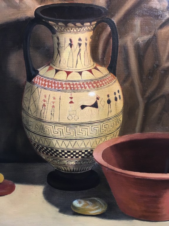
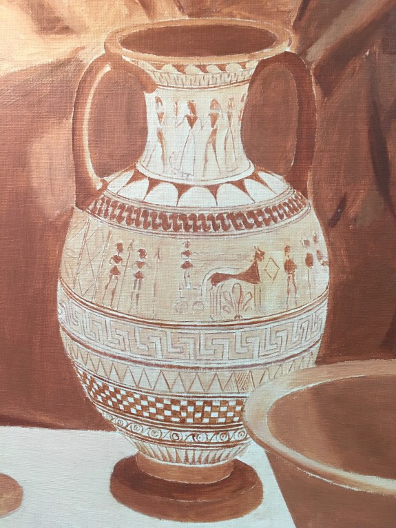
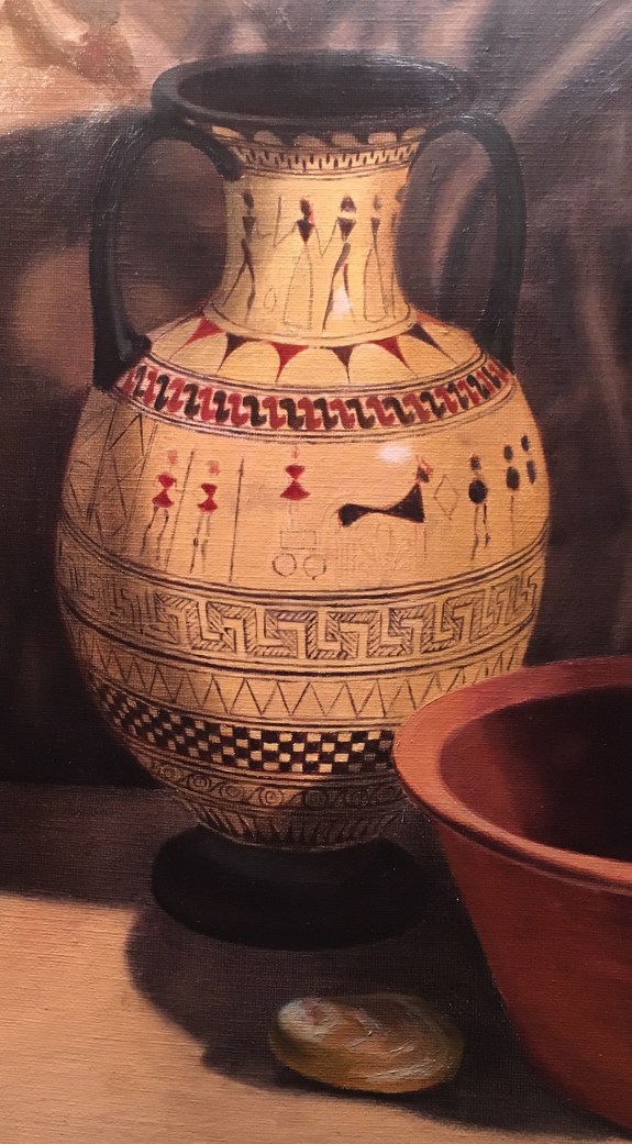
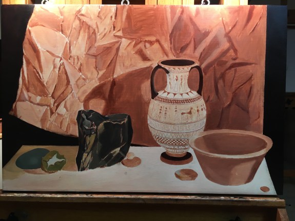
The paint on the vase was now dry enough for me to paint the first glazes in the shadow areas. I used a glaze of ultramarine blue and raw umber to indicate the shadow cast onto the vase from the orange bowl, and the form shadow of the dark side of the vase. I’ll probably darken these shadows later, as I adjust the darkness of the background. I also added a frottie (a glaze mixed with white) on the right side of the vase to darken it to closer to the correct value. Normally, I’d paint subtle transitions in value (as on the right side) in body color, mixing the tones wet-in-wet, and then paint the details of the vase on top, after the body color dried. Since I didn’t want to lose the intricate drawing on the vase, I would have had to try to blend body color in subtle graduations between all of the markings. It would have been impossible for me to achieve smooth transitions in value while trying to keep the drawing visible.

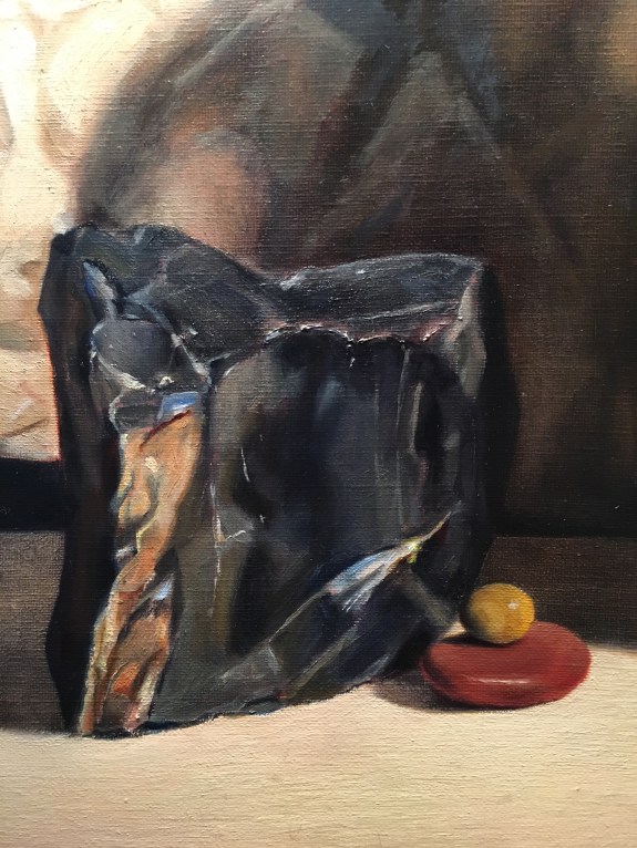
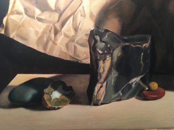
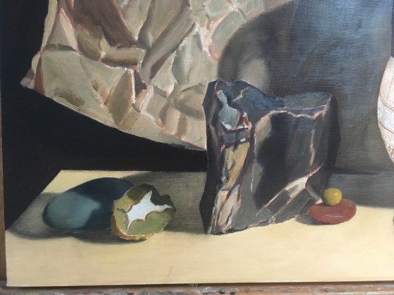
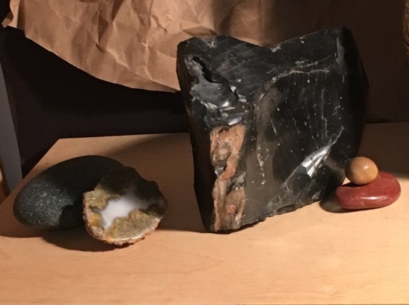
It was time to add some more paint to the obsidian. Below, you can see the first layer of paint. Above is my second attempt to correct color and value using both dark glazes in the shadow areas, and direct paint elsewhere.

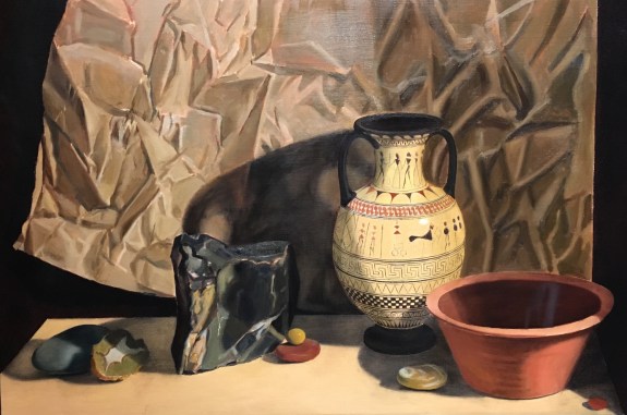
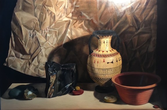
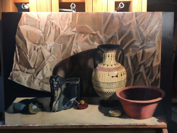
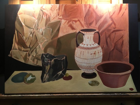
I try to work all over the canvas as much as possible, so that no area advances much beyond the others. I added some more glazes to darken shadow areas in the vase, bowl, and stones. I also darkened the shadow cast by the vase on the paper. At my next session I’ll work on the rim of the bowl, as well as finishing my second attempt at the paper. All of this will have to dry before I can glaze the right side of the paper to its proper darkness.
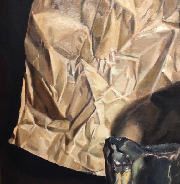
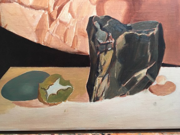
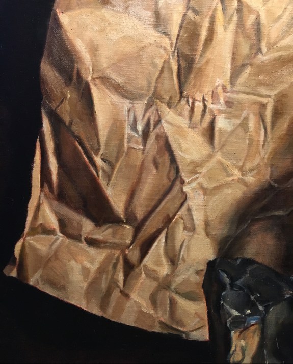 I continued to refine the paper at this session. Below you can see how it looked at the beginning, after my first block-in. The underpainting is still showing through in places, and the shapes of the wrinkles is approximate. Edges are sharp, and the colors are not quite right. Above, you can see how I’ve subdued the paper’s greenish cast, refined the drawing, covered more of the underpainting, and more carefully observed and rendered edges.
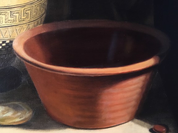

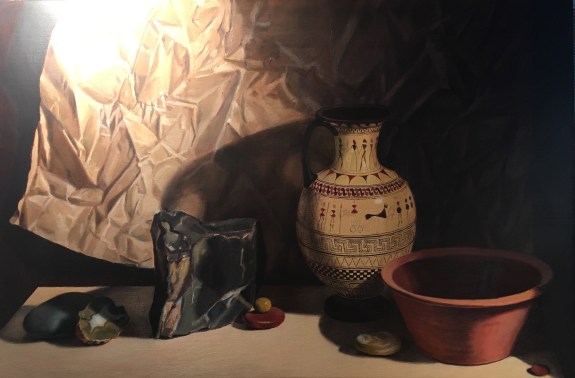
 The photos above and below were taken in different lights. The one above is in a warmer light. Try to ignore that if you can! The one above is my ‘after’ shot. I added the subtle horizontal ribs in the body of the bowl with some simple strokes in pale dulled orange. I glazed the interior a darker, warmer hue, using alizarin crimson and a little ultramarine blue. I painted into the wet glaze with a dark yellowish tone to represent a highlight that I observed there. I could have scumbled the reflection onto the glazed area once it was dry, but that would have had too much texture. Painting it into the glaze made it look as if it floated inside the dark area and was part of the shadow. I also darkened the shadowed back rim with a more neutral glaze. I repainted the rest of the rim with body color, correcting color and softening edges.
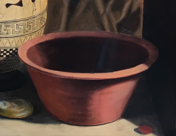


 The paint on the paper on the right had dried, so I applied a dark glaze over all of it to bring the value down closer to what it should be. This is always fun to do! It’s both simple and transformative. The photo has a glare at the top, so it’s hard to see, but it is darker! Now I can see more clearly what the finished painting will look like. After the glaze was down, I noticed that the folds all looked too soft- almost like cloth. I’ll need to add some sharper edges. Also, the color is too uniform. In reality, there are a lot of warm tones reflecting from the bowl and vase onto the paper. I’ll address these issues when I apply my next glaze.
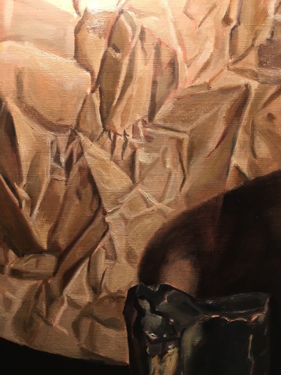
 The paper on the right side needed finishing, so I spent quite a bit of time on that, getting the shapes and values of the wrinkles right.
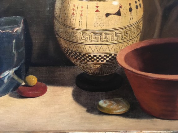
 I decided to begin my session with adding some shadows, since the paint on the tabletop had dried. I had obscured my drawing of the shadows with the overpainting, so I eye-balled them. I used a glaze of ultramarine blue and raw umber. I wiped away most of the glaze, because there are many areas within the shadows that are very light, and the color of the tabletop has to shine through. When the glaze dries, I’ll add more for the darker areas.
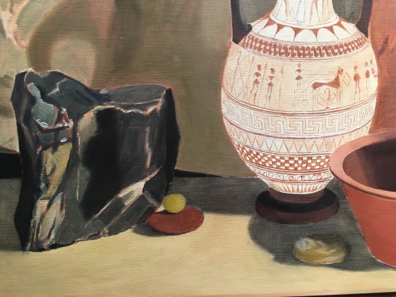


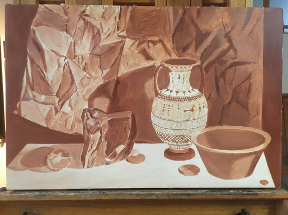 The underpainting is finished! I included some cast shadows on the left, but then decided I would paint over these with the local color of the tabletop. After that dries, I’ll paint the shadows over as glazes. The shadows will look convincingly transparent, because a glaze actually is transparent! Also, the color will be just right, because the color of the tabletop will show through the glaze. A shadow painted directly with body color doesn’t seem as transparent, and it can be tricky to guess the correct color. I’m always tempted to paint in the shadows from the start with body color, both because I don’t want to lose my drawing, and its easier to blend the shadow edges softly while painting wet-in-wet. A glaze can be more challenging to blend.