 The paint on the paper on the right had dried, so I applied a dark glaze over all of it to bring the value down closer to what it should be. This is always fun to do! It’s both simple and transformative. The photo has a glare at the top, so it’s hard to see, but it is darker! Now I can see more clearly what the finished painting will look like. After the glaze was down, I noticed that the folds all looked too soft- almost like cloth. I’ll need to add some sharper edges. Also, the color is too uniform. In reality, there are a lot of warm tones reflecting from the bowl and vase onto the paper. I’ll address these issues when I apply my next glaze.
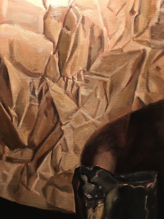
I had another go at painting the paper on the right side in the light. With a base layer of paint set, I can now begin to make better judgements about color and form. The more that I have down on the canvas, the easier it is to spot errors. It’s always less trouble to correct an error than to make your first guess! For instance, If I have a tone down, it’s easy to compare that area to reality and see that it needs to be more yellow or more blue or lighter or darker. Or, if I have most of the wrinkles painted in, I can see if one of them is in the wrong position. Painting is all about comparing- both your painting to reality, and areas of the painting to other areas.
I softened the transitions between dark and lighter areas and between different colors. It’s easy to fall back on laying one tone next to another with a hard edge between them. Reality seldom looks like that! There is usually a blended area between tones. How much depends on the nature of the material. A soft cloth will have very gradual transitions between tones, whereas a fold in paper will have sharper ones.
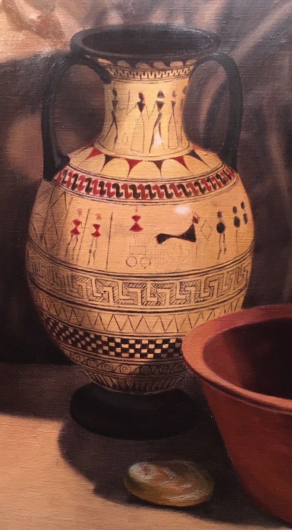
Above, you can see that I’ve almost finished the decorations on the vase. I painted the S-shaped designs at the top. I’ve saved working on the delicate transitions from light to dark on the body of the vase until the values of the background are set.
