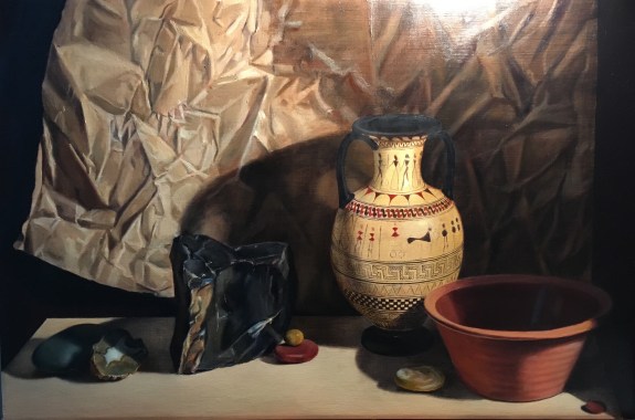
At this session, I turned my attention to the orange bowl and the obsidian, and made a few changes to the vase.
 The photos above and below were taken in different lights. The one above is in a warmer light. Try to ignore that if you can! The one above is my ‘after’ shot. I added the subtle horizontal ribs in the body of the bowl with some simple strokes in pale dulled orange. I glazed the interior a darker, warmer hue, using alizarin crimson and a little ultramarine blue. I painted into the wet glaze with a dark yellowish tone to represent a highlight that I observed there. I could have scumbled the reflection onto the glazed area once it was dry, but that would have had too much texture. Painting it into the glaze made it look as if it floated inside the dark area and was part of the shadow. I also darkened the shadowed back rim with a more neutral glaze. I repainted the rest of the rim with body color, correcting color and softening edges.
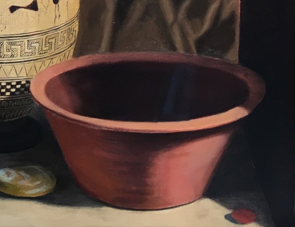
By softening an edge, I mean to make a gradual transition between two adjacent areas, instead of a sharp line. I do this by dragging a bit of body color right over the sharp edge. I mix a color that is in-between the areas both in value and in color. For example, I softened the edge between the light front rim and the dark interior. The value of the color I wanted was darker than the rim, and lighter than the interior. The hue was a bit trickier. In this case, I saw a very warm reddish tone in this area when I looked quickly at it. (If I looked too closely, the effect disappeared!) I decided to use straight cadmium red. The value was in between the two areas, as I wanted, and the intense color seemed right in this case. I also softened the edge on the far right side where the outside rim of the bowl is seen against the dark wall. here, I mixed a color that was halfway between the two in both color and value. I used a dark orangey brown.
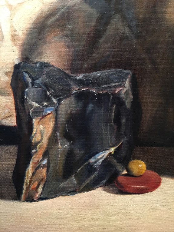
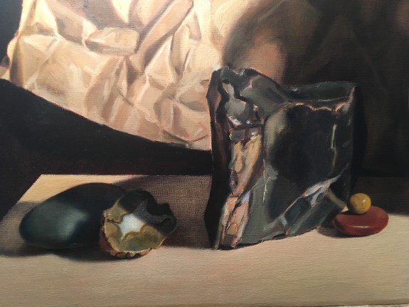
The first correction I made to the obsidian was putting a dark glaze over the darkest areas. Next, I adjusted shapes that seemed wrong, and added some cooler (bluish) tones. There is a danger when working under a warm light with many warm colored objects that the painting will end up with not enough cool tones. A painting needs cool tones to balance the warm while at the same time, to appear to be lit by a consistent light source. The cool objects in this still life are the obsidian, the grey stone, and parts of the geode. Also, the shadows are predominately cool. I added highlights and subtle markings.

You can compare the results with the ‘before’ photo below.
I made a few changes to the vase. I darkened the handles and added some markings to the zig-zag patterns

At the next session, I’ll darken the shadow on the right and work in earnest on the paper, especially the top area, which I haven’t worked on much yet.