This paper lamp in my latest still life was interesting to paint because it is lit both from the inside and from the outside with my spotlight. As always, I begin with a careful drawing. If you’d like some tips for getting the drawing right, see Drawing My New Set-up.

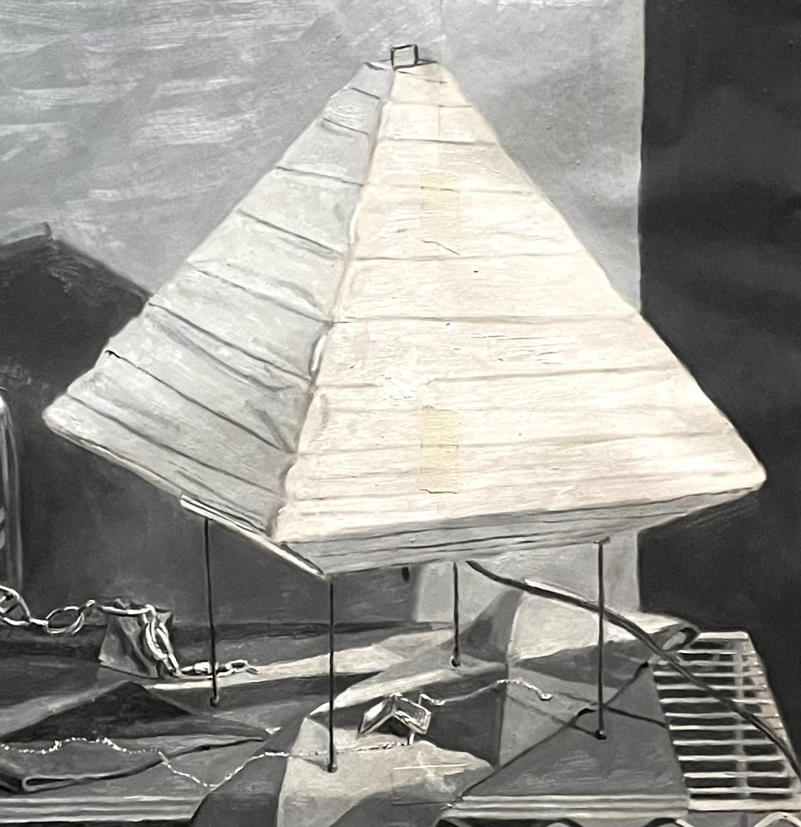
After I have the drawing mostly correct, I take a break from it and paint a quick study in 9 values of black, white, and gray, on tracing paper. I will use this study to see how my composition looks. It can be easier to judge this in black and white without the distraction of color. I tape the paper right over my drawing, so that I can see through it and use the drawing as a guide. This study is very loose and quick. It usually takes me two days. On the first day, I get all of the shapes and values in. Once that dries, a few days later, I go over it again to correct and adjust. At this point, I study my study to see how the composition looks to me. If I want to make any adjustments to shapes or values, I can make them in the study, and then go back to my drawing and incorporate the changes. You can see the part of my study that includes the lamp, below. I’ll refer back to this study as I paint, using it as a value reference.
After I am sure about my composition and have transferred the drawing to my canvas (see Transferring the Drawing), I am ready to begin the underpainting. I do this using 9 values of burnt sienna and lead white. I keep it several values lighter than the finished painting will be. The final colors will look brighter against a lighter base. I also paint very thinly and without visible brushstrokes. I keep edges sharp in the underpainting so that I don’t lose the drawing.

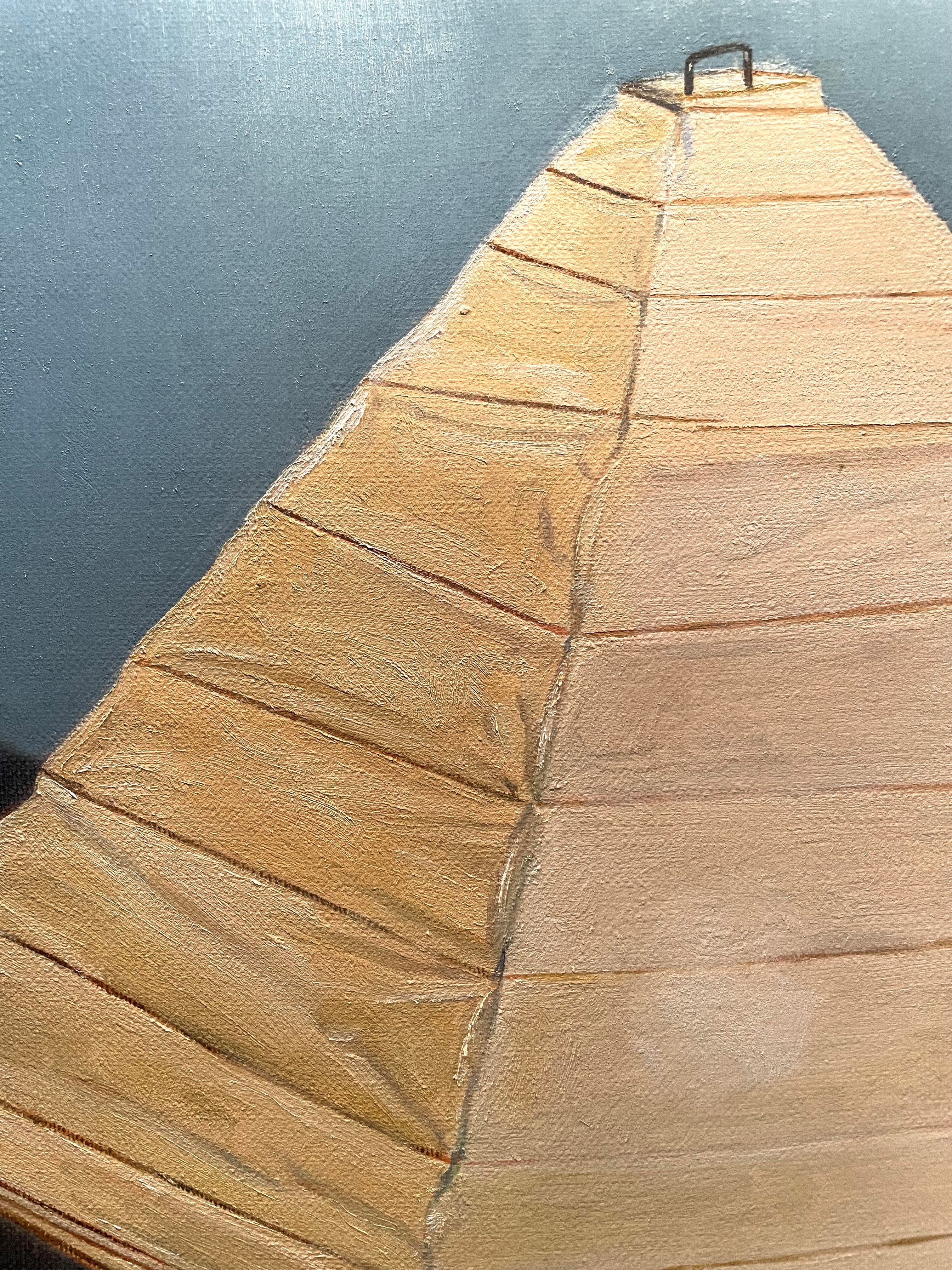
I let the underpainting dry before I begin to paint subsequent layers. Below you can see the first layer of paint. At this stage, i am just trying to put in local colors without trying for too much detail. I have indicated the major creases in the paper, and my first guess at the colors.
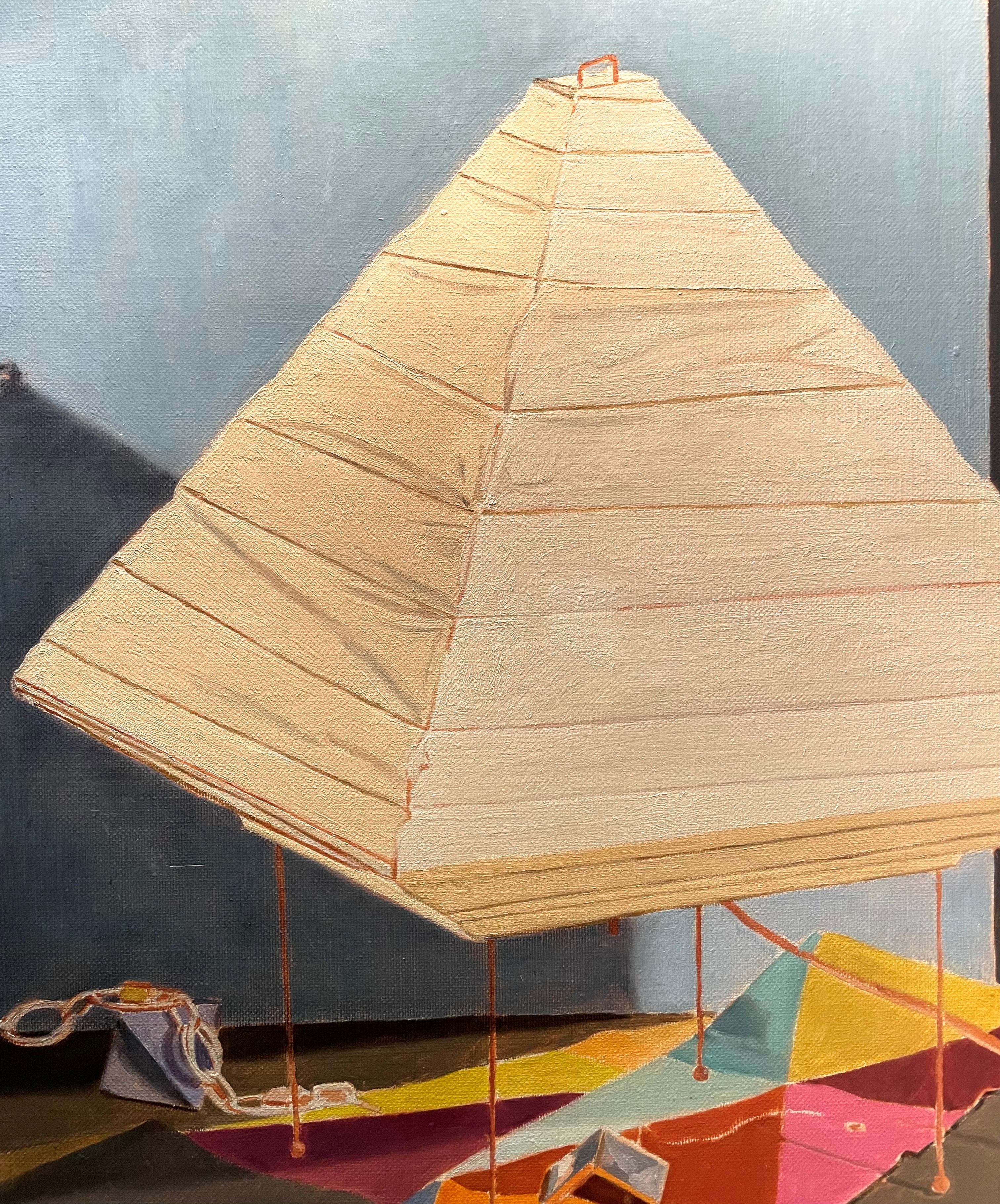
The biggest challenge in painting this lamp, is the very close value range of all of its parts. The left side is the darkest, facing away from my spotlight. I have to save the brightest white for the area directly in front of the bulb, showing on the right side. All other values are keyed from this lightest area, so even though the whole lamp looks bright, everything else must be darker than this small area. This is frustrating because what you end up painting is actually darker than what you’re seeing in reality. It’s important to remember that paint will never be as bright as real light, and we can never have the whole value range of real light available to us in pigments. You have to strive to create the illusion of more light than there actually is.
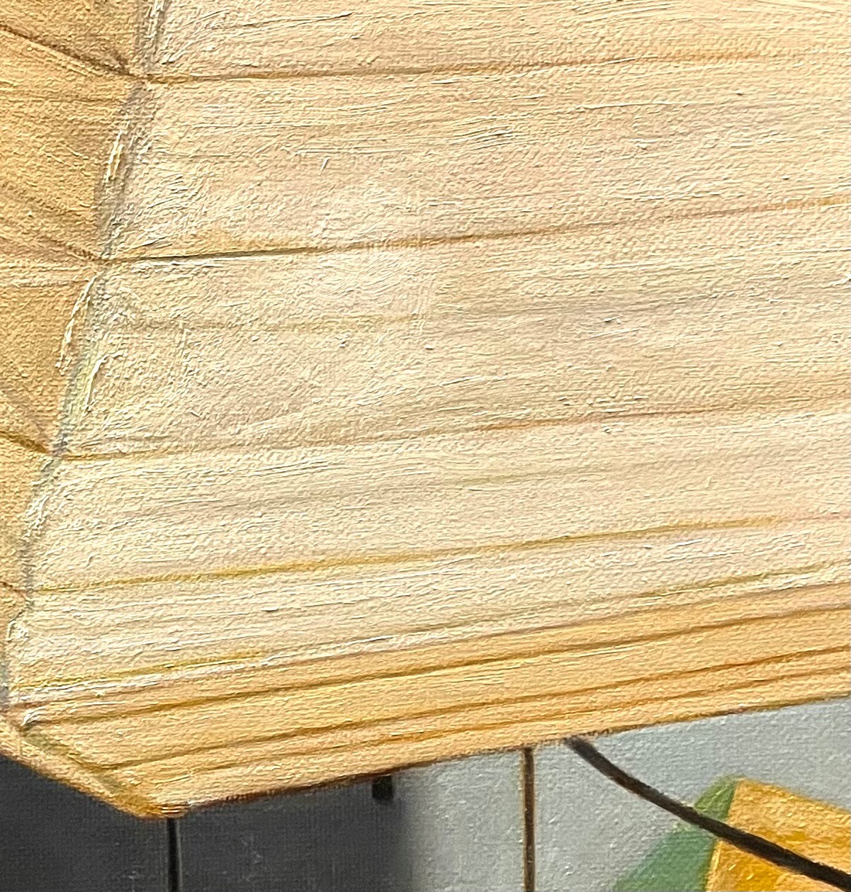
Above, you can see that the only way to get the spot where the lightbulb shines through is to darken the surrounding areas. I have also begun to indicate the wrinkles and folds in the paper. It’s important to keep these all within a very tight value range. When you stand back and squint your eyes, most of the detail should disappear. Sometimes it’s easiest to begin painting these details a bit darker, so that you can see them clearly. Later, you can go back and lighten them by scumbling a lighter tone over. I’ve also used a mix of warm and cool tones. I find that juxtaposing these can give a shimmer that suggests glowing light.

Above is the finished lamp. I tried to keep the edges of the lamp soft, so that it appears to be glowing. Below, there is a close-up where you can all of the subtle value differences, and also the mix of cool and warm tones.