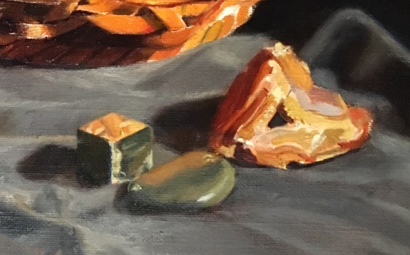
I thought that I was finished with the area, but then I noticed a few details that could be improved on in the crystal, geode, stone and surrounding cloth.
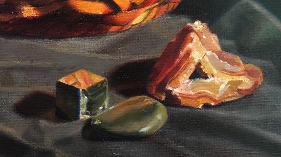
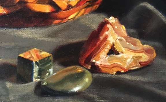
The geode needed some more punch. The right side didn’t look bright enough considering its closeness to the light source. I added some sparkling lights to the far right edge. Also the left side of the triangular hole in its center was catching some light. In both of these areas, it only required a few tiny specks of paint to make a difference! I brightened the highlights on the green stone- both the major one, and the smaller yellow one to its right. For the bigger highlight, I painted some small lines radiating out from its center. If you look carefully at a bright highlight on a shiny surface, you can actually observe these! They have to be painted subtlety, though, or the effect can be easily overdone. I also brightened the upper edge of the stone, showing the reflections from the basket above. I painted some reflected light into all of the cast shadows onto the cloth, lightening them and adding some color.
I brightened the top side of the crystal and added some reflected light to its left side. Finally, I added some scumbled lights to the raised areas of the cloth that were catching the light. To do this, I dragged a dry brush loaded with a warm light color over these areas. (I had to mix the color much warmer than you’d think, because scumbles always look cool.) The top of the weave of the canvas catches some of the paint, creating a shimmering effect that nicely conveys the look of highlights.

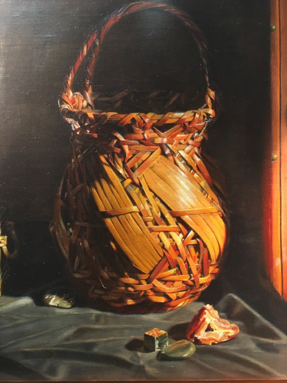


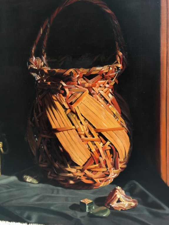
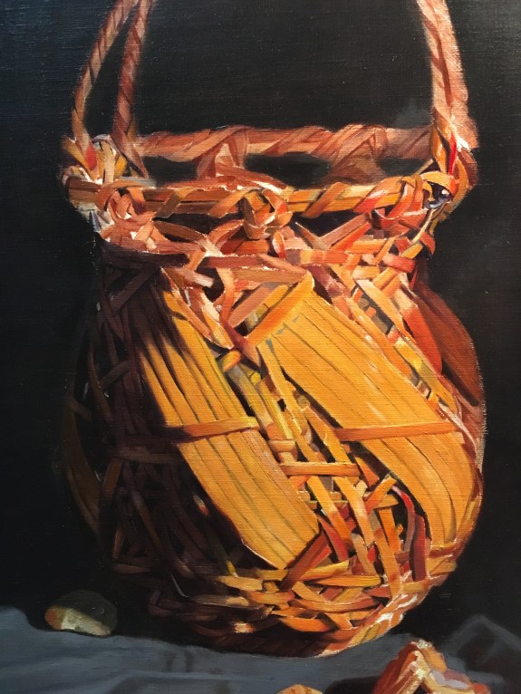
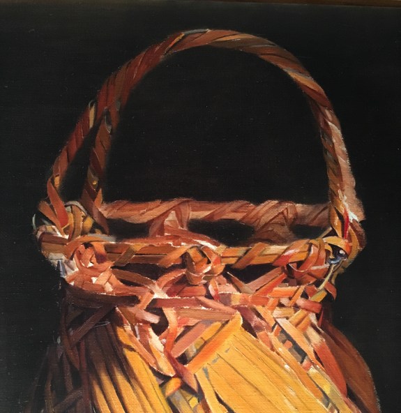
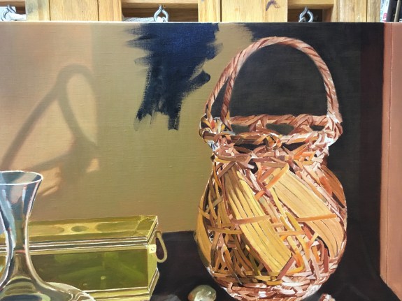
 At my next session, seen below, I decided to further darken the left band of bamboo and also add some highlights to the individual strip’s edges. I made the highlighted area on the right band much brighter, obliterating some details. I also brightened many of the other strips that were catching the light and made their edges soft and hazy to mimic the look of bright light glowing and bouncing off of them. I noticed that many of the small shadow edges looked rather sharp and too dark. This often happens when I make a first stab at painting shadows near a bright light. At first, it seems as though the dark area is very dark, especially when closely compared to the adjacent light. However, if I step back and take in the whole set-up, I can see that the light from the bright area reflects into the dark shadowed area, casting a light glow onto it, effectively making the shadow appear much lighter than it first seemed. It always seems counter-intuitive to paint these shadows lighter, but observation always wins!
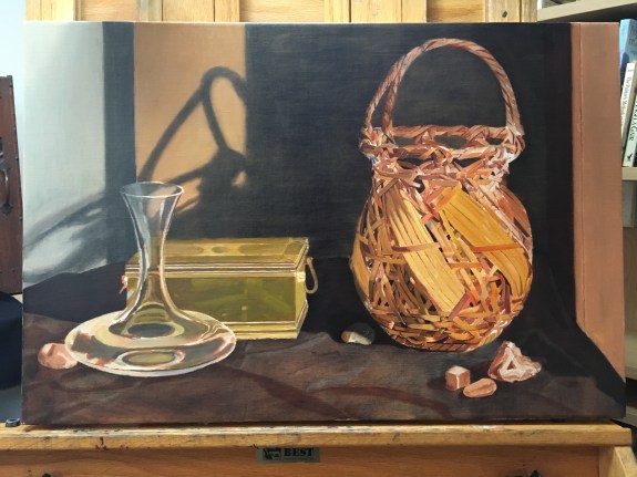
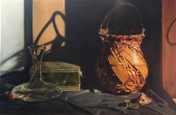
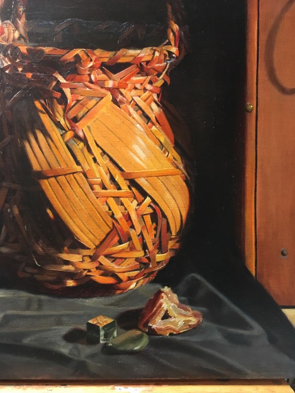
 In the second photo above, you can see that I’ve worked on the orange geode. I’ve added highlights to the right side and shadows to the left. I also corrected some colors. I darkened the table cloth with a gray glaze.