Painting something as complex as this scarf takes time. It’s front and center, so it has to look right. I began, as usual, with the underpainting, where I indicated the patterns and values very simply, following the drawing underneath very carefully.
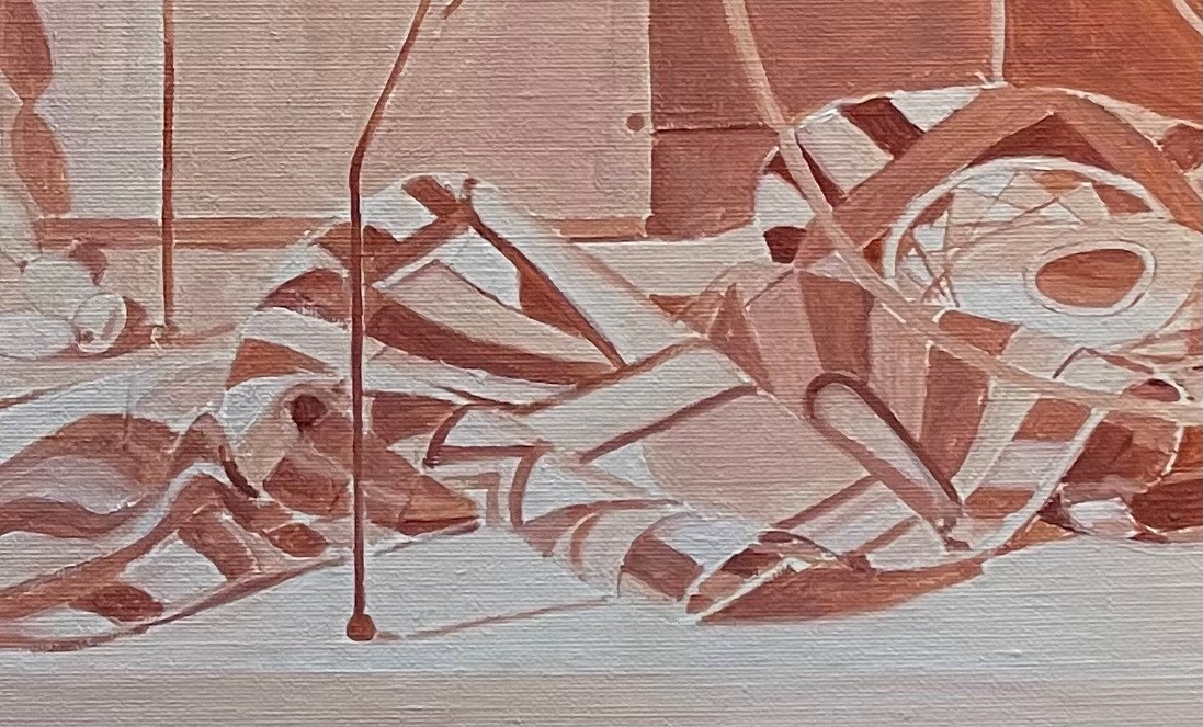
My first layer of paint, below, is applied very simply. I’m not aiming to capture subtle shadows or reflections. I’m just putting down the local color of the various patterns. It took a surprisingly long time to accomplish this. Below you can see what I finished in one day.
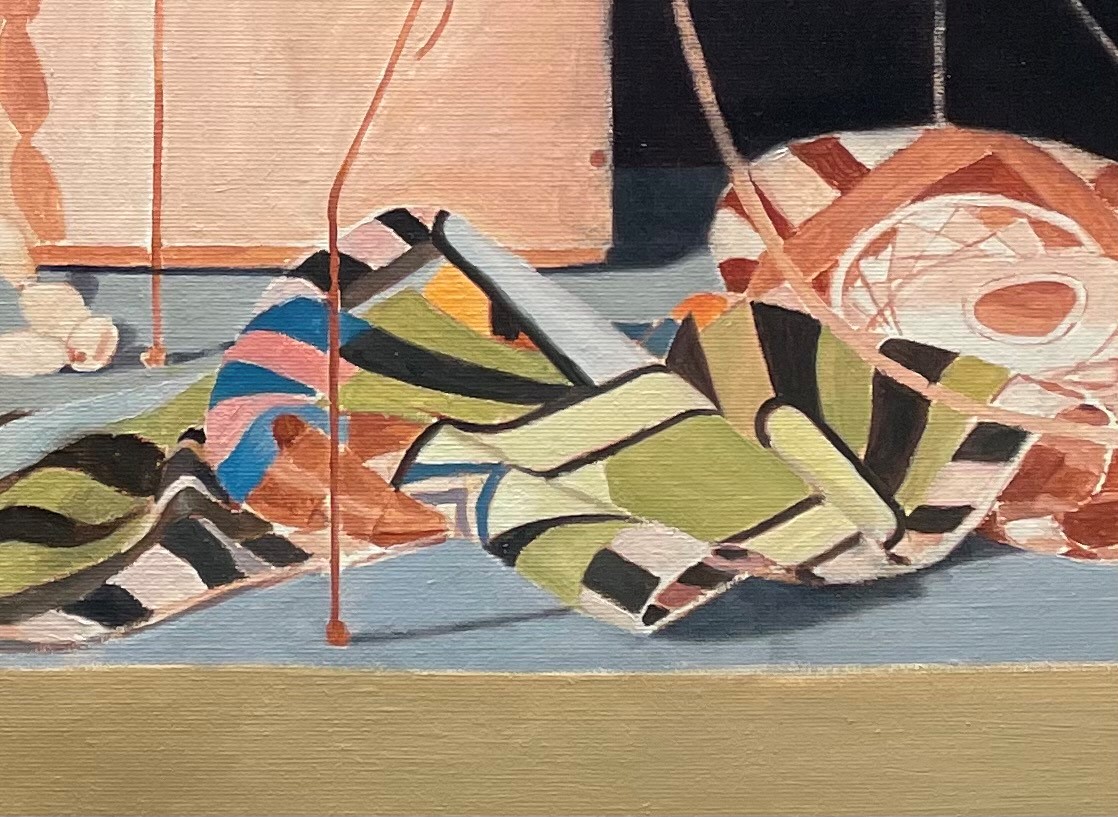
Below, on the second day, I’ve finished the first layer. When this dries, I can begin to refine.
Below, the shot is a little washed out, but you can see that I’ve begun to add some highlights and shadows. I smoothed out some rough edges, and added the white dots. I lightened the black bits of the pattern. Though they seemed so dark at first, they really were reflecting quite a bit of light.
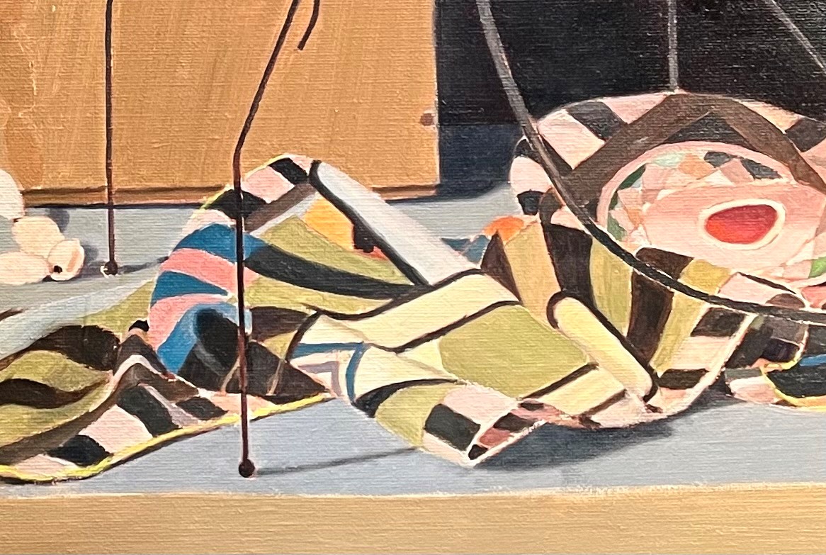
Below, I’ve applied another layer of paint, always carefully observing the edges. Often, an edge seems sharp at first, but when you look closely, the light reflecting around blurs it. I’ve also begun to think about the yellow edge of the scarf, which is hand-stitched, giving it a distinctive puckery look. I’ll refine these areas later. As I work, I always try to observe carefully and correct my drawing. Even at this stage, I often find mistakes. Some aren’t worth fixing, as they don’t effect the design of the painting, but others are. I don’t want accuracy just for the sake of accuracy. Every decision has to be made with the goal of achieving a beautiful result. No one will ever know if the abstract pattern of the scarf in the painting is slightly different than that in the real scarf.
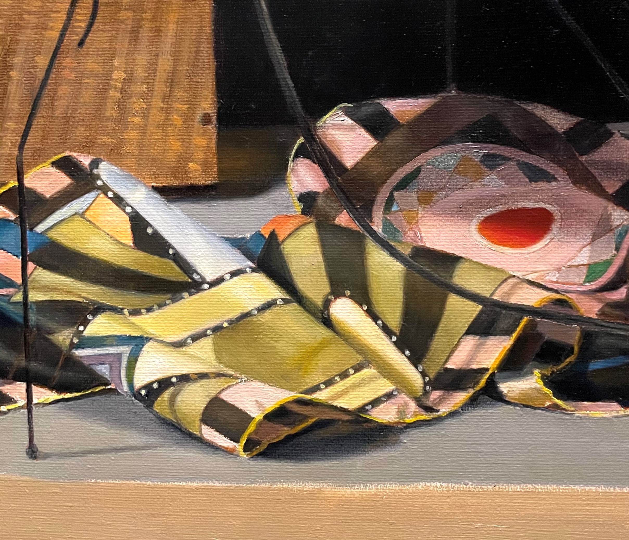
Below, I’ve worked on the cord hanging down from the lamp, softening the edges where it meets the scarf. I’ve added the shadow that the cord makes onto the scarf, keeping its edges very soft. I’ve added some bright highlights directly under the lamp.
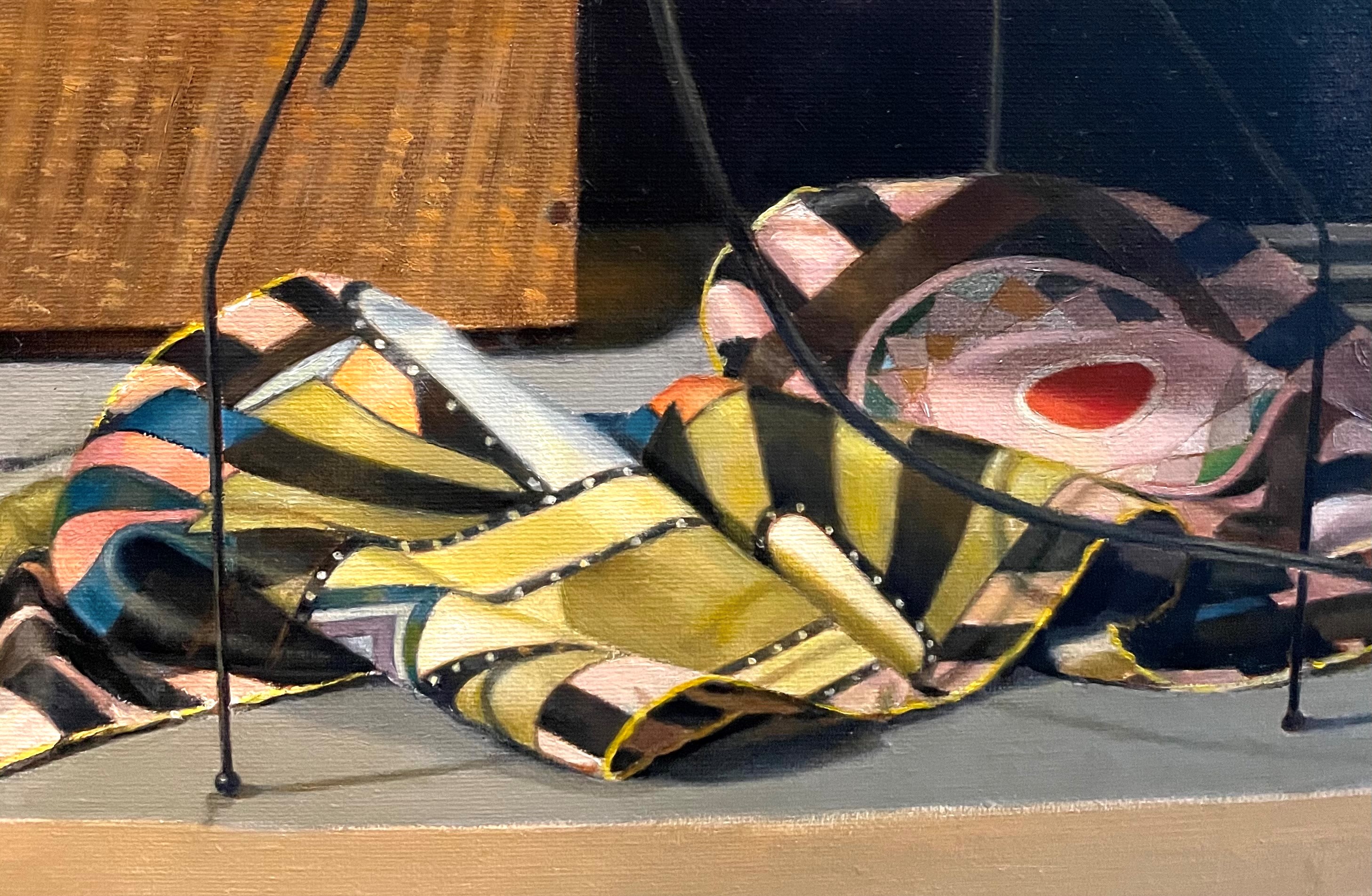
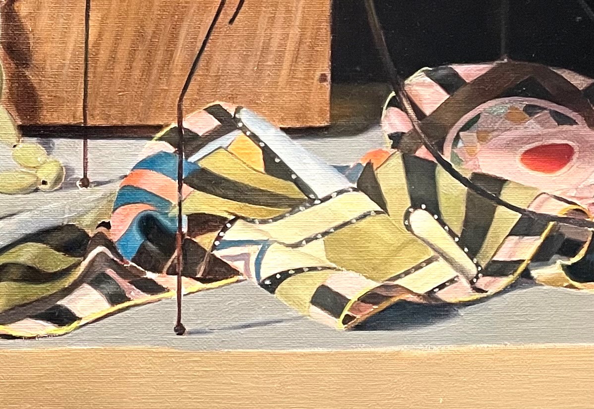
Below, I’ve repainted the area around the red dot, and indicated the edge stitching on the far right. I also worked a bit more on the yellow edge. It was tricky mixing the correct color for this edge in shadow. Often, when you try to darken yellow, it ends up looking greenish. I added some transparent golden ochre, cobalt blue and raw umber to get the color in the shadow. The trickiest areas in the scarf to paint were the folds in shadow. They seemed dark at first, but were actually quite light compared to the darkest areas of the painting. I found the pink areas in shadow especially tricky to mix. I ended up using a mix of cadmium red, viridian green, cobalt blue and naples yellow. These pink areas, being somewhat sheer, let the light shine through them, illuminating the shadow cast onto the table top. you can see this in the bottom left of the photo below.
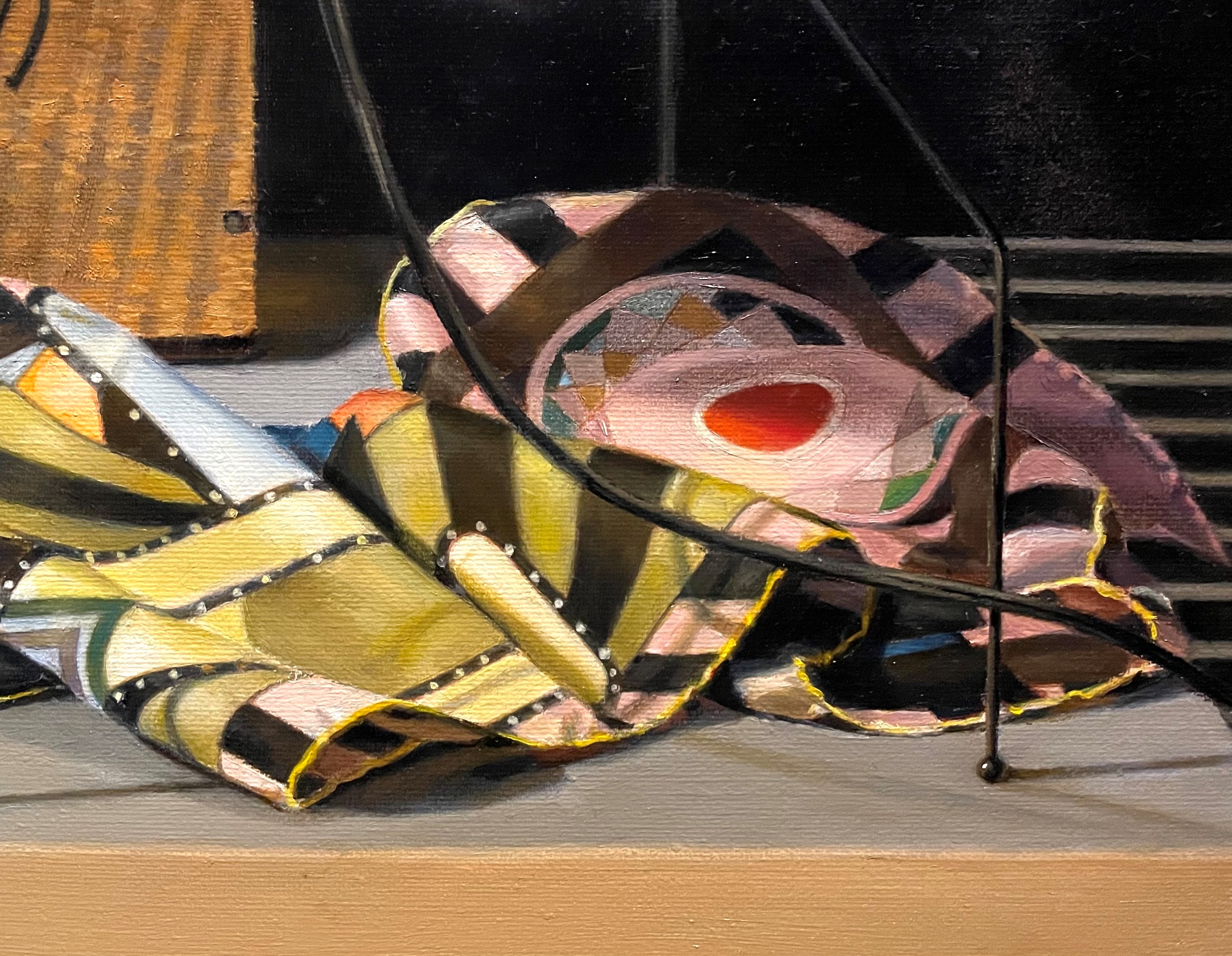
Finally, I lightened the black areas of the scarf again. They seemed so dark at first. I think this was because my mind knew that they were black. However, if I looked carefully at them, I could see that they were illuminated brightly, just like the rest of the scarf. Lightening them made them look like they were being lit by the same light source.
The scarf is mostly finished, but I’ll probably come back to it to make small adjustments.
