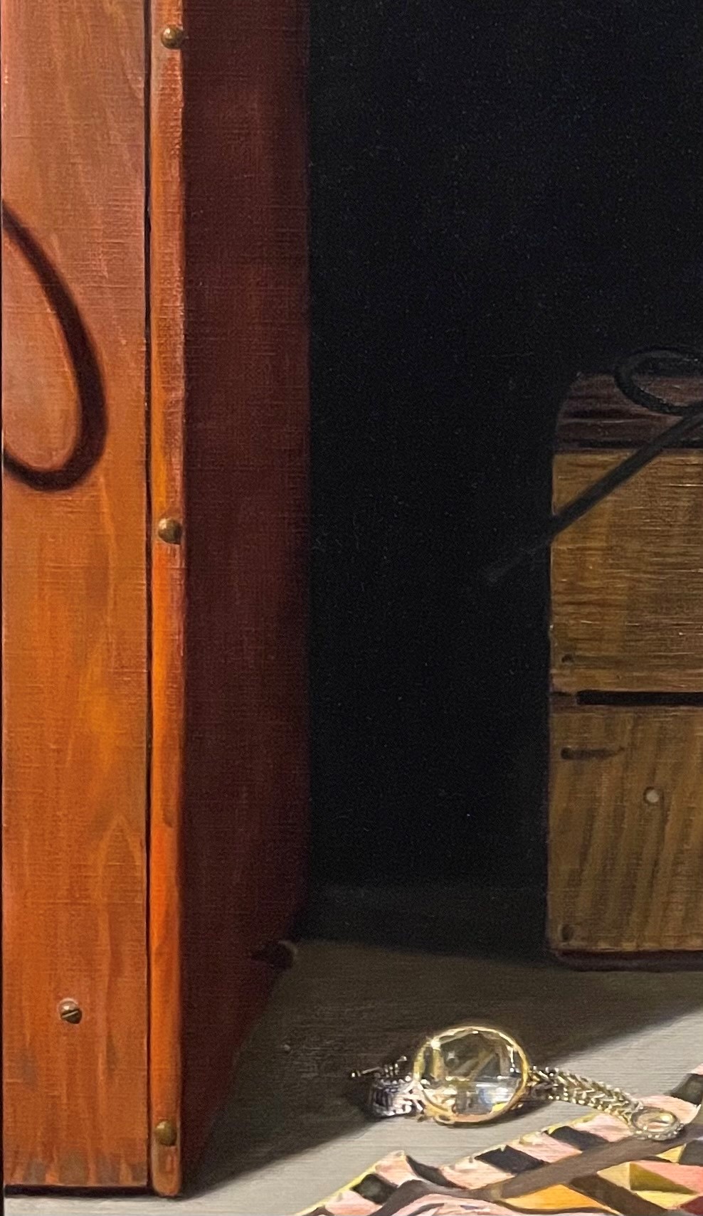
Below is the wood box on the left side of the painting. It has received no paint on top of the underpainting yet.
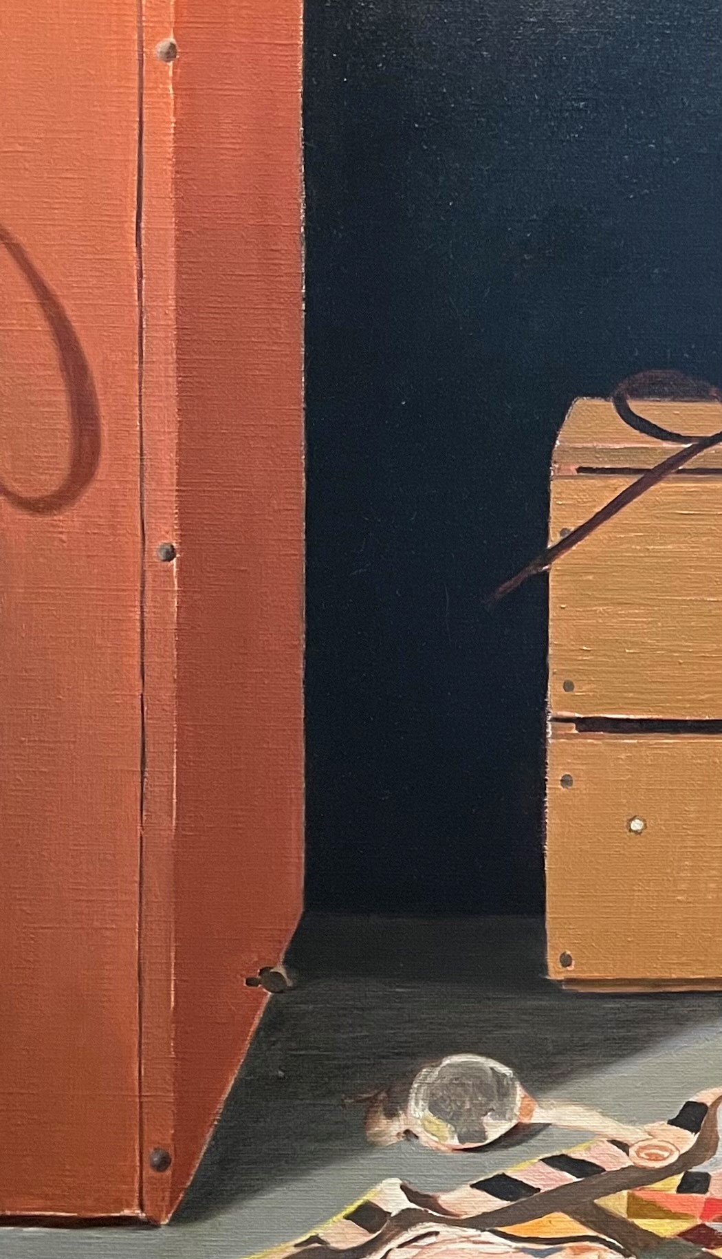
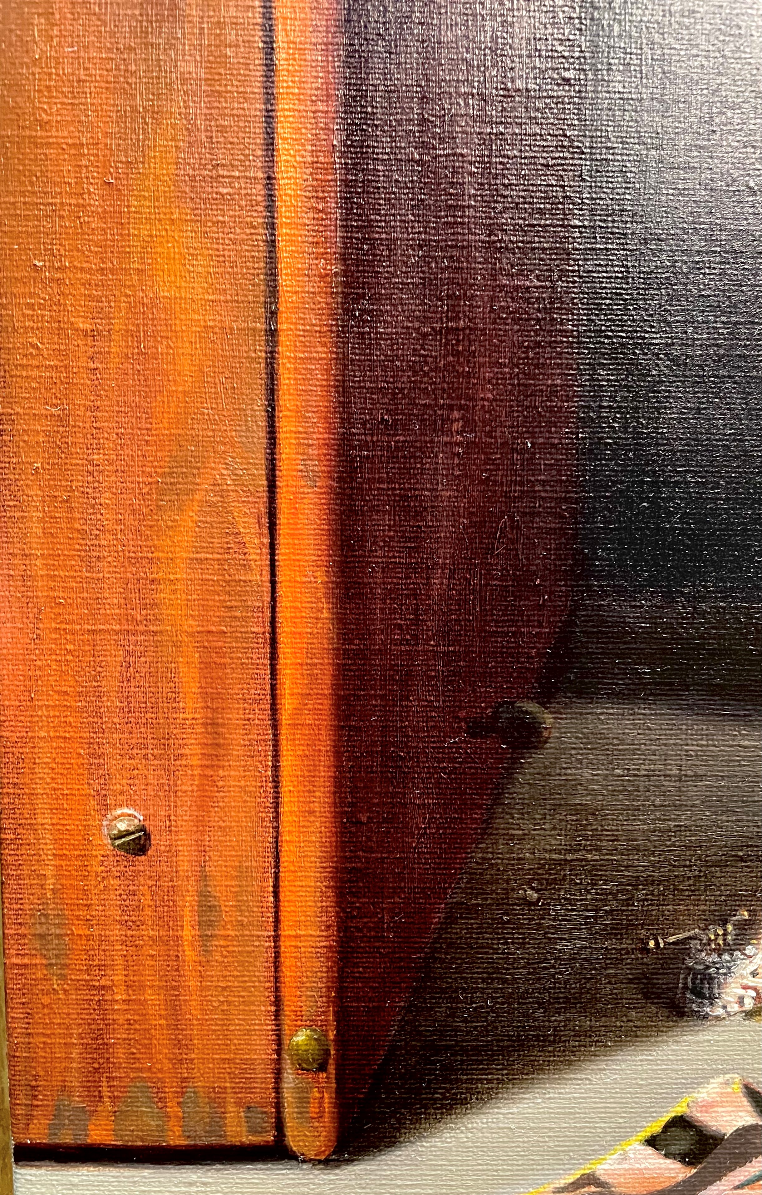
Below, I glazed a dark shadow onto the box’s shadow side and began to roughly paint in an indication of the lines of the wood grain on its light side. These lines don’t have to be exact. My goal isn’t to perfectly replicate the wood grain, just to indicate it convincingly by showing its characteristic patterns and colors. I tried to keep all of the lines in a very tight value range. If the lines are too dark or light, they will stand out too much and look wrong. I adjusted the colors. The underpainting color was close, but not quite right. On the edges where the spot light struck, the color was a surprisingly bright orange. The other colors of the various streaks of the grain were much more subtle. I mixed up many options before finding the right ones. These subtle colors can be hard to mix! Its best to avoid putting too many colors into any one mixture, as it can easily turn muddy.
Below, is a close-up shot. I’ve worked more on the rivet, showing its highlights, cast shadow, and reflected light. Even tiny parts of the painting deserve to be painted in such a way as to show the light. It all adds up. I adjusted colors more, and added some details at the bottom. I softened the vertical edge where the box turns into the shadow. It can be hard to get these smooth gradual transitions. Luckily, oil paint is easy to manipulate and blend.
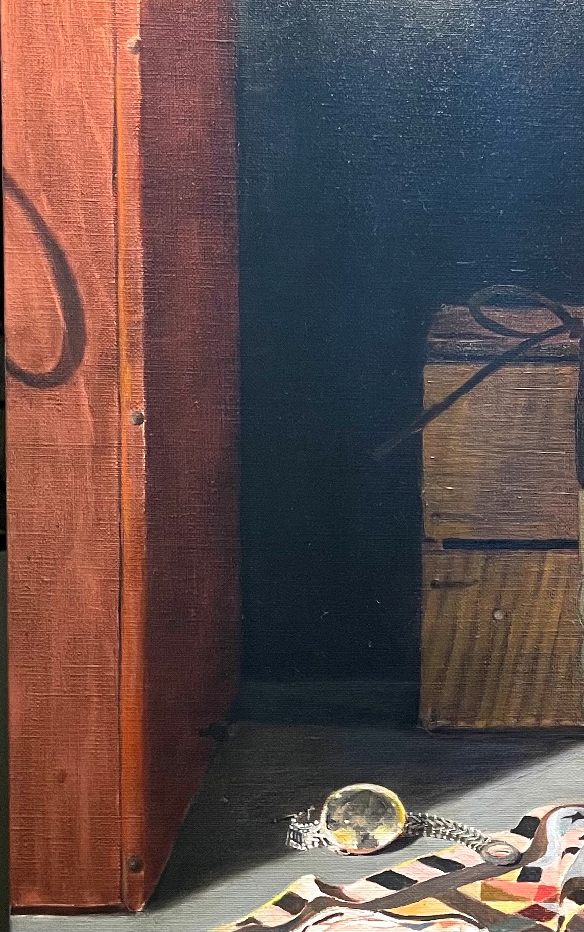
Below, I’ve continued to refine the grain, carefully observing the values and colors. I added another glaze to the dark side. I used alizarin crimson, ultramarine blue and raw sienna. I painted into the wet glaze with some very dark paint, barely indicating the wood grain. Details are very muted in the shadows, so a bit goes a long way. Painting into a wet glaze produces a very subtle blended effect.
I’m happy with the wood grain. It’s detailed enough to be convincing, but not so detailed as to look fake or to draw too much attention away from the focal point.
