For me, having the correct values in a painting is even more important than having the right colors. Value is the lightness or darkness of an area. The eye is drawn to differences in value. Controlling the values means controlling where the eye will go in a composition. Also, the correct values can make an object look convincingly illuminated and 3-dimensional. Finally, as I’ll show you below, they can make an object appear as though it’s glowing.
Below, I’ll show you two versions of my latest painting. First, you’ll see the older version, and next, the latest version. You’ll see how controlling the values greatly improves the composition and the feeling of reality.
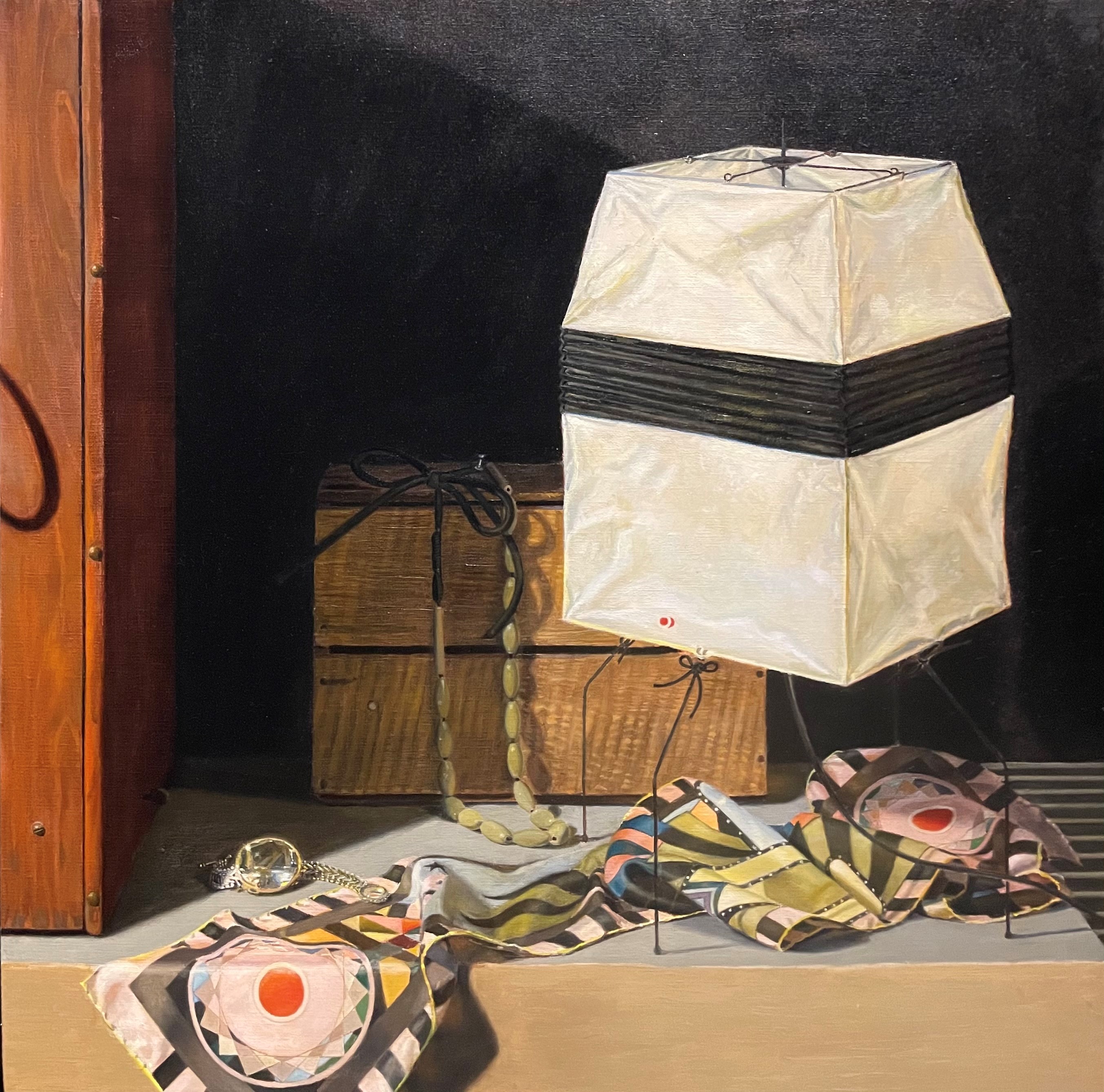

First, let’s compare the Japanese lamp in both versions. My goal was to make the lamp glow. To do this, I needed it to be brightest where the lightbulb inside the lamp shone through. This is the area just below the black band on the left side of the lamp. I painted this area with my lightest valued color–pure lead white with a touch of cadmium yellow. To make this area appear brightest, most every other part of the lamp had to be darker in comparison. The range of values that an artist can represent with paint is extremely limited in comparison to what exists in reality. This means that the artist has to alter what he sees in order to emphasize what he decides is important. So, in order for the brightest spot on the lamp to look bright, the other area had to be painted darker (even if they might not have seemed so in the set-up.) In the second photo, I darkened the other planes of the lamp, leaving the bright spot as light as could get it. I had to be very careful not to get too dark, or the illusion of light would be destroyed. I also added touches of this brightest white along some of the edges of the lamp, making it seem as though light were spilling out. I scumbled some lighter tones over the black band in front of the lightbulb, so show that it was glowing through there, too. This value had to be much darker though, since it was shining through dark paper.
I felt like the scarf wasn’t drawing enough attention now that the lamp had been brightened. Though the lamp is the focal point, I also want the scarf to shine. I decided to address this problem by increasing the value difference in various areas of its pattern, brightening some areas in the light, and adding more darks in the shadow.
Finally, I wanted the hanging necklace to connect the lamp and the scarf, bringing the eye up from the scarf to the lamp. I decided to lighten the value of the beads on the right side, in the light. You can see this in the second photo. Now, the two area of the painting are connected, creating a path for the eye to follow.
I’ll continue to make adjustments until I’m completely satisfied. It’s almost there!
