Of all of the things I’ve painted, letters give me the most trouble. There are so many tiny nuances to their shapes and spacing. Sometime, you can just suggest letters, but if a book is front and center, it would look very strange if everything was well-defined except the letters! Though it’s tempting to perfect the letters in the drawing, (because it’s so much easier to depict tiny details in pencil) I have found that in painting the body colors of the book, I lose the drawing! There is no practical way to paint around the letters, keeping them visible. My usual method, then, is to complete the book, and then when it is dry, to do the lettering.

Above, you can see my first attempt. I very lightly paint in guidelines for where the letters begin and end, then sketch in a bare-bones version of the letters. I usually end up wiping this off many, many times before I’m happy with it. I always end up making the letters too big! This is where working on a dry surface comes in handy. I can wipe off my mistakes over and over again
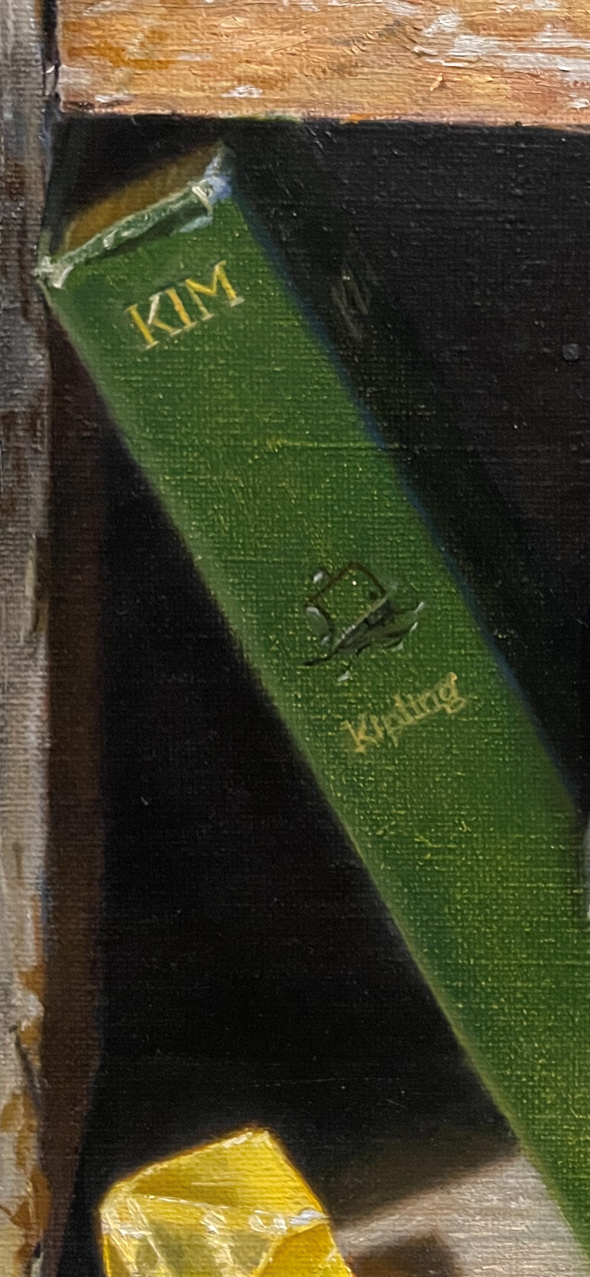
It’s tempting to just paint in a generic version of each letter, but it looks much better when you pay attention to the particular font and its look. It helps to look at the space between each letter, too, not just at the letters. The trick is to see the shapes, and not depend on your previously-formed idea of what letters look like. I mix up the color of the book, and the color of the type. I switch back-and-forth between them, using the color of the book almost like an eraser, teasing the paint to perfect each letter. I try not to get too obsessive about this. It doesn’t fit into my style of painting to be super-exact and make the painting like a photo. This is an oil painting, after all, and I like for it to look painterly. After all, from the distance I’m viewing the book, the letters aren’t super-clear. Its never a good idea to paint more detail than the eye could really see! (In this photo, you can also see an example of just suggesting lettering in a shadowy area on the front cover of the book.)

Above, I’ve begun to indicate the subtle reflections in the gold lettering. These were hard to do . When I looked at them, they looked bright, but when I painted them that way, they looked way too bright. I think that it’s natural that when you’re studying something, you tend to see it in a more focused and detailed way. When you take in the whole scene, though, you can see relationships better. I also tried to show some of the shadows and highlights from the embossing, in a very general way. All of these ideas also apply to the painting of the small boat illustration!
I’ll probably work on the letters a bit more. A few of them are a bit crooked, and I still need to ‘erase’ some gold paint in places.

I am beyond impressed by the letters you have created here. Being a book nerd, I may love this particular painting a little more than the others! When you posted your painting of these on Instagram, I actually gasped in aww of your talent and ability. Where you see imperfection, I see perfection in a rendering of a book.
Thanks so much for your thoughtful comment! I love books, too, and love to paint them- but it’s much more interesting if they are old and well-worn! I think my next painting will contain some books, too!