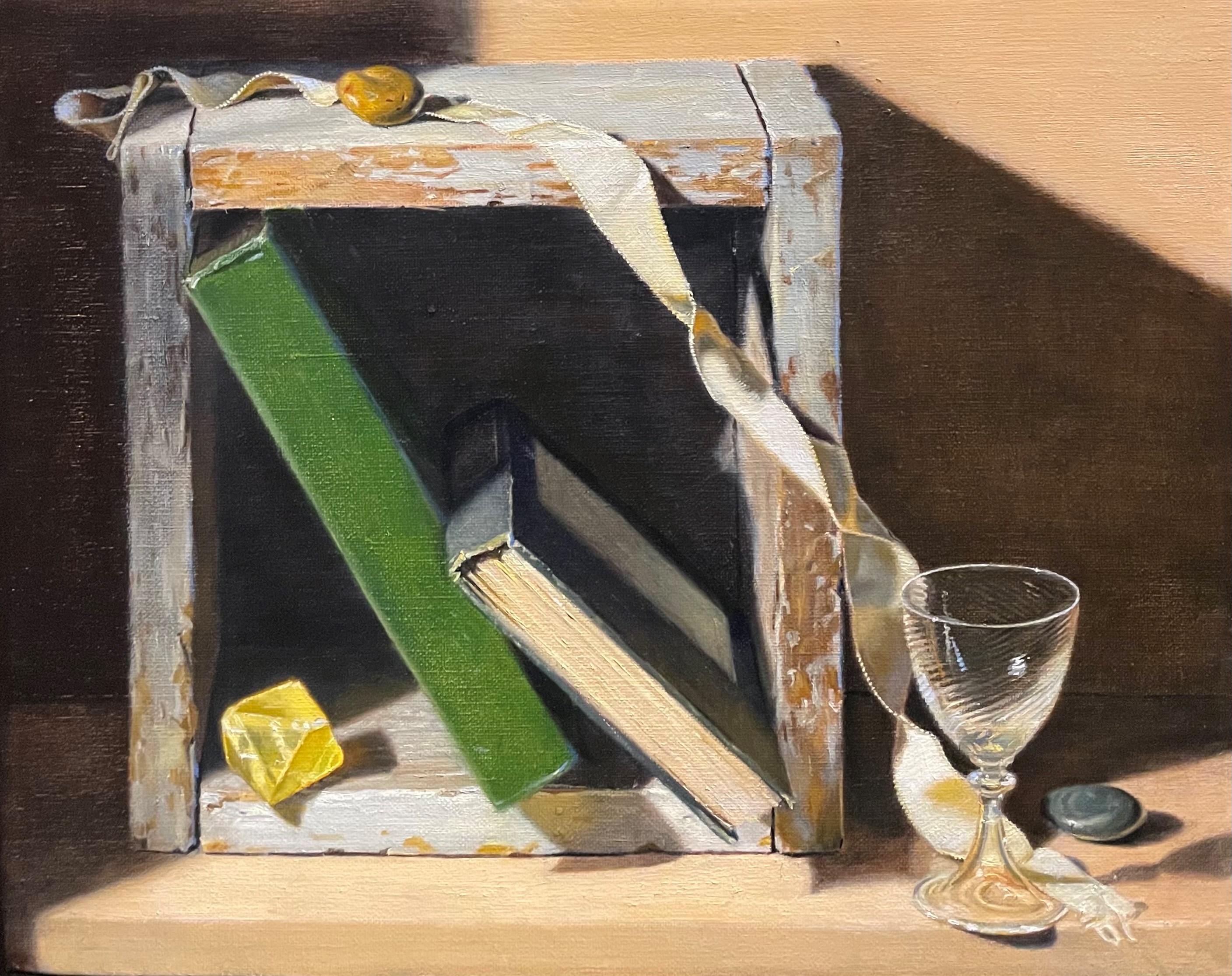
When I set up this still life, I intentionally let in a bit of cool daylight from a window to the right of the set-up to contrast with the warm spotlight on the left. This variety in the temperature of the light adds vibrancy to the painting.
Since the warm spotlight is so bright, it can be difficult to see the cool lights, so I turned off the spot for a while. The first photo below is the set-up with the spotlight on. In the second, I’ve turned the spot off.
I’m at the po
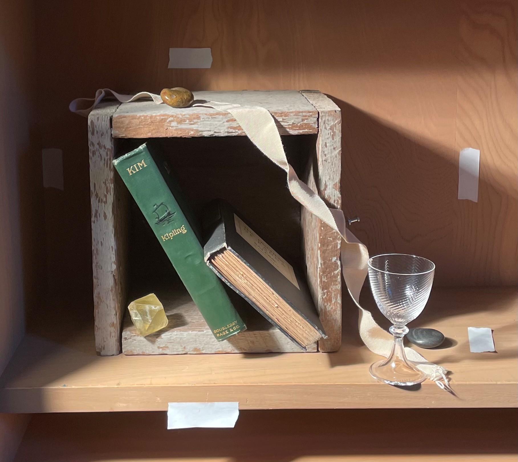
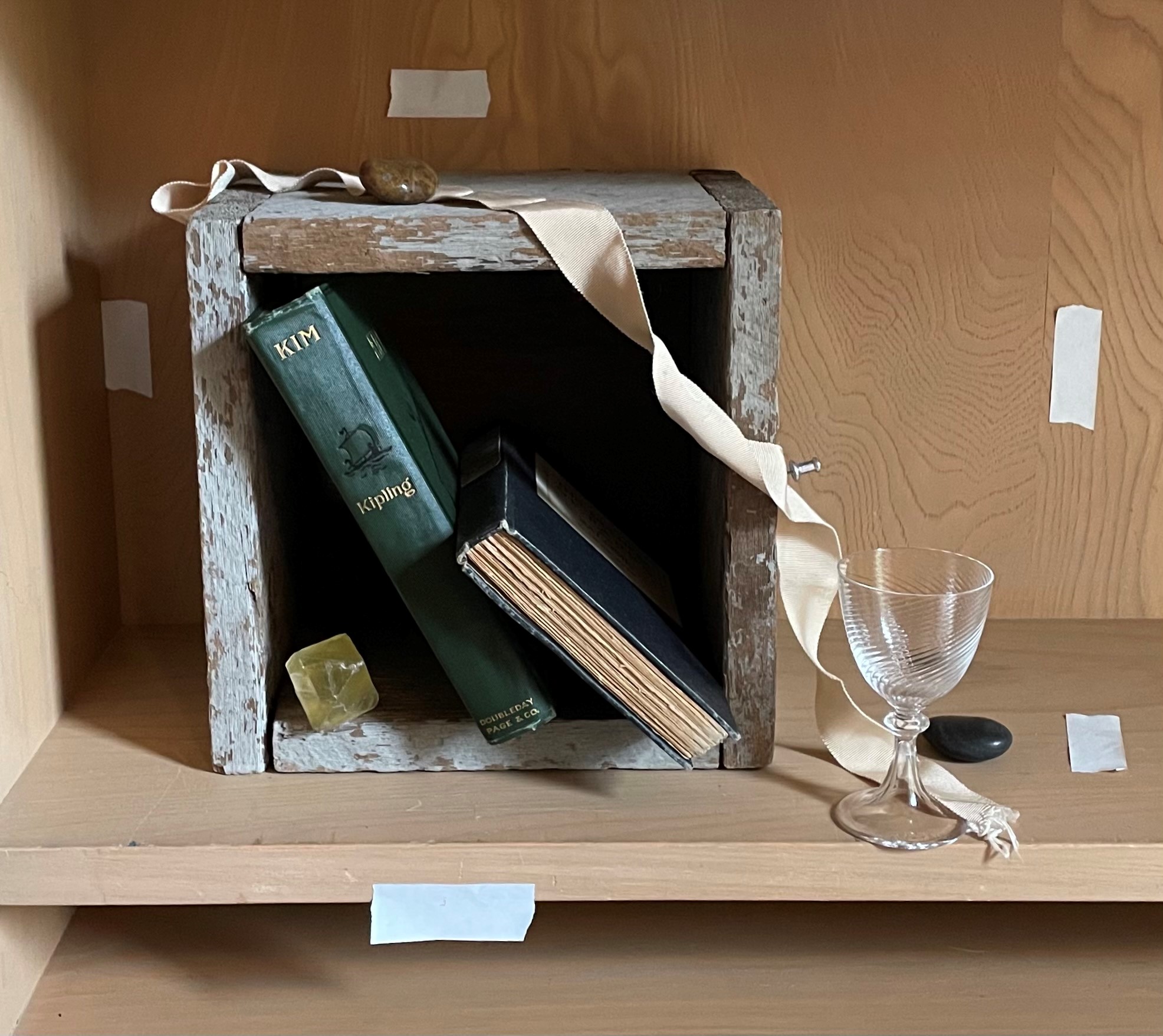
They are dramatically different! It’s now easy to see where the cool natural light is. The right side of the green book, the right edges of the box, and the right-facing surfaces of the ribbon are all quite cool and blue. There are some blue highlights on the glass as well. The table top on the right is also very cool. Some of these effects will become invisible when I turn the spot on, but many of them can still be seen.
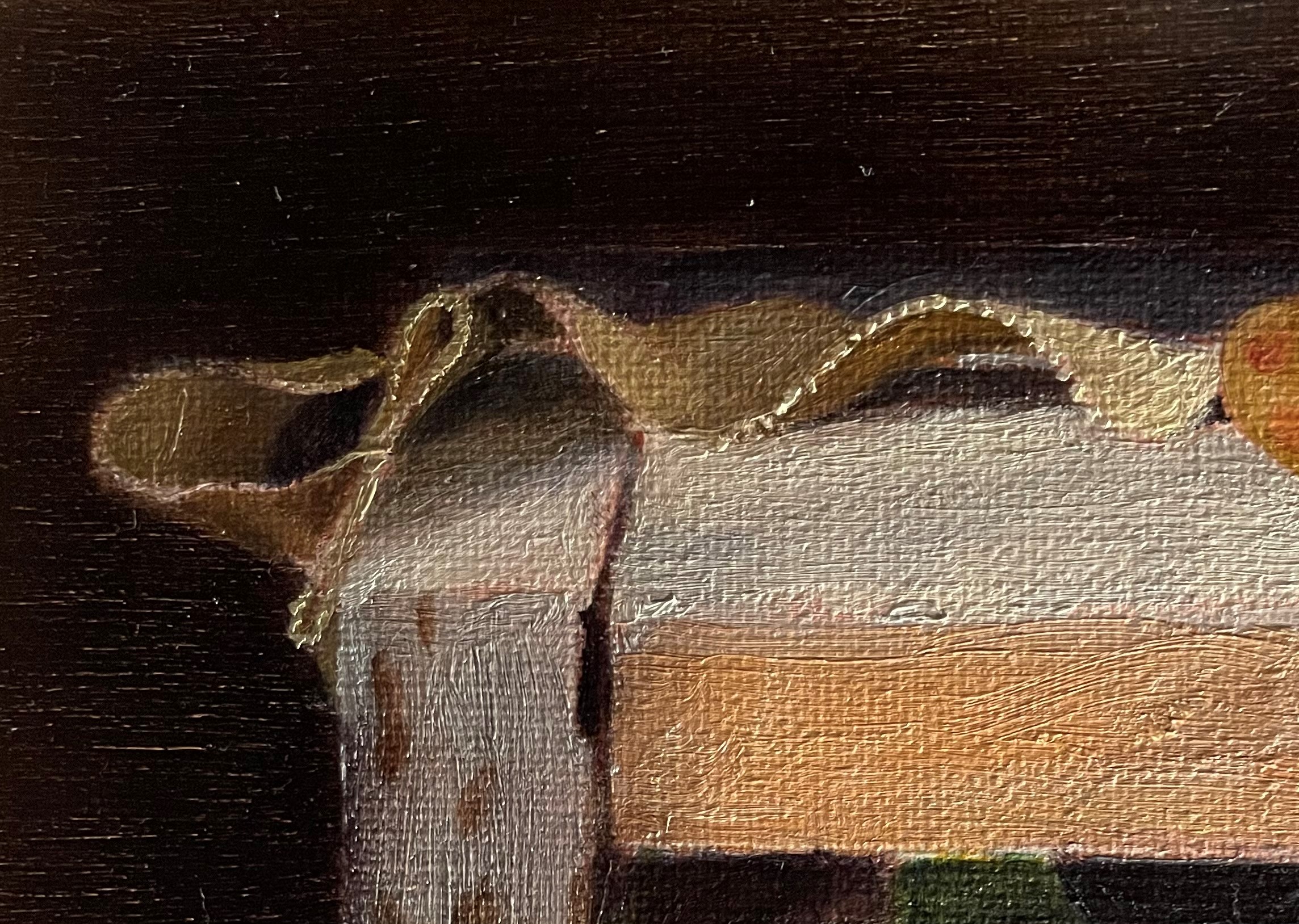
Above is the ribbon as I first painted it. I used mostly warm hues, because that’s how it looked to me at the time. Now that I’ve seen the cool lights with the spot off, it’s easy for me to see them with the spot on! Below, I’ve added the cool tones. I think that it looks more vibrant now.

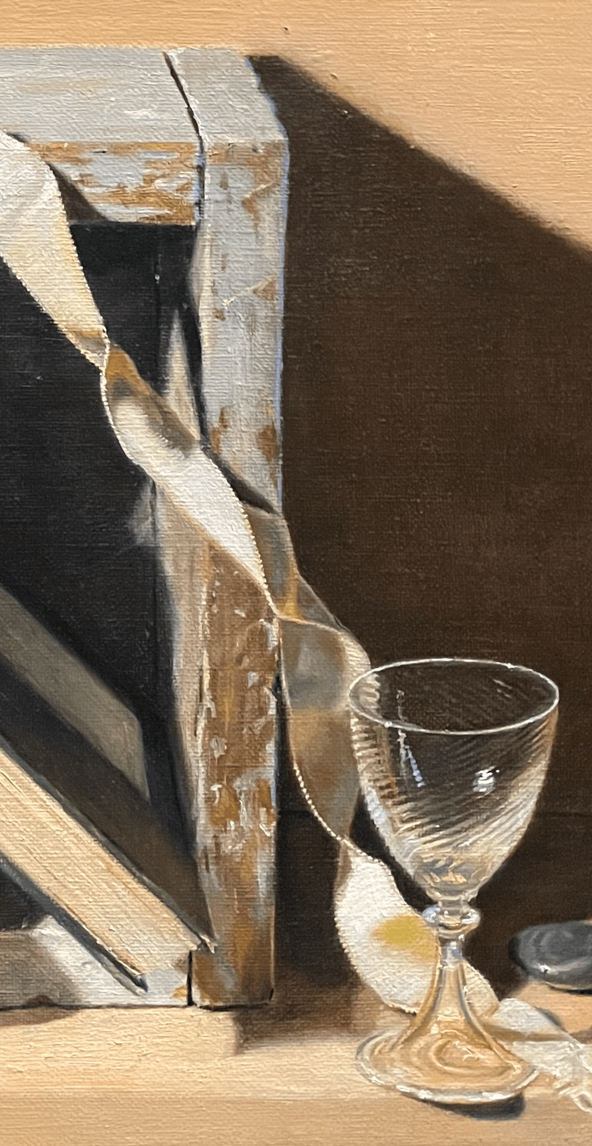
Below you can see where I’ve added a blue edge to the right side of the box, the glass, and the right-facing side of the rest of the ribbon
I have found that just looking is not enough. The brain has to understand what is causing the effects that we see. Only then can you really begin to see what is in front of you! I encounter the same issue when drawing. If I don’t understand the perspective, no matter how much I observe and try to re-create what I see, it never looks convincing. When I take the time to study and understand, then I can actually see more and draw it properly.