My first stage in painting the blue book was to block in the local colors. Since I will be glazing the shadows on the cover later, I don’t indicate them yet.
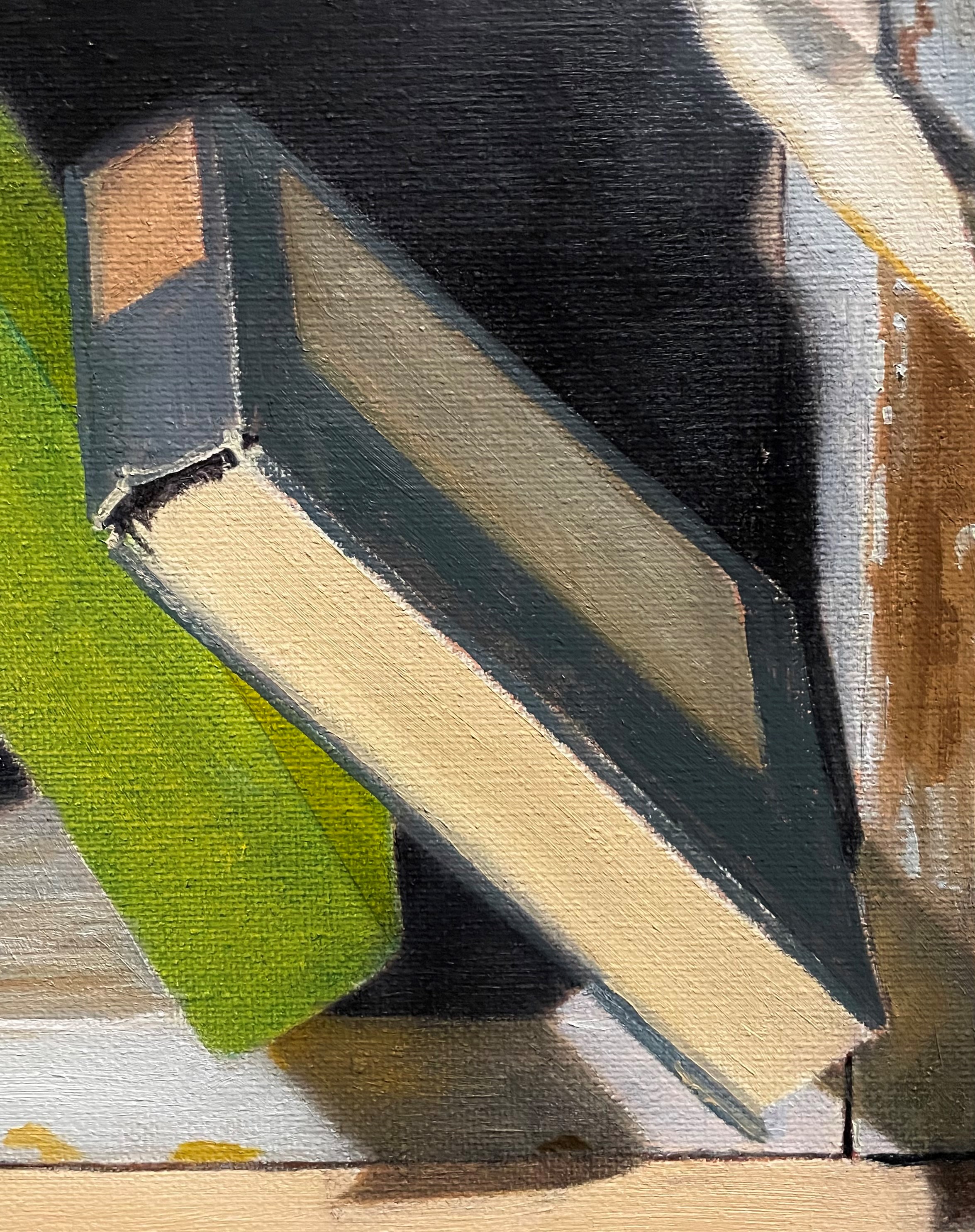
After that layer was dry, I glazed in the shadows. You can see this in the photo below. I then began to indicate the signatures on the book pages, especially near the spine, where they are the most visible. I also painted the end page at the bottom left where it curves away from the other pages. Basically, I’m just painting the most easy to see features first. I scumbled some thick paint to indicate the rough texture of the page ends. I added a little detail to the edges of the book’s cover. I refined the shape of the pages at the bottom of the book. It wasn’t a straight line, as I had shown, but had a more jagged edge. I saw some reflected light from the box on the book’s front cover, which I quickly painted in. I’ll refine this later.
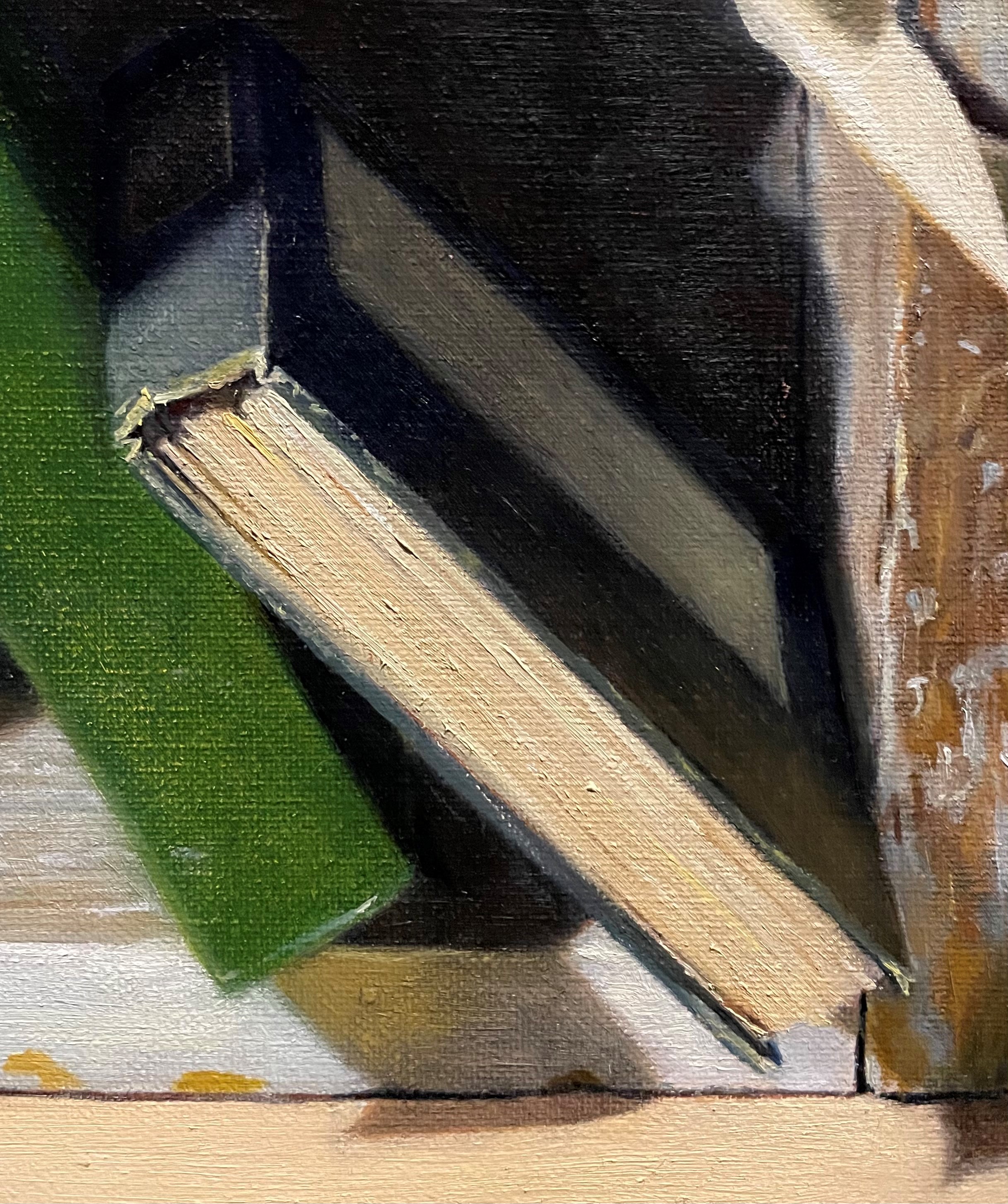
At my next session, below, I’ve painted some cool natural light coming from the window on the right, onto the book’s cover. I was then ready to begin putting in some more detail on the page edges. I can’t paint every page and bump, nor would I want to! I just want to show enough to communicate the textures and feel of the pages. I could see little bumps that caught the light and cast tiny shadows. I painted these using very slight value changes. When I squinted my eyes and looked at my canvas, all of the pages should appear as one value. If I used too dark darks, or too light lights in painting these details, they would stand out way too much. It’s natural to emphasize differences in color and value when studying something, but it takes practice to show restraint and paint details in a more subtle manner than you first think is required. I often put down a color thinking that it’s correct (ie: the faint shadow line between two signatures, and see right away that it’s way too dark! Fortunately, I can always wipe it off and try again!

Below, I took a shot at indicating the lettering on the front of the book. These letters were hardly visible, so I’m not even going to try to actually letter them. I never like to paint a detail that I can’t actually see from where I’m observing the set-up!
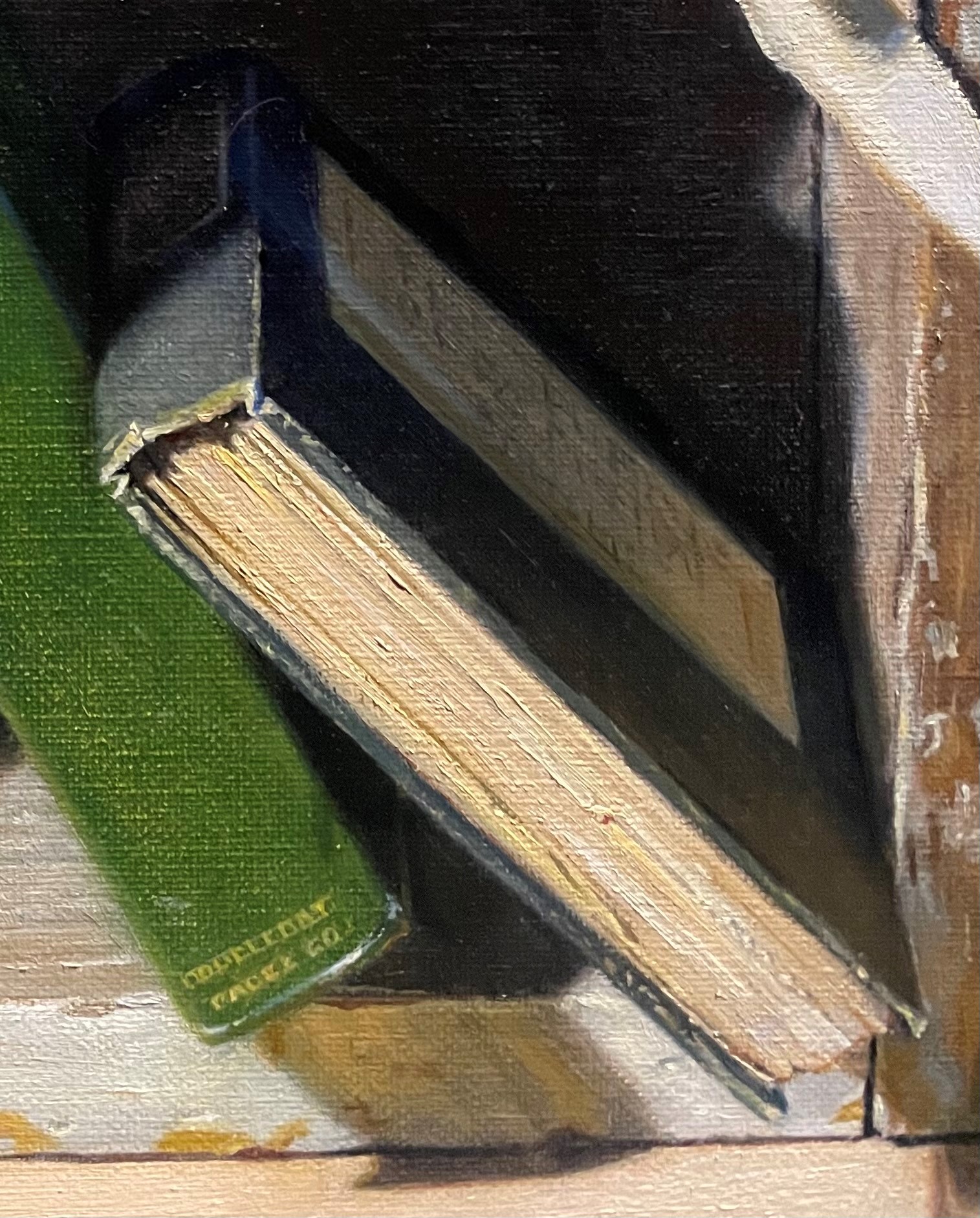
Below, I’ve strengthened the reflected light onto the cover, and continued to add some more definition to the pages. I lightened the edge of the back cover on the left side of the book. I also lightened the inside of the box a tiny bit, so that you could see where the book ends and the background begins
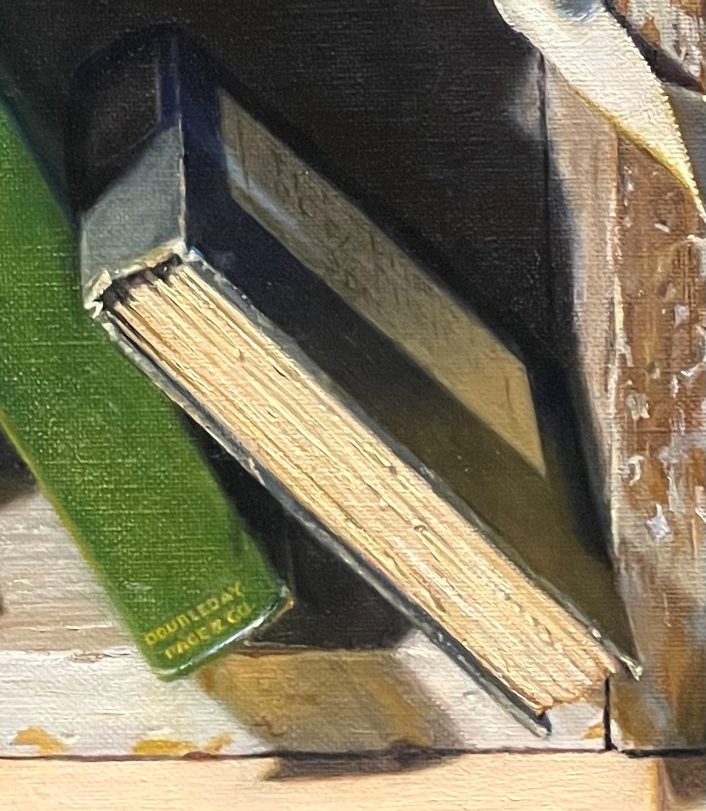
I’m happy with the results! I’ll see how I feel about it in a few days.
