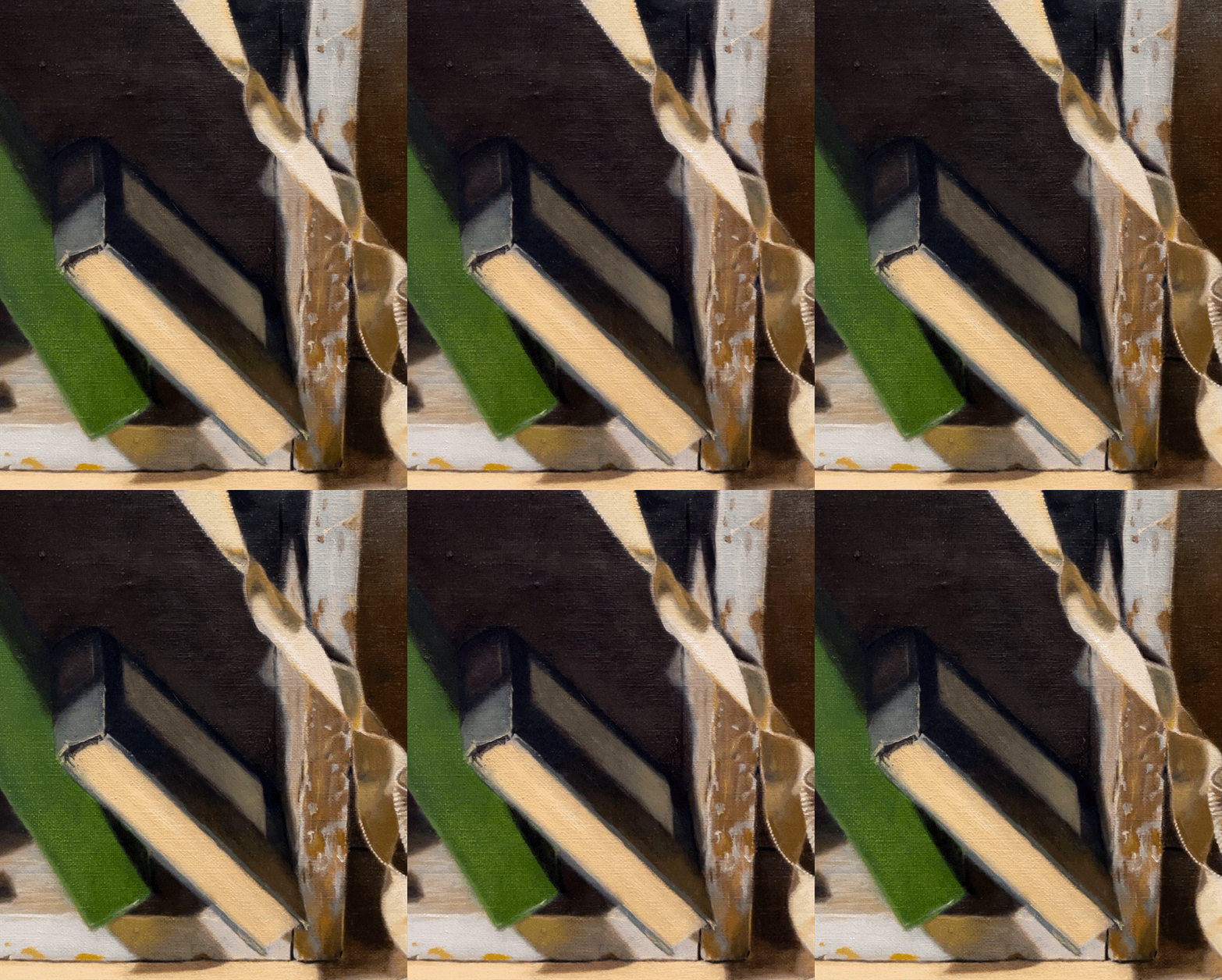
I thought that it was time to give the pages of the blue book some attention. Below is how it looked when I began. I wanted to begin indicating the texture of the pages.

Below you can see that I’ve begun to paint the signatures of pages as distinct units. I don’t have to paint all of these precisely, but near the spine, they were very obvious. It was tricky deciding what colors to use. I ended up using lead white mixed with a bit of transparent golden ochre and cobalt blue. For the darker bits, I added a small amount of raw umber and more cobalt blue. It’s important to keep the values of the dark and light areas very close. It’s easy to over-emphasize the differences and paint the shadows too dark. When I squinted my eyes and looked at the set-up, the edges of the pages all looked the same value! It’s wise to keep checking.

I defined the edges of the book’s cover and refined the bottom edge a bit. I sharpened up the label on the book’s cover.

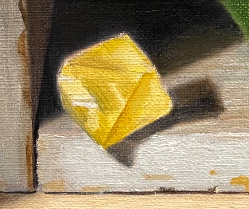
Now I turned to the fluorite crystal. Above is how it stood.

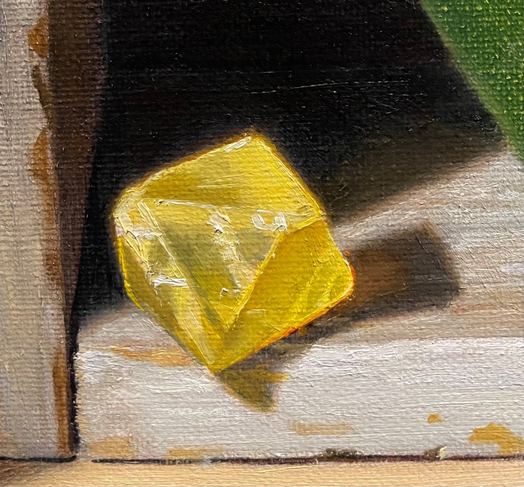
The first thing I did was to paint some raw sienna mixed with cadmium yellow around the lit edges. I darkened the tone as I went away from the outline by mixing in some raw umber. This blurred the edge and made it look as though the light was radiating out from the fluorite, making it glow. I added in the darker tones, adding some cobalt blue to the yellow to make a greenish color. I added some highlights. I could see a bright orangey red area at the base of the crystal where it meets its cast shadow. I saw them out of the corner of my eye. When I focused on the area, they disappeared! I always try to capture these bits of phantom light. I painted in some pure cadmium orange, cadmium red, and alizarin crimson around this edge. I painted the warm reflected light into the shadow. I used a mixture of raw sienna, raw umber, and a bit of alizarin crimson.
I’ll return to these areas again and again, getting closer each time.