
The second brick from the left had curving ridges forming a concentric pattern. I indicated this right from the beginning with the first layer of the over-painting with thick brush strokes.

At my next session, above, I roughly painted in the larger ridges and shadows. They didn’t necessarily line up with the ridges in the first layer, but that didn’t really matter. I knew that it’d contribute to the textured look in the end. Everything was difficult to see clearly at this point. It was frustrating, but I knew that I’d see more at every session.
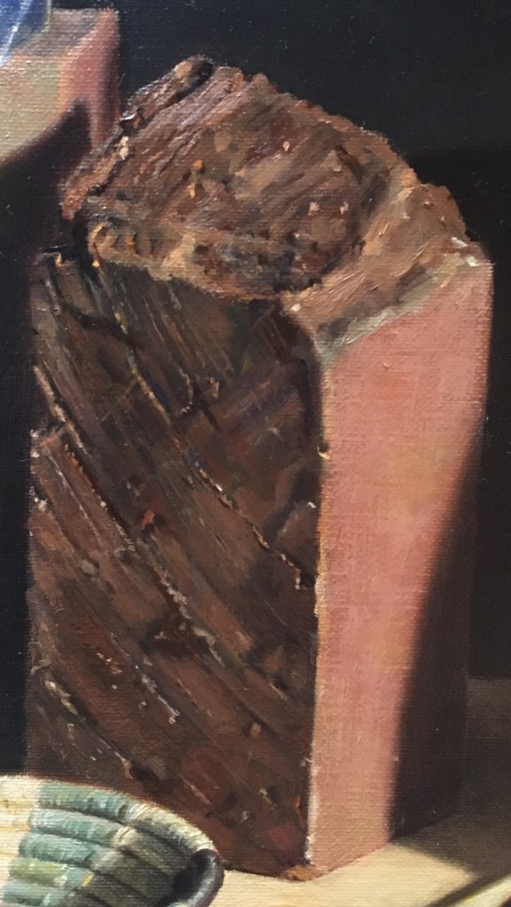
I noticed a greenish cast in many areas, so I scumbled in a medium, green tone. A glaze would have made the area too dark. I added a few more details, but it’s still very rough. I scumbled in a light tone over the right side of the brick facing the light.
I painted painted over the greenish areas with some orange tones, and continued to add details. At this point, I wasn’t sure how detailed I wanted the brick to be. Partly I wanted to just suggest the texture, but since the brick was is a prominent position, I wanted the details to reward close inspection. I knew that I couldn’t paint every ridge and hollow, though!

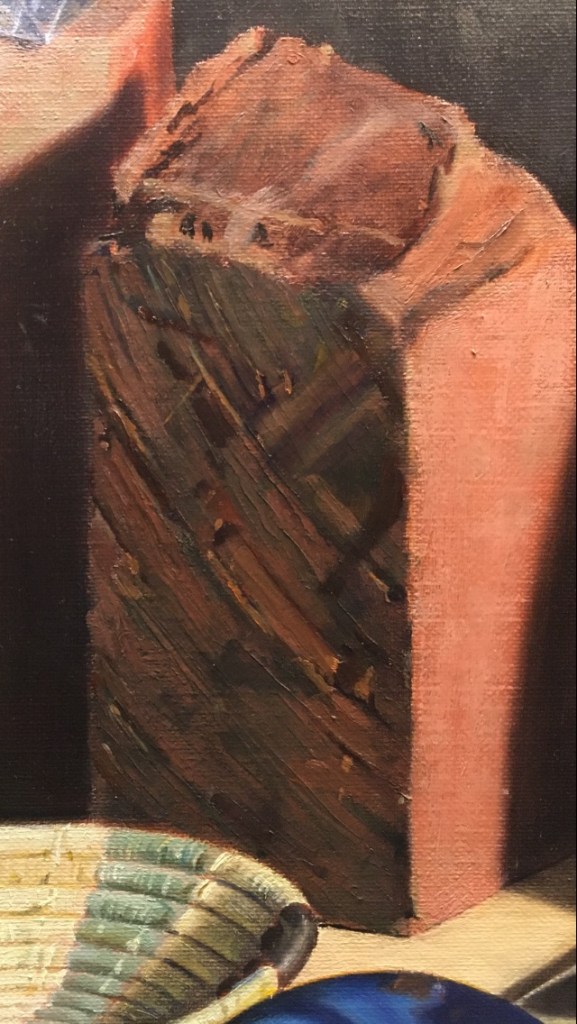
Above, I’ve started to put in some tiny, sparkling highlights. I was careful to give every ridge I painted a shadow and a highlight. It’s important to keep these very subtle. It’s tempting to make the shadow very dark and the highlight very bright, but they both have to fit into the general medium value of the brick when I squint my eyes and look at it. Even though the shadows seemed very dark black when I first studied them, they were actually a darkish, muted red. The highlights were not white, but a dull medium orange. I didn’t figure this out until I had tried many alternatives. Sometimes it surprises me to see what the correct colors and values actually are. I added more to the top of the brick.
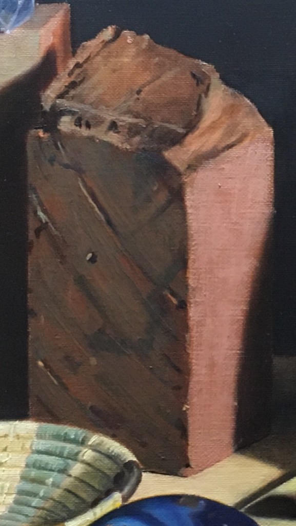
Now that a lot of details were in place, it was easier to observe more of them. I thought that maybe the whole brick was too light, so I glazed it all a bit darker. I also began adding highlights and more details to the top of the brick. Rather than paint every ridge, I tried to suggest a few of them.

In my last session, above, I decided that there was actually more reflected light onto the brick than I had thought, so I brightened up many areas. I noticed many sparkling, tiny highlights, so I indicated them with tiny dots of a medium value, muted orange.
I could go on refining this forever, but I think that it’s looking good with enough details to satisfy the eye, but not over-worked.
