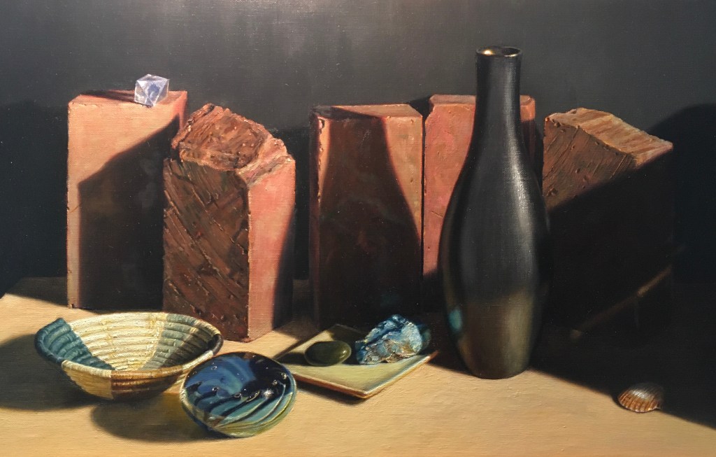
Since I was almost finished with the painting, I decided to stand back and see if the composition was working as I had intended. I wanted the eye to start at the basket on the left, then follow a curve through the blue paperweight, the turquoise, up to the top of the black bottle, and then over to the small blue crystal on the left and out. I was mostly satisfied, but thought that the trip up from the turquoise to the top of the bottle could be stronger.
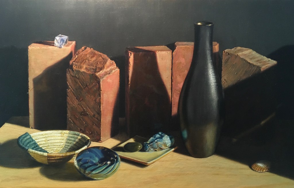
I made many subtle adjustments to achieve this. First, I strengthened the vertical highlight on the right side of the vase to lead the eye up. For the same reason, I then brightened the reflected light on the left side of the vase (though this is hard to see in the photo). Also hard to see, I made the highlights at the top rim of the vase stronger because bright lights against a dark background draw the eye. I added some more details to the front surface and edges of the brick behind the vase (smudges and tiny nicks). Detail also draws the eye. I lightened the bit of brick showing to the right of the neck of the vase to contrast more with the vase. I lightened the third brick from the left so that it contrasted more with the brick behind the vase. Contrast in value draws the eye. I thought that all of these details would attract attention and lead upward. The brightness of the tabletop was directing the eye down, so I painted in the woodgrain. This both darkened it and added some horizontal movement that keeps the eye from exiting through the bottom. Lastly, I lightened the brick on the far right, adding more highlights on its top.
I’m pretty happy with it now!
