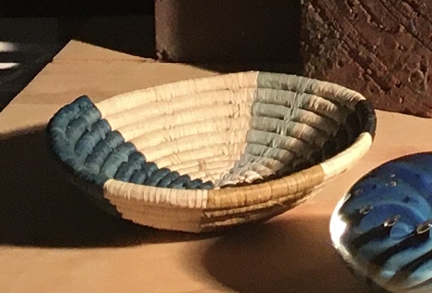
I thought that it’d be interesting to track the progress of the basket. Above is a photo I took of the set-up. I should say here that I’m not interested in making my painting replicate the photo. Photos can be very misleading, and painting from them discourages the artist from truly seeing and painting their subject. A photo puts a layer of separation between the artist and reality. In a photo, parallax distorts perspective and all of the subtleties of light are lost. The artist’s job is to take what he sees in his subject, edit out the unimportant and accentuate the important according to his ideas of beauty and order. This is very difficult, if not impossible to do when you’re slavishly copying a photo. That being said, the photo is a useful reference for you to get an idea of what my set-up looks like.

Above, I’ve completed the drawing. I numbered the coils so I could keep track of them better while drawing. It was easy to lose track of which one I was drawing as there were so many similar shapes. I found the basket difficult to draw. Because the basket is constructed of one rope coiled around, none of the ellipses are parallel to the horizontal. There is a slight tipping upwards from left to right.
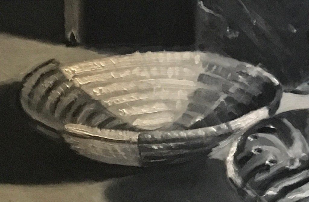
Next, I did a black-and-white study in oil on tracing paper laid over my drawing. My style is very loose here. Details aren’t important at this stage. I just want to get a general idea of the value pattern and composition.
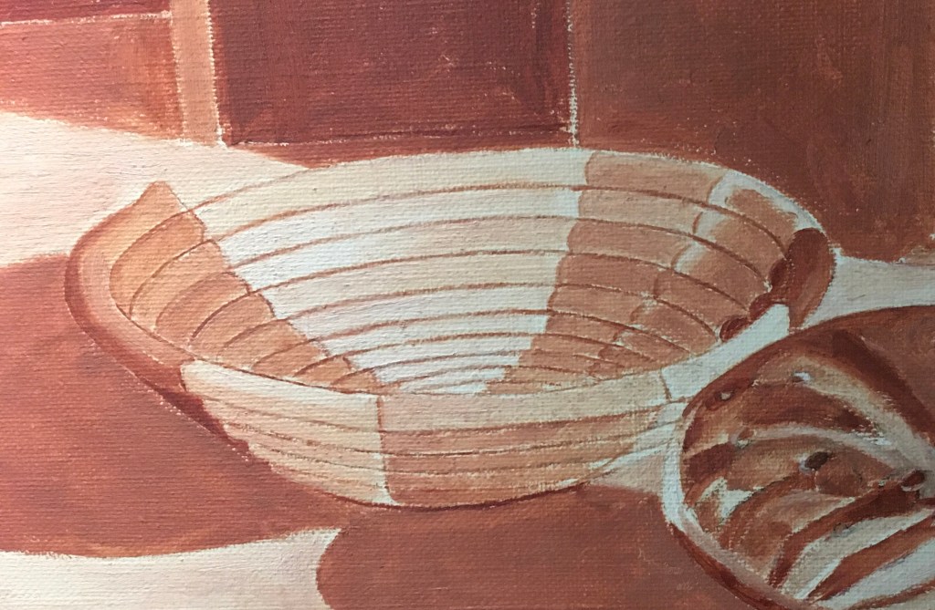
After I transferred the drawing to the canvas, I did my underpainting in burnt sienna and lead white. I tried to keep the lines precise so I’d have a guide for my overpainting. All values are lighter here than in the finished painting. The colors will look more vibrant over a lighter base. I kept the paint layer very thin so that it would dry faster and not contribute a lot of texture to the finished work.
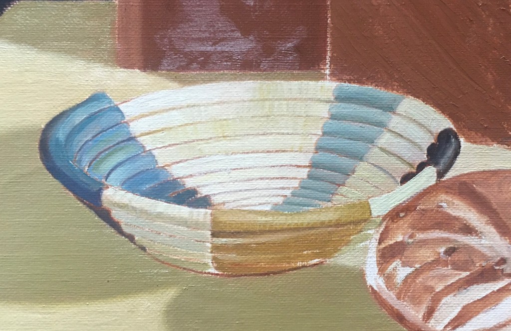
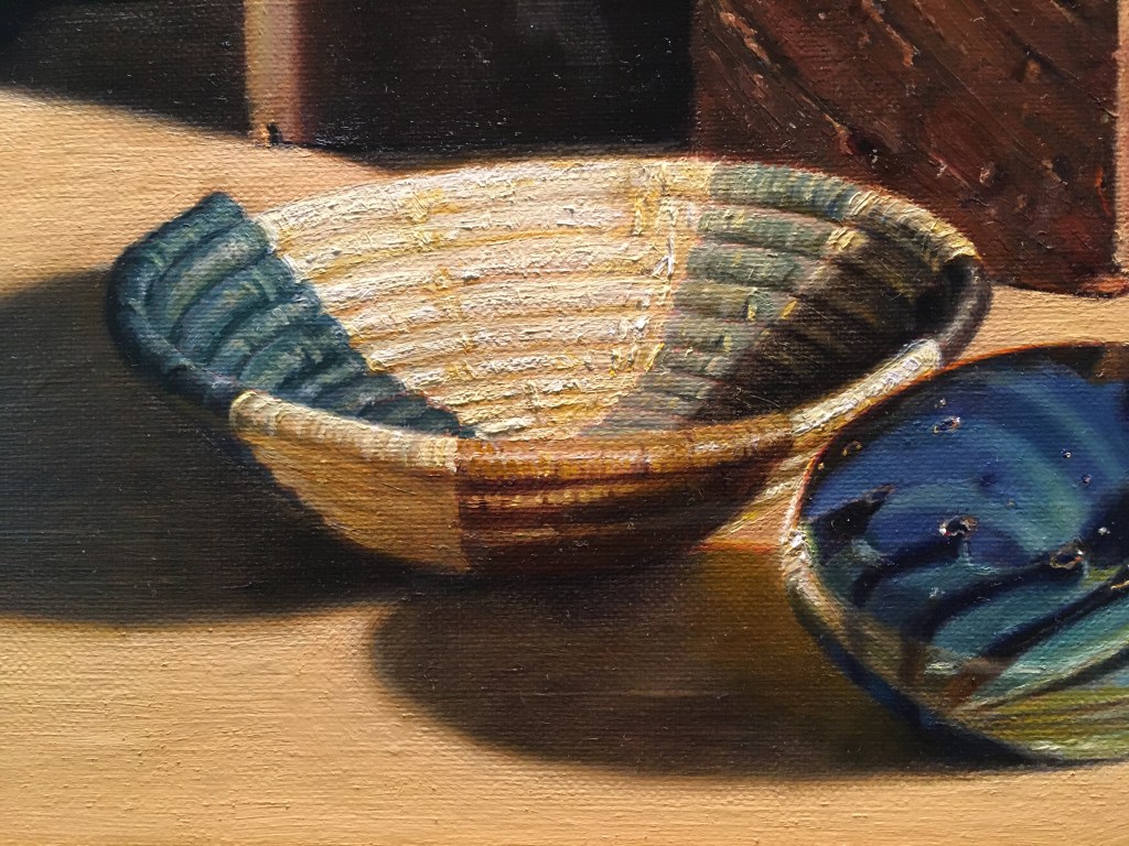
Here is my first layer of paint. I made the blues and yellows a bit light so that I could glaze them later. The lines are still very apparent. Until I glaze the cast shadows and the bricks adjacent to the basket to their true values and colors, I can’t judge the colors and values of the basket. I stopped here until the surrounding areas were further along.

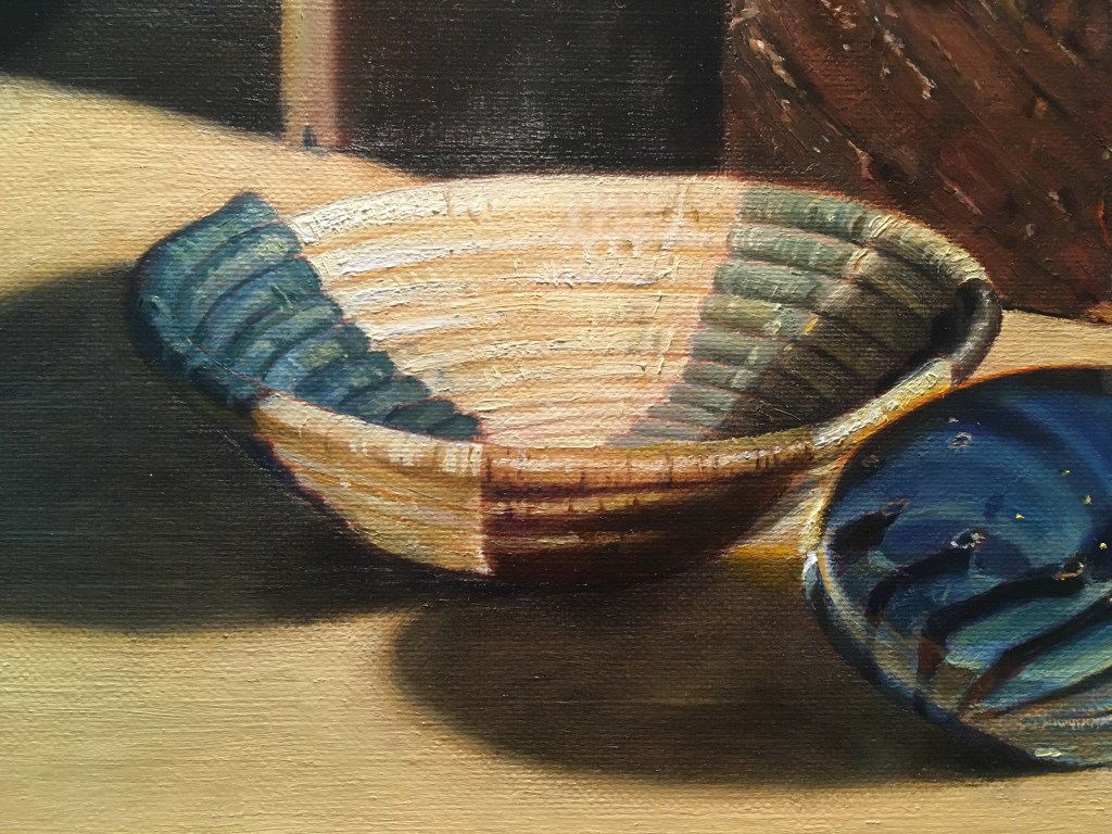
Above, the surrounding areas are closer to their finished colors and values, so I could begin painting the basket in earnest. I muted the lines between the coils and put down some thinner paint, beginning to indicate the darks and lights. I glazed the blues areas and corrected the colors. I glazed the underside a warm muted orange, and began to indicate the fibers wrapped around each coil.

At my next session, I continued to suggest the fibers and the highlights on the coils
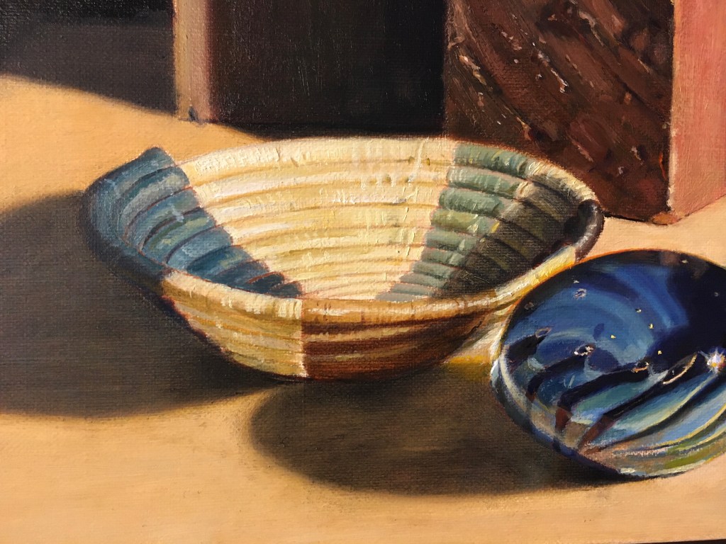
Above, I’ve put in some reflected lights from the tabletop onto the left underside of the blue section. I darkened the shadow cast by the basket onto the tabletop and added more highlights to the rim. I glazed another layer on the interior shadow.
At my next session I strengthened the highlights and darkened the underside. I’m not sure if I like this. I night add back some reflected light onto this area.
Above is the latest version. I added reflected lights in the inside shadow area on the right side. I added more details of the fibers in the lighter areas. I glazed the lower left outside a bit darker. I brightened up the highlighted right side where it meets the paperweight. Finally, I softened up the top front edge.

Here is the photo again. What differences can you see? I notice right away that the edges in the painting are much softer. The highlights are emphasized. Also, the painting doesn’t attempt to show all of the detail. Do you prefer the painting? I do!

The photo is very nice. It looks almost as good as a painting, so not as good as your painting!