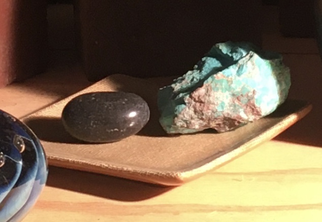
I thought that it’d be interesting to track the progress of a part of the painting from the beginning. Above is a photo of the stones on the dish from my set-up.
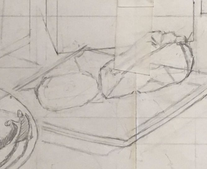
The first thing I did was to draw them. I ended up changing the positions of the stones a bit, and making the turquoise longer.
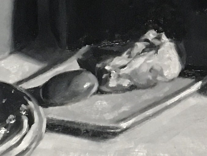
Above is my black and white study. This was a very quick and loose rendition done in oil on tracing paper. I did this to better judge the composition as well as to serve as a value guide when I started to paint.
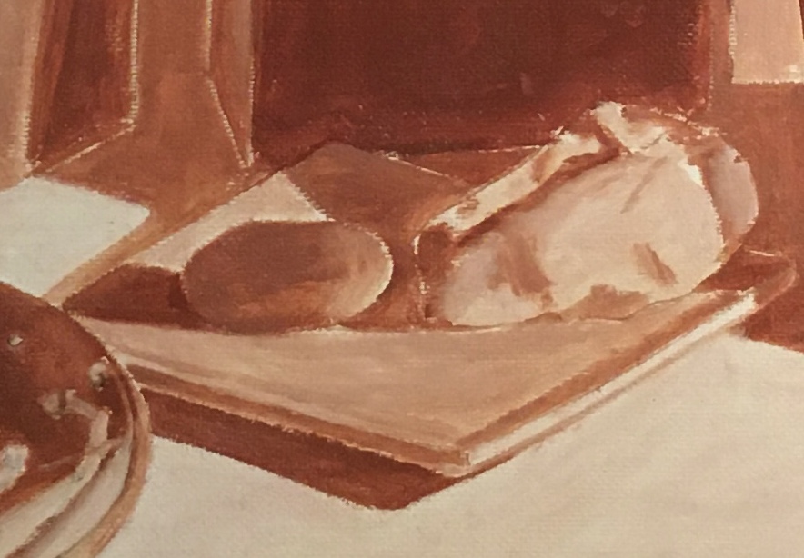
After the drawing was transferred to the canvas, the next step was to paint the under-painting in various tones of burnt sienna and lead white. I have omitted details and painted everything much lighter than it’d be in the finished work.

Above is my first layer of the over-painting. I left the shadow areas lighter, because I will glaze them darker after this layer dries. I indicated some of the details on the turquoise, but at this point they were difficult to see and paint. I know that I can add and correct later, as the forms and colors become clearer to me.

As the surrounding areas developed, I could better see the colors and values on the stones and dish. I lightened the dish and glazed all of the shadows darker. I added bright blues to the turquoise and lightened the right side of the green stone.
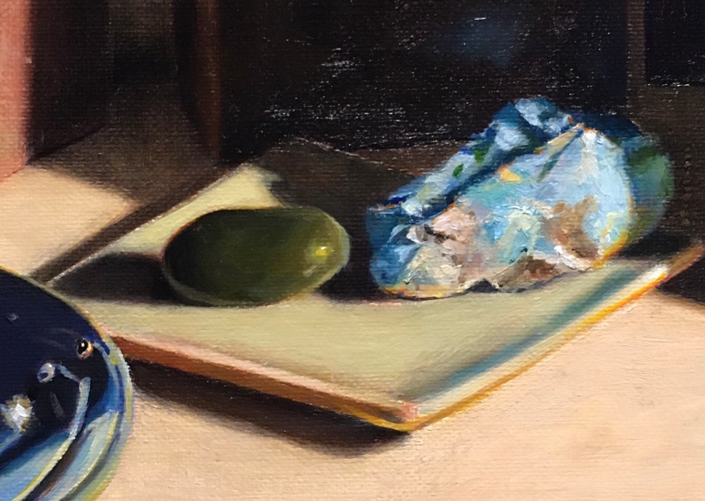
This is the latest picture. I added a highlight to the green stone, put in some reflected blues on the right top side of the dish and continued adding details to the turquoise. I’m finding it frustrating that I can’t seem to get the turquoise bright enough. I’m using phthalo blue, which is a very bright, strong pigment. However, when I add white to it in order to lighten it, the color appears more and more chalky and not bright. I tried underpainting the bright areas with white paint, letting them dry and then glazing the blue on top. I thought that this would result in a bright color, since a glaze will usually appear more intense than body color. It still didn’t seem bright enough! Another trick to make a color seem more intense is to juxtapose it with touches of its opposite color. Since orange is blue’s opposite, I painted bits of orange around the stone. It’s easy to go overboard on this and end up with an unnatural look. I’m still thinking about if this idea is successful. One of the frustrating aspects of painting is that no pigment can mimic the intensity of nature. It’s easy to fall into the trap of thinking that just because you see a color in your set-up you can mix it in paint. It’s the artist’s job to make the colors convincing within the context of the painting, relating well to the surrounding colors.
