Above is the first layer of paint on the stone dish. The colors and values aren’t quite right, but that’s ok. When first painting something, especially when it’s surrounded by an unpainted area, it’s almost impossible to correctly judge values and colors. Painting is about comparing and correcting- both the painting to the set-up and the parts of the painting to each other. It’s only when you have something down on the canvas that you can begin this process. Once I let go of the idea that my first attempt had to be correct, I relaxed and became a better painter. When I can see that something’s not right, I can decide how to correct it!

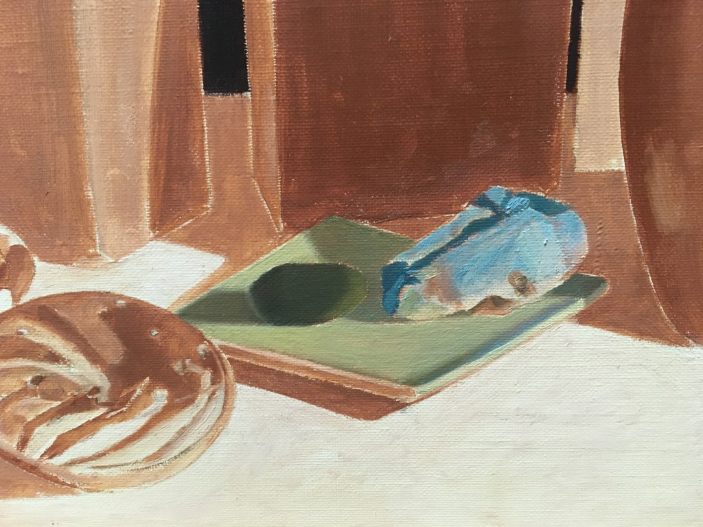
The first thing I did was to glaze the shadows on the dish. After that, the first thing that struck me was that the dish was too green and a bit too dark. Above you can see how I’ve corrected that with a lighter, yellower tone. I painted in the rest of the dish. I then glazed the shadow side of the green stone and repainted the rest of it, adding some highlights. I then glazed the shadows and added some more details to the turquoise.
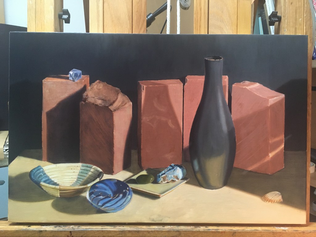
Next I wanted to finish glazing the shadows on the bricks so I could get a better idea of the finished values of the painting. Above, just the two bricks on the left are glazed.

Above, I’ve glazed the rest of the bricks and the shadow on the right tabletop. On the lighter areas of the middle brick, I’ve scumbled a lighter, greener tone both to show the texture and to neutralize the bright orange, bringing it closer to the right color and value. I added a thin glaze of a greenish color to the forth brick to darken and neutralize it.
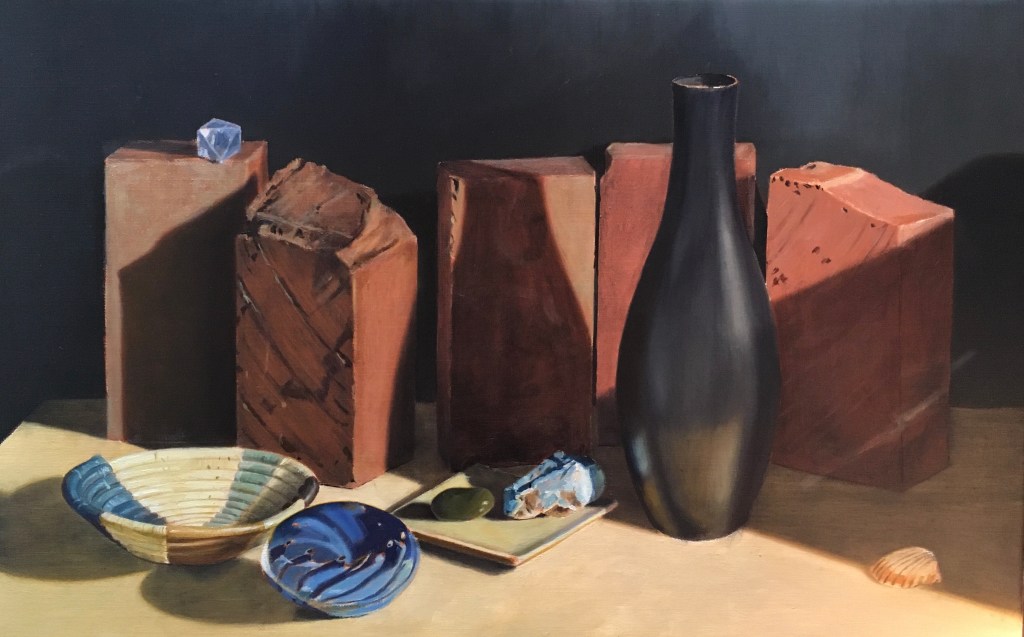
My next goal was to begin indicating the distinctive texture on the second and fifth bricks. I always end of over-stating this sort of texture at first. I’ve accepted that this is a result of trying to see intricate details. When I’m studying and staring at a small ridge, it seems more like a crevice, so I paint it that way, accentuating the darks and lights! Only later can I see that the changes in color and especially value are way more subtle than I originally thought. I try to correct this tendency as I’m painting by squinting my eyes when looking at the set-up. If the detail I’ve been painting disappears, then I know that it should be painted in a value very close to the area surrounding it. Another reason that I sometimes overstate details is that sometimes I’m drawing them without the aid of the underpainting. Since I usually don’t indicate small details on my underpainting (such as small holes in the bricks), I end up having to draw them in paint. I can see the details better if I put them in darker than they really are. On the brick on the far right you can see where I’ve indicated where some of the holes will be. I’ve also overstated the details on the second brick from the left.
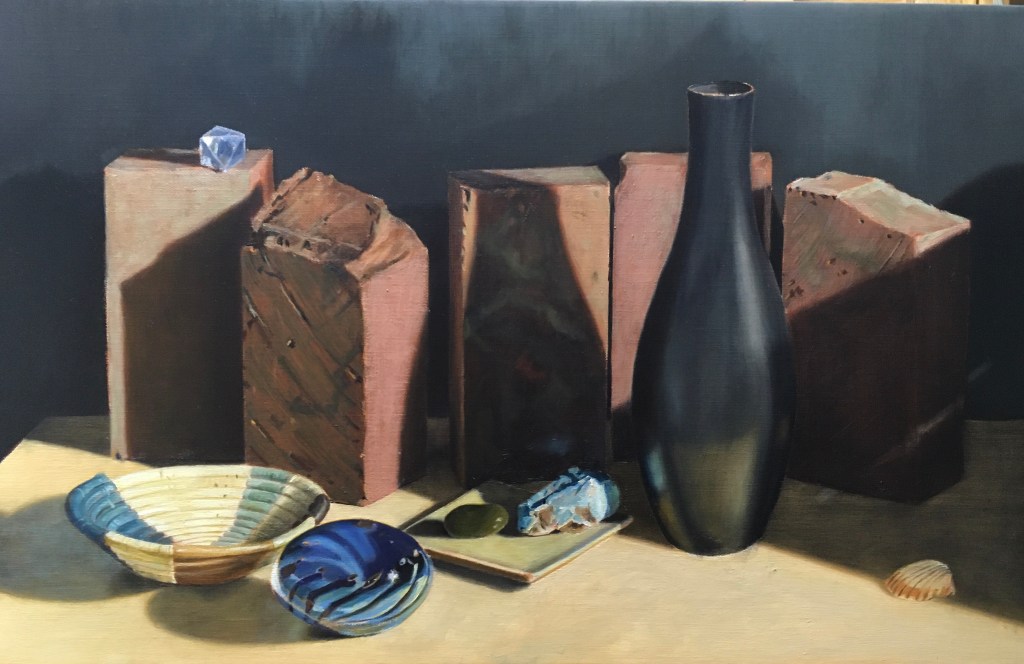
At my next session, I scumbled a greenish tone over the second brick to mute the details and neutralize the orange hue. I also scumbled the lighter areas of bricks 4 and 5. I made the tiny holes less dark on brick 5, and added highlights on them. I added some more of the circular ridges, managing to keep them subtle!
