After my last session, I lived with the painting for a few days and decided that it needed to be darker between the basket and the bowl, and on the far right. Even though I had captured the actual quality of the light there, I thought that the composition would benefit from more drama and contrast. I decided to add a dark glaze in these areas. I only applied a thin glaze, so I could judge its effect and then add another if I thought it necessary. Also, the table top seemed still to be too dark. I scumbled a light gray over the right-hand side, nearer the light source. I added more light touches to the bowl and box. I shortened the piece of straw sticking out to the left. I had lengthened it a few sessions back, but it had been bugging me since. I scraped off the thick white paint with my palette knife, then dotted in some dark glaze to cover. If I had just glazed over it, the impasto (thick paint) of the straw would have shown through. Finally, it’s been bothering me how yellow the rice paper has been looking. I decided that it needed to be cooler (it was cooler in reality, as well). I scumbled pure lead white over the entire background wall. This added a bit of texture, as well as neutralizing the yellow. After it dries, I’ll repaint the tiny bits of golden fibers embedded in the rice paper, along with the tiny bits of light they reflected and shadows that they cast. These were obscured by the white glaze.
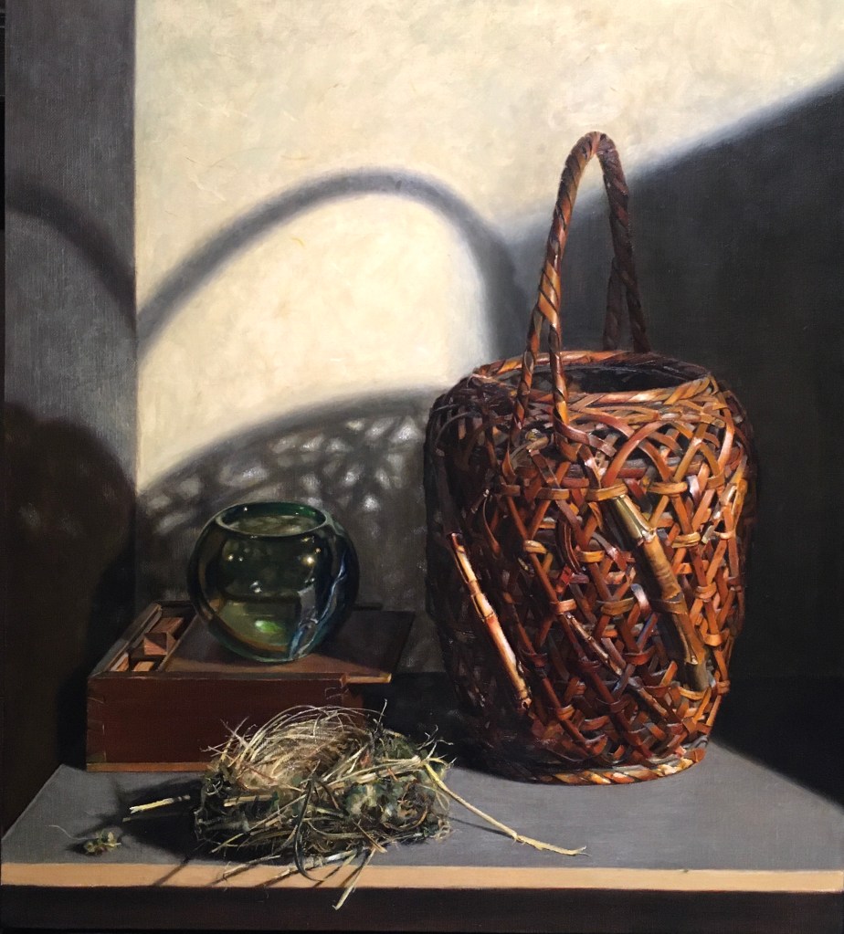
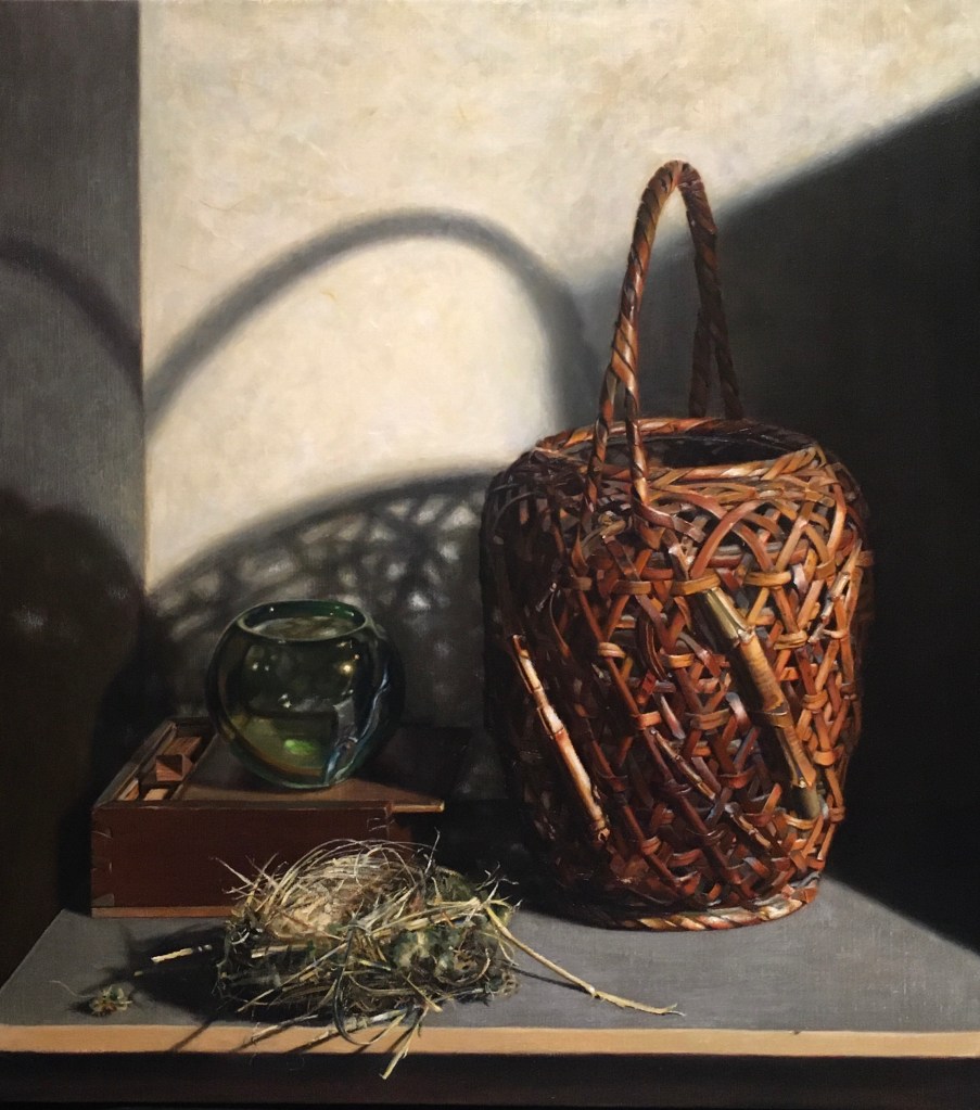
Above, you can see the before and after shots. The changes are subtle, but I think that they are good. I see that I need to work on the upper right of the basket near the rim. It looks a little flat there. Also the nest could use some highlights. I’ll tackle these next week.
