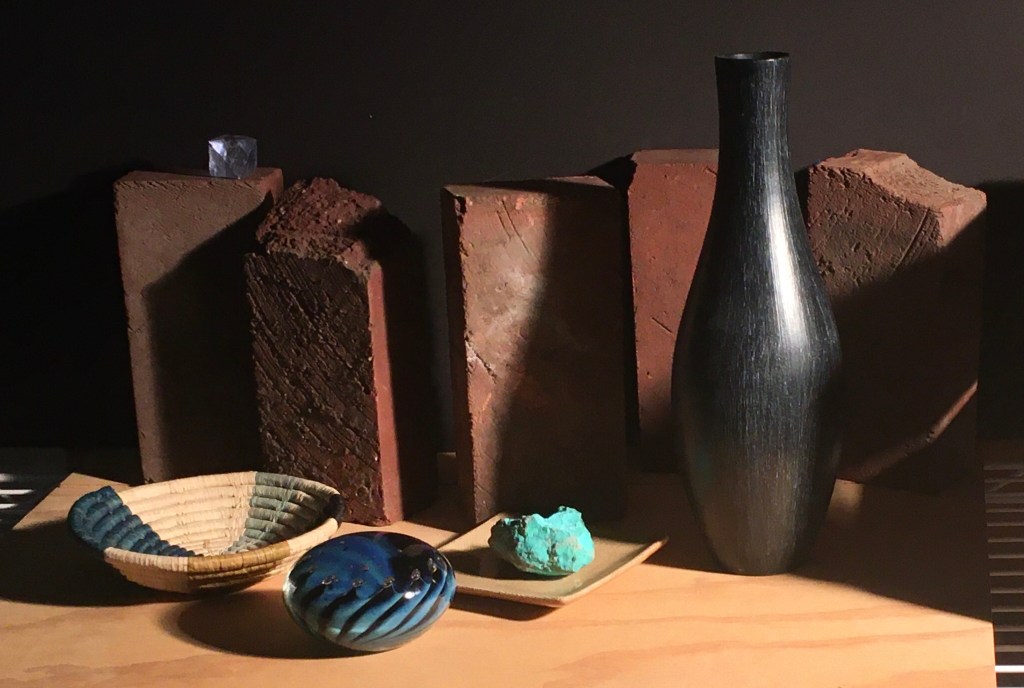
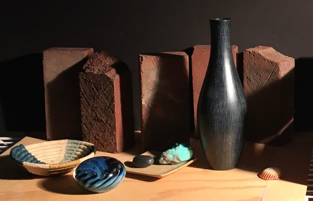
Above is how I left the set-up after my last session. It bothered me that the turquoise was so close to the center of the composition. Also, it was almost equidistant from the paperweight and the black vase. It looks more interesting if the space between objects varies. I moved the turquoise over to the right. I also changed its angle to lead the eye up to the vase to continue the arc that begins with the basket and leads to the paperweight, then to the turquoise and up to the vase. I saw that the turquoise’s cast shadow didn’t touch the paperweight any more. Since I’m trying to get most of the darks to join up, I added a dark stone to the turquoise’s left to continue the dark. I also put a small shell on the far right to fill in some of the emptiness there. Below you can see the result.
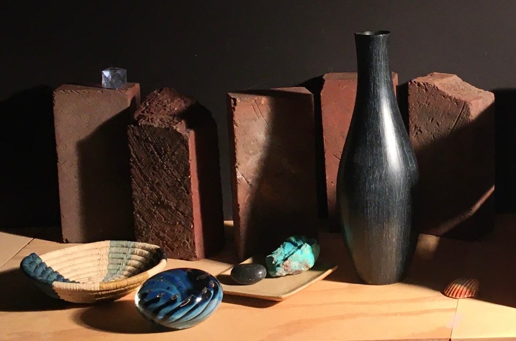
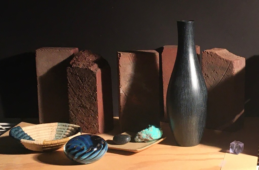
I think that I like the small shell, but I’m not sure. Another thing you might notice in the photo above, is that I continued the tabletop off to the left with another piece of board to eliminate the bit of the metal shelf below that had been visible, angling down. Surprisingly, I discovered that I didn’t like this new look. The shadow cast by the last brick on the left continued the line of the cast shadow that I had added on the far right to make one long diagonal. I found that this diagonal carried the eye out of the composition. Below, I put it back the way it had been. You can see that the little bit of the left side of the tabletop angling down helps keep the eye in the picture. It’s a small detail, but I think it makes a big difference!
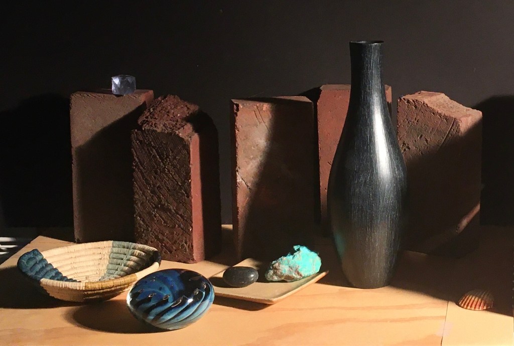
I wondered how it would look if I removed the shell and the blue crystal on the top of the left brick. I thought that it looked a bit empty without them. See below.
Below, I put back just the shell.
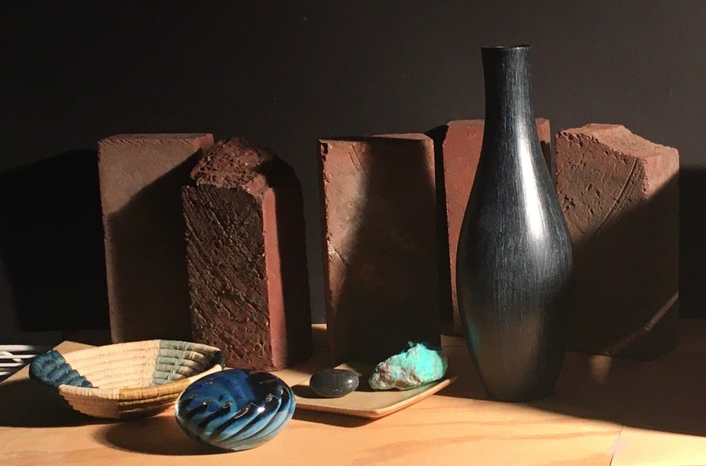
It seemed better. I wondered how it’d look with the crystal in the shell’s position. Also, I experimented by lowering the brick on the far right by bringing it forward.
I didn’t like this as well. It seemed to draw the eye too much. However, I do like the far right brick lower in the picture. The line of the top of the bricks looks more interesting to me now.
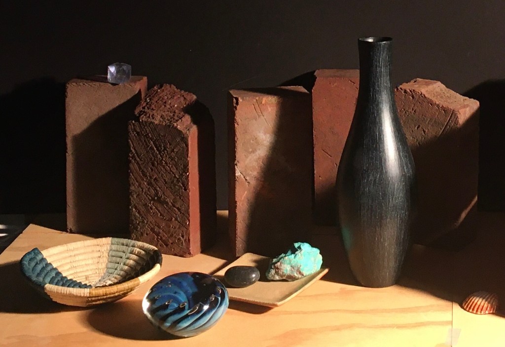
Above is the latest version. There are many things I like about it. It is dramatic. The bricks have a strong, massive presence. The other objects make a pleasing arc from left to right and up. My biggest concern with the composition is that it still doesn’t have a strong enough focal point. At least in the photo, the turquoise draws the eye the most, but I’m not sure I want that as the focal point. If I want the eye to travel in the arc up the black vase, I don’t want to stop it’s journey at the turquoise. Maybe I could make the vase more of a focal point by emphasizing the reflection of the turquoise on its left side near the bottom and the highlight on its right side. That would help lead the eye away from the turquoise and to the vase. Another potential problem is that maybe the darks throughout the composition aren’t unified enough, which gives a spotty appearance to the composition. As usual, I’ll live with it for a while and see how I feel about it later.
