Now that I’ve been away from this new set-up for a few days, I can see some things I’d like to change. The space between the second and third bricks seems too wide. That, and the small bit of light showing there draw the eye in to the background and out of the picture. Also, I wonder if the vase would draw the eye upwards more if both sides of its top were silhouetted against the second brick from the right, as opposed to just its right side, as it is now. Finally, I thought I’d move the vase a bit to see if I could get a more interesting shadow cast onto the middle brick. Below is a photo of how I left the set-up last I worked on it.
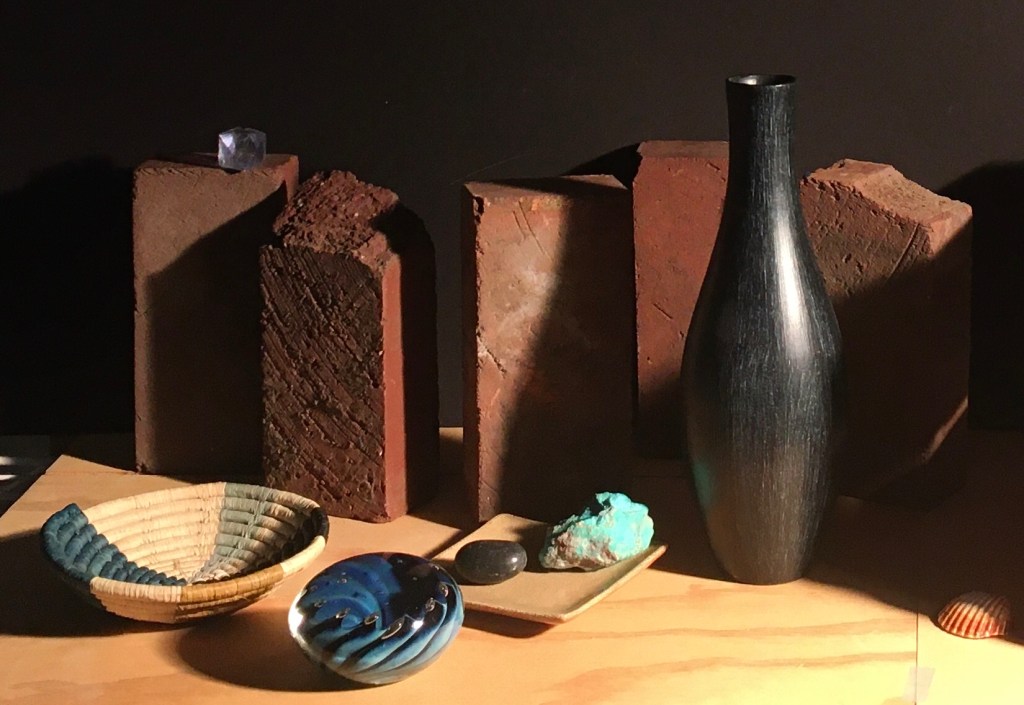
Below is a photo of the changes I made.

The biggest change is in the shadow cast by the vase. Now, more of the shape of the vase is apparent in the shadow. (It’s nice to have some repetition of shapes, for unity.) Also, some of the shadow is now cast onto the second brick from the left, further unifying the foreground and the background. This new arrangement caused the lighter-valued space between the second and third bricks to be dark, and eliminated the small bright spot, too. Now there is a dark mass of shadow in the center of the composition. I think that this lets the eye focus more on the foreground objects and the curve that they suggest. I moved the shell more into the picture. Finally, the brick behind the vase is now visible on both sides of the vase. I like this for two reasons. First, the shape of the vase is now more defined. Second, the shape of the brick behind the vase is clearer, accentuating the importance of the continuous line of bricks that makes up the background.
