I’ve set my Japanese basket painting aside for a week or so, so I can look at it more critically. It’s time to set up something new! For a previous painting set-up, I needed a higher table surface, so I had laid a board on top of some bricks. I was disassembling this to get ready for the new set-up, and I noticed that I really liked the bricks. They were all unique. Some were very rough, some patterned, some chipped, some greenish with moss. I wondered if they could play a major role in a painting. I have used them before, but only as a pedestal for another object.
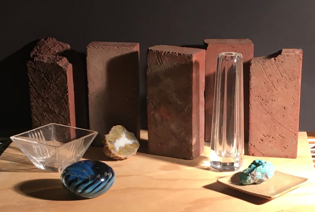
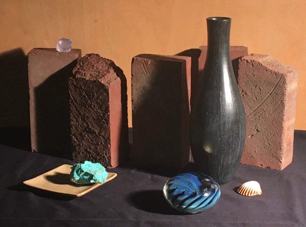
I hung up some black paper for a backdrop, and arranged the bricks in a jagged line. I chose some smooth glass objects to contrast with the bricks, and some rough organic shapes to echo them. My first attempt is below.
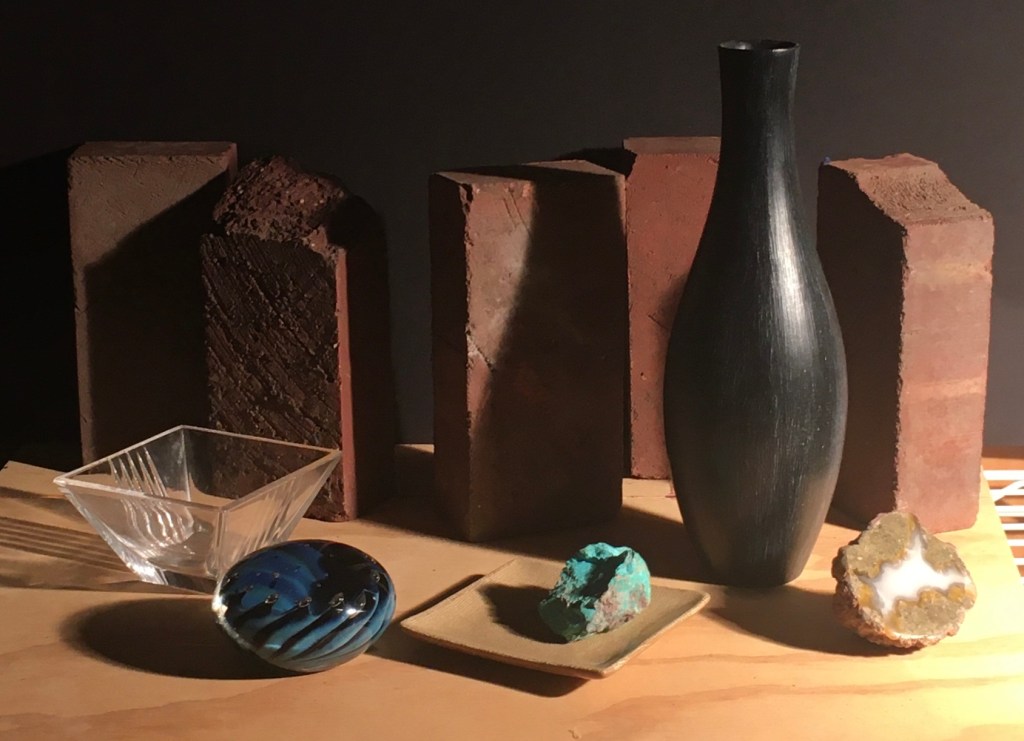
I thought that maybe the glass vase wasn’t standing out enough. Maybe something more solid and taller than the line of bricks would work better. I replaced it with a black vase. I moved the rough chipped brick on the far left in one closer to the middle, and set the one on the far right at more of an angle. I also moved the geode and the dish with the turquoise. This version is below.
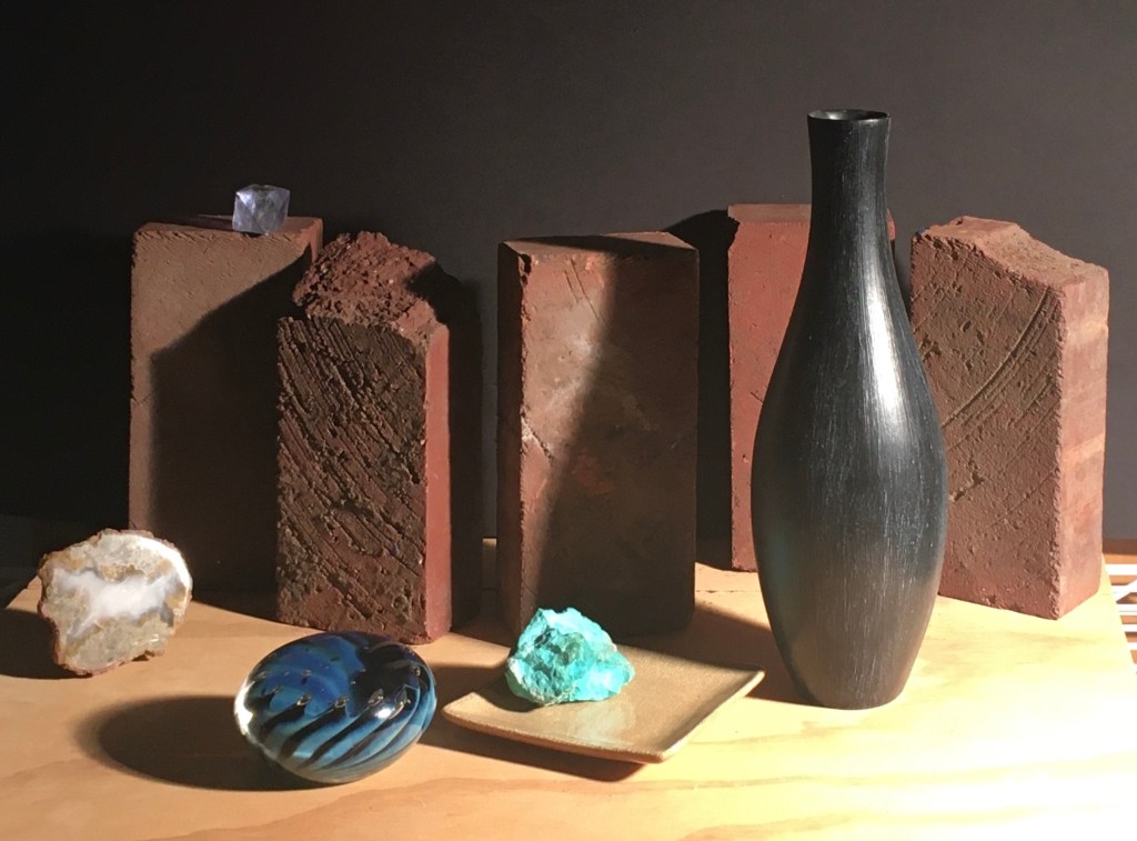
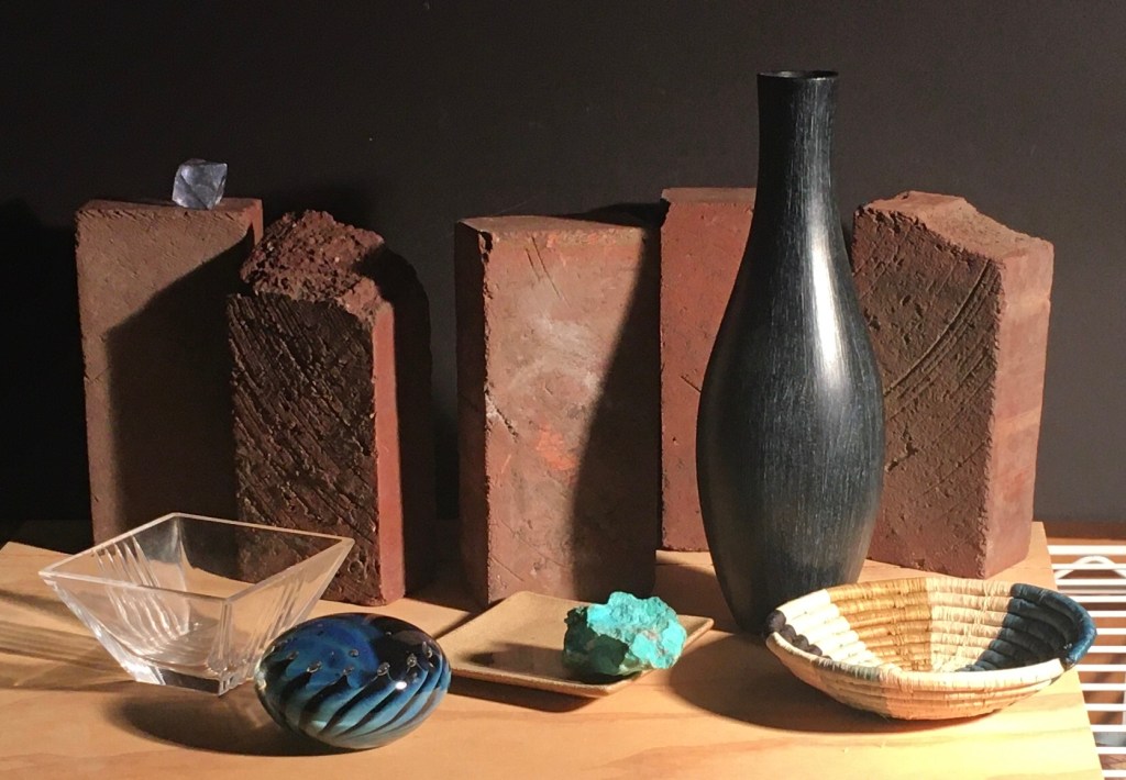
I thought I’d try one without the glass dish. Also, I wondered if it’d look good to have a small object sitting on top of one of the bricks. I placed a small blue crystal on top of the left brick, moved the geode over and rearranged the other things a bit. The result is below. I like the little crystal. However, I think now that there is too much focus on the left side.
As I arrange and rearrange objects, I try to keep some principles of composition in mind. I’ll list a few of them.
1. Try to connect most of the dark areas into unified mass. Also try to do this with the light areas. If the darks (and the lights) are disconnected, the composition can look spotty and incohesive.
2. Don’t split the composition down the center. This can result in the picture having two unrelated halves. Try to have the eye flow over the center to a focal point to the right or the left.
3. Have a focal point!
4. Harmony and Variety- Repeat shapes, colors, and textures, for harmony, but vary them for interest.
5. Lead the eye around the composition. The eye should have an entry point, then a path leading to the focal point, and then to other areas of interest, and out again. The eye shouldn’t leave until the whole trip has been taken. Lines made by the edges of objects can lead the eye, as well as spots of color or areas of value contrast.
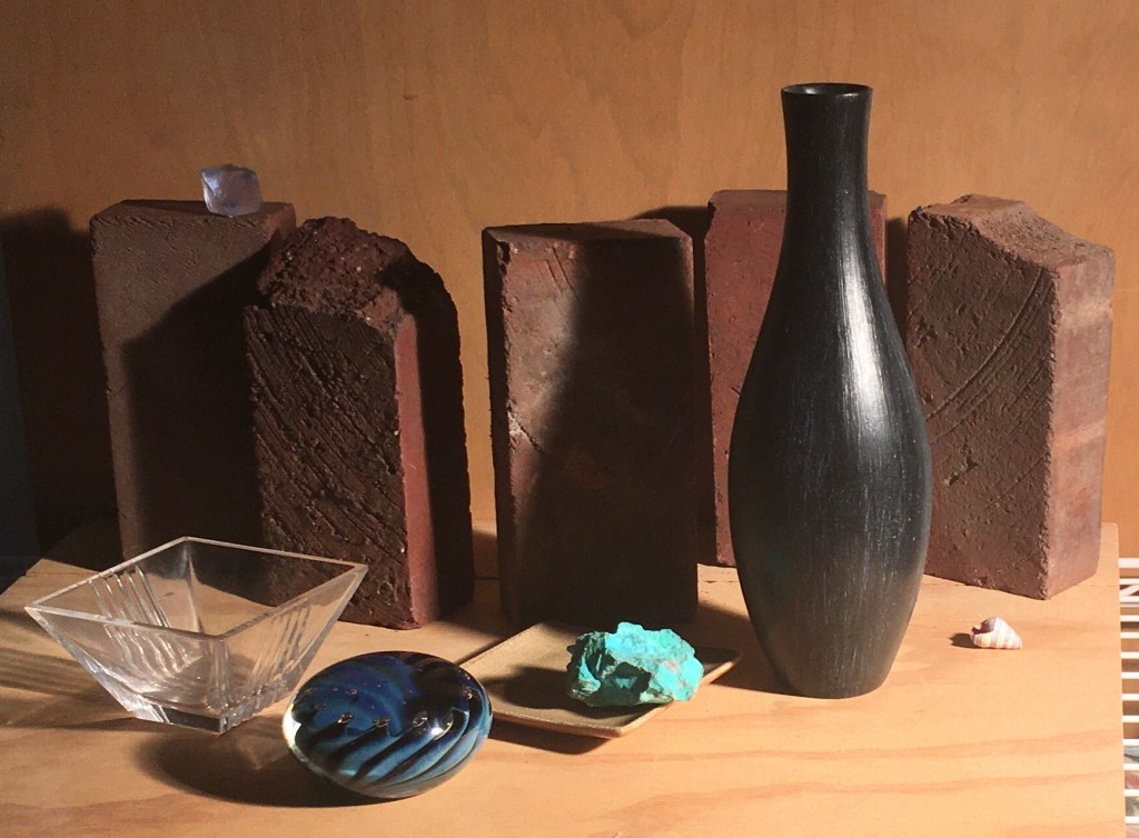
Just to make sure I was on the right path, I decided to change the color of the back wall to see if it’d be an improvement. Above you can see the result. I think the composition loses drama.
Above, I tried a dark cloth on the table. I’m also not happy with it. The darks are united, but I think there is too much focus on the top edge of the line of bricks. I do like the way the lines on the small shell repeat the lines in the glass paperweight.
When I broke for lunch, I saw a small woven basket that I had bought recently. The blue color caught my eye and I wondered if it’d look good in the new set-up. Above you can see it.
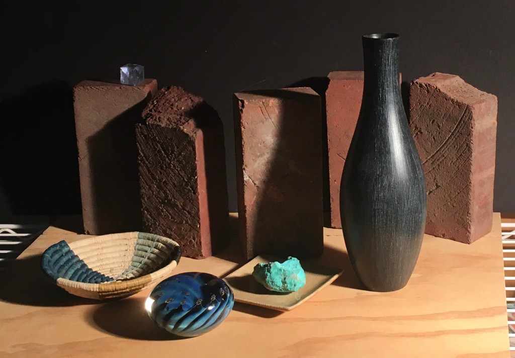
Above, I switched the basket to the other side and eliminated the clear glass dish. The white metal shelf that the table board is sitting on is visible in this shot at both edges of the frame. I hadn’t intended it to be seen. Normally, I would just paint the board as if it extended all of the way to both sides. It does look kind of interesting, though. I’ll consider whether I should keep it or not. I think that maybe the area on the far right looks too empty.
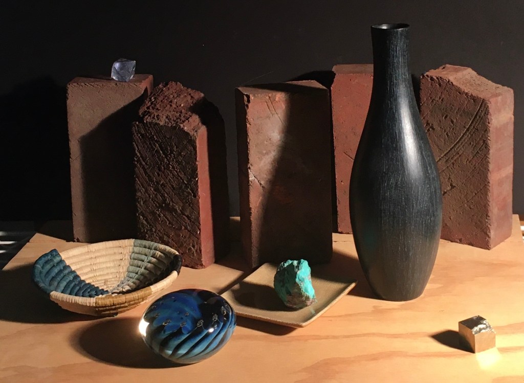
Above, I’ve added a crystal to fill it in. I’m not sure that I like it. Maybe it is too disconnected to the rest of the objects.

I had another idea to mute and integrate the right side of the composition. I set a wood crate off to the right to cast a shadow onto the right side. I often find these mysterious shadows useful. This shadow shows the space between the slats on the crate coming down at an angle. This fortuitously echoes the line of the right side of the glass dish. Maybe I should add back the small shell on the right side, half in the new shadow.
I think that I like this. The texture of the turquoise repeats the texture of the bricks. The smooth glass surfaces of the paperweight, crystal and beige dish are a nice contrast. The color scheme is a simple classic complementary scheme- blue and it’s opposite on the color wheel, orange. The darks are more connected than in many of the previous set-ups. There is a nice curving line suggested by the bottom edges of the basket, paperweight, dish and vase that echoes the top edge of the line of bricks. I don’t know that it has a clear focal point, though. It seems like it should be the black vase, but the clear bright blues in the paperweight and turquoise draw the eye. Also, I wonder if I need some blue on the right side to balance the blues on the left. I’ll live with this for a few days and return to it with fresh eyes on Wednesday.

This is really interesting. I agree with you though about the focal point. I’m drawn to the blue glass object and the little glass cube, in all of the compositions.