After focusing for so long on details, I thought it was time to step back and look at the whole painting. My first thought was that the light upper part of the back wall was drawing too much attention away from the objects in the painting. I checked the original photo I took of the set-up to check and see if the balance of lights and darks was different in my initial conception. Below is the photo of the set-up that I liked way back when.
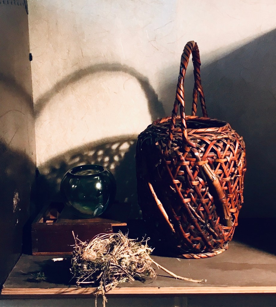
Below is how the painting looked last week. The main difference between the two is that the photo of the set-up is a bit underexposed, making the darks very dark. Because of this, the light areas appear even brighter. The highlights on the nest, for example seem brighter, as do the highlights on the basket. These bright areas balance the bright area on the top. At the time, I liked this look. The actual set-up, however, has quite a bit of light bouncing around it. The darks aren’t nearly so dark. My version below is actually very like the set-up. Now comes the hard question that I always face. Do I faithfully recreate the quality of the light in the set-up, or do I manipulate the painted image to make it darker and more dramatic? I have nothing (philosophically) against making my painting different from the set-up in order to achieve a more beautiful result. The problem is that my paintings depend on a faithful reproduction of light in order to invoke a sense of reality in the viewer. If I stray too far from reality, I lose this sense. The other problem is that I’ve come to love the subtle play of light in the center of the painting, with all of the reflections and bits of light filtering through the basket onto the other objects and surfaces. If I were to darken that area with a glaze, I’d gain drama, but lose this delicacy.
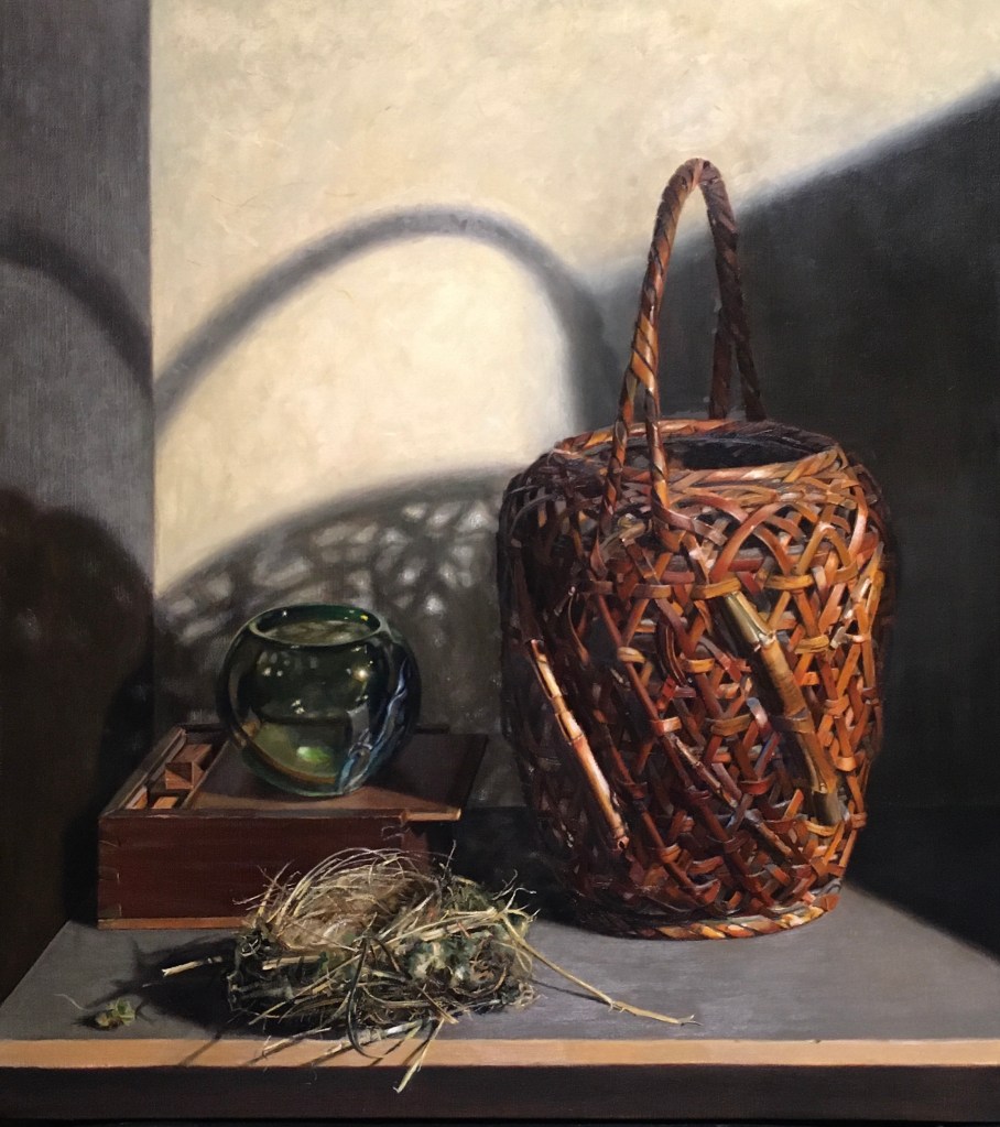
I decided to make some subtle changes to see if I could improve the balance without glazing the center area darker. (I can always glaze it later, but it’s impossible to take it away once I do it.) I decided to lighten the brightest areas (except for the wall). I added more bright grass strands to the nest. Also, as I discussed in my last post, I enlarged and lightened the bits of straw sticking out on either side of the nest. I scumbled a lighter tone over the whole tabletop and repainted the front edge of the table a few shades lighter. I brightened many of the highlights on the green bowl, and darkened the adjacent areas so that the highlights would appear even brighter by contrast. Finally, I added more and brighter highlights to the basket.

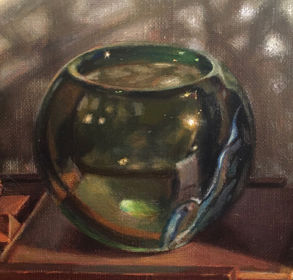
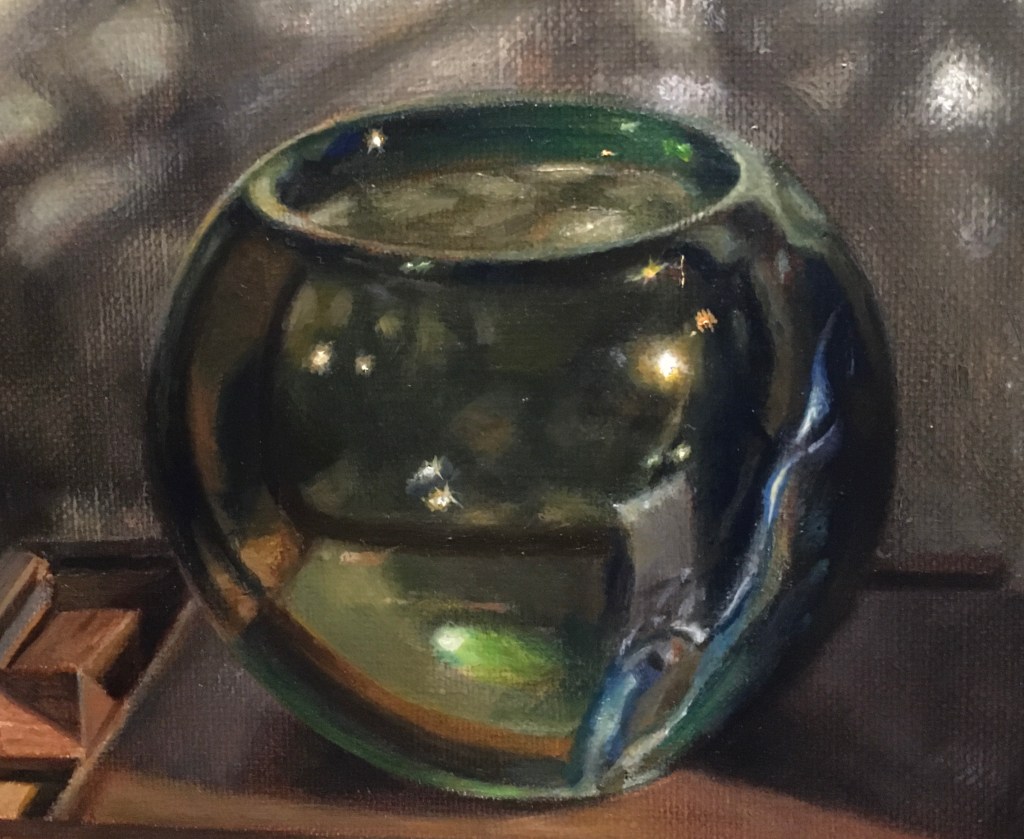
Above is the painting now, after I completed the changes. Unfortunately, the photos don’t quite capture the new lighter areas as well as I’d like. Below I show a close-up of the bowl before and after the changes so you can get a better look. It’s subtle, I know! If you look carefully you can see more dark areas and a few brighter highlights.
I like the effect of the changes. In person, the canvas looks markedly different now. I haven’t abandoned the idea of glazing the dark areas darker, but I’ll live with this version for a while before I decide.
