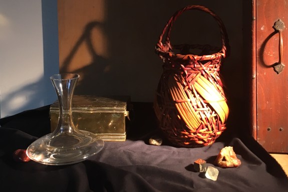
 I didn’t look at my set-up over the weekend, so that I could have a fresh eye this week. Looking at it today, it struck me that perhaps the composition was a bit busy. Particularly, the paint box on the right, though interesting, might be pulling attention away from the basket. They are similar enough in size and color that there is a potential competition between them. I cropped the right side to eliminate the paint box to see how it would look.

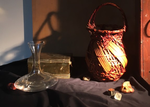
I think that this version might look more unified and strong, though I miss the more horizontal aspect of the original. Another option would be to keep the box, but darken its value. Or, I could simply show less of it. Also, maybe moving the position of the handle on the box would improve the composition.
Here I’m showing just a little of the paint box. I like this better. I miss the little bit of tabletop showing on the far right under the paint box. I think I’ll put a bit of that back in. Also, I don’t think that the geode’s shape is clear in the position I placed it. Rotating it a bit should help. I’ll also experiment with replacing the pale yellow crystal with the grey stone again.
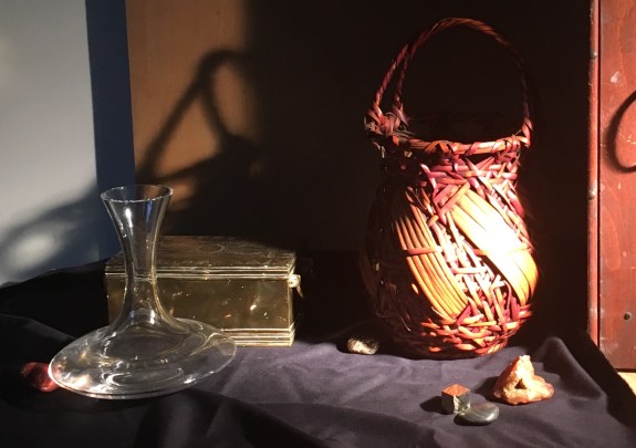
It always surprises me how a little thing like the small triangular bit of tabletop showing on the far right can change a composition. Just that little bit of light balances the light areas on the left side. I notice that I prefer this triangle to be small, as it is here. Before, when more of the paint box was included in the picture, that bit of tabletop was larger, and had the effect of attracting too much attention, as well as pointing the eye down to the right, out of the picture (see the first photo of this post). This triangle of tabletop is important for another reason, too. Its shape echoes other triangles in the composition- the geode, (whose triangular shape is more apparent now that I’ve rotated it), the weave of the basket, the cast shadow on the back wall, and even the top of the decanter.
I think I’ve carried composing as far as I can using my camera. Photography is limiting, both because of the distracting distortions of parallax, and the lack of consistency and precision of my camera angle. I can be much more precise using my pencil, T-square, and ruler to precisely position all of the elements, fine-tune the design and work out the perspective. It’s time to do a basic drawing! I’ll then use the drawing as the basis for a full-sized black-and-white painted study. When I’m happy with that, I’ll go back and perfect the drawing. There’s no point in spending a lot of time drawing that basket if I’m going to make changes based on the black-and-white study!
