Some friends who own a collection of antique objects invited me to come to their house to select some things to paint. I’m so excited to have some new subject matter! I brought home candlesticks, a brass box, a crystal wine decanter and 3 beautiful antique Japanese baskets. One of the baskets was particularly fascinating, and I decided to use it as my main subject.
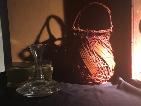
When I got home, I didn’t have much time to work, but I was eager to see what the basket would look like under the spotlight. I covered the table with a black cloth for contrast and placed a wood paint box on its edge on the right side to cast a shadow. I added the brass box and decanter because of all of the things I borrowed, they were among the simplest. I didn’t want anything to compete with the basket for attention! This preliminary set-up took about 5 minutes. I thought that the basket looked very dramatic and cast an intriguing shadow on the wall.
The next day, I decided to move the decanter to the left and move the light so that the edge of the cast shadow onto the backdrop from the paint box wasn’t dividing the set-up vertically in two. It’s generally not a good idea to have an eye catching line positioned in the center of a composition.This also changed the position of the basket’s cast shadow, shifting it to the left. I liked this better.

Now I wondered what it would look like if I included more of the paint box on the right.

I liked its vertical mass. It also pushed the basket further into the middle of the composition, giving the basket more importance. Finally, the curved shadow of the handle mimicked the basket handle’s shadow on the back wall. Repeated shapes unify a composition.
I noticed that he foreground looked a little plain and empty. I wondered if I needed to add some more objects.
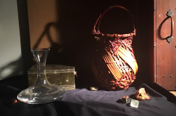
I added a geode and some crystals in front of the basket. I liked the way the basket was reflected in the top plane of the yellow crystal. I also placed a stone peeking out from the shadow of the basket, and another stone to the left of the decanter, catching the light that it’s casting on the table top, and bringing some orange to the left side of the composition, balancing all of the orange on the right.
Looking at the set-up today, I think I’d like to make a few changes. I’d like the orange stone to be bigger. Also, I’m not happy with the way the top left edge of the decanter lines up with the edge of the back wall. The decanter would look more convincingly in front of the wall if it appears to overlap it. I need to move the decanter a bit to the right or the left. For now, I’ll try the left.

I like the changes. At this stage, it’d be interesting to see what the set-up looks like in black and white. It can be easier to judge a composition with the distraction of color eliminated. The pattern of values stands out more clearly. For this reason, I always paint a black and white full-size study before I commit to a set-up, but I can do a quick preview using the black and white setting on my iPhone.
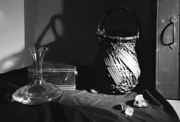
Seeing the set-up in black and white, I’m wondering if the bright crystal in the front is drawing too much focus and leading the eye out of the composition I think I’ll try replacing it with something darker.
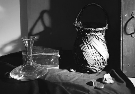
I think that I prefer this, but I’m not sure. Often, after working on a set-up I find that I loose objectivity. I think I’ll live with it for a few days!
