Tackling the Nest Again

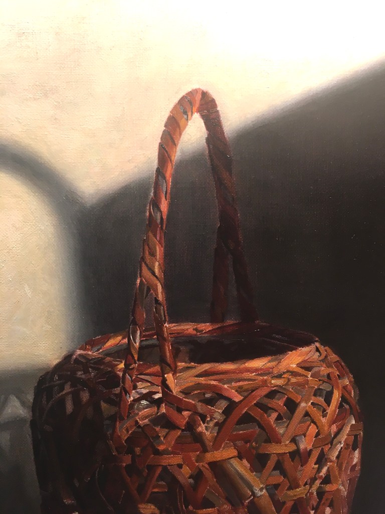
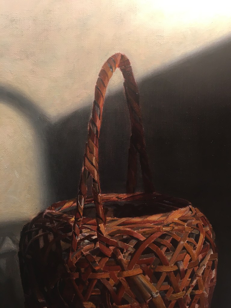
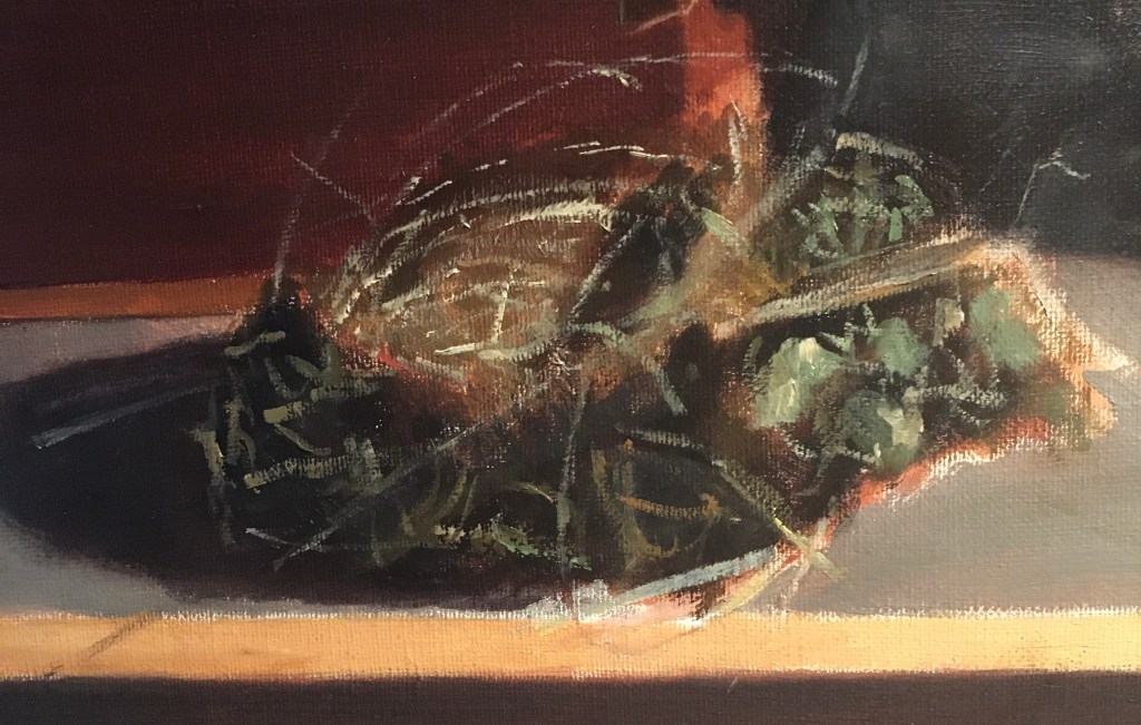
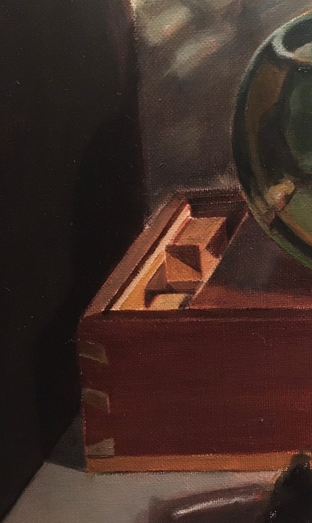
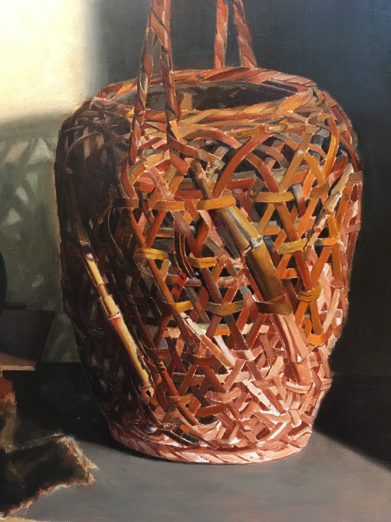
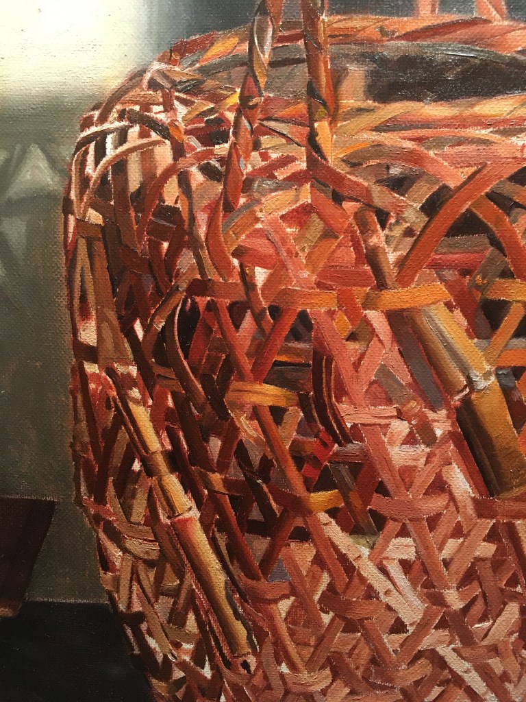
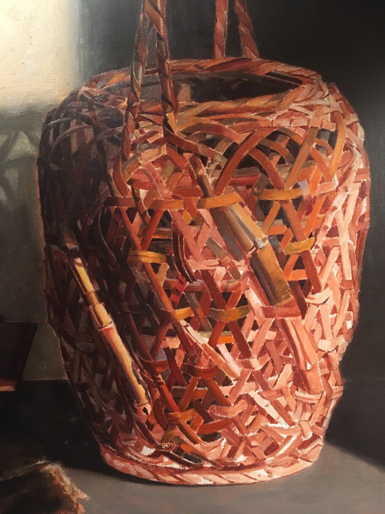
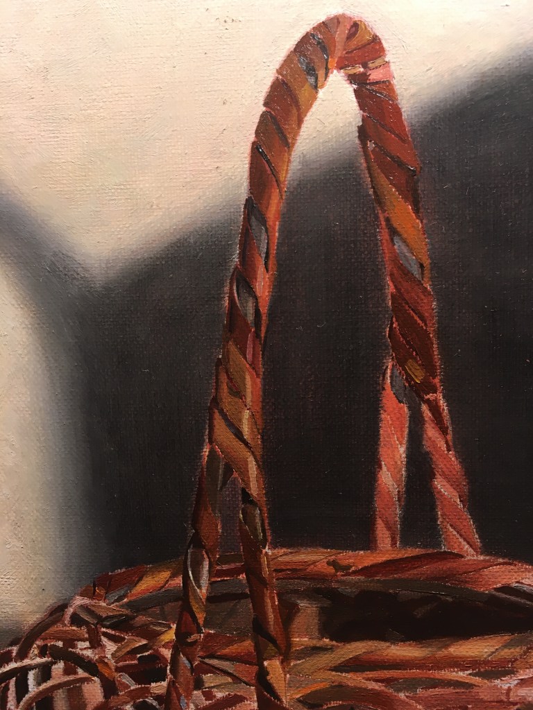
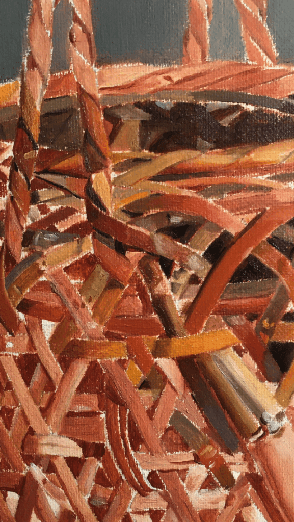
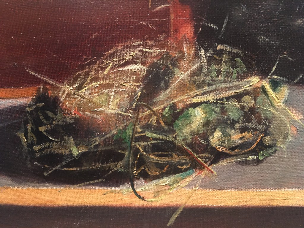
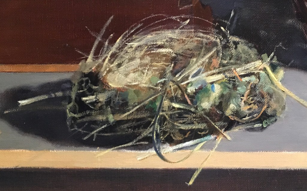
I thought it was time to work on the nest again. I still don’t feel confident about it. Usually, I know that I can paint something even if it’s complicated. The basket, for instance, is very complex, but I’ve painted a similar one before, and I can understand its structure. The nest, on the other hand, is very irregular and made up of tiny bits and pieces- most of them hard to differentiate from each other. I’ve never tackled anything like it before. When I sat down to paint, I had no idea where to begin. I mixed many colors that I thought I’d need, more as a way of avoiding painting than anything else! Part of the problem is that part of me wants to paint every stick and twig, though I know that that’s neither practical nor desirable. It’s not as if anyone, including the bird who built the nest, would ever know if it was ‘correct!’ More importantly, I need to pick out the essential parts to emphasize the character of the nest. I want to leave out any parts that are distracting or not contributing to the beauty of the whole. An exact replica was never my intention. Eventually, I picked a tiny area to work on and focused just on that. Painting can be hard!

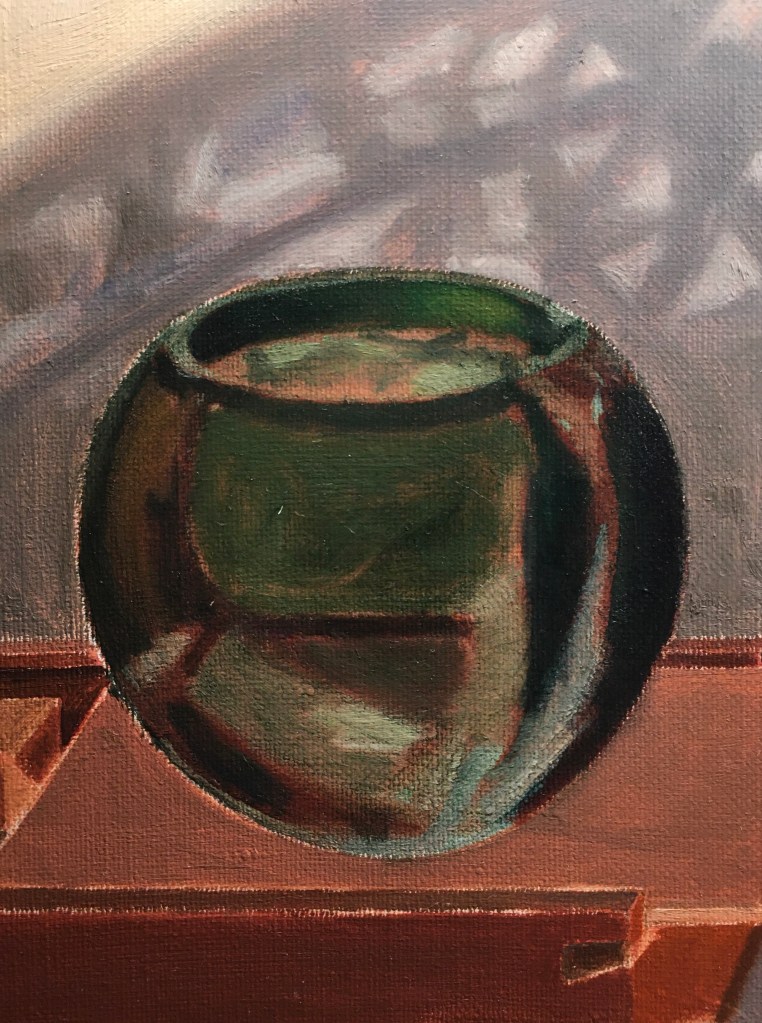
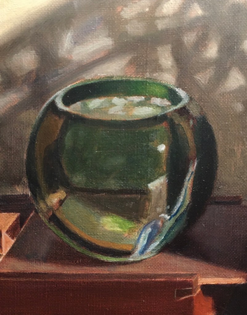
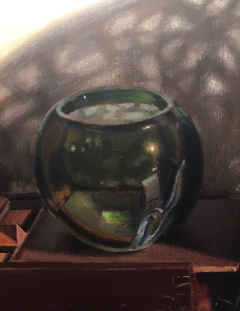
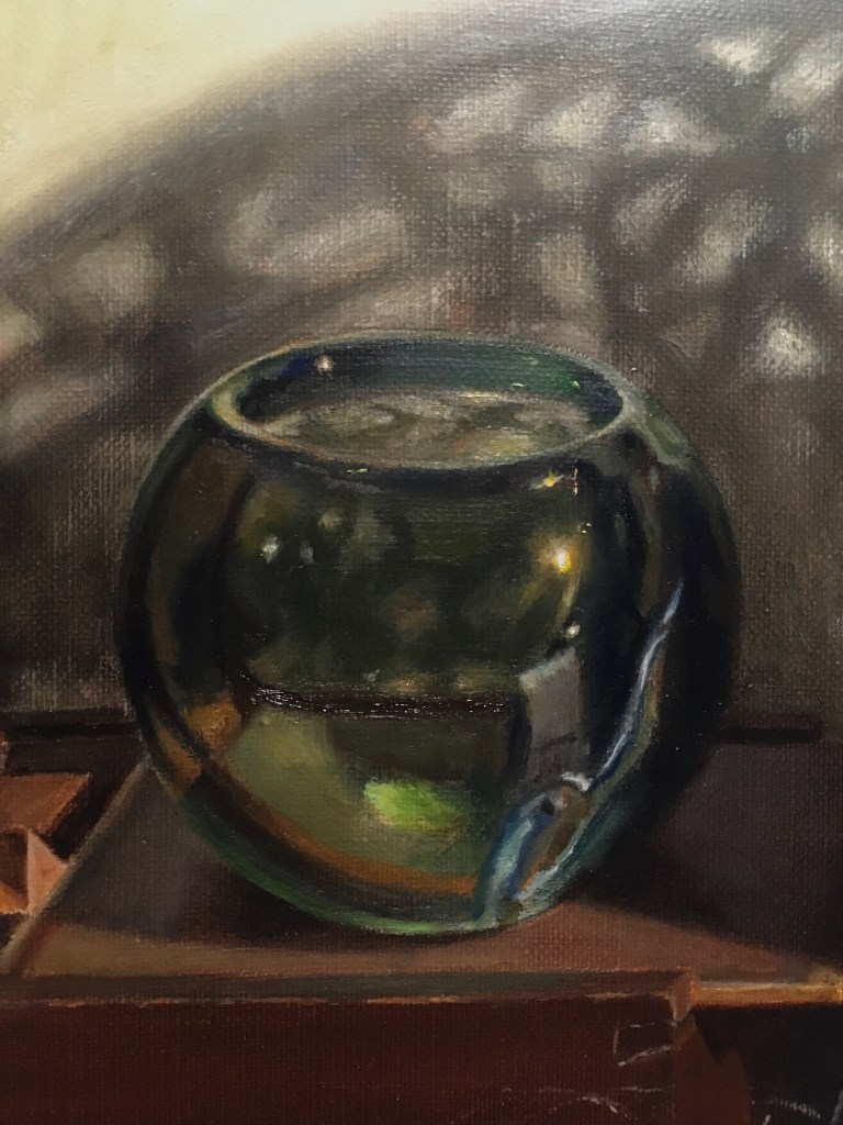
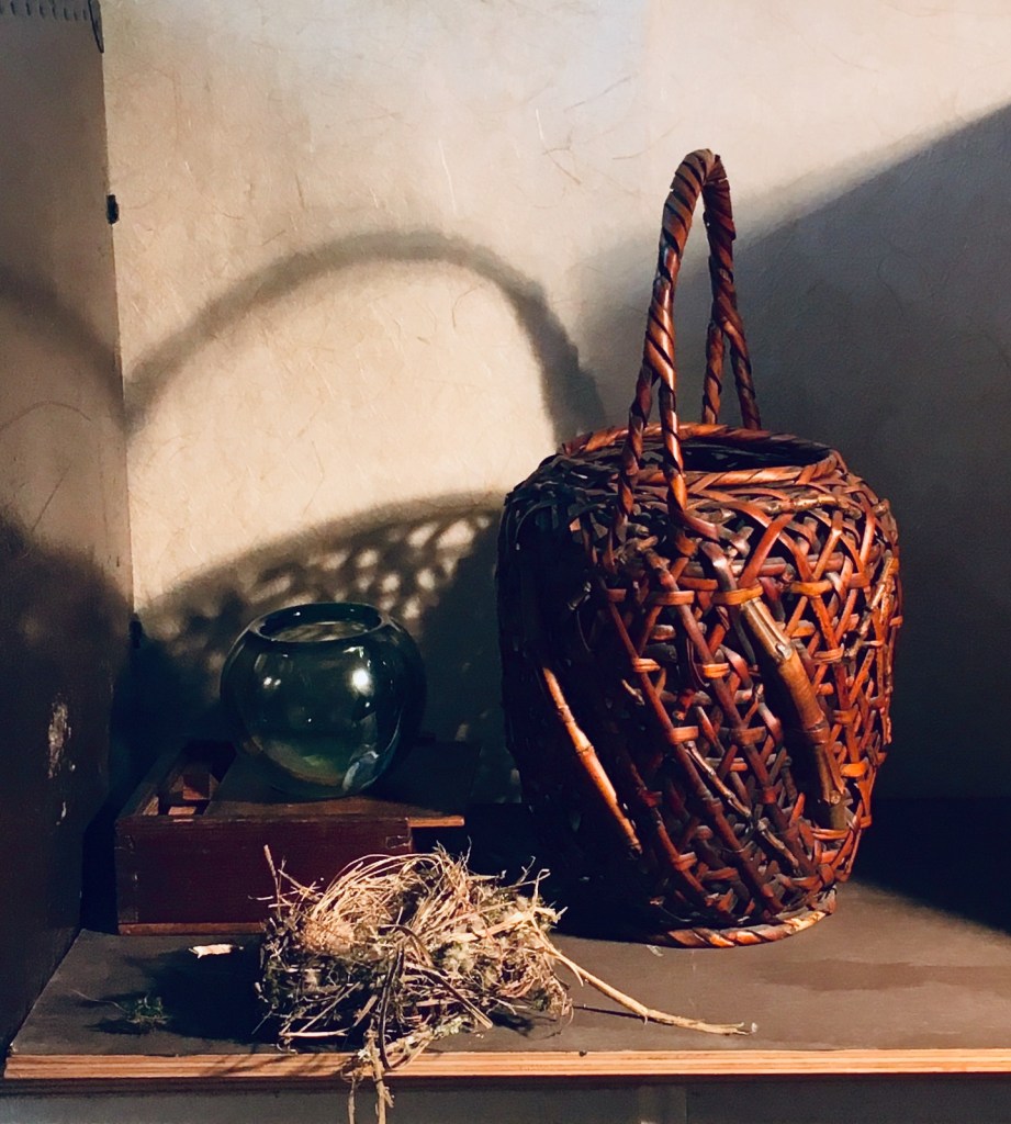
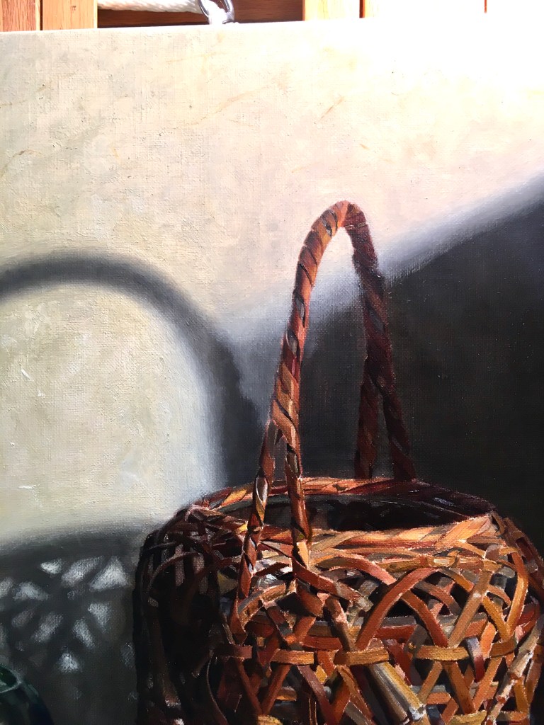
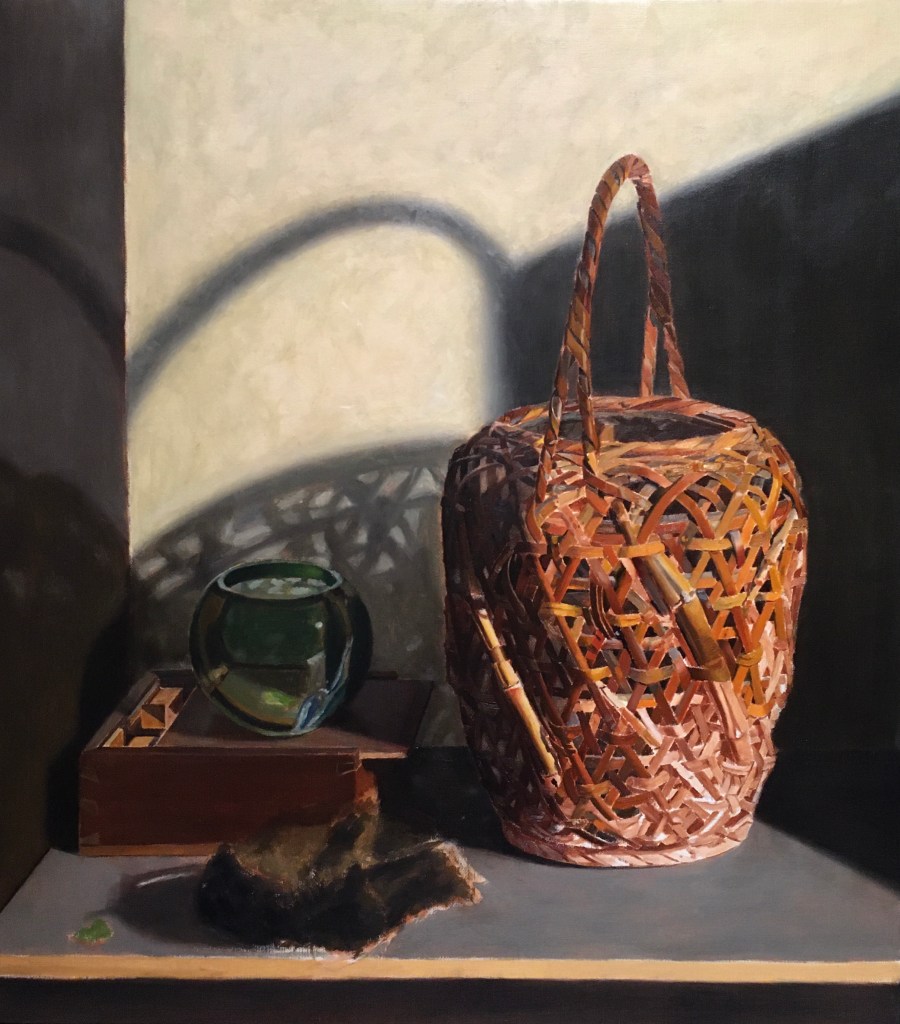
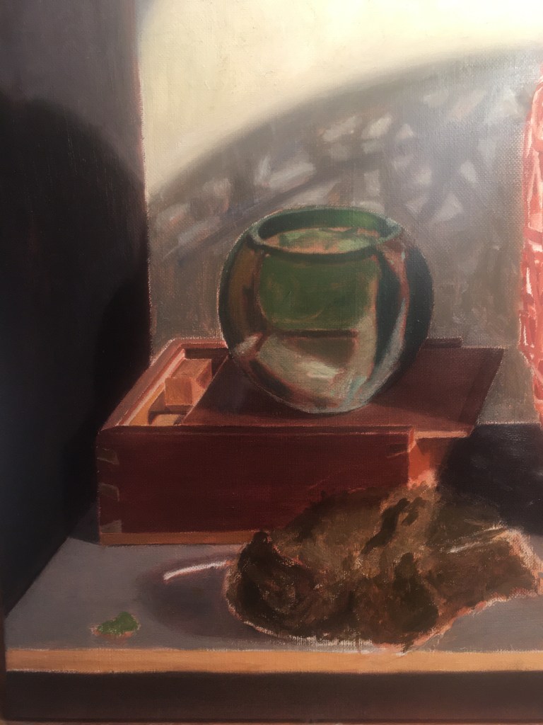
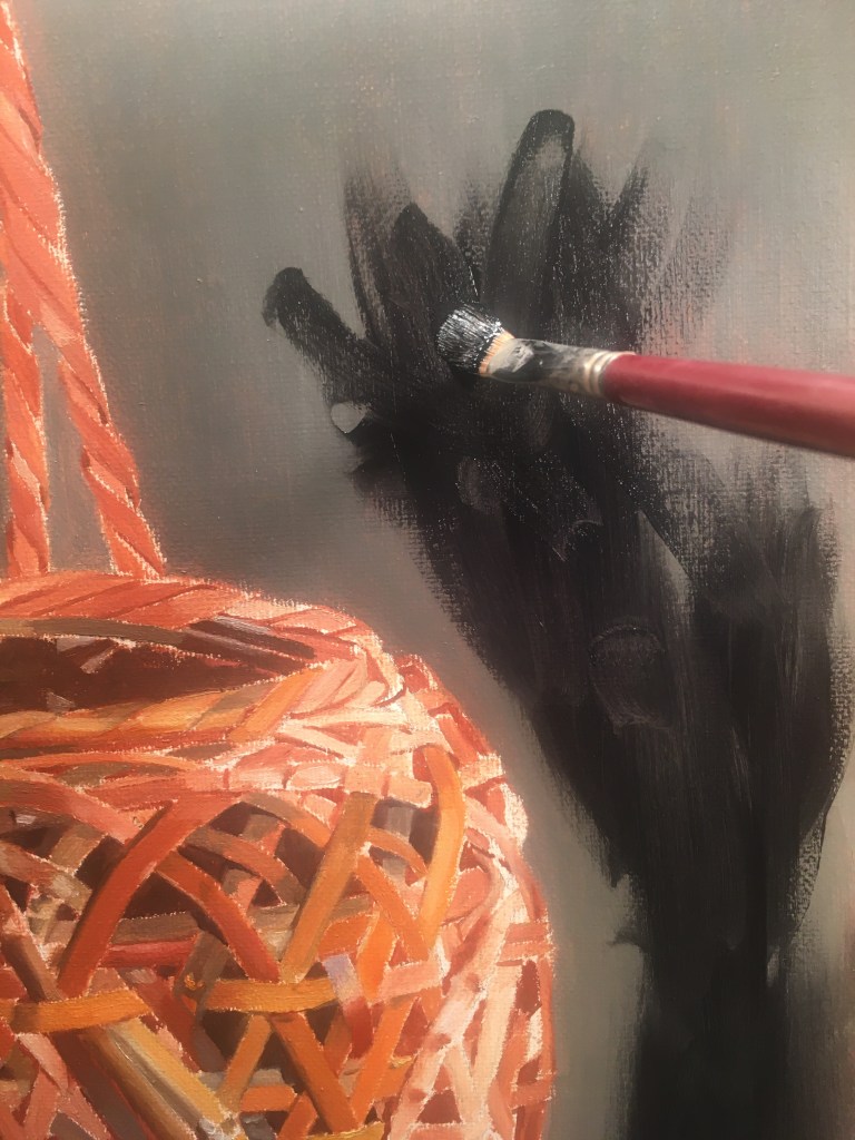
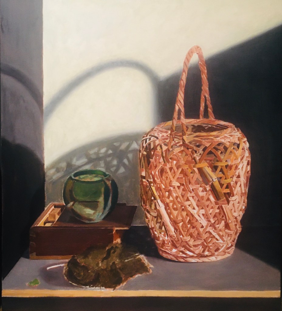
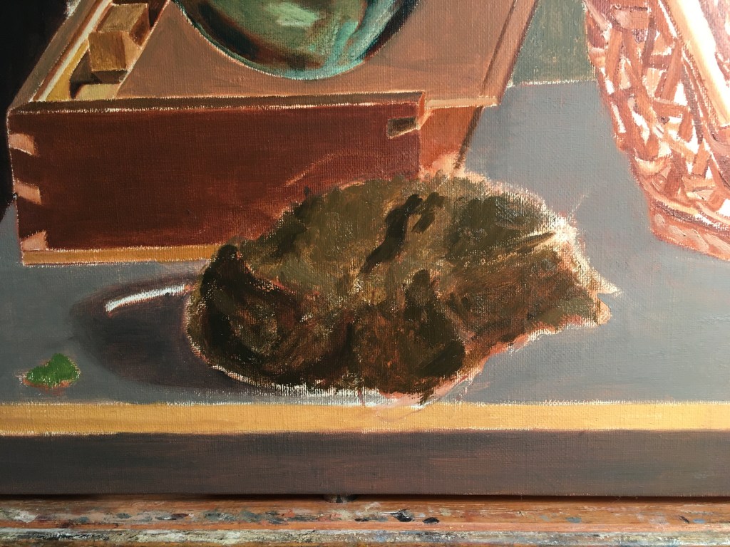
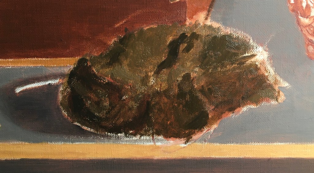
Below, I’ve shown my progress thus far. I’ve published the first four of these photos before, but I thought that it’d be useful to have them here as a basis of comparison with what I did today.

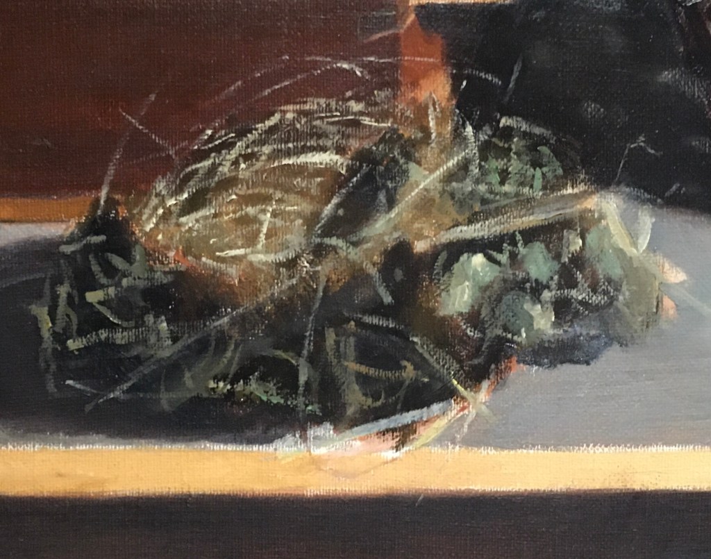
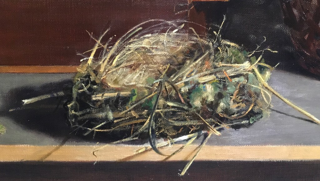
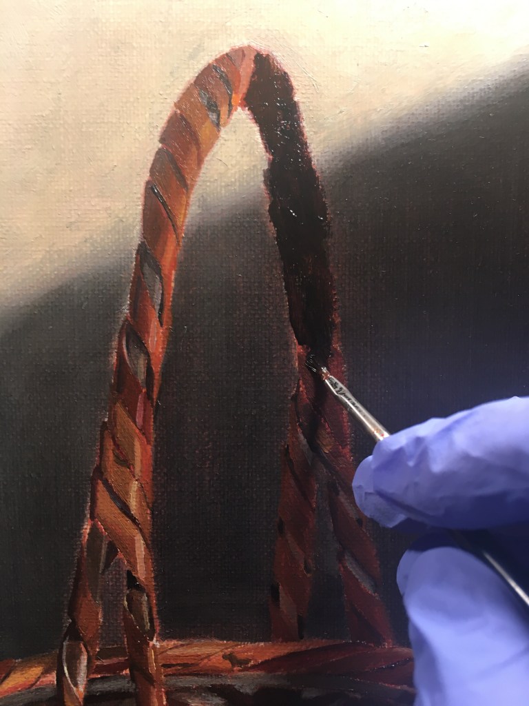
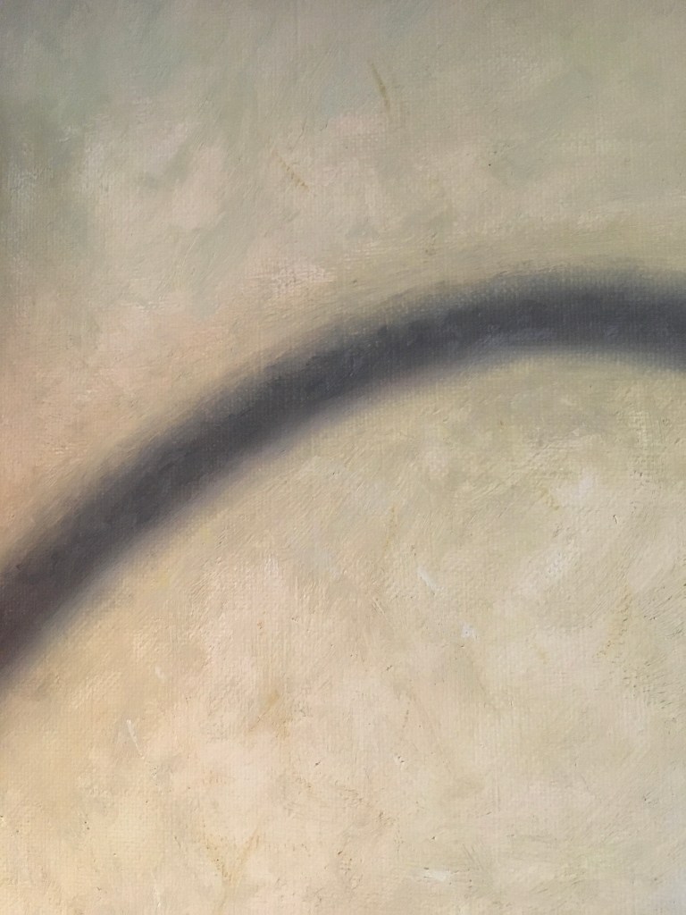
Above is how the nest stands now. I’ve filled in the interior with lighter strands and have begun to add the lightest pieces all over. I glazed the shadows cast by the grass onto the table and over its front edge. I’ve begun to paint in the tiny bits with a very fine brush. I still have more highlights to add and some more details, but it’s largely there now!

The Bowl

Above is my first layer of paint applied to the bowl. I’ve just indicated the basic shapes and colors with no real detail.

Above, I’ve filled in some details, painting the blue design on the right side, some highlights on the top rim, and some bright green at the top and in the reflection in the base.

Above, I glazed a dark green over most of the bowl because everything seen through the glass is modified by its green color. I added some highlights. You can also see that I softened the edges of the light spots on the back wall. I did this by scumbling some light paint over the edges.

I noticed that the top rim of the box seen through the bowl was placed too high. I lowered it. I corrected some shapes and colors near the rim. I did some work on the box top showing some green reflection cast onto it by the bowl.

The question that I am most often asked by people is how I paint glass. I know that it must seem confusing, but it’s just like painting anything else. I’m just painting the shapes that I see through the glass as well as the outline of the glass object itself. The shapes seen through the glass are modified by the shape of the glass object, so that they seem to curve around, following its shape. I suppose the trick is to look at the facts- the visual data- that you are seeing, not to think about the object as transparent. I use my eyes and not my brain, if you will. So, I would say to myself ‘there is a round shape there that is pale green, that touches a dark vertical piece,’ instead of wondering what every little shape actually is. It can be confusing at first to see all of the shapes, because things seem distorted when they are seen through glass, and there can be many reflections. The trick is to just put down what you can understand, and gradually, at each session, you’ll be able to see more.

Shadow on the Back Wall

I’ve been unhappy with the shape of the cast shadow on the back wall. It seemed awkward. I went back and looked at the photo I took of my initial set-up and discovered that indeed, it looked a bit different. (See the photo below.) Perhaps my spotlight got shifted a bit. In any case, the angle of the shadow coming from the upper right was too shallow. Also, the vertical part of the shadow near the basket handle should have been set further to the right, allowing the shape of the shadow of the basket handle to show it’s full curve. Below, you can see the original shot of my set-up.

Below, you can see the adjusted shadow. I scumbled some light paint over the existing shadow, making the angle steeper. I also used a scumble to adjust the shape of the shadow, showing the full curve of the basket handle. I softened all edges.

It’s worth noting here that I never paint from photos. I always look to the set-up for my information. The photos are very useful, though, for judging compositions and refreshing my memory as to what drew me to the set-up in the first place.

The Nest

Above is a (slightly over-exposed) photo of the nest. I include this so that you can appreciate its complexity. Obviously, I’m not going to attempt to paint every twig!

My first stab at the nest (shown in the second shot above) was a bit scary, as I’ve never attempted anything like it before. I was relieved to find that it looked pretty good! At this next session, (shown in the third shot, above) I began to study the forms more carefully. I found it was very hard to get started. The nest looked like a hopeless jumble of twigs and moss going every which way. Just to get going, I glazed the area on the left darker to serve as the shadowed part. I won’t overpaint this until it has time to dry. Next, I decided to look at the major twigs and lumps of moss and to check my drawing. I found that their positions needed adjustment. Details like this are easier to see if you unfocus your eyes a bit and take in the whole nest. I repainted the moss on the right and added some bright green. I placed some twigs that I had left out, and repositioned others. I’m not attempting the lightest twigs yet. I want to paint these later with bold, confident strokes after the base is correct. If I were to try it now, I’d probably need to make changes and re-paint and my beautiful strokes would be wasted. For now, I indicated their positions with a mid-tone. I need to be careful not to completely cover up the dark underlayer which serves as the shadow area.

As the day progressed, the nest seemed more understandable. I was more able to focus on an area, see the shapes and colors, and reproduce the most important parts of what I saw. I just needed to put in the time, carefully observing. It was slow-going, but what seemed hopeless in the morning now seems do-able!

Some Glazes and Scumbles

I was eager to put a glaze down on the rear part of the handle. It’s very satisfying to have part of the composition that is in shadow actually look darker. Also, it’s fun to do! I’ll wipe some of the glaze away with a lintless cloth so that the details will show through.

Above you can see the result. I still have to work on the edges and will selectively restate parts of the handle in shadow to bring out the lighter parts slightly.

It was also time to tackle the nest, at least in a cursory fashion. I’ve never painted anything like it before, and was a bit nervous about it. I had an idea that if I first painted in a dark background tone, I could just pick out the light straw bits with a thin brush. Above is my first experiment. I like the effect. Later I’ll make it more specific, but for now, I’m just relieved that I have a beginning.

The next thing I did was to scumble a light tone over the wall on the left side at the top. Above you can see the before and after shots. Soon I’ll clean up the vertical where the left wall meets the back wall. It’s a bit of a mess!

Here’s a shot of the studio!

A Scumble and More Basket

At this session it was time to scumble a light orange tone on top of the deeper brown of the wall on the left (actually a lacquered box propped up on its edge). A scumble is a semi-transparent layer of lighter paint dragged over a darker layer underneath so that the under layer shows through. You can see the result in the second photo. I preferred this approach to simply painting it in the correct color in one layer because the transparent nature of a scumble results in a surface with a beautiful pearly quality. This suggested the irregular and reflective nature of the box nicely. When scumbling, you have to remember that the area will look cooler (bluer) than the actual paint mixture that you apply. I had to mix quite a bright orange to achieve this result. Also, the paint has to be dragged over the canvas with a dry brush so that the pigment gets caught by the top surface of the weave of the canvas. I also scumbled a few spots of a lighter and cooler tone at the top to represent the reflections cast from the back wall.

Next I applied myself to working on the basket, adding more strips. I’m not going for finish-level quality here. I’m just trying to get the basic local colors in as best I can. I’m not painting the larger shadows yet. These I’ll glaze in later after this layer is dry.

Here’s how it stands!

Making Progress

Sometimes I mix up some colors that I think I might need before I begin to paint as a way of easing into a painting session. It takes the pressure off of me to mix up a perfect color right off the bat. Also, I won’t have to stop painting to mix a color I might need right when I’m just getting started. Anything that makes starting easier is a good thing. The colors above are my guesses for the basket. I’ll end up using some, not using some, and modifying others.

Above, I show the basket as it was when I began the session, and under that, how it looked when I finished. I glazed the left side of the basket, which is in shadow. I’ve been looking forward to doing this, as it’s easy, and instantly reinforces the feeling of 3 dimensions. I’ll add more glazes later, to darken it further, when I can better judge the correct value. I wiped a bit of the glaze off here and there where the light parts of the back wall show through the basket.

Above, I show the box, bowl and nest as I left them at my last session, and under that, what I did at this session. I added highlights to the top of the bowl, and painted in the design on the lower right. I put in the reflected light from the back wall onto the sliding top of the box by scumbling in a light gray. I added some shadows using dark glazes in the interior of the box. Finally, I darkened the nest. This dark tone will serve as the darker, shadowed areas in the nest. When that dries, I’ll overpaint it with lighter strokes, indicating the straw and grass. I’ll leave spaces between the strokes, so that the dark interior will be visible in spots.

Painting the Basket

For this painting session, I decided to tackle more of the basket. This is going to be time-consuming, and I can’t proceed with the rest until I’ve at least covered up the underpainting. I noticed that it was very hard for me to mix the correct colors for all of these bamboo strips. Partly it’s because I’m painting them a different color than they appear, to prepare for subsequent glazes. Mostly, though, I think it’s because I paint by comparing, and there isn’t enough paint down yet to serve as a basis for comparison.

The handle was next. It was very tricky to see all of the intricacies of the wrapping of the bamboo. I did my best to indicate the basic shapes and colors. I wasn’t too concerned about getting all of the details perfect yet, though. I’ll still need to add another glaze to the background. When I blend this glaze, whether by stippling with a shaving brush or wiping with a cloth, some of the glaze will inevitably get on the handle, obscuring some of the paint. I’ll have to restate many areas after that glaze is dry. That’s ok, though. At this point, I’m not trying for finish-level details. I like the whole painting to proceed at the same rate. I don’t want to commit to final details until I can judge the whole together. Later, I will repaint many areas. They’ll be better observed, and the multiple layers of paint add complexity and richness.

I worked my way down the left side. Little-by-little it’s progressing!

Working on Shadows

The shadow cast on the wall by the basket handle was too sharp. To blur the edges more, I mixed three colors- one, the color of the wall, another, the color of the shadow, and an intermediate shade. I repainted the areas where the shadow meets the background, and then dragged the intermediate color between them to blend. It took quite a bit of blending to get it more or less even. The picture above shows the result.

Next I added some cast shadows using a dark glaze. You can see these on the box, tabletop and left wall (I didn’t do the shadow cast by the nest on the table yet). This was very satisfying, as it was easy to do and greatly added to the sense of reality. I didn’t make these shadows as dark as they’ll probably end up. Until I have more paint down, I can’t accurately judge the correct darkness for the shadows. I can add another glaze later to darken them, but I can’t take glazes away! If the shadows get too dark, I’d have to scumble over them with a lighter color. This would result in a more matte texture, which is not the best for shadows. Also, if I want to adjust the color of the glaze for the shadows (if they need to be redder, for example), I can add another glaze later with the color correction without making the shadow too dark.


The last shadow I added was the big shadow on the right cast by the right wall onto the back wall. I brushed on the glaze rather loosely, then stippled it with a shaving brush. This resulted in a nice even finish. Sometimes, instead of stippling with the brush, I wipe off some of the glaze with a lint-free cotton pad. This can also leave a smooth finish, but takes away a lot of the glaze. That’s fine if I want to layer many lighter glazes, but in this case, I wanted one quick dark glaze. I was eager to paint this shadow, as it is impossible to paint the right side of the basket in the correct values unless the adjacent area is correct.

I painted a bit more of the basket on the left shadow side. This is tricky, as I’ll be adding a dark glaze over this area. I need to paint the light areas even lighter than they appear, so that they’ll be visible through the subsequent dark glaze. The dark areas will need to be painted lighter too, so that they’ll be correct value after the glaze is added. The dark glaze will tend to mute details, so much of the clear underpainting will be lost. This is as it should be, because details always look obscured in the shadows. However, I don’t want to lose all of the details! As if that’s not hard enough, I’m painting an area that is in shadow. It’s hard to see!

Painting Basket, Nest and Bowl

I started painting the basket. It’s so hard at this point to judge the correct colors! I just made my best guess, knowing that I’ll correct later. I decided not to paint the shadows in yet. I’ll use a dark glaze for those when this layer is dry. Unfortunately, leaving out the darks makes it even harder to judge the correct values for the other areas. So, it’s hard to judge both the colors and the values!

I jumped over to the bowl and added a green glaze over all of it. I then darkened a few areas.

Next, I very roughly painted the nest with a tone that will serve as the shadow areas underneath the twigs and grass.

I’ll leave it here for today!