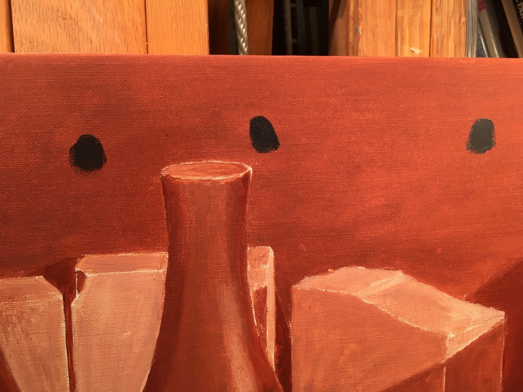
I decided to begin with the backdrop. I needed to get a smooth transition from dark to lighter, from left to right. This can be tricky to do. It requires a lot of careful blending. Blending can get messy because the paint often gets smeared onto adjacent areas. Better to paint it first, so I don’t mar anything that’s already been worked on. Above you can see where I’ve tested several different values of gray to make sure that I’ll get a smooth transition. It’s clear here that the underpainting is a few shades lighter than the finished value. I painted swatches of these colors directly onto my value study to make sure I got them right.

Above you can see the dots of paint that I dabbed onto the value study to compare values. The orange spots are from when I was painting the underpainting. I was checking that the values I chose were a few shades lighter than the finished value. The dark spots are from this session, where I was trying to get the value the same as the in the study.
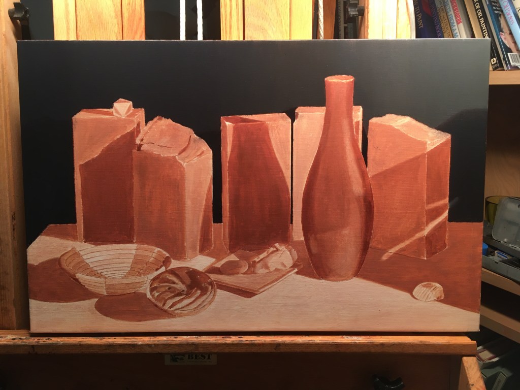
Above, the backdrop is complete (for now!). I don’t want to work on any adjacent areas until it dries, so I’ll have a first go at the dish and stones.
At first, I try to get the basic local colors in. I can’t do any finished work at this early stage, because all parts of the painting must grow together. If I put a lot of detail in now, I’d probably find later that the colors and/or values were incorrect. Everything must be compared with everything else, as the painting slowly evolves.
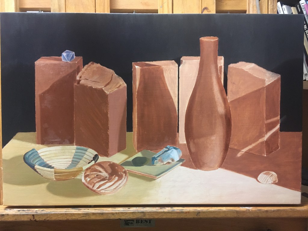
At my next session, I roughed in the blue crystal and the two bricks on the left. The color of the bricks is very similar to the underpainting, so it’s hard to see what I did. I put in a thicker layer of paint and indicated some texture. The brick on the far left has a stippled, rough texture. The one next to it has concentric semi-circular markings which I indicated with strokes of the palette knife. I painted the bricks slightly darker than was indicated on my value study because I intend to scumble a lighter value over them to mimic paler deposits on the bricks. I put down the local color of the tabletop on the left.
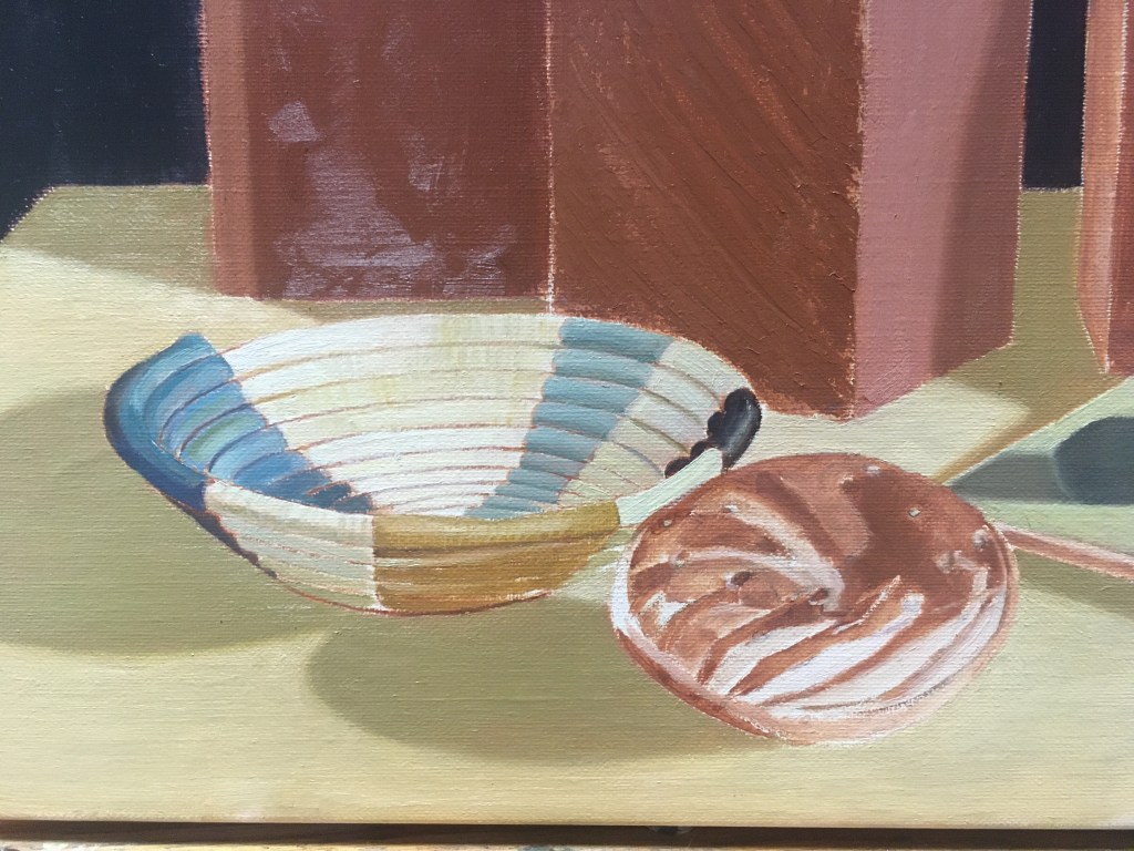
Above, I’ve made a first stab at the basket
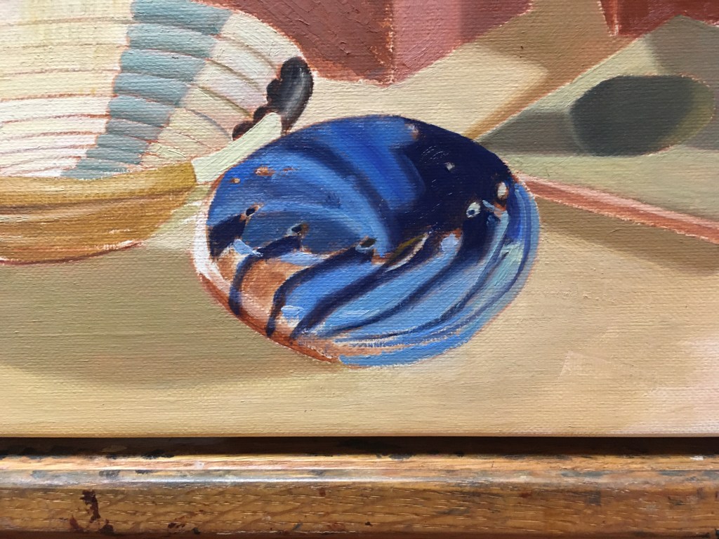
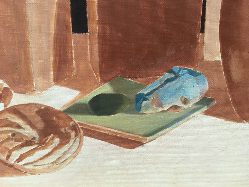
Next, I worked on the paperweight. The patterns are very hard to see, but I did my best! It’s frustrating to not get it right on the first try, but I can always make corrections later. Each time I repaint an object, it’s easier to see. The more landmarks that are in place, the easier it is to see if what is there is correct.
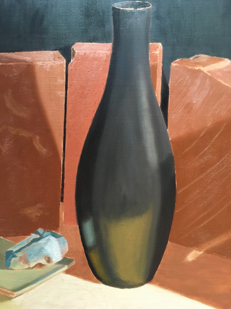
The vase was next. I didn’t paint the darks as dark as they would be because I want to glaze the shadowed areas later.
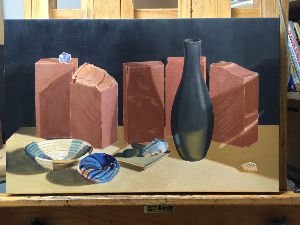
Finally, I finished putting a layer of paint on all of the bricks, the shell, and the rest of the tabletop. I couldn’t resist glazing a few shadows on the drier parts of the tabletop on the left. The paint wasn’t quite dry enough, but I got away with it. They will be much darker after I apply a few more glazes.
