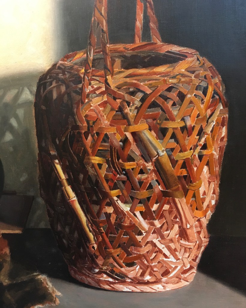
Above is the basket as I last showed it. I still haven’t completed the covering of the underpainting in the lower right section and upper rim.
Above, I’ve covered most of the underpainting. I’ve gone back to the shadowed section on the left to the right of the bright thick bamboo strip and picked out some lighter areas that were obscured by the last glaze. I glazed in a shadow on the far right side of the basket. I also worked on the top rim.
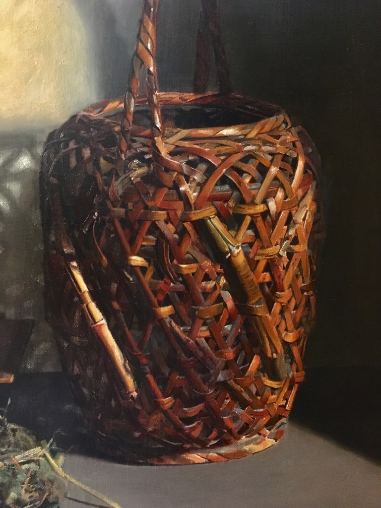
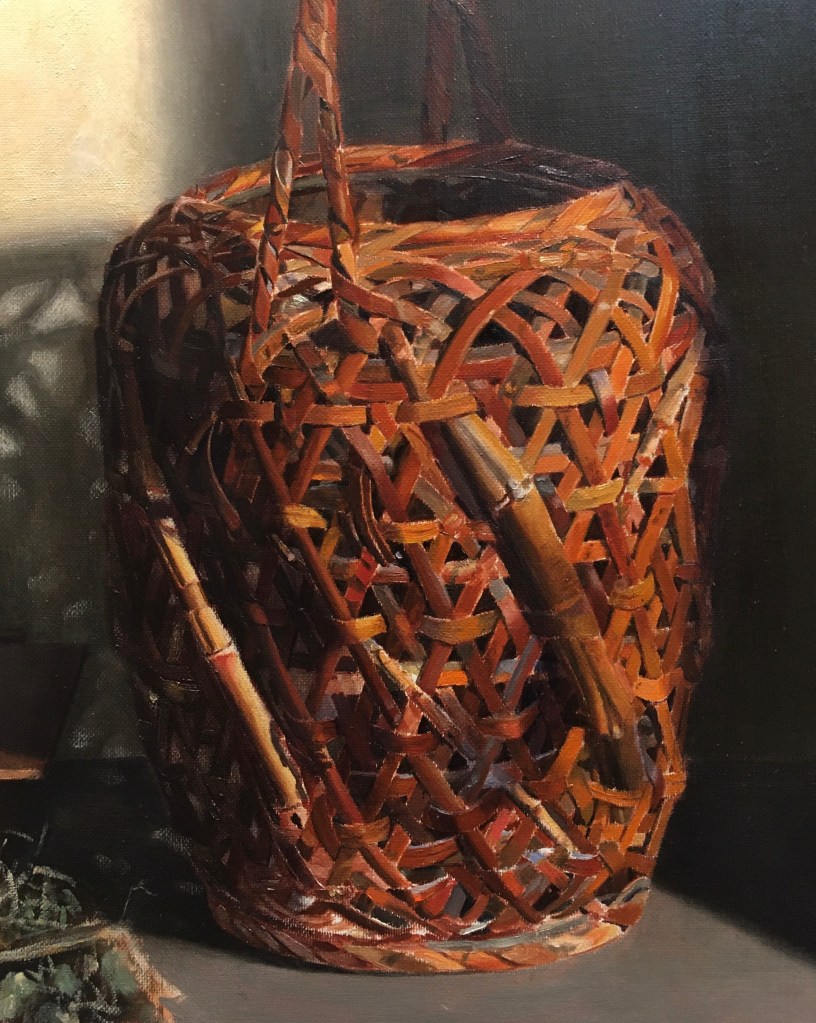
I worked on the front top rim and the area below the front two handle pieces. I repainted parts of the handle. Finally, I’ve started to work all over to refine colors and details on the areas that I already worked on. Now that everything is in place, I can judge if areas are too dark or too light, as well as adjust colors. Many of the oranges were too bright. I went over these areas with a more muted orange. Many of the warm deep colors have been very difficult for me to reproduce in paint. When I’ve mixed a color that was dark enough, it didn’t look rich enough. I tried adding alizarin crimson, one of the colors that is both warm and dark, but often this looked too red. Adding yellows (raw sienna, cadmium yellow) made the mixture too light. Raw umber was a bit too cool and greenish. In the past, I’ve been successful glazing these dark rich tones, but it seems cumbersome to glaze so many tiny areas. I’m going to try adding burnt umber back into my palette. I haven’t used it in years. It is a reddish dark brown earth tone. I can’t remember why I stopped using it! We’ll see if it does the trick at my next session.
Finally, I’ve softened edges that were too sharp. I also softened edges and adjusted colors and values in the many small cast shadows. When I focus on these when studying the set-up, they seem darker than they really appear than when I take in the set-up as a whole. Actually, the spotlight and the bright areas in the basket cast light into these shadows, lightening them. This light also seems to warm up these shadows. Some of them seem to have a dark warm reddish hue. Alizarin crimson works well here, because it is transparent, warm in color, and a lighter value than the ultramarine and raw umber tone that I usually use for glazing shadows. This is a bit confusing, since, theoretically, shadows cast by a warm light are cool- so a yellow spotlight will create bluish cast shadows. I have to go with what I’m seeing, though!
