When a painting is almost finished, I like to go back and evaluate if the composition is working. After concentrating for so many months on details, it’s easy to lose sight of the whole composition. One trick I have for doing this is to look at the photo I took of the set-up I chose back in the beginning, when I was setting up the composition. l photograph the set-up options while I am composing a painting, because it is easier to see them as 2-dimensional designs, and I can compare them easily on my phone. I never paint from these photos, however. A photo can never capture the nuances of light and form that you see when looking at reality. Colors appear different, values are simplified, and form can be distorted. For this reason, my painting always ends up not looking exactly like these photos. Usually, that’s not a problem, but sometimes a detail from the photo makes a better design. For instance, in looking back at the original photo, my phone might have exaggerated a color, or made some area brighter. If I decide that it helps the composition, I’ll change the painting. This can be hard to do, after being for so many months in the mode of faithfully representing what’s in front of my eyes, but it’s crucial to remember that it’s the painting that counts. There is no reward given for faithful representation of every aspect of the set-up. Details must always be in the service of a good composition. So, I make changes to improve the composition.
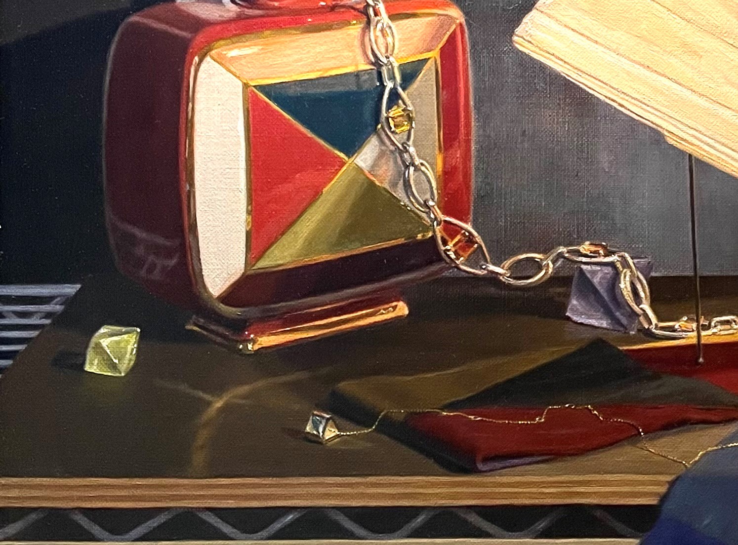
I decided that the left side of the painting was looking a bit dull and flat. In studying the old photo, I saw that the green and red areas in the scarf under the vase were lighter in value than in the actual set-up that I had reproduced. Also, the yellow fluoride crystal was lighter, and the triangular end of the chain necklace had more sparkle. The edge of the pressboard tabletop was lighter, too. I also decided to re-paint the green and orange triangles in the vase a bit brighter, as they appeared in the photo. All of these details seemed to balance the composition, by drawing more attention to the left side. Above, you can see how the painting stood. Below is how it looked after I brightened up these areas.
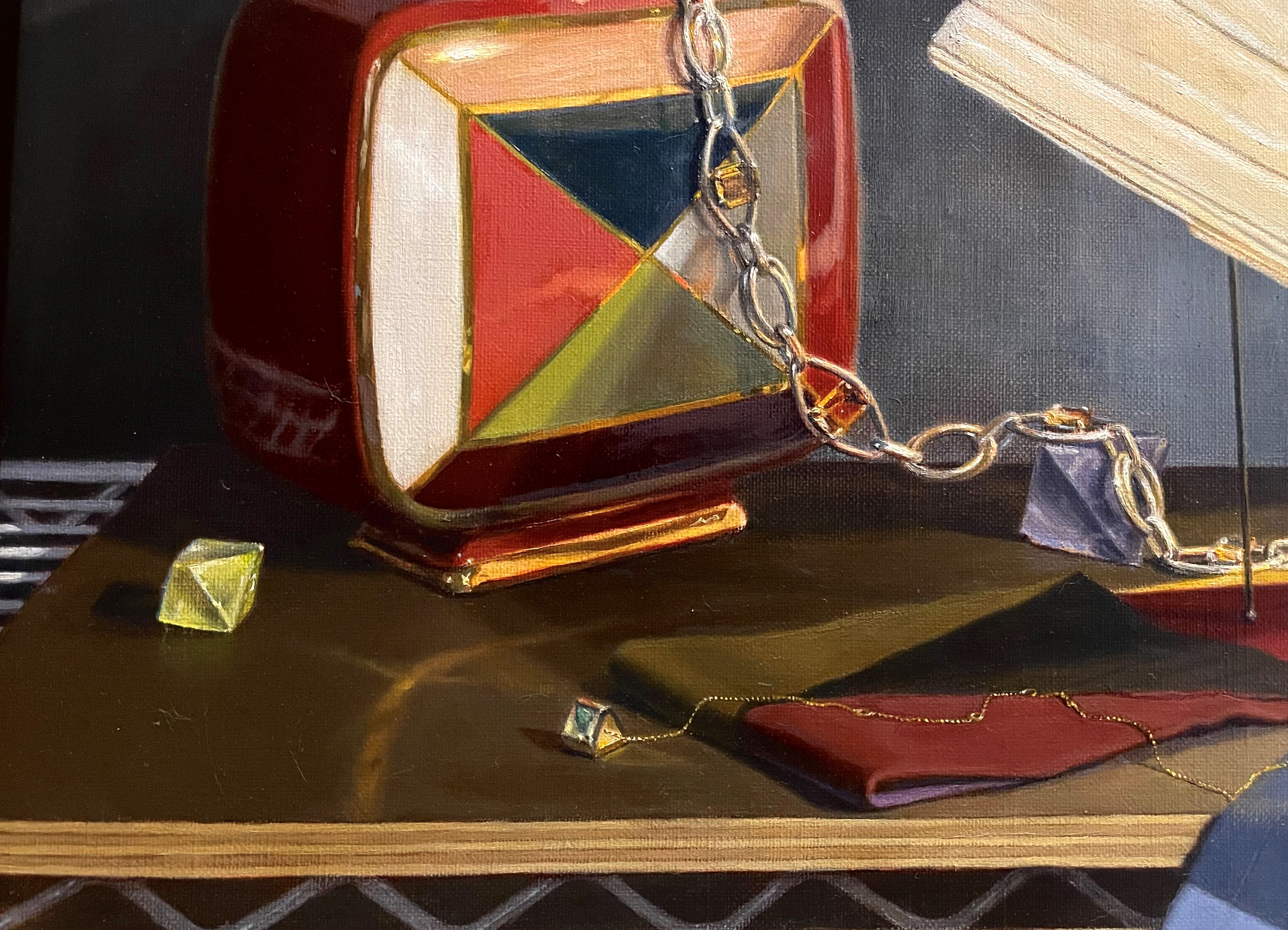
Though it’s not shown in the picture,above, I shortened the reflection of the vase onto the tabletop so that it doesn’t reach the front edge of the table. I think it was drawing the eye down too much the way it stood.

The dark blue triangle in the scarf at the bottom also has been bothering me. tI seemed to draw the eye down and out of the painting, because of the strong value contrast with the front of the table. I thought I’d experiment with trying it in different colors and values. I cut out some pieces of paper and painted them in different colors to experiment, and lightly taped them onto the canvas to judge them. I painted one in rust, one in green and another in pale blue. The pale blue won! It echoed the blue of the wall, balancing the composition. It was close in value to the front vertical at the bottom of the painting, so it didn’t attract too much attention away from the focal points.
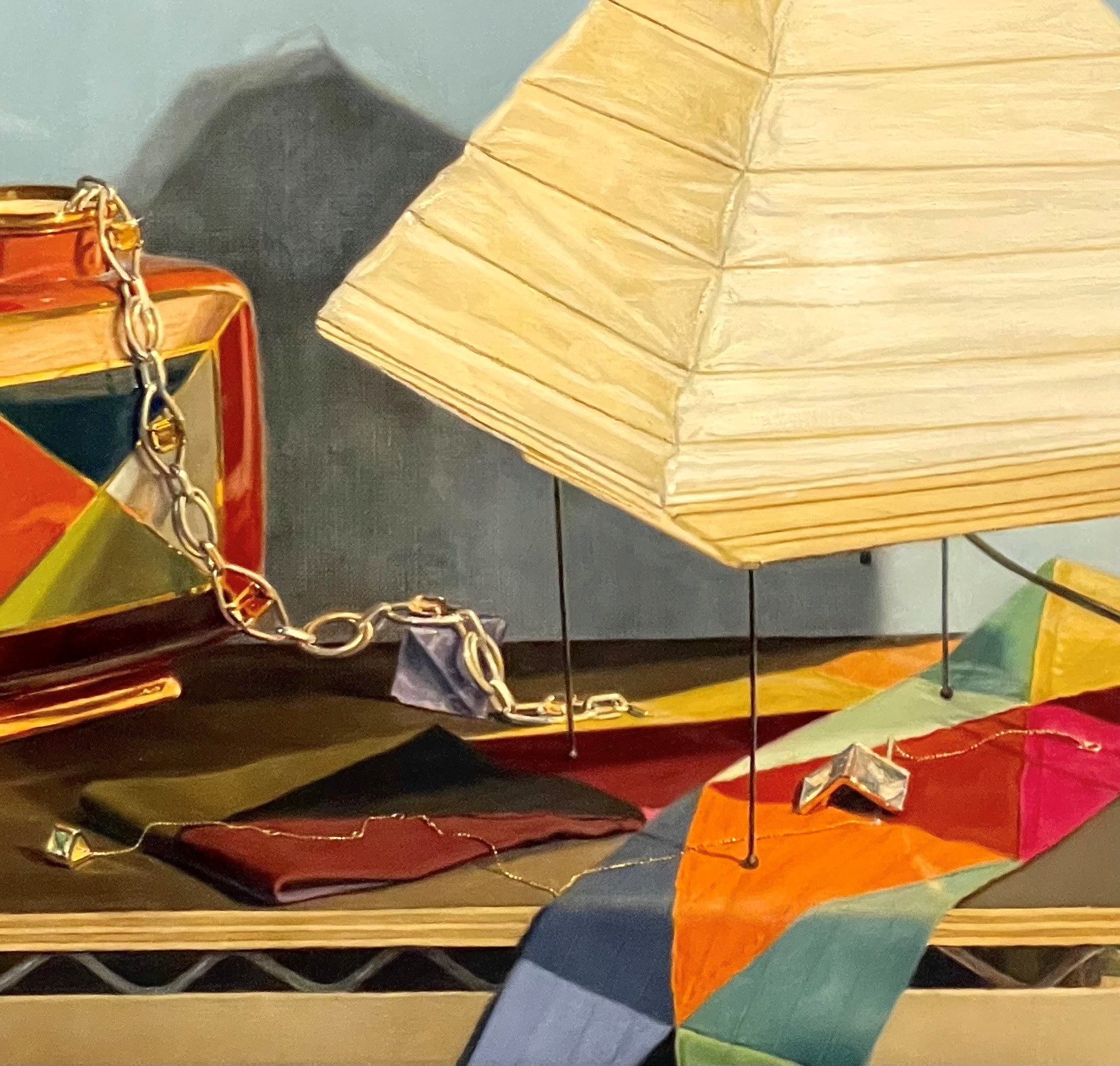
Above you can see the triangle re-painted in light blue. I’ll continue to look at the composition critically in the next few weeks before I declare it finished and sign it.
