I began, as always, with the underpainting. There are a few areas of the painting that will be bright green. I’ve already glazed these with cadmium yellow with just the plain canvas beneath. I did this hoping to achieve a brighter green than I could create with solid pigment. Here, I have applied a layer of viridian green over the yellow.
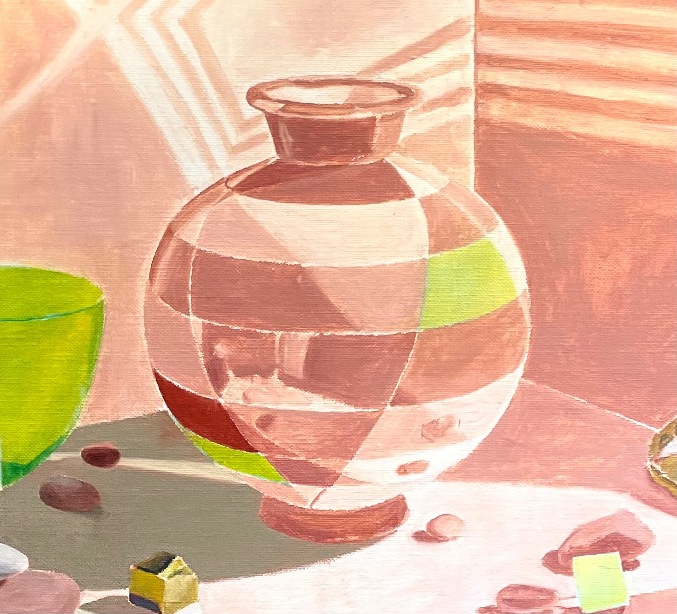
Below, I have applied all of the local colors. The shadow areas aren’t as dark as they will be, because I plan on glazing them darker later. I’ve indicated a few highlights, but most of these will wait for later after all of the colors and values are mostly correct.
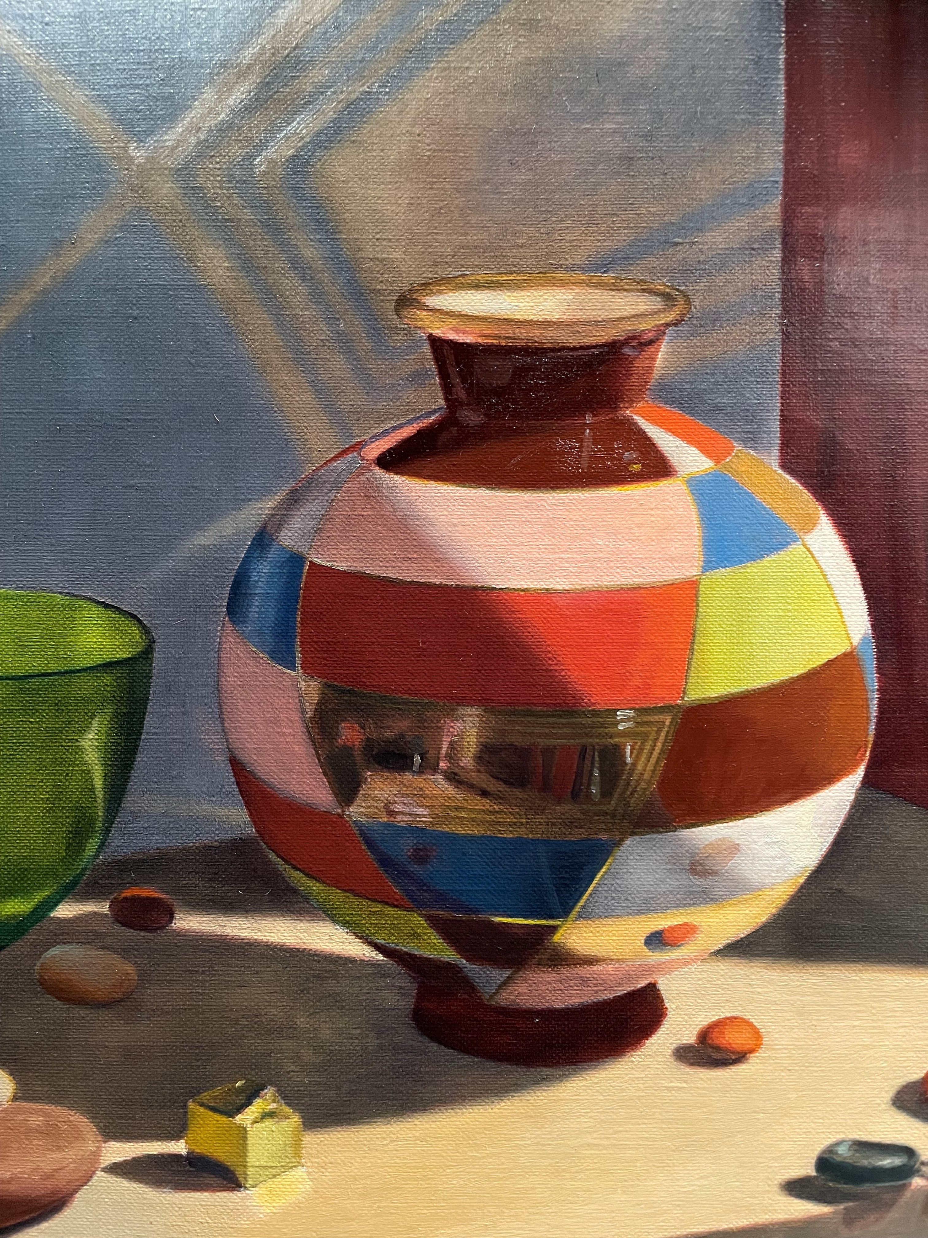
Below I’ve started to adjust the drawing on the rim which got a little out of whack. It’s still not quite right, but it’s better! I try not to worry about perfection. I can always correct things. I’ve started to observe the subtle reflections and values on the left side of the vase. I’ve painted more of the reflections of the set-up and room in the gold mirror section. I added some detail on the base. I stared to indicate the narrow gold outline between the colored sections. These change color quite dramatically depending on if they are in shadow or reflecting the spotlight. I’ve begun to soften some edges. A round shape looks more convincingly round if its edges aren’t hard and sharp. Also, the light reflecting off of the light part of the vase will make the apparent edge look fuzzy.
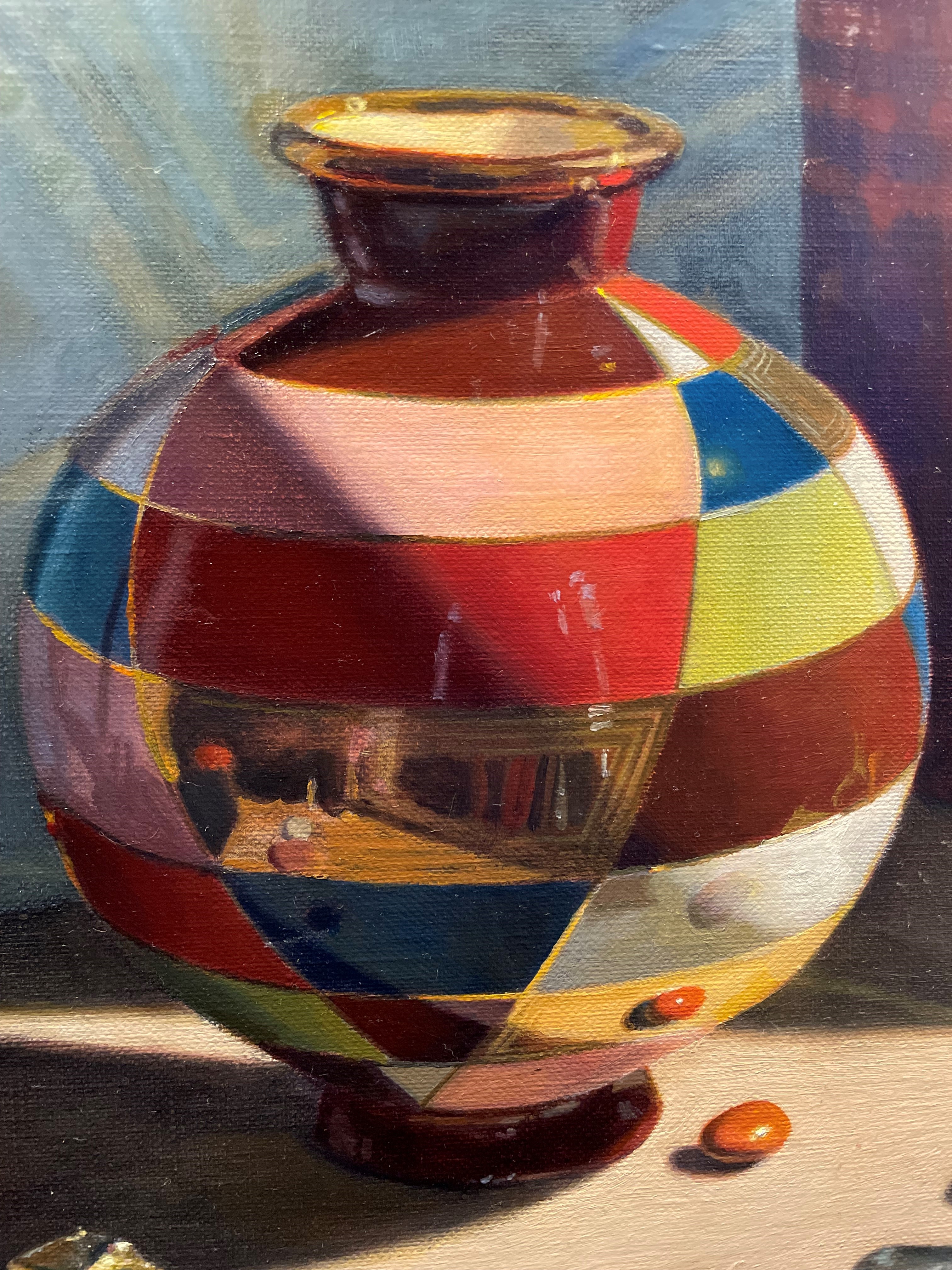
I didn’t like the look of the lighter parts of the vase when I glazed them darker to show that they were in shadow. They ended up looking speckly, and not shiny like porcelain. Above, you can see in the light pink and the green sections that I re-painted the areas in shadow with body color, painting over these glazes that I didn’t like. It can be tricky using glazes to indicate shadows on light areas if the weave of the canvas interferes with the texture that you want to portray. In this case (trying to indicate smooth porcelain), the bumpy weave of the canvas didn’t help me. If I had been painting an object with more texture, it would have been great.
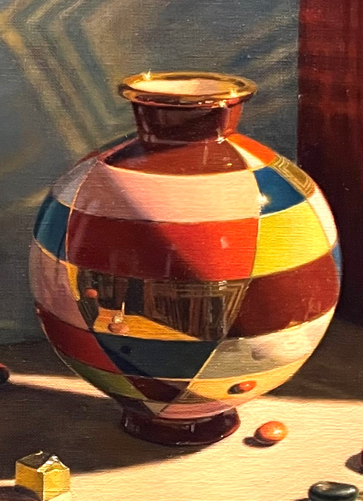
Above, I’ve mostly finished correcting the rim. The left side was too long, and the angles of the neck were uneven. I added the highlights. I also added a highlight on the blue section on the right. I make the highlight radiate out, obliterating details, suggesting a brilliant glowing light. I’ve re-worked the reflection of the room in the gold mirror section. You can see several of the stones, the tabletop, and the blue box reflected here. The details were easier to see now. At first, they looked very confusing and hard to pin down, but because I took a stab at it, and got something down, even if it wasn’t correct, it made it easier to see and paint this time. I love that oil paint allows you to keep correcting as your vision and observation skills increase as the painting progresses.
