I was recently asked by a follower on Instagram how I got a feeling of depth in my paintings. I realized that there wasn’t a quick answer, so I thought I’d talk about it here (as I’m still waiting for my canvas to arrive and can’t paint yet)!
I think that the first thing that gives a still life depth is the proper use of perspective. It’s essential to master the basics, or your work will never look convincingly real. Even if you’re the best observer in the world, I find that you need to check your observations with measurements–to locate your vanishing point and make sure that all lines perpendicular to the picture plane recede to it. If objects are at an angle to the picture plane, you have to learn about 2-point perspective, and find or estimate those vanishing points. Ellipses have to be drawn at the correct angle and be symmetrical. Below is the drawing for ‘Books in Box with Ribbon and Glass.’ You can see that all lines parallel to the picture plane recede to a vanishing point above the top of the drawing.

Once you begin the painting process, I have found that the way you treat the shadows vs. the light areas also affects the appearance of depth. I like to keep the paint in the shadow areas very thin and transparent. I use several layers of a dark glaze to achieve this. In the lightest areas of the painting, I use heavier layers of paint. The brushstrokes in these light areas stand out from the canvas and actually catch the light illuminating the canvas. This contributes to the illusion of light bouncing off of the objects, which contrasts with the deep, mysterious thin shadows.
It’s also important to remember that in the shadows, details are difficult to discern. Muting these details in the shadows by leaving out some parts, softening edges, and decreasing value differences also increases the illusion of depth. Below, you can see how I muted the details on the spine of the blue book that is in the shadow.

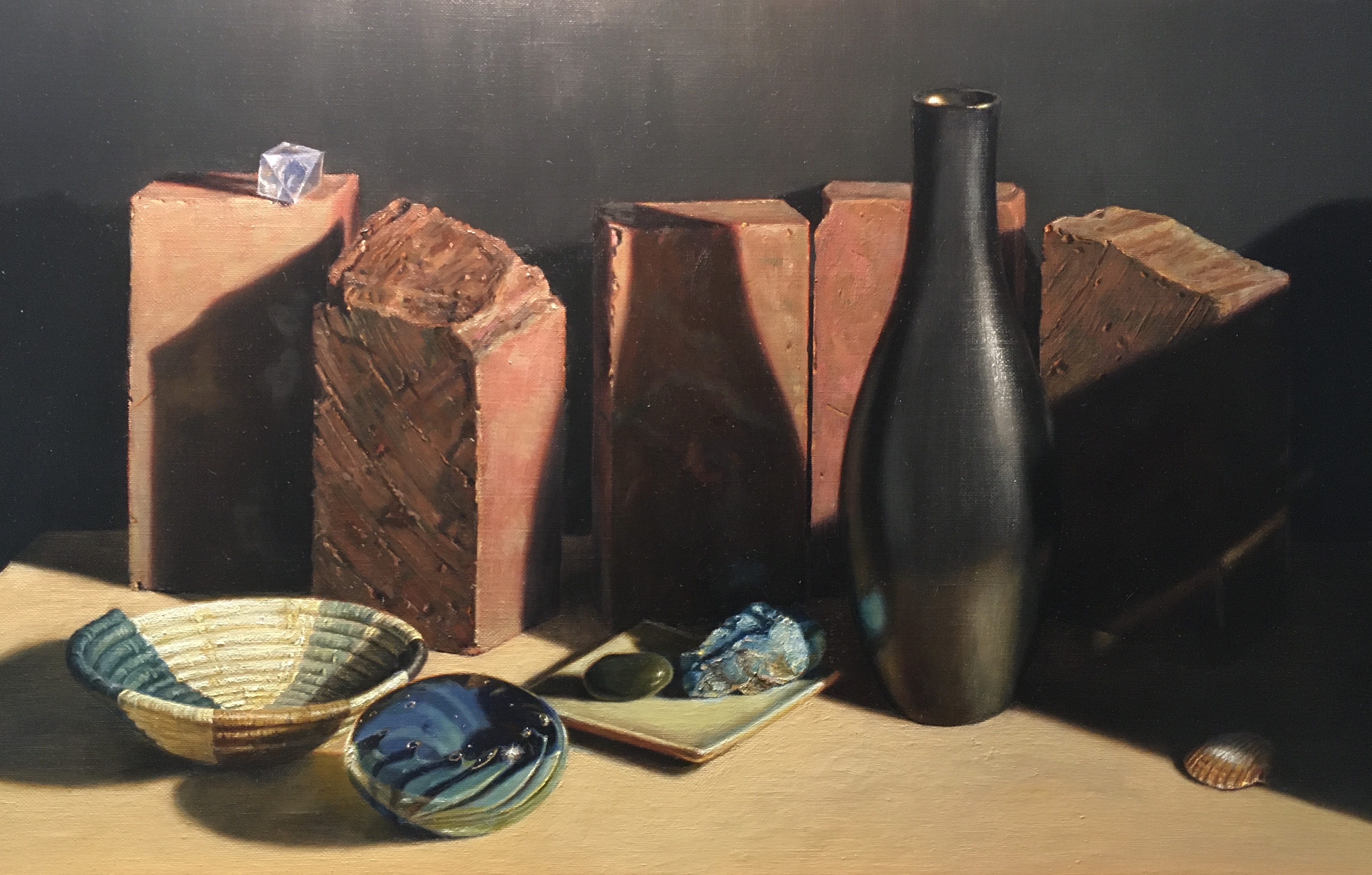
The way you set up a still life can also create a feeling of depth. Overlapping one object with another is one way to do this. This gives the viewer the idea that there is space for this to happen in. It’s usually not a good idea, though, to completely block the base of an object that is being overlapped. Even just a glimpse of the base of the object in the back clarifies its form and lends a feeling of stability. In the painting below, you can see some of the base of all of the bricks. This helps you understand their form and gives them visual weight. The objects in front of the bricks overlap the bricks and each other, giving you a sense of foreground and background, and hence, depth.