I’ll use the time waiting for my canvas to arrive to paint my value study. I paint this on tracing paper taped over my drawing, so that I can follow the outlines. I use 9 values ranging from white to black. There will be more values in my finished painting, but this is enough for now. I number them right on the palette for easy reference. This study will be very rough. I don’t need a lot of details to give me an idea of what the finished composition will look like in black-and-white.

The purpose of the study is two-fold. Most importantly, seeing it without color, I can judge the composition more easily. Lightness and darkness and the contrast between them are crucial in the construction of a painting. Color does affect the composition, but I’ve found that if the composition doesn’t look good in black-and-white, it won’t look good in color.
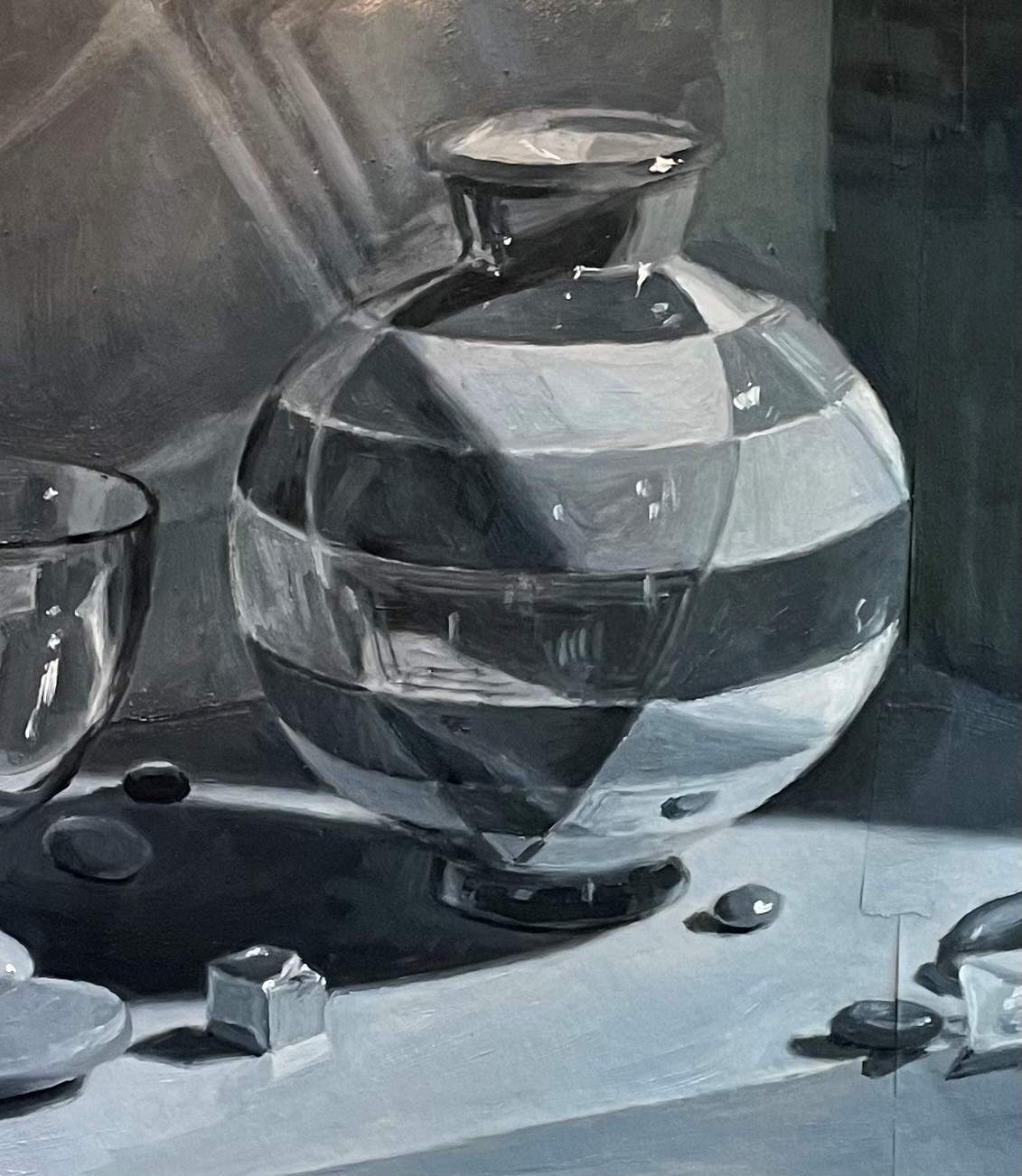
Above is my initial attempt. It’s hard to get it right the first time, as one must compare areas to judge the right values, and until all areas are painted, you can’t judge correctly. I can see already that the lights need to be lighter. Below is the whole picture. I’ll let this dry for a few days so that I can paint in corrections.
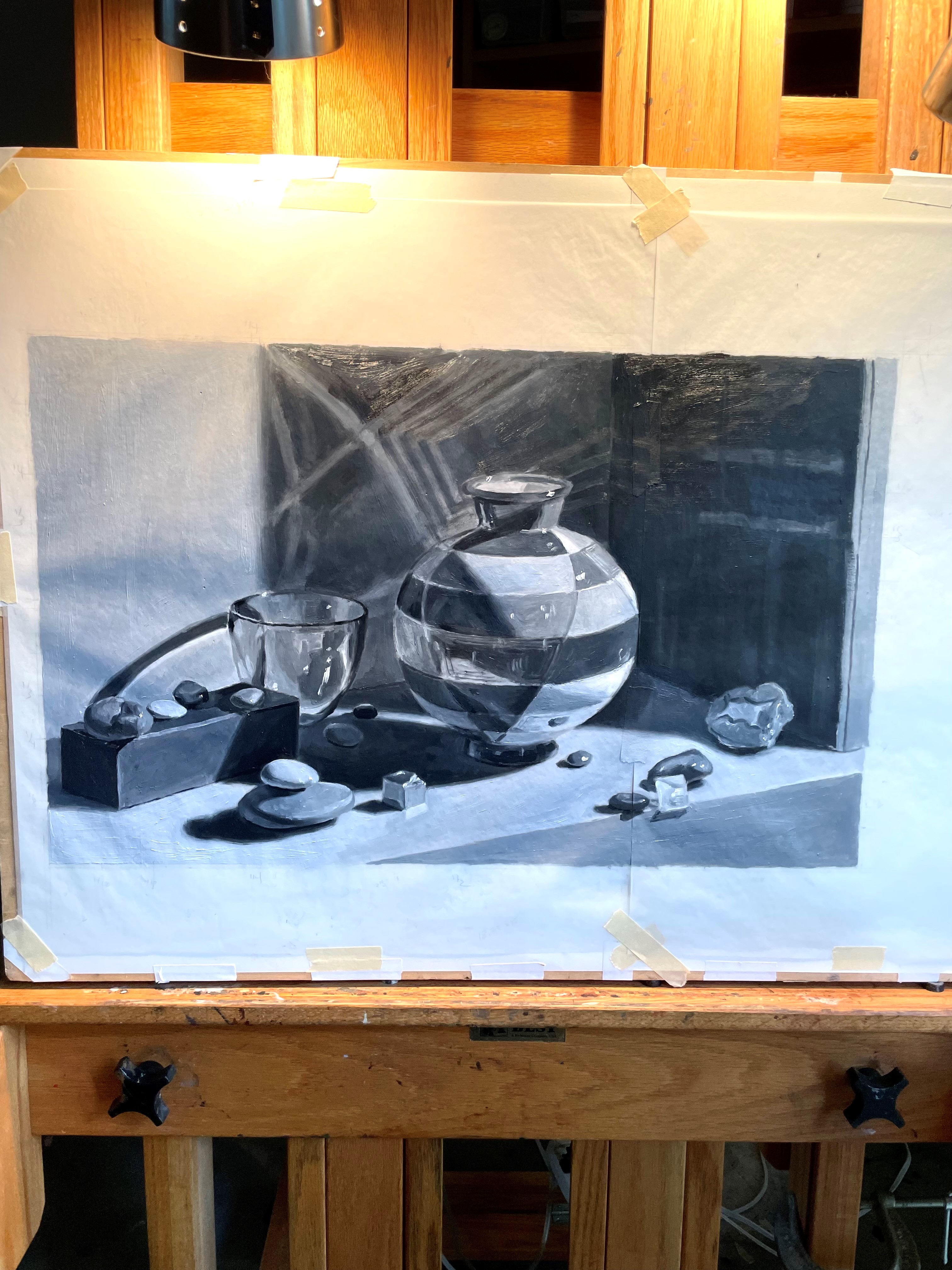
A week later, I put in my corrections. You can see this below. Most of the lights have been lightened, especially the tabletop, the wall on the left, and the white stones. I’ve also darkened the box, the shadow cast on the table by the big vase, and the area around the geode on the right. I’ve added reflections on the big vase, especially on its shadow side.

I’m happy with this, though I’ll live with it for a while to see if I want to make any more changes.
