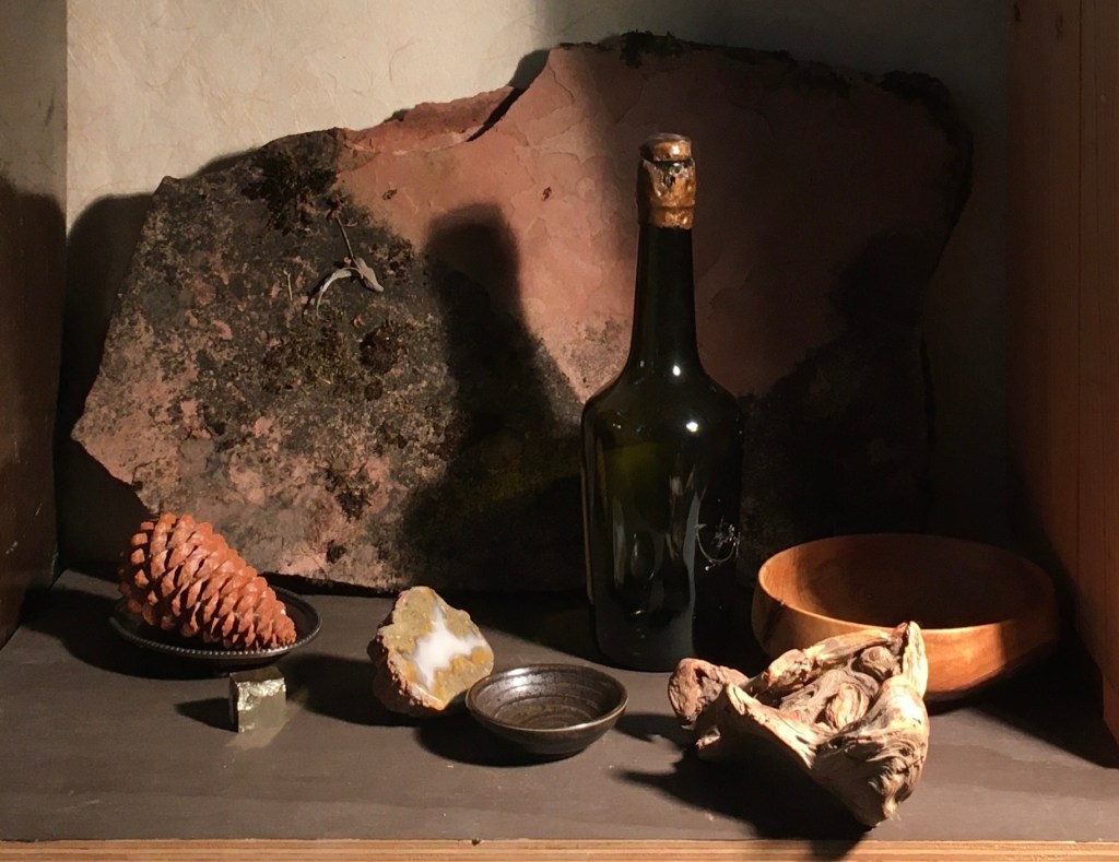
Above is the composition I worked on last. I lived with it for a while, and though I liked it, I thought that I’d try another.
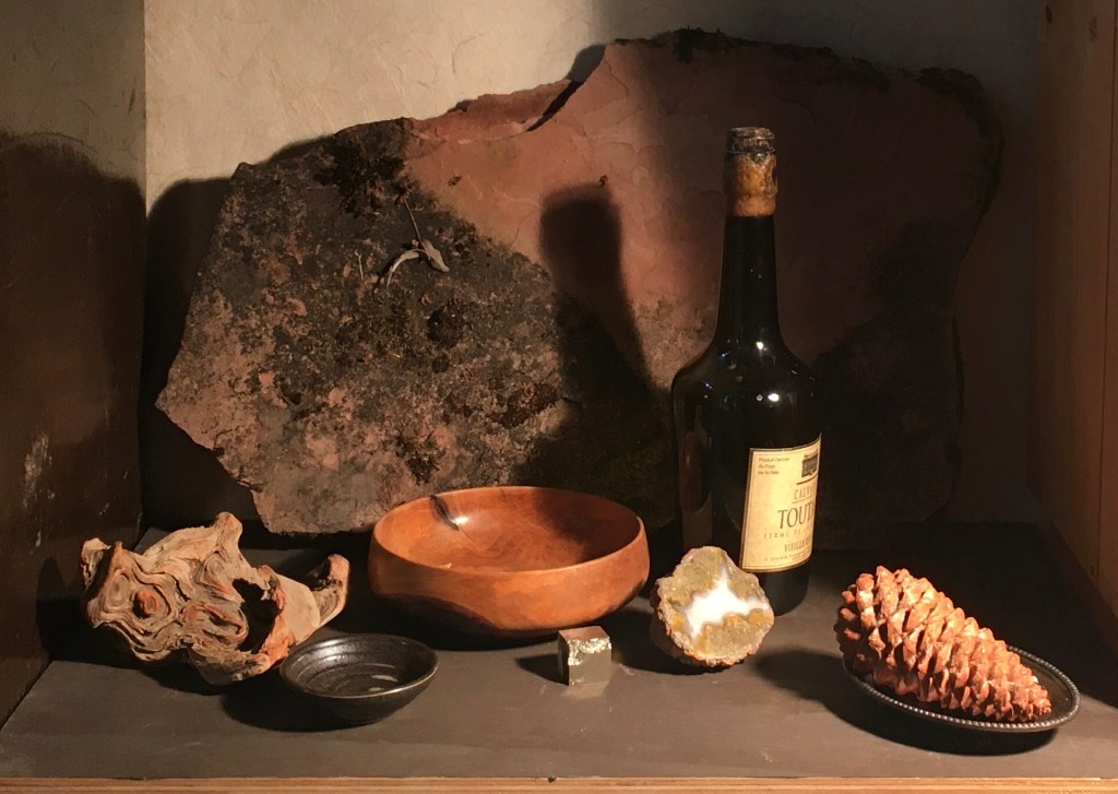
I left the bottle where it was, and moved everything else around, just as an experiment. I also wondered how the bottle would look with its label showing. The result is above. The label seems distracting. Also, the wood bowl so close to the middle draws too much attention. Lastly, the pinecone points out of the picture- never a good thing!
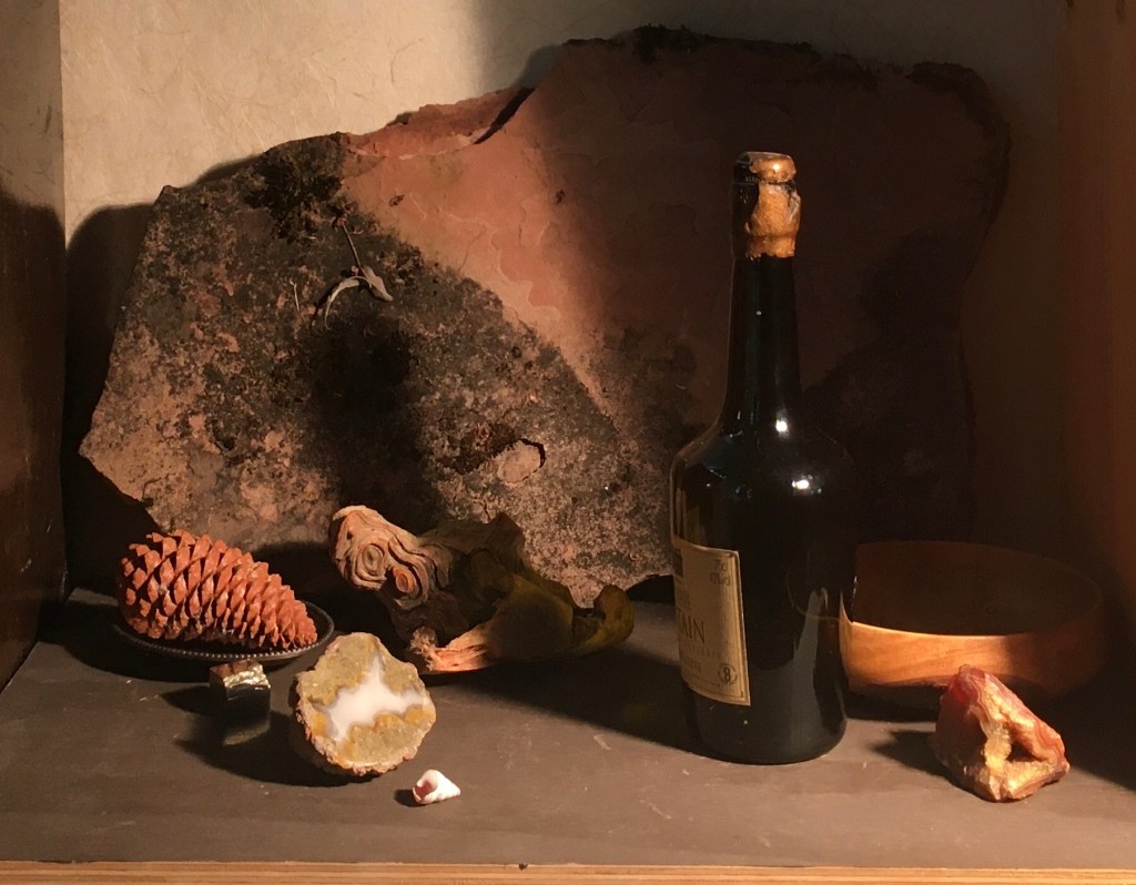
I put the pinecone and the bowl back to their original positions, and experimented with moving the driftwood back into the shadow of the bottle. I removed the small brown bowl and added the orange geode and white shell. I turned the label away from the light. I like the label more, but this arrangement seemed fragmented- as if it were pulling the eye in two different directions. I thought I’d try removing the pinecone to shift the focus more to the center of the composition.
This seemed better, but something didn’t seem right. I tried looking at the image upside down. This is a great method for seeing the composition more clearly, since the eye doesn’t focus on the separate objects so much as on their abstract shapes and relationships.
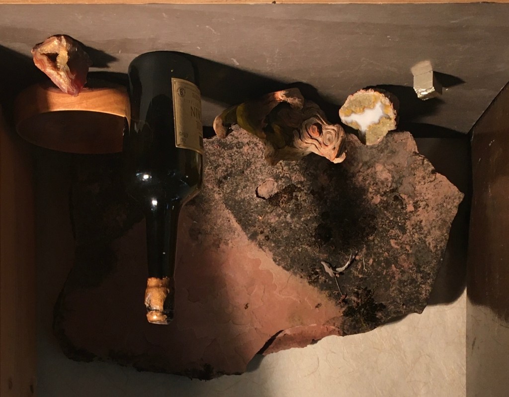
When viewed upside-down, I noticed that I didn’t like the shape of the orange bowl and orange geode. They make a pronounced horizontal and vertical that didn’t seem harmonious with the rest of the composition. Also their brightness both in chroma and lightness in value drew the eye out of the frame.
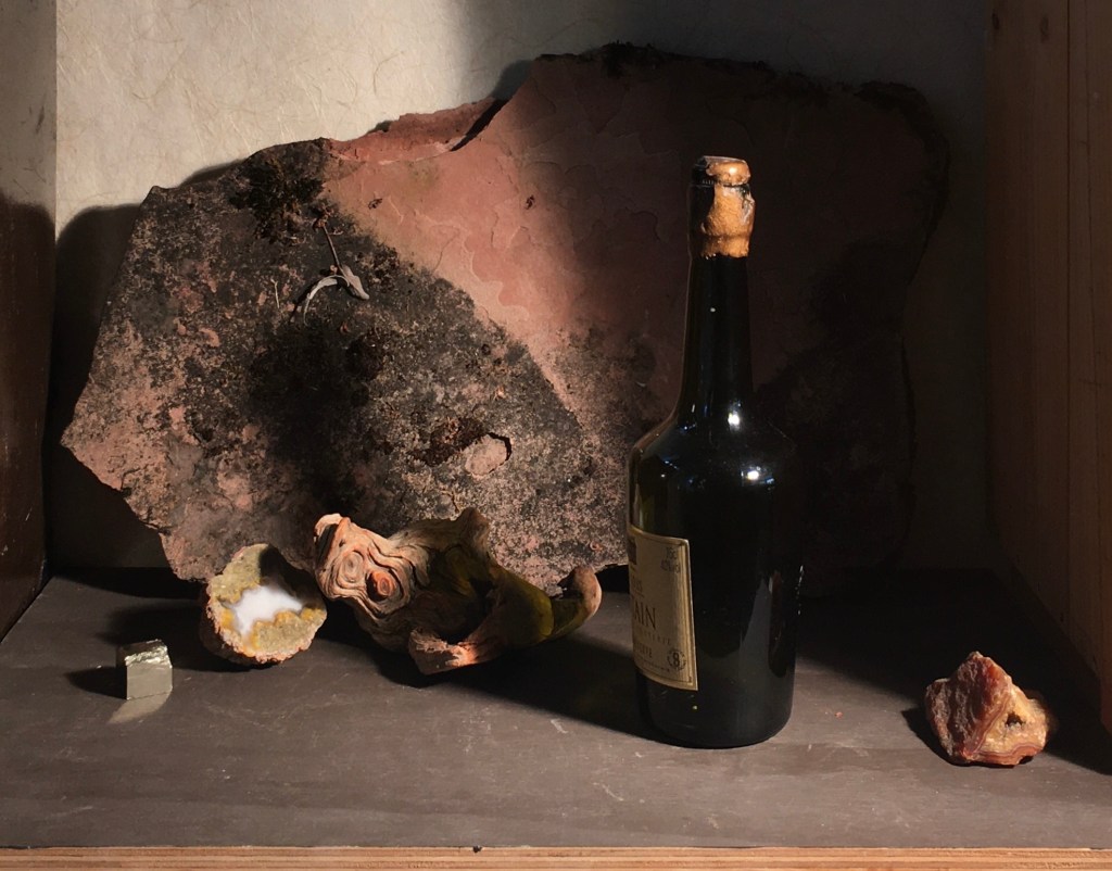
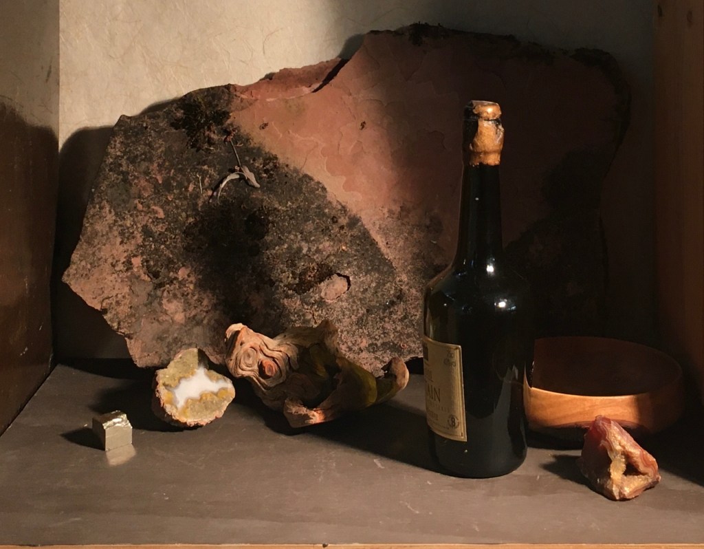
Above, I eliminated the bowl and re-positioned the orange geode. This is better, but the bottom of the composition seemed rather dull. I thought that I’d try adding the small brown bowl back, but further forward, overlapping the edge of the tabletop.
This seems promising. I like the way that the upward angle made by the top left side of the sandstone is echoed in the line of the fool’s gold, green geode and the lit top of the driftwood. This angle is also echoed in the line of the brown bowl and orange geode. Repeating angles can help to unify a composition. I feel like maybe it could use some more light values and brighter colors.
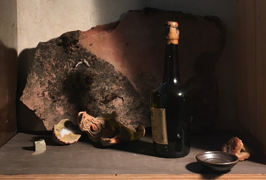
Here’s the original composition. I don’t know which I prefer. I’d better give it a few days!
