
I never work from photos. The camera both distorts and doesn’t provide enough information. It doesn’t pick up subtleties of color and tone, and can be deceiving about shapes and perspective. That being said, I have found one use for photos. Details on objects that are focal points should be clearly painted. If those details are too far away from my easel for me to see clearly, I need a little help. I could hop up and down from my stool to get closer to the set-up for a look, but that is exhausting and creates too much lag time between seeing and painting. It’s much easier to glance down at a photo on my phone held in my hand. One danger in this is that I might easily end up showing more detail than looks natural for an object seen at a distance of 5 feet with some of the areas in shadow. To avoid this, I only use the photo for the ‘drawing’ of the details. Before I paint them in earnest, I return to looking at the set-up to judge if some of them need to be muted or made more hazy, especially as the object turns into shadow. I can de-emphasize an area by dulling the intensity of its color, reducing value contrast, or making the drawing more hazy.

Above, I’ve begun to paint in details on the vase. You might notice that my painting isn’t exactly like the photo. Partly that’s because my drawing isn’t perfect! Partly it’s the result of the perspective in the photo being distorted because I was very close to the vase when I took the photo. As long as my perspective is correct, the disparities between my drawing and reality don’t bother me, because my goal isn’t to create an exact replica of the vase. It’s to create a beautiful painting!
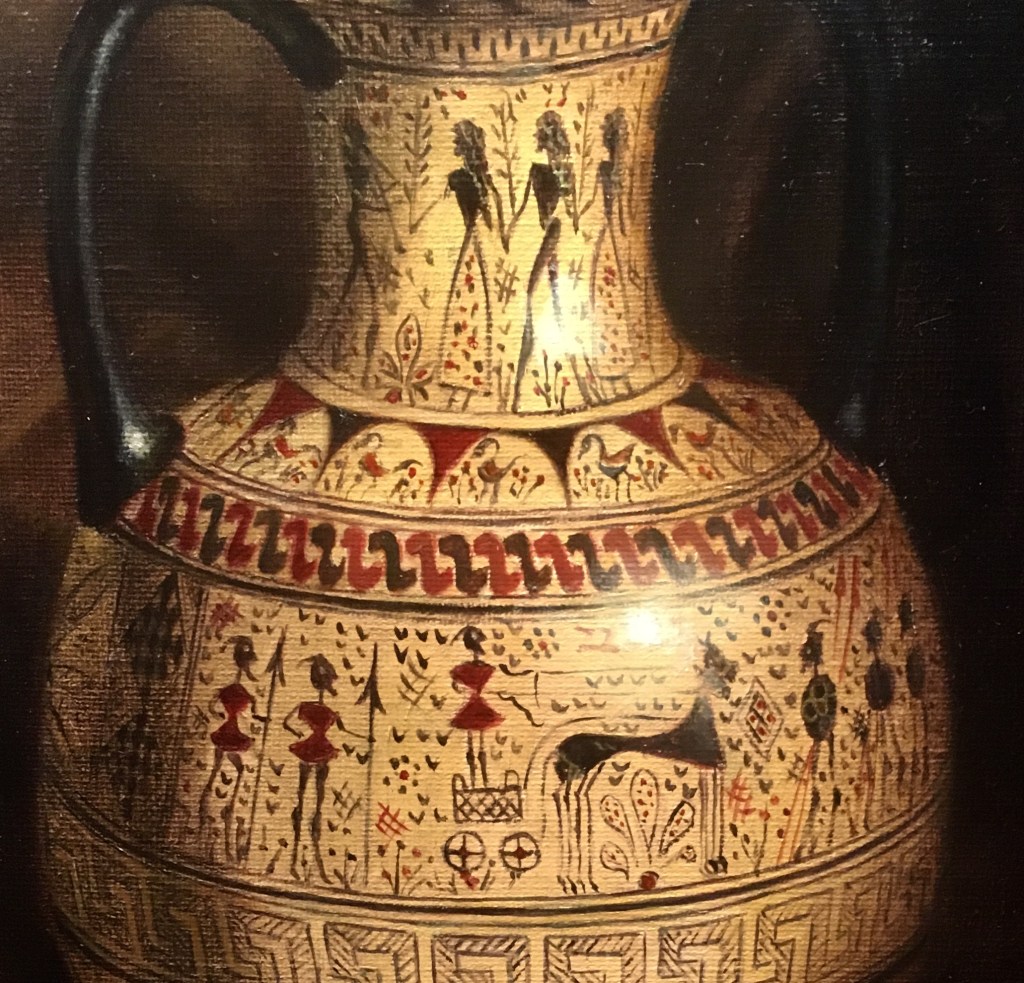
Above, I’ve completed most of the designs. You can see how I’ve muted all detail in the highlighted areas. Also, as the vase turn toward the shadow, I’ve made the images much hazier with less value contrast. This makes the vase look believably rounded and the designs seem to be part of the vase.
