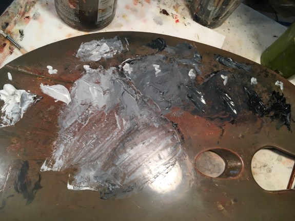
Above are my paint mixtures going from white to black. I number them right on the palette, so it’s easier to keep track of them. For instance, if #4 is too light, I can go right to #5, without wondering which one I’d just tried. I find that 9 values gives me enough range to judge the final result, though in a finished painting I use many more values.
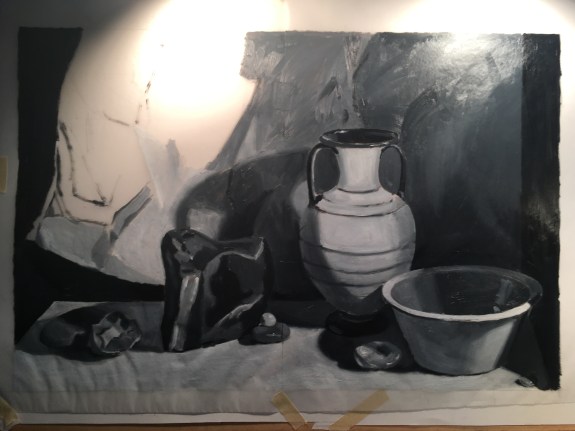
I’ve taped tracing paper over my drawing, and paint my study right on the paper with oil paint, using the drawing as my guide. Here is my first stab at the values. It’s hard to get these correct right off the bat, because you can’t judge something’s value unless you can compare it to the adjacent value. I always have to make many corrections once this layer is dry.
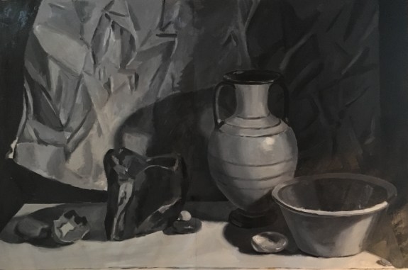
I’ve roughly indicated the texture of the paper background. I’ve also tried to correct the values in the vase. I’ve darkened the background on the right. Now I’ll let it dry for a few days because tacky oil paint is impossible to paint over!
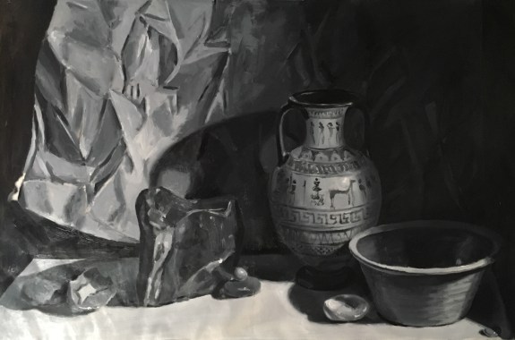
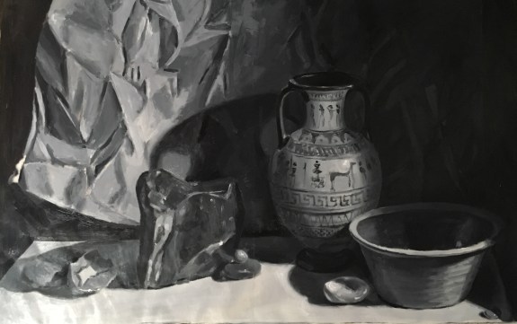
The finished study is shown above. The photo has some glare on the left side, so those areas appear too light. I’ve very roughly indicated the design on the vase, and did not attempt more than a suggestion of the paper’s wrinkles. Details aren’t important here. I’ll use this study to judge the overall composition. If it doesn’t look good in black and white, it won’t look good in color!
I’m pretty happy with this. I wondered if the composition would be improved by cutting off a bit of the top.
I think not. I think that the original version with more space at the top lends the composition a sense of airiness that I like.
Now I’ll order my canvas. That should arrive in a few weeks. Until then, I’ll return to completing the drawing, especially of that very detailed vase!
