I began this set-up right before I started ‘Japanese Basket.’ I think it has promise, so I’m going to proceed.
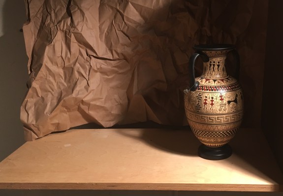
This one started with the crinkled paper. I’m always looking for a new background, and this caught my eye as I was unpacking a shipping box. You never know where you’ll find something interesting to paint. I tacked it up on the wall just as it was, then added the vase- the first actor on the stage! I usually like to cast a deep shadow onto my set-up for the drama of the contrast of light and shadow.
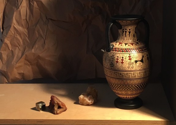
I found a crystal, rock and geode in the same color family and added them. They are pretty small. It looked like I needed some other larger object.

I moved the vase to the center of the composition, and added the woven box and a few more stones. I like that the darks and the lights are now massed into more or less continuous shapes. The dark mass is on the top right side on a diagonal, and the light mass is on the bottom left. This makes the composition more unified. If the darks and lights are scattered throughout the composition, it can look unfocused and spotty.

I thought I’d try something different just to see if I liked it. I don’t like to get stuck in just one way of thinking, here at the beginning. I moved the vase back over to the right and put the box on the left. This doesn’t look as pleasing to me, partly because the darks and lights aren’t massed together and partly because the interest seems evenly divided between the vase and the box. One of them needs to dominate.

I put the vase back towards the center. I wasn’t liking the way the weave on the box was competing with the pattern on the vase, so I substituted an orange pottery bowl. Also, it is difficult to make a pleasing composition with two large objects so I added the large piece of obsidian. I tore off a small piece of the wrinkled paper to see how it’d look. I also tilted up the background paper on the wall. I like the diagonal line this creates on the far left side. It’s interesting and serves to lead the eye into the picture. This arrangement is looking more cohesive than the one before.
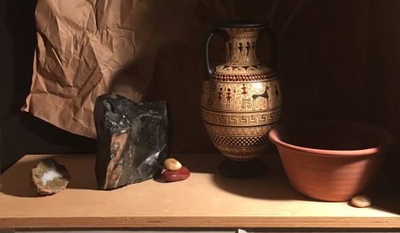
Here, I stacked up two stones and used them instead of the paper. I like them better. I rearranged the other stones. I like the way the orange stone picks up the orange of the bowl and vase decorations

I thought I needed some more weight on the left side, so I added a large gray stone behind the geode. I added a large pale rock under the vase. It’s getting better!
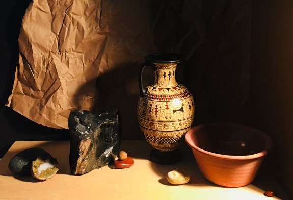 Here I experimented with leaving more room at the top of the composition. I like the airiness this imparts. I might decide to decrease this space a bit on my next try. I also added a tiny orange stone at the far right bottom. This completes an arc beginning from the geode, up through the obsidian, the belly of the vase, down to the orange bowl, and finally, to the small stone.
I think I like this composition. The darks are dramatic and mostly massed together. The Greek vase is the obvious focal point. The other objects are complementary and don’t compete with it. I like the way the wrinkled paper echoes some of the lines in the obsidian and the vase. I’ll live with it for a bit and see what I think.
