Now that I’ve worked on all parts of the painting, I thought I’d take a look at my composition to see how it was holding together. First I’ll compare it to my black-and-white study to see if the values are what I had envisioned at the beginning.

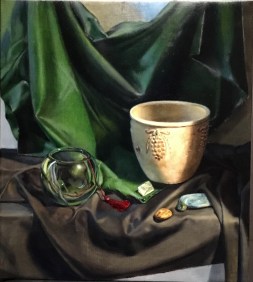
They’re pretty close. There are several areas in the painting that are lighter in value than in the study- the lighter portions of the green cloth, the black cloth, and the left side of the terra cotta pot. I have to decide if I like this or not. I usually end up following my original plan, but sometimes I make changes. The differences are usually the result of the light being different on a painting day than on the day I painted the study. This accounts for the lightness on the left side of the pot. The study shows it on a cloudy day, and the painting shows it on a sunny day, with more light coming in through my window shades. I’ll have to decide if it’s confusing to have the ‘shadow’ side of the pot be so light. It probably is! My usual policy is to imitate reality as closely as I possibly can while I’m in a painting session. When I’m painting I’m a copying machine, and I’m not engaging the critical side of my mind. After a session (maybe later that evening, after I ‘ve had some time away), as I’m studying what I’ve done, I can decide if reality is fighting with my composition. A good composition is more important than being accurate! Of course, any deviations I make have to be believable in the context of the work.

Next I have to decide if the green cloth is too light. I’ve been avoiding glazing it darker because I liked the intense green color so much. Once I darkened it I couldn’t undo it! I thought I’d wait to see how it looked in the context of the almost-finished painting. It definitely calls attention to itself, which I think I like. It’s taken on the quality of being an object of interest in the painting, not just the background. I might want to darken it a bit near the top, so it doesn’t draw the eye away from the center of interest. I also notice that it needs some more detail in the area above the glass bowl. It looks too smooth and flat. I’ll need to go back and observe the subtleties of the folds in that area.
I think that the shadows on the right side of the painting could be darkened for added drama. Again, on a sunny day, there is a lot of light bouncing around within the set-up. I find this fascinating to observe and to paint, but it might not be contributing to the final effect that I want.
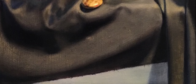
I think I like the value of the black cloth even if it’s not as dark as I originally envisioned it. I like the nuances of the warm lights, the bluish reflected lights from the window on the left, and the dark cool shadows.
I’ll make a few changes at my next session and see if the composition improves.
I consciously decided to make the green cloth lighter, as I was enjoying the brilliant green in the light areas. The left side of the pot appears much brighter and lighter on sunny days
