Black & White Value Study

I now will paint a full-sized back, white and grey value study. It is very helpful to see the composition without the distraction of color. The design stands out and I can see if any areas need to be darkened or lightened to emphasize my focal point, and lead the viewer’s eye the way I want it to travel. I can also more easily see if the basic shapes of the composition are pleasing. If the composition doesn’t look good in black and white, it won’t look good in color.

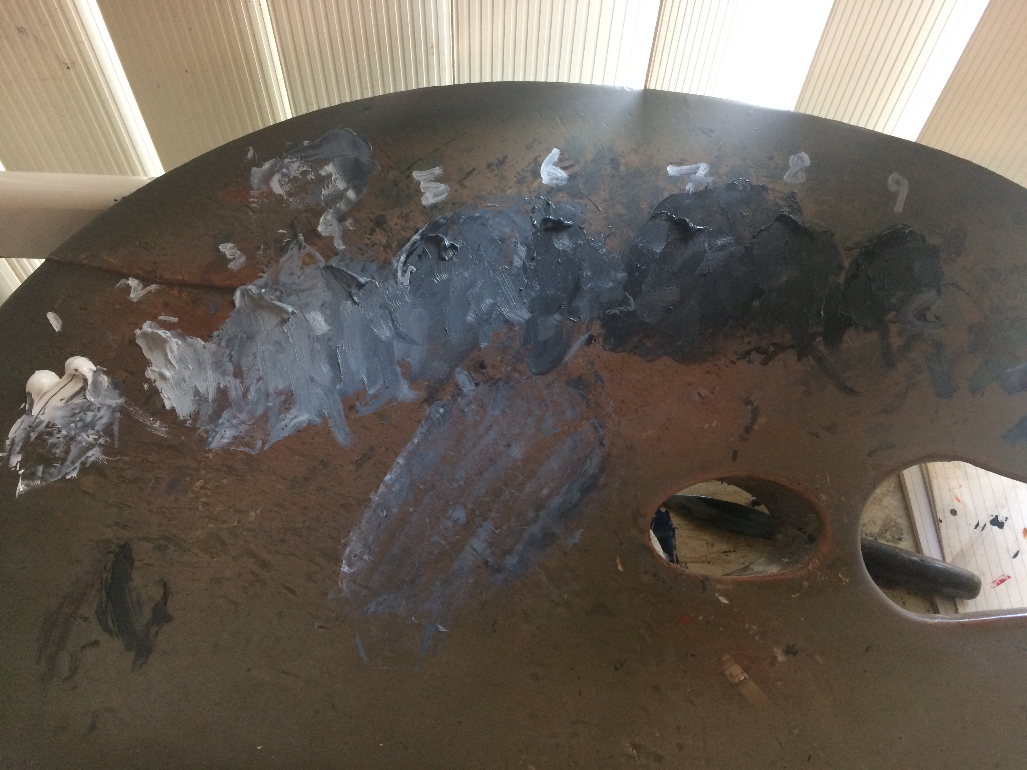
I mix 9 shades of grey on my palette, starting with pure white and ending with pure black . I number these right on the palette, so I can identify them as I work . I might paint an area with grey #3 and say to myself “#3 is too light, let’s try #4.

green-cloth-and-bowl-value-palette

I now tape a piece of tracing paper over my line drawing, and using the drawing beneath as a guide, start to paint. I keep it very loose and free. I don’t have to be precise at this point.

green-cloth-and-bowl-value-painting-unfinishedI let this initial attempt dry for a few days. I then go over it with a fresh coat of paint to make corrections. Inevitably, I get a lot of the values wrong the first time around, because its very hard to judge the darkness or lightness of an area until the whole is finished. I am constantly comparing one area to another. Once all the areas are painted, then judging becomes easier. Also, it is very difficult to paint sharp edges and smaller details into the wet paint of the first layer. Everything tends to smear and blend. Once the first layer is dry, the final touches adhere much better.

2016-11-02-dmc-gx1-p1070733green-cloth-and-bowl-studio

Drawing

I’ve been studying photos of my still life set-up for a week, and I still like it! I’m ready to start my drawing. First, I need to decide how large I want the finished work to be. I generally like to paint life-size. I find that still life especially, benefits from this approach. The image seems more real and compelling. I measure the front horizontal plane of the set-up to get a rough idea of the width of the finished painting. I composed the set-up looking through a viewfinder with a 8 to 9 ratio, so I can now calculate the height of the painting.

Drawing is a long process of looking and measuring. I divide up the rectangle of my drawing into a grid of horizontal and vertical lines. I mark these same lines on my viewfinder (scaled down to fit the viewfinder). If I hold up my viewfinder and look at the set-up through its window, I can see where lines on it correspond to key positions in the set-up. I hold a very skinny knitting needle up to the viewfinder at whatever horizontal or vertical position I like.  I can then refer to my grid lines on my drawing to accurately draw in these key areas. As I progress,  I compare the positions of key points in the set-up with others to gage their relationship.

img_4075


After working on a drawing for several hours, I find that it helps to leave it, and then return to it with fresh eyes  the next day. It’s amazing how mistakes that were undiscernible yesterday now stand out with glaring force! I correct mistakes. If there are any ellipses, I now construct them with paper and string, and transfer them to the drawing to correct my free-hand versions (which are already usually pretty good!). If items have an irregular shape and need to be symmetrical (like a vase), I trace one side that I think is correct, flip the tracing paper over and transfer this mirror-image to the other side of the vase. Thus, I attain symmetry!img_3951


A New Painting

After taking most of the year off to spend time with my college-bound daughter, and to get ready for the art show and lecture I delivered in Bellevue in the summer, I’m finally ready to start painting again. This time, my inspiration was a color scheme from one of my favorite paintings. I rarely begin a composition thinking about color, so this is unusual for me. The painting is the portrait of Sir Thomas Moore by Holbein that hangs in the Frick. I always visit it when I’m in NY. I love the strength of character portrayed in the painting, as well as the striking composition and rich colors.

holbien-portrait

The first prop I wanted was some green cloth. I found something suitable at the fabric store- not exactly what I wanted, but close enough. I find that I need my props to be very close to the correct colors for me to be able both to design a composition and to paint it. I can’t imagine color relationships and reflections. I must see them. Occasionally, when a work is well under way, I will alter a color from the set-up in order to improve the picture. I can do it because at that late stage in the painting, enough of the canvas is completed for me to be able to judge the work as a whole from looking at the canvas and not just from the set-up in front of me. I can usually guess at any altered reflections at that stage.

The first thing I did was to drape the green cloth on the wall. I added a black cloth on the table top to add some darkness, and placed a vase, a bowl, a crystal, and some stones on it in harmonious colors.

green-cloth-and-bowls-first-set-up

The set-up looked dull to me. I added a tan stone to echo the color of the pottery bowl, moved the small blue-green stone so it was more visible, and placed the yellow crystal nearer to the pottery bowl to better lead the eye up to it. Finally, using the portrait as my guide, I decided to add a touch of intense red. I found a red cord with a tassel on the end, and placed it in the glass bowl.  Red and green are opposites on the color wheel. Bringing together opposite colors always creates a vibrant effect. Too much contrast, however, is jarring. Just this touch of red brought a vibrancy to the set-up. It also brought out the reddish cast in both the pottery bowl and the tan stone.

green-cloth-and-bowls-final-set-up

I’m now pretty happy with the composition. I like the dynamism of the folds in the green cloth, the color harmonies, and the simplicity of the major forms. I’ll live with it for a while before I do the final drawing.


Portfolio and Jewelry: Drawing

After living with the photos of my set-up for a week, I decide I’m happy with it. The next step is for me to do a full-sized detailed drawing of my composition. First, I decide what size I want my finished painting to be. As a rule, I like to paint life-size. Especially with still-life, this gives the viewer a sense of immediacy, as though the painting were real. In this case, however, I find that life-size yields a very big painting, so I decide to down-size a bit. I draw a rectangle of the decided-upon size in the proportions of the view-finder I used when setting up the composition. Now, I draw!

I establish the vanishing-point so that my perspective is realistic. The vanishing point is at my eye level and directly in front of me. I mark this on the paper (or on my easel, if it’s off the paper!). All parallel lines will converge to this point. Circles in perspective are drawn as ellipses. The closer the circle is to my eye level, the more shallow the ellipse, the further down, the closer to a full circle. To draw these accurately, I have to find the circular object’s angle below my line of sight. To do this, I run a string from a post at my eye level to the circular object in my set up. I measure the angle the string makes with the post with a protractor.

Protractor at Eye-Level with String to Setup

Protractor at Eye-Level with String to Setup

Armed with this number, and the length of the major axis (the diameter of the circle in the drawing),  I can calculate the correct ellipse. This I do using string, two pins, and a pencil. (I’ll explain in more detail how to do this in a future post.) It’s low-tech, but it works!

Drawing an Ellipse

Using tracing paper, I transfer the correct ellipses to my drawing.

Drawing of Cups

Here’s the finished drawing. My next step will be painting a full-size black, grey and white study.

Final Drawing

Portfolio and Jewelry: Composition

I just began a new painting, and I thought I’d document the process, from conception to finished work.

Composition

I bought an old waxed cardboard portfolio at an antique market recently. I thought it might serve well as a background for a still life set-up, or as a base, or both. Here, I’ve placed it on a table, opened up, shone a spotlight on it, and gathered a few objects that might work with it.

Initial Composition

My first guess

The things I chose seem to be fighting each other for attention, so I selected some quieter, smaller ones. I wanted some more contrast in textures, so I decided to use a blue glass bowl and a rough rock. Also, I felt that the setup needed some detail, so I added the gold jewelry. I liked the way the jewelry was reflected in the blue bowl. I rearranged one of the straps of the portfolio to echo the curve of the shadow cast by the blue vase.

Setup with Two Small Cups on Crate

Jewelry Detail

Here, I experimented with a tall vase to replace the small cup sitting on top of the crate, and then with a black cup. I thought that the black cup was more harmonious and didn’t detract from the jewelry and blue bowl, which I decided would be the focal point.

Tall Vase on Crate

Black Cup on top of Crate

Black Cup on top of Crate

The Setup

I’m pleased enough with the composition to proceed to do a detailed drawing.

Why is starting to paint so difficult?

One of the hardest things I ever have to do is get myself into my studio to begin working. Once work commences, I’m fine, and the time flies by. I’m absorbed. I’m having fun! I don’t want to stop. I think, “How can I ever think that this is hard?” And yet, when it’s time to return, after lunch, or worse, several days later, I’d do any dreaded household chore just to avoid entering my studio. Knowing that I’ll be okay once I begin doesn’t help.

Over the years, I’ve developed some strategies for dealing with this feeling of dread. One of the most effective techniques is that before I leave my canvas, I plan the first thing that I’ll do when I return, and write it down. This has to be a very specific, easily do-able thing, such as, “make this shadow darker with a bluish glaze’ or ‘add some light paint to this onion stem.’ Planning this way enables me to contemplate returning to work without thinking I have to be brilliant. I don’t have to accomplish anything great or difficult- I just have to do this simple thing. Once I’m back in front of my easel, and I’ve done the thing, the work just flows.

Another thing I’ve discovered over the years is that I don’t have to feel like painting to paint. If I always waited to feel like it, I might never go in my studio again! I simply (or not so simply) have to just do it. This is so hard, but at least I’m not a slave to my emotions. Just making myself work puts me in charge.

I’ve also learned that the more often I work, the less hard it is to get to work. The weeks that I paint 4 days are much easier than when I’ve just painted once. I feel more in touch with my painting and what I need to do.

Looking for Inspiration

People often ask me where I get my ideas for paintings from. I usually reply that ideas come from many places- a new object I see, a combination of colors (ie: in nature, or on a theater set!), the composition of an old painting in an art book, or simply from choosing some objects, putting them on a table under a light and observing if there are any interesting relationships or light effects.

In a sense, it doesn’t matter where the idea comes from. It’s just a hook- a way to begin. Sometimes, the idea occurs to me easily. Other times (like now!), ideas are elusive. Yes, there are colors I like, but I don’t always have objects in those colors! I could pick some objects in my studio to work with, but I’ve painted most of them before! I could look at art books, but I’ve looked through them so many times. I want something new!

Of course, starting from “I want something new” isn’t very helpful.  That phrase creates a lot of pressure to make something brilliant out of nothing, with no specifics to go on. I need to figure out what qualities I want the new work to have. Why am I bored with my existing way of composing? What’s missing? Is there some method or technique, subject matter, format, color scheme or lighting situation that I’ve never tackled that I would find satisfying and challenging?

It would be easy to put together a composition like one I’ve done before. I don’t have the heart to do that right now. I need to take the time to evolve.

How to Turn an Idea into a Painting

I just finished my latest painting, and it’s time to begin another (or two). I had an idea for a composition while dropping off to sleep the other night, of a very complex, rich design with many objects, richly colored. It was very appealing. Of course, since I was half-asleep, it lacked detail and reality! In my studio today, I began working with this idea. I began with a backdrop. I pinned up some black satin fabric on the wall. I thought that the complex folds and play of light would add richness.I spent a lot of time draping the fabric and studying the shapes it made. I found a tray for the tabletop that I liked. Now I had a stage setting, but no actors! I found myself feeling stuck. I am much more used to starting with an object I like, and then composing around it. Hunting for things to put in my set-up at that point felt awkward. My real problem is that a general idea of ‘richness and complexity’ is too vague a starting place for a composition. Complexity has to make sense and begin with small components. Richness will be the result of the colors of the objects I choose and a sensitivity to subtleties of value.  Maybe a place to begin is to find many objects in warm, rich colors. Then, I can move them around and create that feeling of complexity I want.

New set-up with garlic & onions

The starting point for my new set-up was some bundled garlic I grew last summer. It wouldn’t stand up on it’s own, so I tacked it to my backdrop by its string. Since I have natural light available for a few months, I decided to use it! I opened up the blinds in my studio and used no spotlight.  I was bored with the drawing board I’ve been using for a tabletop, so I used the lid of an antique paint box. For more drama, I created a ‘wall’ with a wood box on the left side to cast a shadow. Now that I had the stage set with the main player, I contemplated it for a while to think what else I needed. The set-up so far suggested simplicity and austerity to me (similar to the old Spanish still lifes I love so much). I decided to keep all of the objects similar in form and color. I chose more garlic and some onions.  Keeping with the theme of simplicity, I arranged the onions and single garlic to continue the arc of the garlic bundle. So far, so good! I still can’t decide which arrangement I like better, the one in the top photo with the white onion leaning to the right, or the one underneath, with the onion slanting the other way. I’m ‘leaning’ towards the bottom one. I also think that the white onion could be a bit bigger. The final issue is whether I want the white garlic to be the focal point or the garlic bundle. As it stands, the strong value contrast between the white garlic and the tabletop draws the most attention to the white garlic. If I want to emphasize the garlic bundle, I’ll have to get more contrast there, or tone down the contrast between the white garlic and the table (or both). Another option is to use a darker, more purple garlic in place of the white one to tone down the contrast. I’ll finalize all of this tomorrow, and order my canvas so I can get started. The sooner the better, as my studio now smells strongly of 9-month old garlic!

Making Changes


In my last post about this painting, I said that I’d cast more of a shadow on the left side to unify the objects on that side of the painting. However, after thinking about it, I decided that I’d cast a shadow from the right. This has the effect of muting the upper right edge of the background stone and the gray pot, and drawing attention to the triangle formed by the black vase, colored blocks, and crystal. The addition of this shadow seems to have solved the problem of my ‘four-fold’ design problem. One of the four objects (the pot) is no longer so much in the spotlight. Three seems to look better than four. I’m happier with the painting now, but it’s still not finished!