Seeing and Painting Complex Forms


Complex objects, such as clear glass or (folded) cloth, can be quite daunting to paint. There are so many subtle shapes, reflections, and fine nuances of color and value that it makes it very difficult to sort out what you are seeing, let alone to figure out how to represent it in paint.  As an illustration, let’s take a close look at how the green glass bowl has evolved.

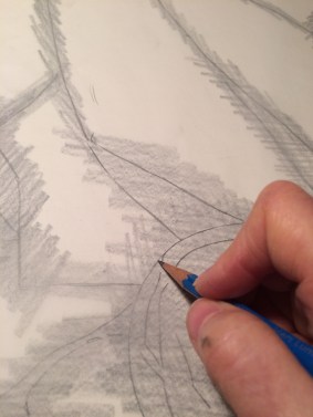
The first step in painting something accurately is to have a clear drawing of the object. I drew the easy-to-see, basic shapes of the structure of the bowl, the reflections, and objects seen through the glass in my original drawing.  I then transferred the drawing onto my canvas, and preserved it when I carefully painted my underpainting. Here, I’ve painted a thin glaze of green over the underpainting to indicate the general color of the bowl. The underpainting is still visible beneath the glaze. At this point, there are very few details shown- just a basic suggestion of the larger shapes.

green-cloth-bowl-1


Below, I’ve blocked in the local color of the black cloth so that I’ll be better able to judge the adjacent colors and values of the bowl. Painting is all about comparing one area of the painting to another. As each part slowly grows, it becomes easier to judge what other areas should be. That’s why I never try to bring just one area to completion before I’ve worked on the others. You can’t properly judge color and value unless it’s in relation to what’s nearby.  I also added in a first indication of the rest of the red cord, and added some of the dark tones to the rim. I also noticed a dark slanting shadow on the left, inside the ellipse of the top of the bowl, showing the shadow side of the cloth behind. These large shapes were very easy for me to see. I always begin with what’s clear to me. The details will come soon enough!

green-cloth-bowl-2

In the next photo, I glazed the green and black cloths a bit darker. I added some of the larger details of the bowl’s design on the left side, and corrected the size and shape of the main highlights. I darkened the dark areas, and the red string. I added some detail on the rim, very gradually bringing it nearer to reality.

green-cloth-bowl-3

Painting is always, at its beginning, seeing. Seeing complex objects is very difficult. It’s easy to become overwhelmed by the myriad details. Also, by the time your eye travels from studying a detail in the set-up to back to the canvas, it’s hard to know exactly where to put the detail you were just studying. Having a basic framework of large shapes in place is like having a hook to hang further details on. For example, I looked at the bowl and saw two long bluish reflections near the inner portion of the red string. Because I had already indicated where the string was on my canvas, I could easily look at my canvas, locate the string, and place the reflections next to it in the correct position. In this way, as I add details throughout the course of the painting, I make it increasingly easy to place additional ones. My painting proceeds by my comparing how reality appears to how what I’ve painted appears. The more my painting gets to looks like the object I’m painting, the easier it is for my eye to go back-and-forth between them and focus right in on any particular detail. I can then see any differences and correct them. Because of this, at every subsequent painting session it becomes more and more easy both to really see and then paint the small nuances of color and value that create the feeling of reality in a painting.

green-cloth-bowl6

At this stage, it’s becoming easy to observe more of the reflections and highlights. Notice how the highlights from my light source on the right are a warm yellow, whereas the highlights from the window on the left are blue. I also added more detail to the rim, adjusting value and color to match reality. The green cloth and the black cloth now have some highlights indicated.  I’ll continue to work on the bowl as the painting progresses, always trying to bring it closer to reality.

grren-cloth-bowl-8


Red Tassel & Cord

The painting is far along enough now that I can start thinking about some finer details. I thought I’d take a stab at indicating the red tassel and cord.

So far I’ve put down several glazes of alizarin crimson, a rich, transparent red, to indicate the mid-tones of the tassel and cord For the darkest areas, I mixed the alizarin with ultramarine blue, which is a very deep, transparent blue.

Now I’ll paint some of the lighter areas- a few individual strings on the tassel that catch the light, and some highlights on the raised areas of the braided cord.


green-cloth-red-tassel

In order for the tassel and cord to look real, I do have to paint in some very small details like this. I don’t, however, want to paint too many of them. Painting every string and every highlight is both impossible and counter-productive. To portray a complicated object such as this, my job is to see it clearly, and then simplify what I see and present only what is essential and important.  I’m trying to show the essence of the objects, not a photograph-like exact record.

It’s interesting to see how just adding a few details greatly adds to the effect of reality! I stop here for now, and will return to the tassel and cord later. I like to keeps all areas of the painting at about the same level of completion, so they all grow together. I make adjustments as I go along, and sometimes I need to re-think an area. It makes sense to keep fine details for the end because if I need to make any changes, I might end up having to paint over an area and cover up all of my hard work, only to have to repaint it later!

Getting the color right on the highlights was a challenge. My painting is lit mostly by incandescent light, which is a warm yellow. All of the light areas should show this warm tone. My first thought was to just add white to the warm red to get a lighter tone. This did not work. Adding white to red results in a cool, chalky pink- not at all the glowing warm tone I was after!

Also, the highlights on the red cord and tassel aren’t the lightest things in the painting. I need to save pure white for these areas (such as the highlights on the yellow crystal). I found that a pure cadmium red did the trick. It was both light enough in value and warm enough to look like a convincing highlight.  For the very lightest highlights I mixed in some pure cadmium orange. Now, the highlights look rich and warm, not dull and cool, as white or white mixed with red would have been.

Sometimes, it’s easy to forget that an artist uses physical pigments that all have different and distinct qualities. We are using these physical pigments to try to portray pure light. Getting the correct effect requires a lot of experimentation to see how the various pigments act and interact with each other. The paints on an artist’s palette will never have the range and subtlety of reality, so the artist has to use some tricks!


Green Glass Bowl- Indicating Transparency

Many people are confounded by the prospect of painting a transparent object. It’s actually not that difficult. You just have to train yourself to see the details of what’s in front of you, and not to get side-tracked into thinking about transparency. You simply observe all of the little irregular shapes and colors before you without worrying about what they are or where they’re reflected from. I might says to myself “This little shape looks like a crescent. It’s a sort of bluish green color that’s darker than the black line to the right of it.” Soon, you stop thinking about transparency, and are just a recording machine, seeing colors and shapes, darkness and lightness. It seems like a little miracle, when you finally step back after working for a while, and see that it actually looks like glass!

Green Cloth- Green bowl, more details.JPG

This is just my first attempt at getting the basic shapes and colors in the glass bowl painted. The next time I work on it, it’ll be much easier for me to see and paint additional shapes and colors, because I’ll have a basic framework set down.  Having a few things in place makes it easier to see how additional details fit in. This base gives my eye a place to settle and  to compare it with new observed data. This is the beauty of a  layered approach to oil painting. You don’t have to see everything at once. Each session of studying reveals more and more detail.


Block-in continued

Green Cloth-Continue Block-in.PNG

Here I’ve painted in a first approximation of the tan bowl’s color, ignoring the details of the design for now.  I also glazed in a darker red on the tassel  and cord. I’ll continue to add glazes to this to get a nice, rich dark red that will serve as a shadowy base for the lighter details of the strings and highlights.

Green Cloth-Details on Pot and stones.JPG

In my next session, I added details on the design on the pot. At this stage, because I’m struggling to see, I tend to paint details in too clearly, with their edges too hard, colors too bright, and contrasts too marked. This is a natural part of trying to see. Later, when I understand the design and have it recorded, I can go back and soften edges, correct color, and mute contrasts. Oil painting is very forgiving!

I added the cool light on the pots left side coming in from my studio window, and darkened the right side with a warm glaze (the shadows cast by cool light appear warmer). I indicated the splotchy texture of the bowl, and added details on the stones. I also darkened the shadows cast by the stones onto the cloth. I added some detail on the fringe of the green cloth.

Green Cloth-Highlights on green cloth.JPG

Finally, I added some of the highlights on the green cloth. To do this, I scumbled a pale yellow over the lit areas with the flat side of a large, dry brush. The fibers of the canvas catch the bits of paint in an irregular way,  allowing the glaze beneath to show through in places, imitating the look of light bouncing off of the cloth. Scumbled areas tend to look cool, so to indicate a warm light, I had to use a very bright yellow. It looked surprisingly bright on the palette, but once applied, it looked just right- just warm enough.


Green Glaze and Black Cloth First Layer

My last glaze is dry, so it’s time for the first green glaze. I use viridian green mixed with glaze medium.

green-cloth-first-green-glaze

Its very bright! If I had added a bit of red to the green glaze, it would have dulled the color down (colors opposite on the color wheel neutralize each other), but I wanted to see what the bright green would look like. It’s easy to tone down the brightness with subsequent glazes, but impossible to get back the brightness once dulled!

Next, I’ll put down the first layer of paint over the underpainting of the black cloth. I’ll keep this layer a bit thin, so that the color of the underpainting shows through in places. This underlying color will unify the painting, and help to create the illusion that everything in the painting is lit by the same light source.

green-cloth-black-cloth-first-layer

I kept the darks in this layer lighter in value than I’ll want the finished cloth to be. This will allow me to glaze over them with a dark glaze to achieve the darker, correct value. Glazing the darks over a lighter base results in a transparent richness that you can’t achieve with one solid paint layer.

Similarly, the light areas are painted darker than they’ll ultimately be. This allows me to scumble a light layer over a darker base. A light scumbled layer, dragged onto the painting with a dry brush, leaves a ragged, broken, textured brushstroke that allows some of the darker underlayer to show through, and mimics light falling on an object.

The Green Cloth

After I glazed the yellow over the green cloth area, I noticed that it obscured the underpainting beneath much more than I had anticipated. If I went ahead as planned and glazed green over the yellow, much of my drawing would become nearly invisible. I decided to wait to put on the green, and instead, glaze in the darker shadows, since their borders define the lines of the drawing beneath. I would have glazed these darks as my next step anyway. After this dark glaze dries in a few days, I’ll finally be able to glaze the green over all areas of the cloth.

I also painted in a rough approximation of the colors of the stones. I didn’t touch the areas adjacent to the cloth, because they would smear as I work on my green glaze at my next session. A layered approach requires patience!


green-cloth-shadows


I Begin the Over-Painting

I let the under-painting dry for a week until it was very dry to the touch. (The paint layer is very thin, so I probably could have painted over it in 4 or 5 days.) I was eager to see how my idea of under-painting the green cloth in yellow would work out, so my first step was putting down a thin glaze of cadmium yellow over the cloth. This is all I did for my first session, because I want to put down a green glaze over the yellow area as soon as it is dry, in 4 or 5 days. If I had started to paint the rest of the canvas, those thicker layers, by contrast,  wouldn’t be dry for weeks. They would inevitably smear as I worked with my green glaze. So, it was a short session today!

green-cloth-yellow-glaze

The Underpainting

My first layer of paint is a monochromatic underpainting. This serves many purposes. It gets me started painting in a stress-free way (It’ll be covered up later!). Also, it’s easier to judge final colors and values painted onto this underpainting than onto a stark white canvas. Finally, the underpainting shows through here and there between the top layers and also through subsequent glazes, providing a consistent color harmony to the finished work. This provides a feeling of unity and reality in the finished work.

I choose to paint the underpainting in lead white and burnt sienna. I like the warm color of the burnt sienna, and both colors are low in oil, important for an under-layer. (An important rule of oil painting is to always have the oilier layers on the top, and the leaner mixtures underneath.) I mix up 9 values from lightest to darkest.

green-cloth-underpainting-pallete


All of the values in the underpainting will be in a lighter key than the finished painting. This lighter tone will allow subsequent layers to appear brighter.  I keep this paint layer very thin so that it will dry quickly, because I can’t paint over it until it is dry to the touch. I blend out any obvious brush marks, so they won’t show through and interfere with my more considered brush strokes in the finished painting. I paint only the general shapes, not any details. Since this layer will be mostly covered up with more paint, it would be a waste of time to spend any time working on details. I keep edges clear and visible to preserve my drawing for the over-painting.

green-cloth-underpainting-detail

It’s hard to judge values correctly when mixing paint on the palette. I find it useful to use my black-and-white study as a value guide. If I’m unsure about the value I mixed for a part of the painting, I paint a dab of it right onto the corresponding area of the black-and-white study, which I have tacked to the wall nearby).  I  can tell immediately if the value I mixed is darker or lighter. Since I’m painting my underpainting a few values lighter than the final result (which are the values represented in the black-and-white study), I might think, “So this dab is the same value as the black-and-white, so I’ll paint it two steps lighter in the underpainting.”

grren-cloth-underpainting-values-on-balck-and-white-study

It takes me two sessions to complete the underpainting. Now, it’ll take about a week to dry completely.

green-cloth1underpainting-complete


Transferring the drawing to the canvas

Now that my canvas has arrived, it’s time to begin!green-cloth-new-canvas


First, I must transfer my pencil sketch onto the canvas. I trace my sketch onto a sheet of tracing paper.

green-cloth-drawing-traced

Then I rub pencil onto the back of the traced drawing. This will act as carbon paper.green-cloth-making-carbon-paper

I now tape this carbon paper right side up onto my canvas.

green-cloth-carbon-taped-to-canvas


I trace the lines with a 2H pencil.

green-cloth-transferring-drawing-to-canvas

My drawing is now transferred to the canvas.

green-cloth-drawing-transferred-to-canvas

Inevitably, all of this tracing distorts the original image. I have to spend some time now correcting any errors that have crept into the image. Here’s a detail of the canvas with the drawing transferred onto it and corrected.

blog-photos-underpainting

I lightly spray some fixative on the drawing so the pencil won’t smear into the oil paint. Now I can begin my underpainting.


Thoughts on my Underpainting

While I’m waiting for my canvas to arrive from the canvas-stretching company, I’ve been thinking about how I’ll proceed with the painting. Normally after I transfer my drawing to the canvas, I do an underpainting over it. This is a preliminary layer- a very simple, thinly painted, monochromatic and undetailed version of the finished work. I usually use burnt sienna, an orange earth tone, and lead white. I keep the values lighter than they will be in the finished work, because I prefer to over-paint onto a lighter base. I do this for two reasons. First, because if I want to glaze (add a transparent layer of color), it must be over a lighter ground to show properly. Second, even more opaque layers look more bright and true when painted over a light ground.

I also omit details at this stage. I would only have to repaint them in the over-painting! I paint very thinly, so the brushstrokes won’t show through later, in case I want to make changes.

This monochromatic underpainting serves several purposes. It provides a unifying color scheme for the whole finished painting. Bits of this color (in this case, burnt sienna) show through here and there, making it seem like the whole composition exists in the same light and place. It is also easier to begin putting down color in my overpainting if I don’t have to do it onto a bright white canvas. It is easier to judge value relationships if the underpainting already suggests what the different values should be. Most importantly, it is an easy way to begin! Details aren’t important, color isn’t an issue, brushwork isn’t seen, even the exact values aren’t important (as I said, I paint all the values in this underpainting lighter anyway). Painting is hard enough without feeling like you must do too much at once. My method of painting allows me to work in stages, tackling different problems in order. First I do a drawing, then I think about values in a value study, then I do a monochromatic underpainting. Finally, I will think about color, and then details.

I was considering tackling the underpainting in a slightly different way in this painting. Since the green cloth is so important to the final effect, I want to make sure the color is very bright. In the Sir Thomas Moore portrait, the green cloth is very bright and was probably painted using a transparent glaze over a yellow layer beneath. Maybe I should try underpainting the cloth area as usual, in burnt sienna and lead white, but make the values very light. Over this, I could glaze a layer in yellow and then when dry, glaze over it in viridian green. For the shadow areas, I could glaze additional layers of ultramarine blue and raw umber, and for the highlights, I could scumble some lead white over the dry glaze.

holbien-portrait