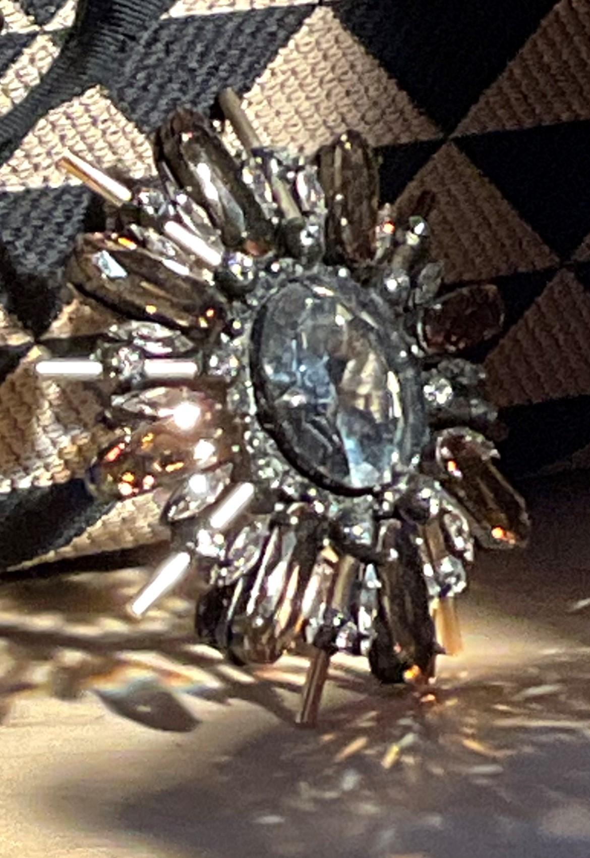
One of the hardest things to paint is a highly reflective surface, such as this crystal brooch in my latest painting. There is a photo of it below. The first difficulty is actually seeing the forms. The reflecting light is so bright that it obscures the forms. Sometimes I take a photo with my phone so that I can see the shapes more clearly. A photo, however, distorts the colors, reflections, and even shapes, so it’s not reliable to paint from. It can be helpful, though, just to make sense of what you’re seeing, especially in complex objects like this.
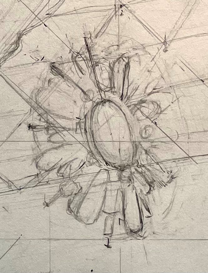
First, I do a very rough pencil drawing to locate the various shapes. I don’t go into a lot of detail, though. Most of it would be lost after the underpainting and first layers of paint, so I save myself the trouble of getting it all down now.
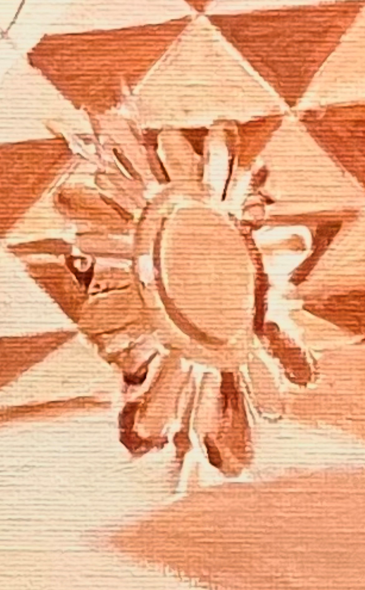
After the drawing is transferred to my canvas, I do a monochrome underpainting in lead white and burnt sienna. I keep the values light and the paint thin. I also don’t attempt any details yet. This layer is meant as a guide for future painting.
After the underpainting is dry, I paint the first layer of color. I ignore the subtleties of reflections and just try to get a first guess in as to local colors and general shapes. It doesn’t have to look good at this point.
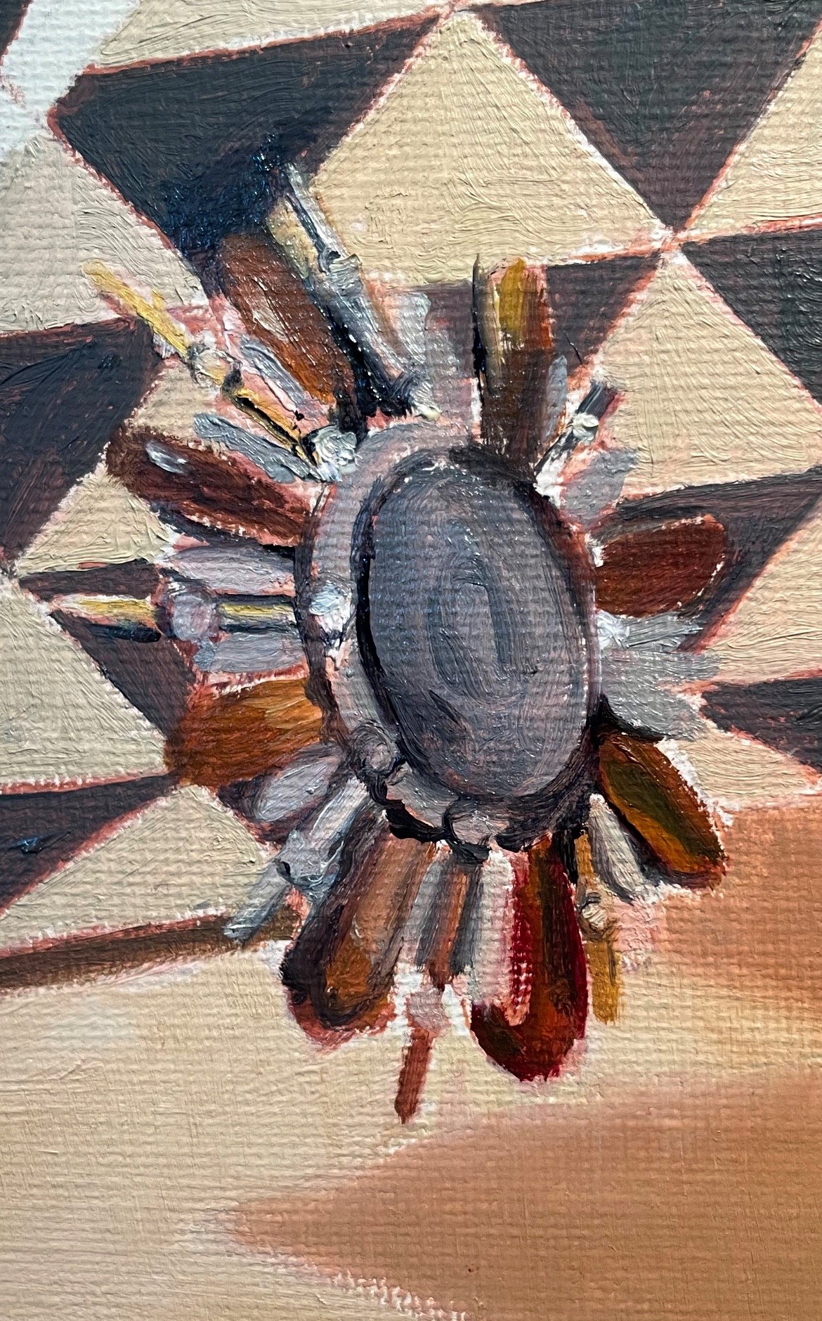
In the next session, I adjust some colors and the drawing. I reduce some of the contrasts in values, since all of the light bouncing around means that nothing is really dark.
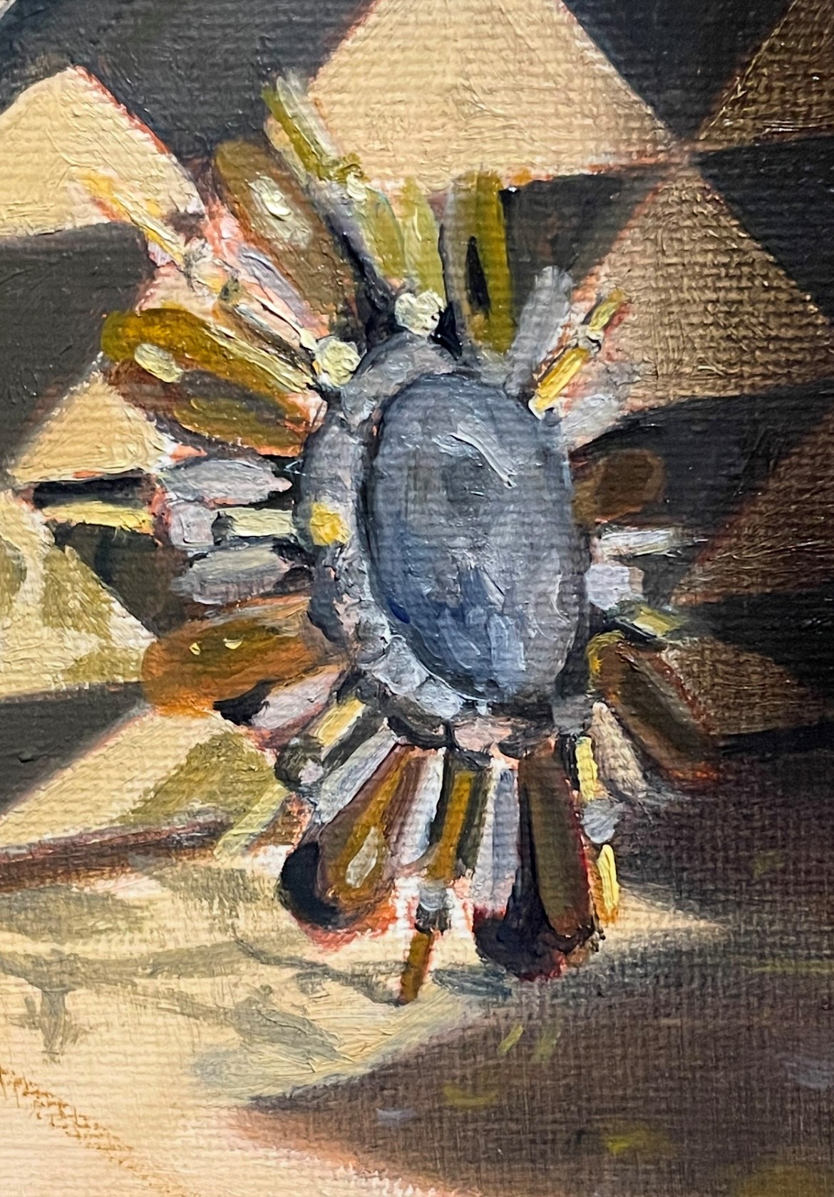
Below, at the next session, I adjusted the shapes again. I had to refer to my photo sometimes, because many of these shapes were completely obscured by reflections at my distance from the set-up of 6 feet. After I made the corrections, I put away the photo and observed my set-up. It’s amazing how much difference there is between reality and a photo. Things that seemed sharp in the photo were actually very blurred and indistinct in reality. I had to make sure to reproduce this indistinctness in the painting and not be too clear, otherwise my painting wouldn’t look convincing. This is one reason that paintings done from a photo will never look as real as ones painted from life. It seems counter-intuitive, but it’s true! Below you can see the shapes becoming less distinct.

Next, I continue to correct colors and I add warm haloes around the reflective crystals. This mimics the light bouncing off of the forms. You can see this effect on the gold spoke on the left side of the brooch. The highlight is the lightest value, with the edges fading to yellow, then to a dark gold.
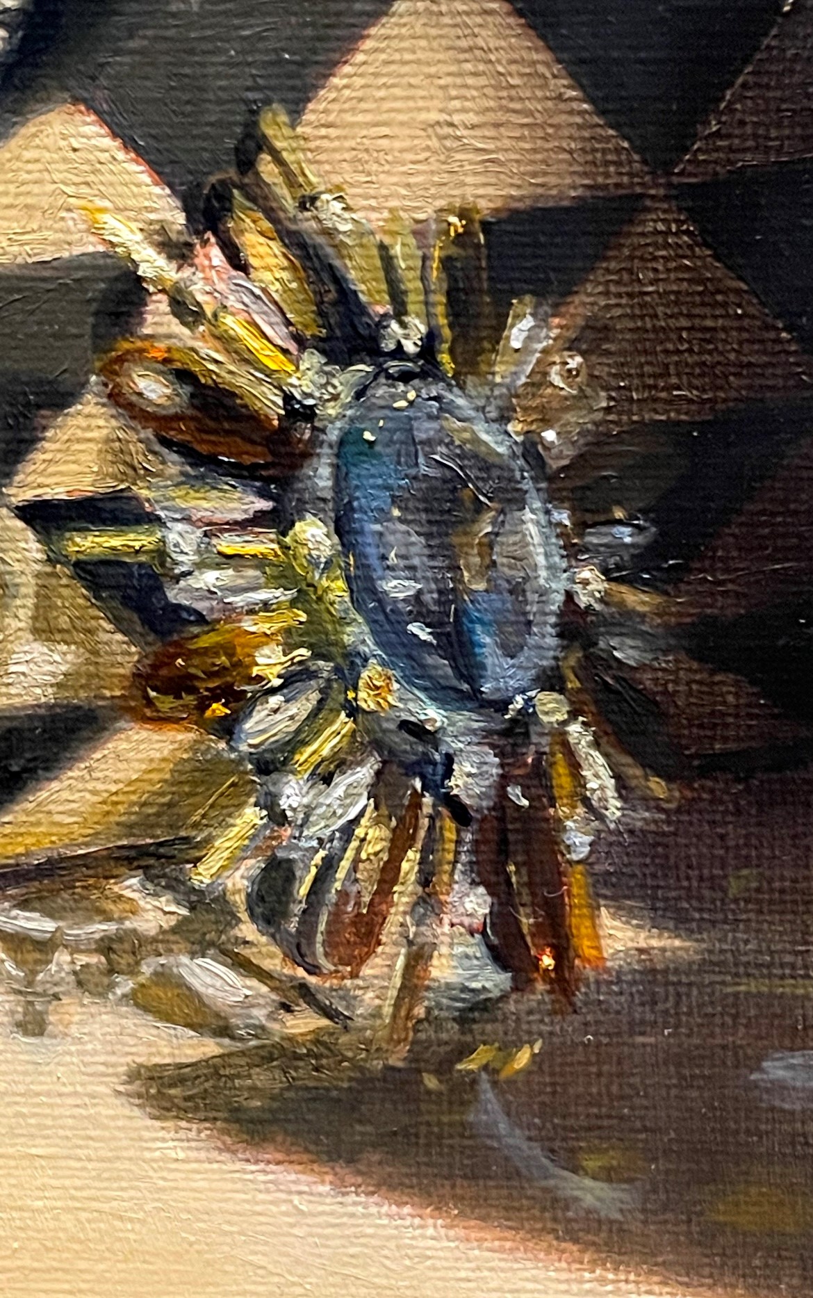
Finally, I continue to blur edges and add the brightest reflections in lead white with just a touch of yellow to represent light coming from a warm light source. I also make sure that there are not too many darks near the reflective elements. (In the photo below, the darks appear darker than they are in the painting.) Even though areas might seem dark when you focus on them, if you take in the whole scene, you will notice that in the area of the reflective objects (here, the brooch), everything is bathed in light. So, keep the darks brighter and warmer than you think. Finally, resist the temptation to show detail that is impossible to see from your vantage point.

