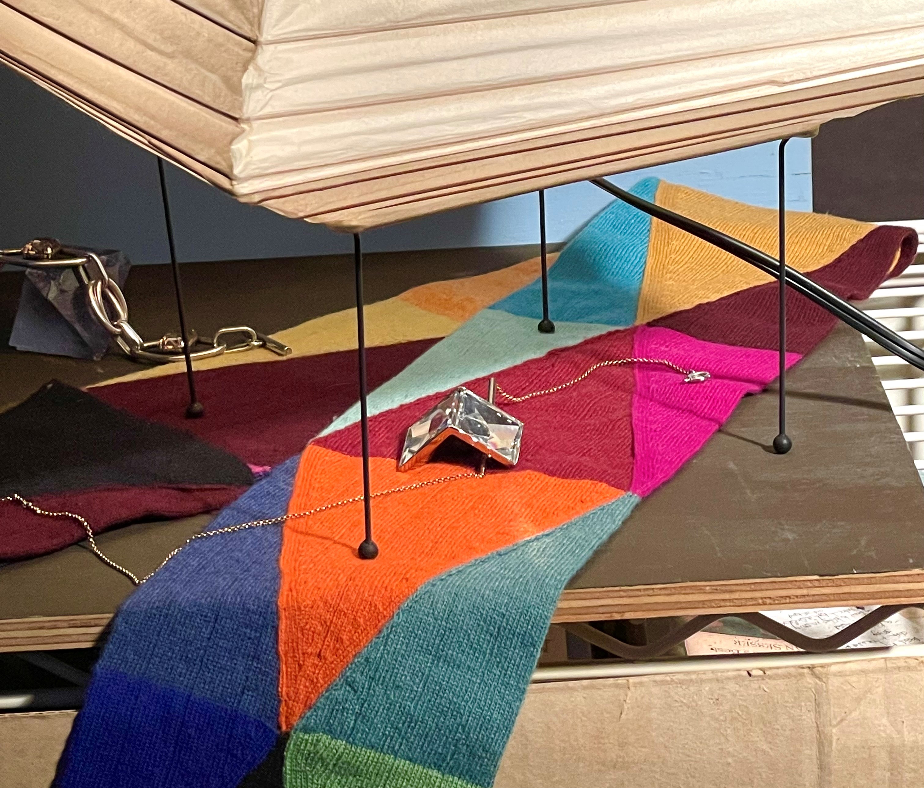
I need to mix a lot of colors to paint this scarf. Of course, it’s not crucial that I get them exactly as they are in the real scarf for the painting to work, but I do like these colors and composed the painting with them in mind. Below is a picture of the set-up so you can see the colors within the limits of photography. (One reason I never paint from photos is that the colors are never right! I show you this just so you can get a rough idea.)

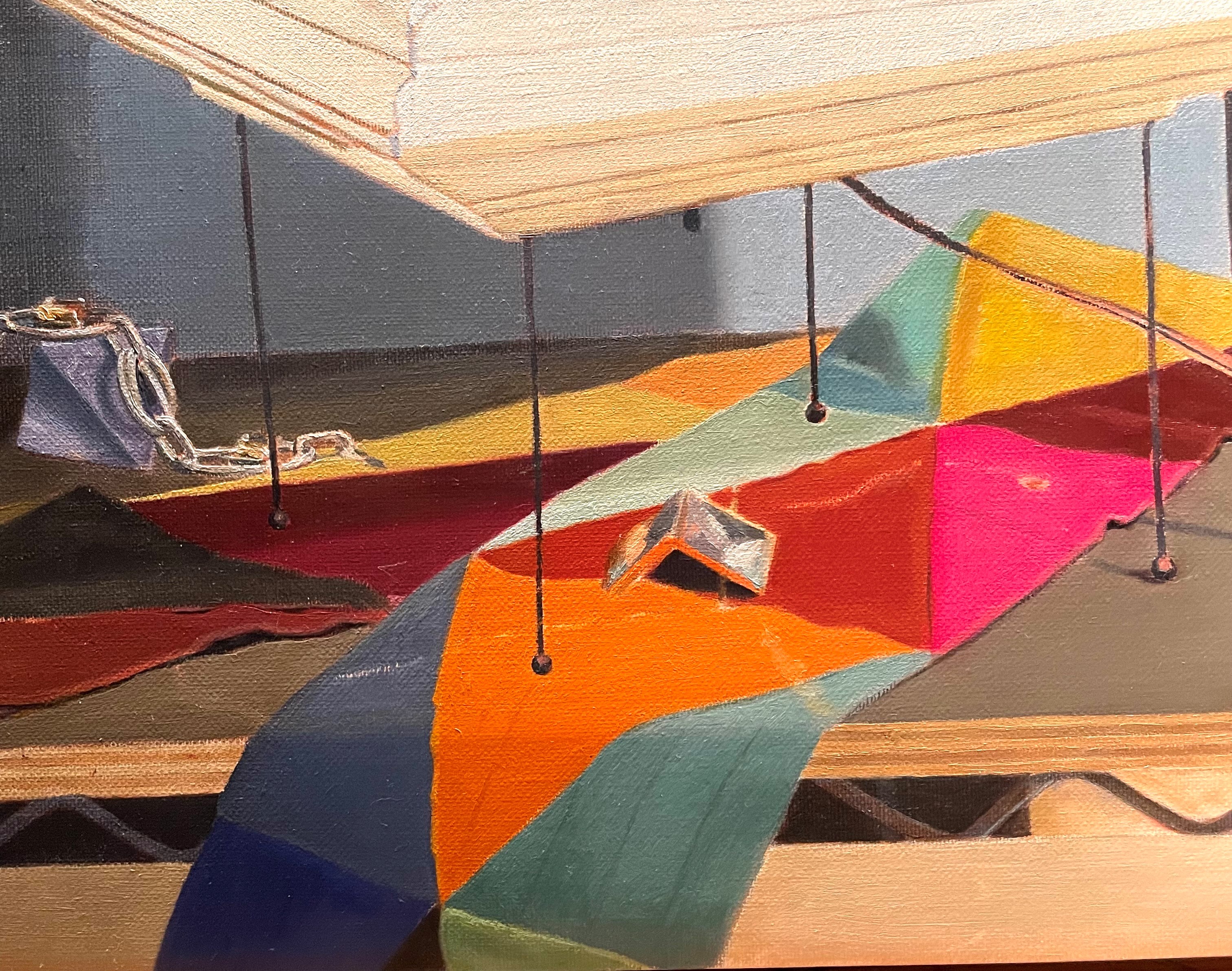
Below is my first attempt to block in the basic local colors. I’m not trying to capture any nuance yet of shade or reflection. That will come later. Let’s look at a few of the colors I had to mix. The dark orangey-red triangle, right under the lamp, was tricky. I started with an Indian red- a very strongly pigmented earth pigment. It was too dark right out of the tube, so I needed to lighten it. Rather than mix in white, which would have the effect of dulling the color, I added Naples yellow dark. Even this turned a bit chalky because of its light value, so I added cadmium orange-a warm color closer to the value of the Indian red. This looked better but seemed like it needed to be brighter. I added permanent light red. This did the trick. (This illustrates an important fact about lightening red tones. It almost always looks better to lighten them with orange or yellow, not white. White will make the color chalky and dull). Getting the right color often takes some experimenting. I put down a color and see that it is wrong, then I add and test, and try again until it looks good. Sometimes I guess right the first time, but usually it takes me a few tries. Also, keep in mind that colors will look different after they are all painted and you can see them adjacent to each other.

I continued until I had a first guess at all of the colors in the scarf. I let this layer dry, then took another stab at it at my next session. Below, you can see that I’ve adjusted the colors. The rust-colored triangle that I was talking about above seemed too dark. I added even more permanent light red to the Indian red. The hot pink triangle was too pale. Rather than mixing alizarin and white, I decided to glaze pure alizarin over the first layer. This produced a nice vibrant hue. A glaze can often be brighter than a mixed color! I also needed to re-paint the pale yellow and pale orange bits at the back, as they were too light. Darkening these pale, warm colors is very hard to do without without turning them greenish or reddish. For the yellow, I succeeded by adding some transparent golden ochre to the cadmium yellow and white mix I had used for the first layer. For the orange, I mixed lead white, cadmium orange and just a bit of burnt sienna.

A trick I use to judge if colors I’ve painted are correct is to make a window with the thumbs and first fingers of both hands. I peek through these little windows, framing the bit of color in the set-up with one hand and the corresponding area in the painting. I look quickly back-and-forth between them. Seeing the colors isolated from their surroundings makes it easier to compare reality to the painting. Differences will be obvious.

You can correct colors in several ways. You can re-paint with a solid, covering paint layer, glaze with a transparent dark mixture to warm, darken, or alter the underlying color, or you can scumble a thin layer of a light-valued pigment to cool and lighten what’s underneath. Below, I scumbled the large yellow triangle to indicate some lights.
I’ll continue to work on these colors. Sometimes it takes a few sessions to see them clearly. For instance, now that I look at the picture of the set-up below, I can see that the purple triangle on the left is too dark and dull! Also, the dark orange triangle needs to be a bit cooler and more purple. I’ll fix it next time!