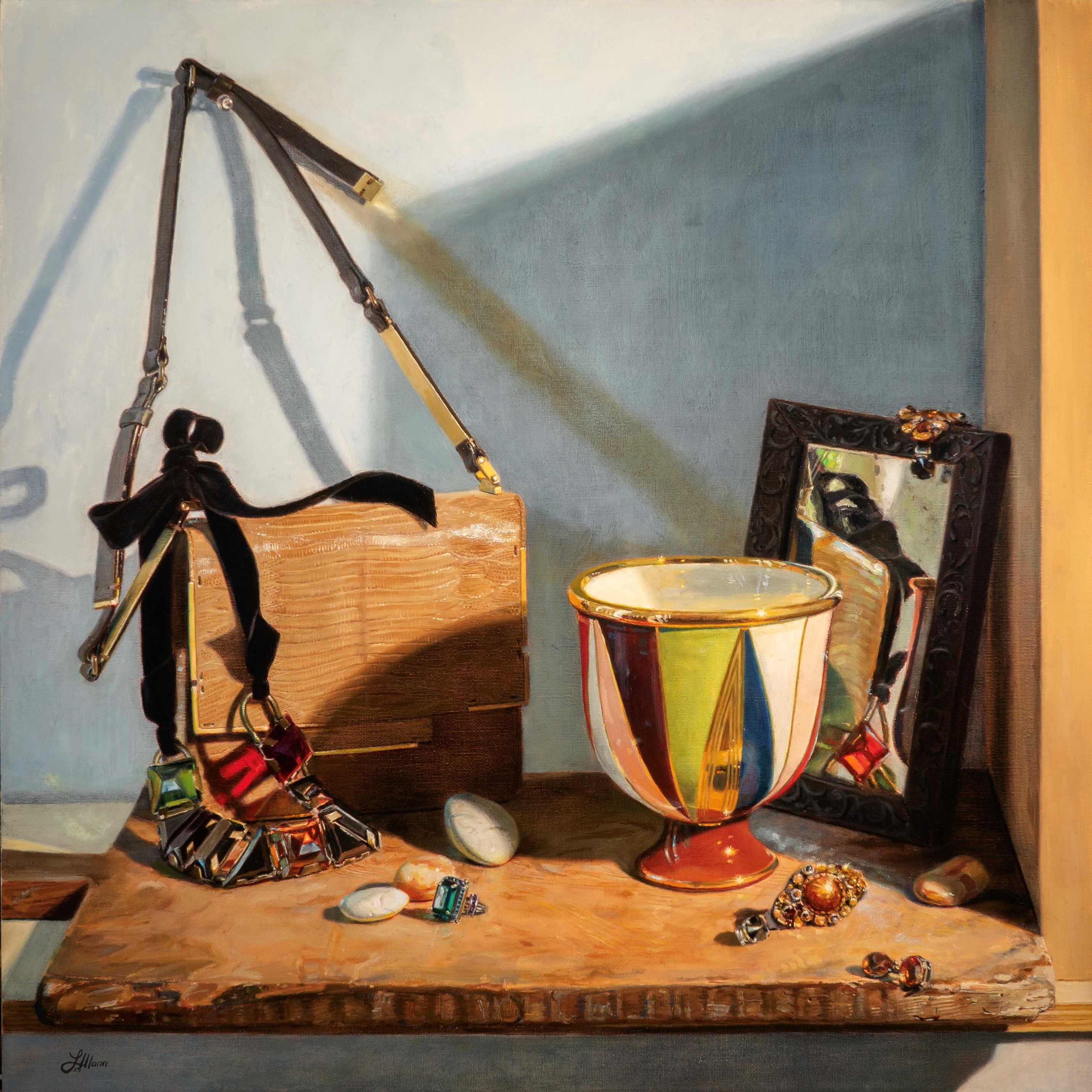
One of the themes of this painting is cool daylight vs. warm indoor light and the effect it has on the color of shadows and lights. I have a warm spotlight coming in on the right side, and a window on the left, admitting cool daylight. You can see the effect that this has most clearly in the cast shadows of the handbag and straps on the wall. The shadows cast from the spotlight are cool blue. The shadows cast by the daylight are a warm yellow.
To make it easier to see the cool light, below, I turned off the spotlight in the set-up. You can see how all of the lights are now cool, and the shadows warmer. Some of these warm shadows from the window are very light in value and are overpowered by the warm spotlight when it’s turned on. Looking at the set-up this way, however, helps me to see the warm shadows when I turn back on the light.
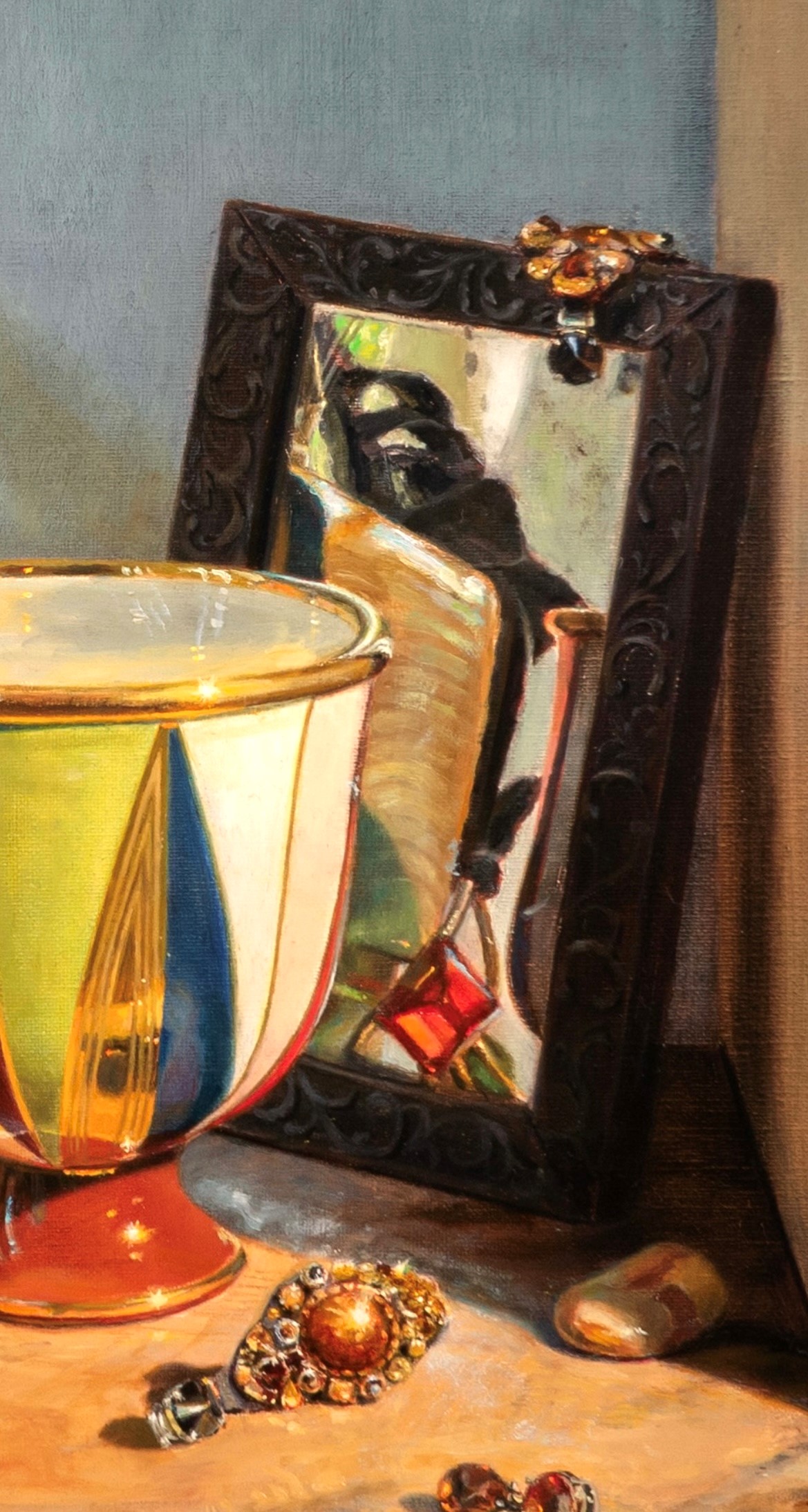
In the detail below, the framed mirror is casting a warm shadow to its right, on the wall and tabletop. This is created by the cool light coming in the window. Also, the mirror itself is very cool. This is because it is situated entirely in the cool shadow cast by the wall on the right. This is accentuated by the cool light coming in from the window, which gently illuminates it. In addition to these effects, the mirror is reflecting cool highlights into the shadow on the tabletop.
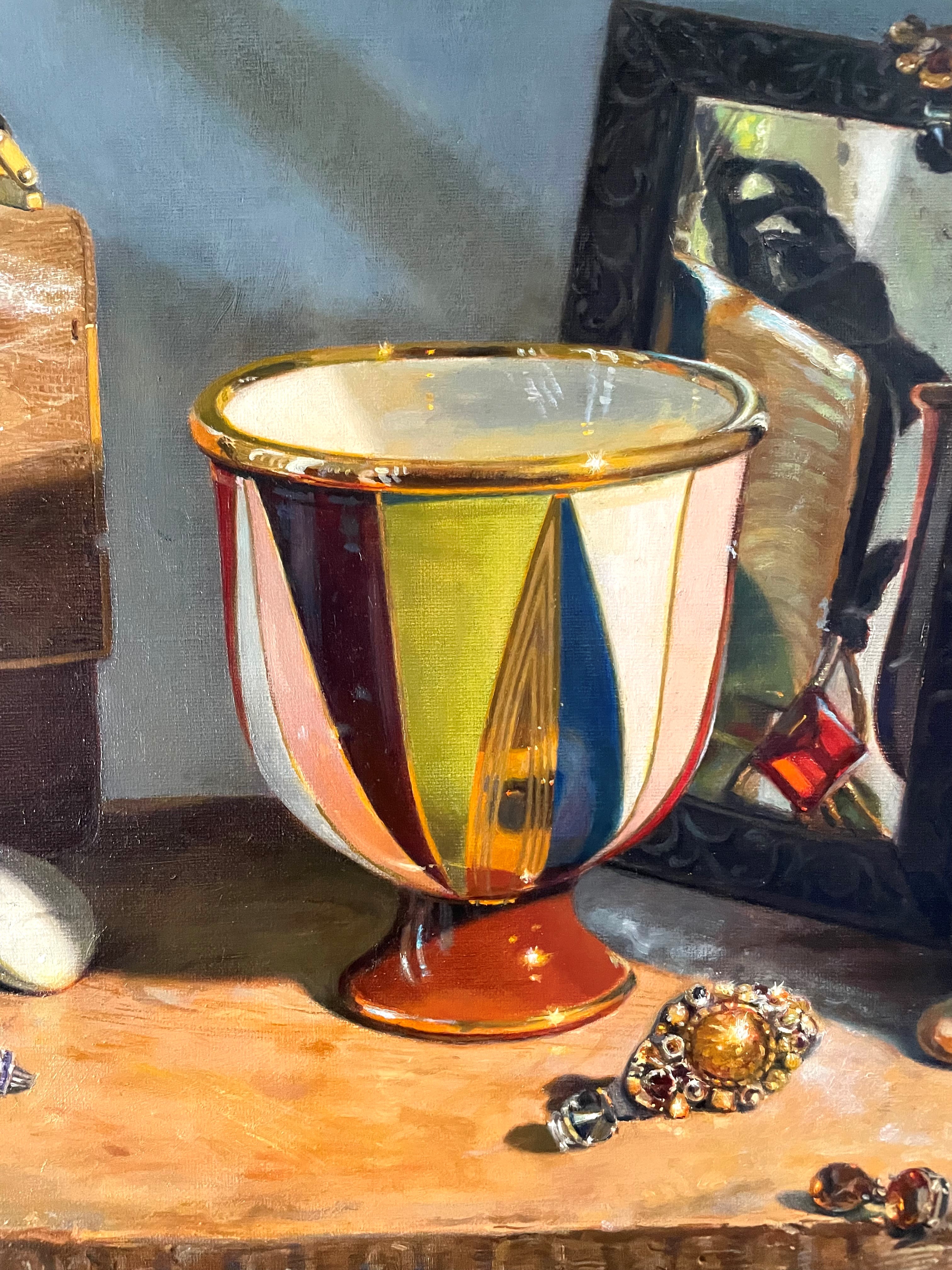
Below, you can see the colors of the lights in the vase. The highlights on the front of the rim on the right side are warm yellow, created by the spotlight. The highlights on the front of the rim on the left are created by the cool outdoor light. Similarly, the white triangular area on the body of the vase on the left side is a very cool blue, while the white triangular area on the right is a warmer yellow. Typically, I wouldn’t use such a strong secondary cool light, because I usually like to have a distinct dark side and light side to any object. You can see that the vase doesn’t have a strongly defined dark side. Having light come from two directions diminishes that effect, but in this case, I really enjoyed the cool/warm contrast, and in this painting, color and light is more important than value contrast.
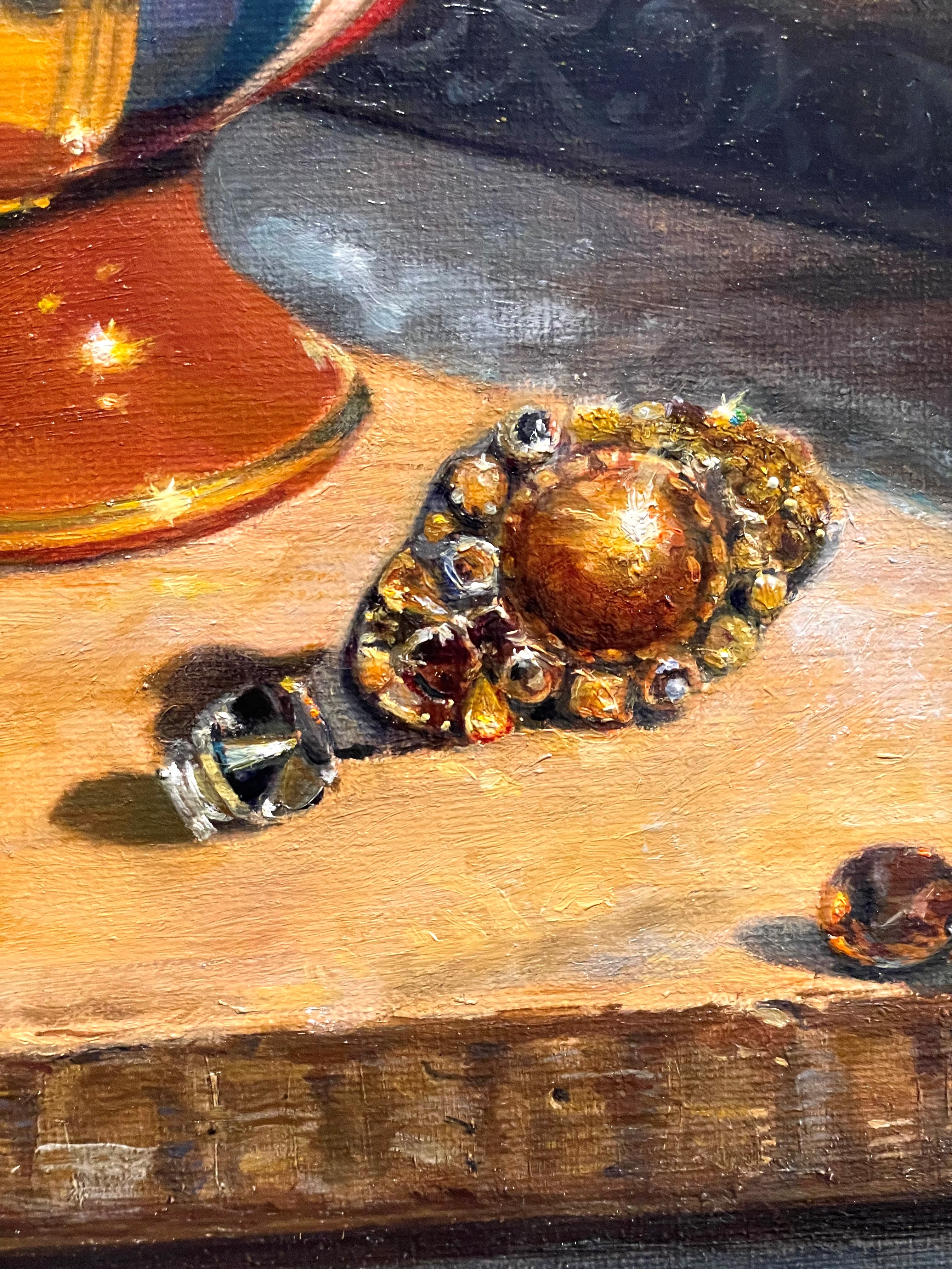
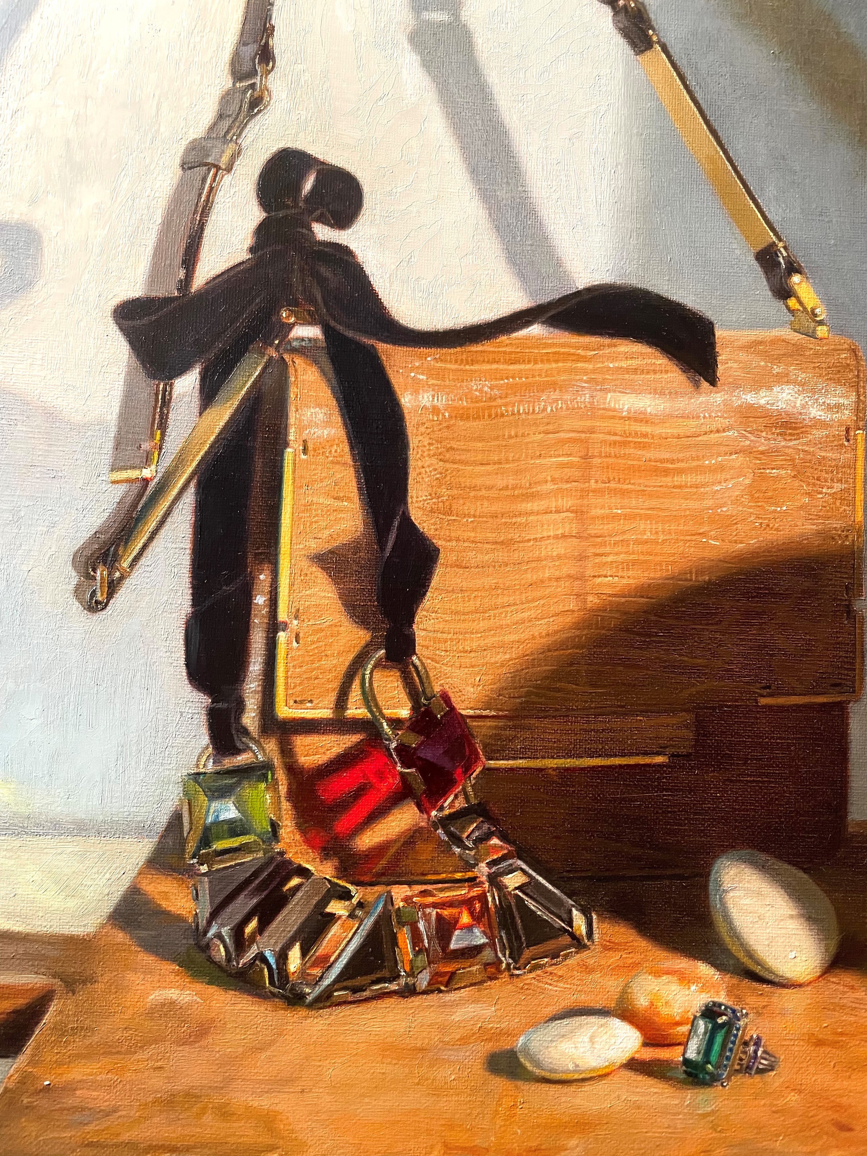
Below, the cool shadows cast by the necklace onto the cutting board are made cooler and lighter by the cool blue light coming in from the window. You can also see how the transparent red crystal is casting a red shadow.
Throughout the painting, cool and warm lights are mixing. In the detail below, you can see the very warm yellow cutting board with flecks of cool blue light flickering over it.